
Communication Design & Printing
The Challenge
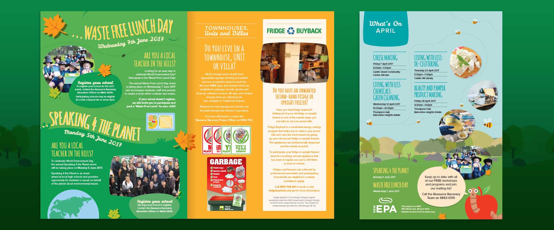
Communication design is important for The Resource Recovery Team at The Hills Shire Council because they manage the domestic waste service for their local residents in Sydney. This includes collecting bins, organising clean-up collections and ensuring that the correct items are placed in residential bins. They approached communication designers, Percept, for this brochure design and printing project.
The communication design brief was to create a brochure design that would connect with their residents. It was to provide information on the domestic waste service and the programs that are offered, and ultimately encourage and increase recycling.
The strategy for this communication design and printing project was to revamp the previous brochure to encourage residents to re-read it.
The Solution
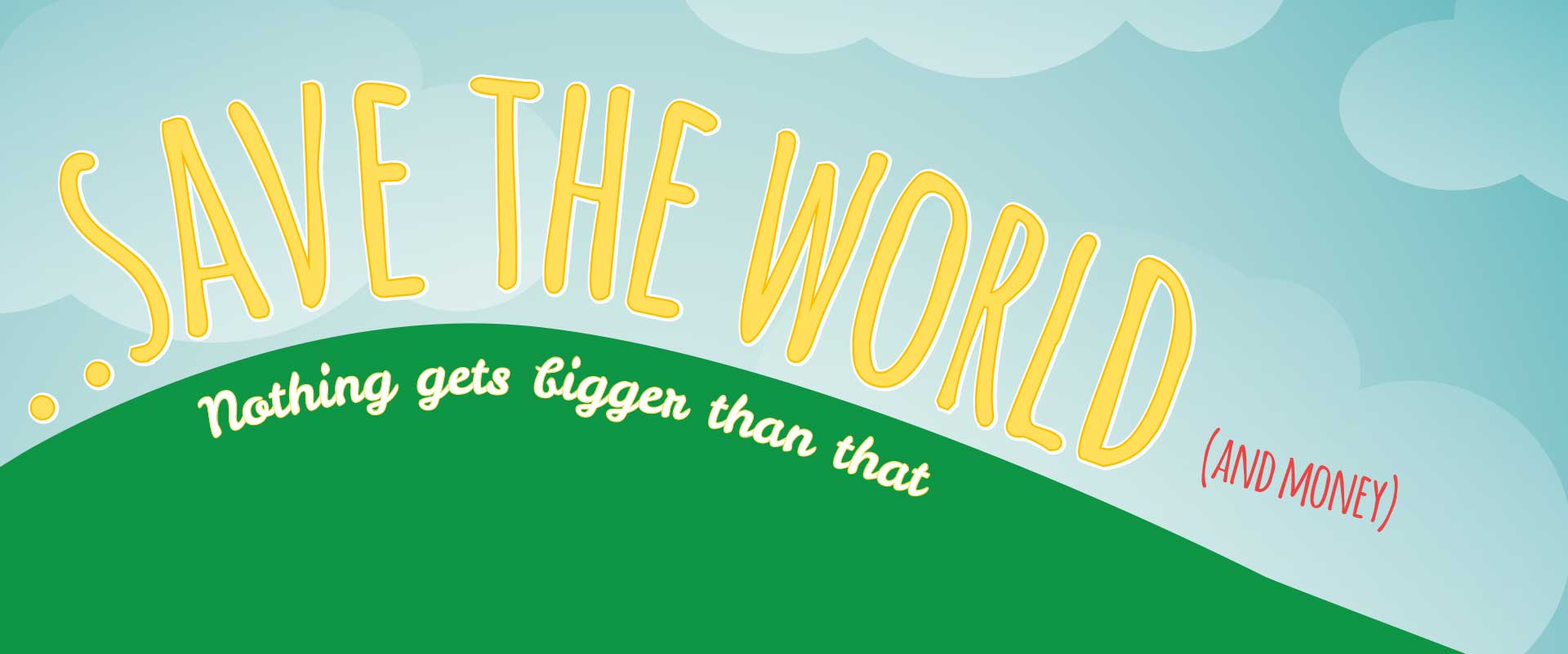
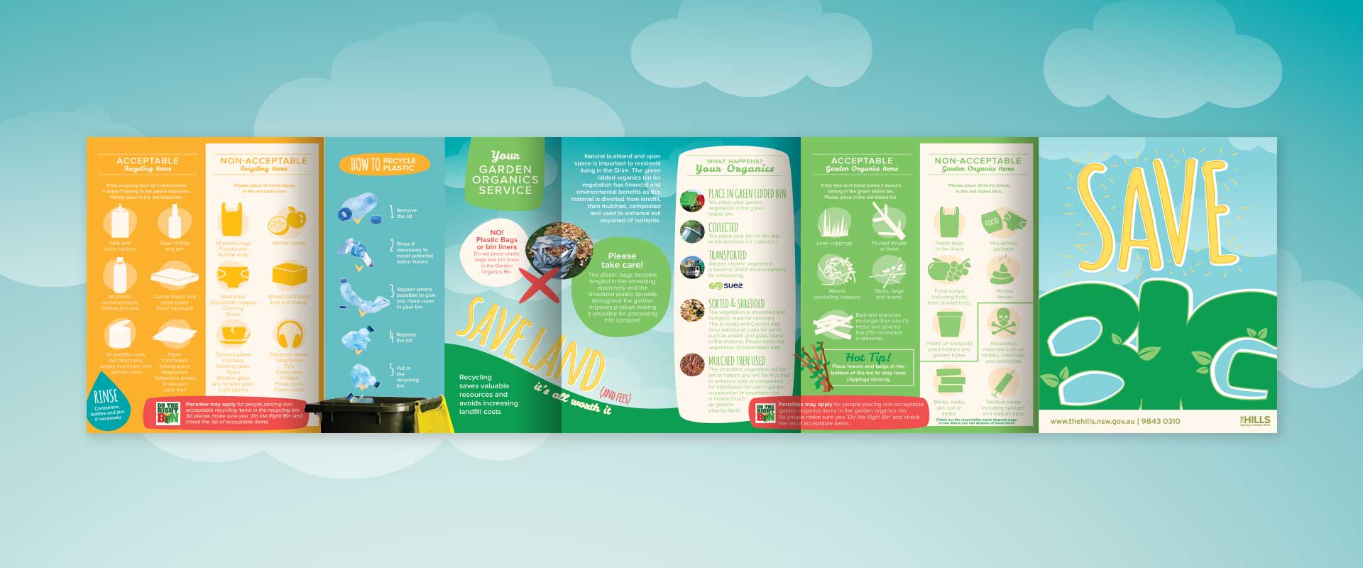
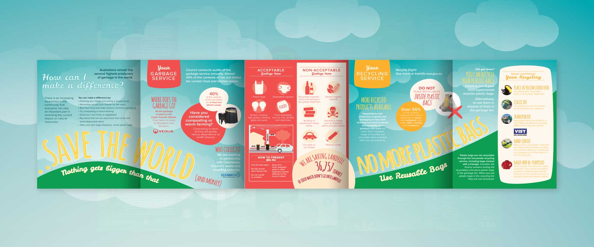
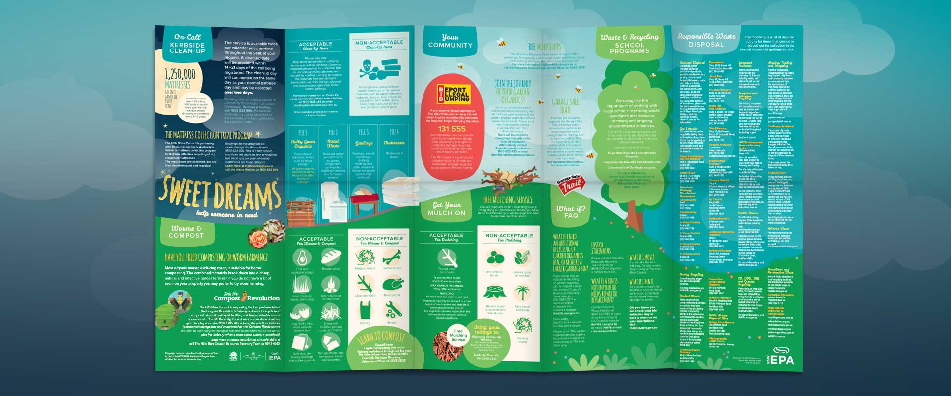
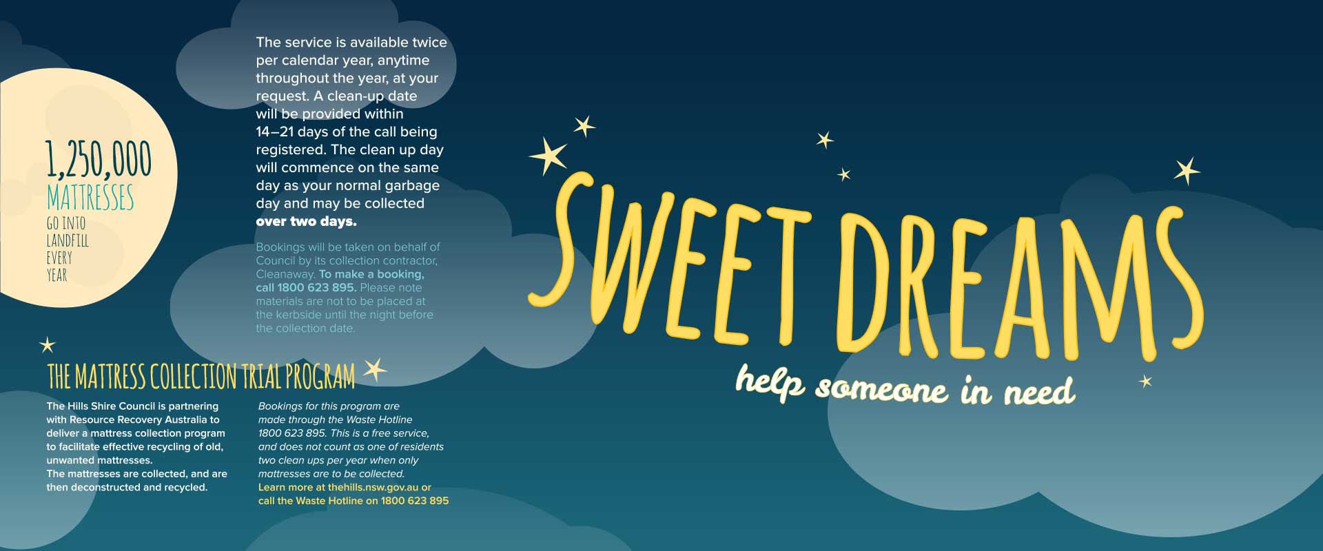
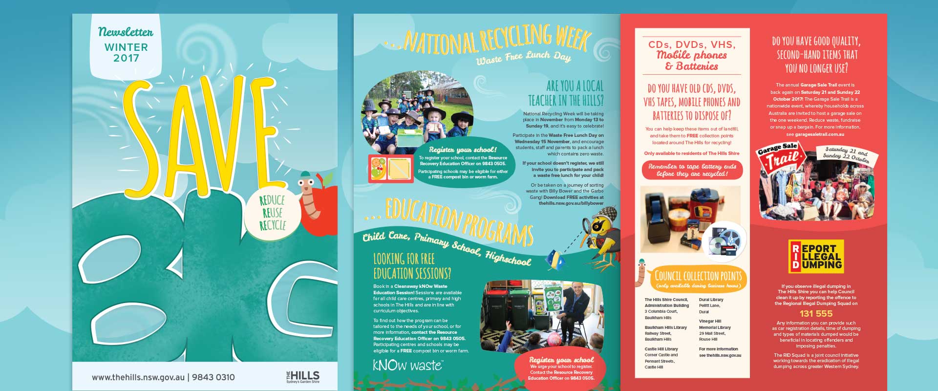
To stand out from previous brochures sent out to residents, communication designers, Percept approached this brochure design and printing job with the intention of making a strong visual impact. The headline ‘Save Big’ has a double meaning, it encourages residents to save money as well as saving the world at the same time.
Bold colours and simple illustration style gives the communication design a friendly and approachable feel, while enticing the resident to look inside. The message from the cover leads into telling the story of ‘Save the World (and Money) – Nothing gets bigger than that’ – this message is reinforced by the physical size of the finished, printed brochure, as it folds out to form a large flat sheet that tells the recycling story.
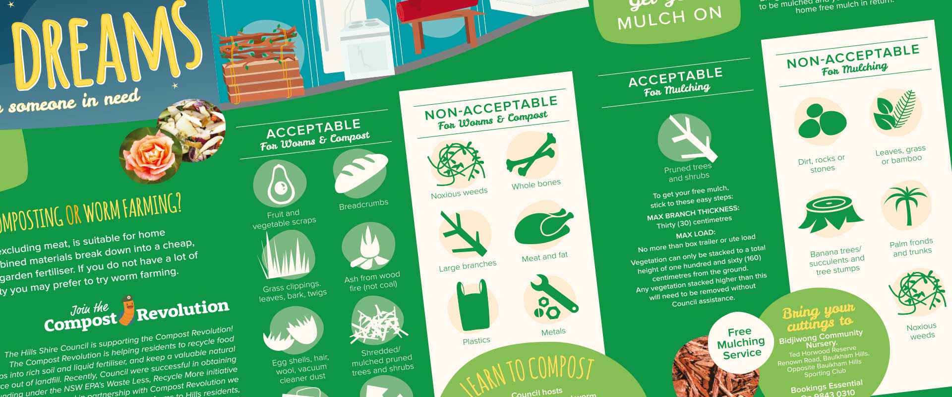
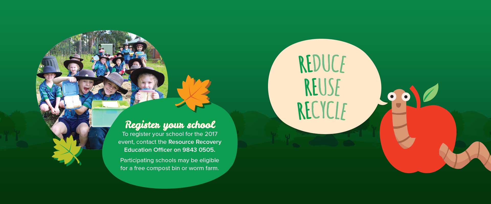
Expert communication designers, Percept, ensured each section is colour coded to match the appropriate recycling bin (garbage = red, recycling = yellow and garden = green). The messaging has been simplified using pull-quotes, images and infographics to make the content easy to understand.
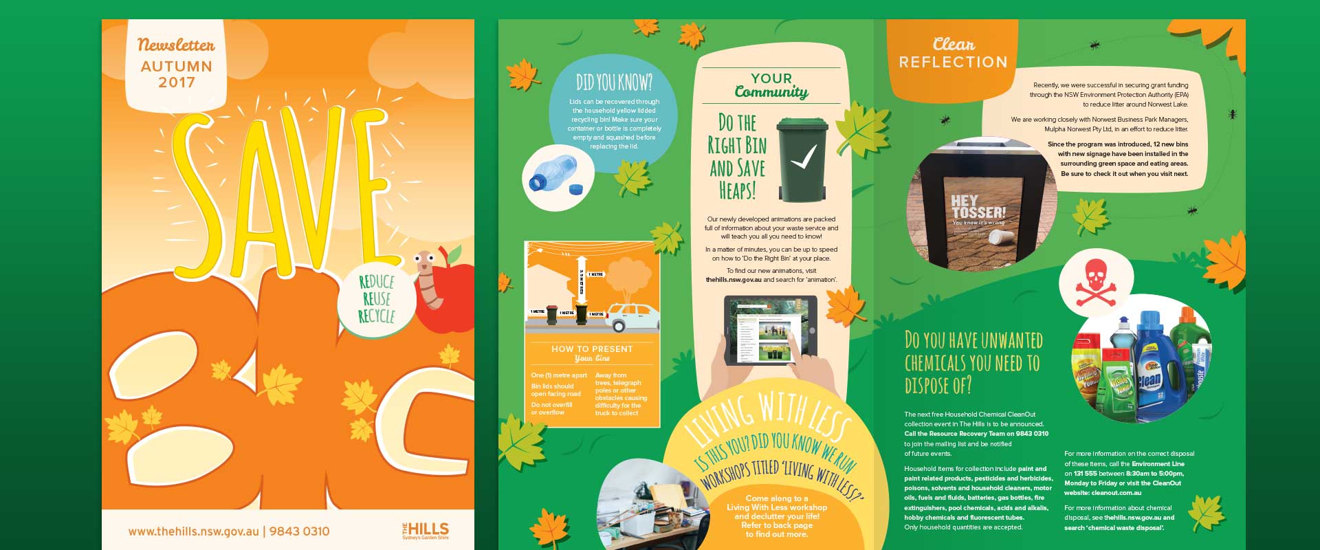
The communication design and printing project has proven a success, with the council reporting less waste and increased recycling. Such have been the results, the brochure is now published as a quarterly newsletter, with communication designers, Percept, creating a new look for each season.