Packaging Design by Packaging Designer, Percept in Sydney
After 4 years in Australian retail stores, the Cheeky Blonde beer brand was looking to refresh their image in the market which had become saturated with competitor blonde beers. Packaging designer, Percept, in Sydney, was approached to work on the packaging design for this premium beer product.
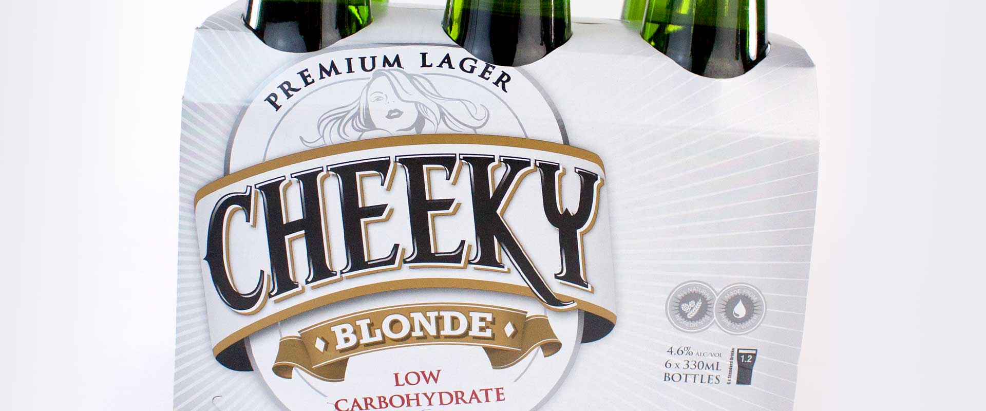
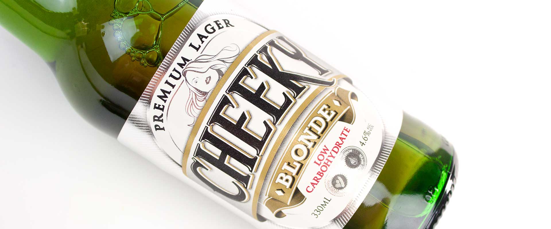
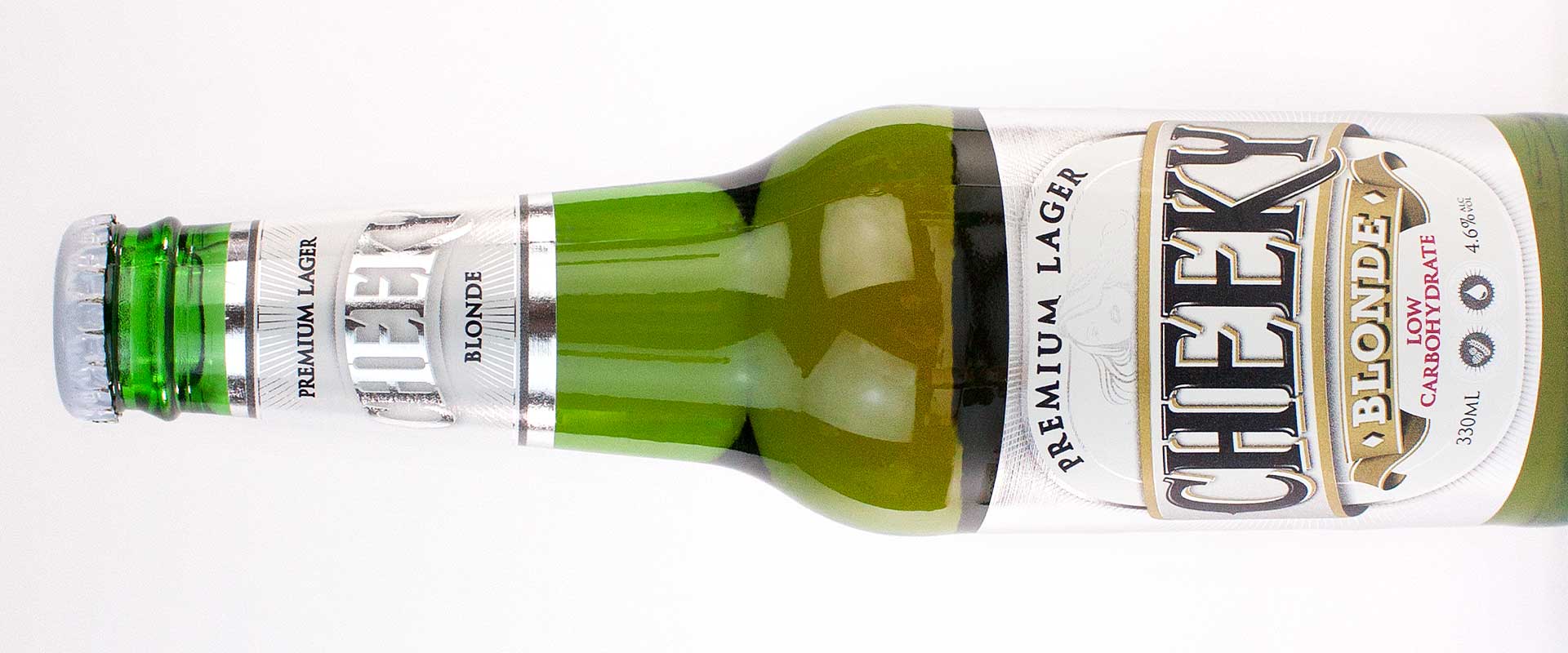
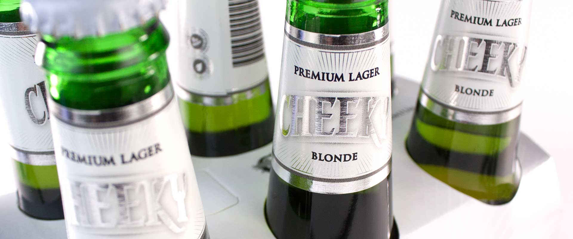
Firstly, packaging designer, Percept, looked at brand strategy on the packaging design assignment and assessed the competitor landscape for this beer brand. For the design strategy, packaging designer, Percept, believed that more focus should be on the word Cheeky which is ownable to their beer brand. Hence, less priority should be on the word Blonde which is common to all beer branding that have now entered into this market segment. The resulting typographic solution from packaging designer, Percept, satisfies this theory and has been hand crafted to give the beer branding a boutique feel. We wanted the consumer to believe that a lot of care had gone into the contents of the bottle.
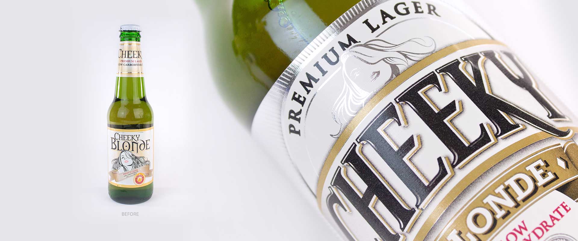
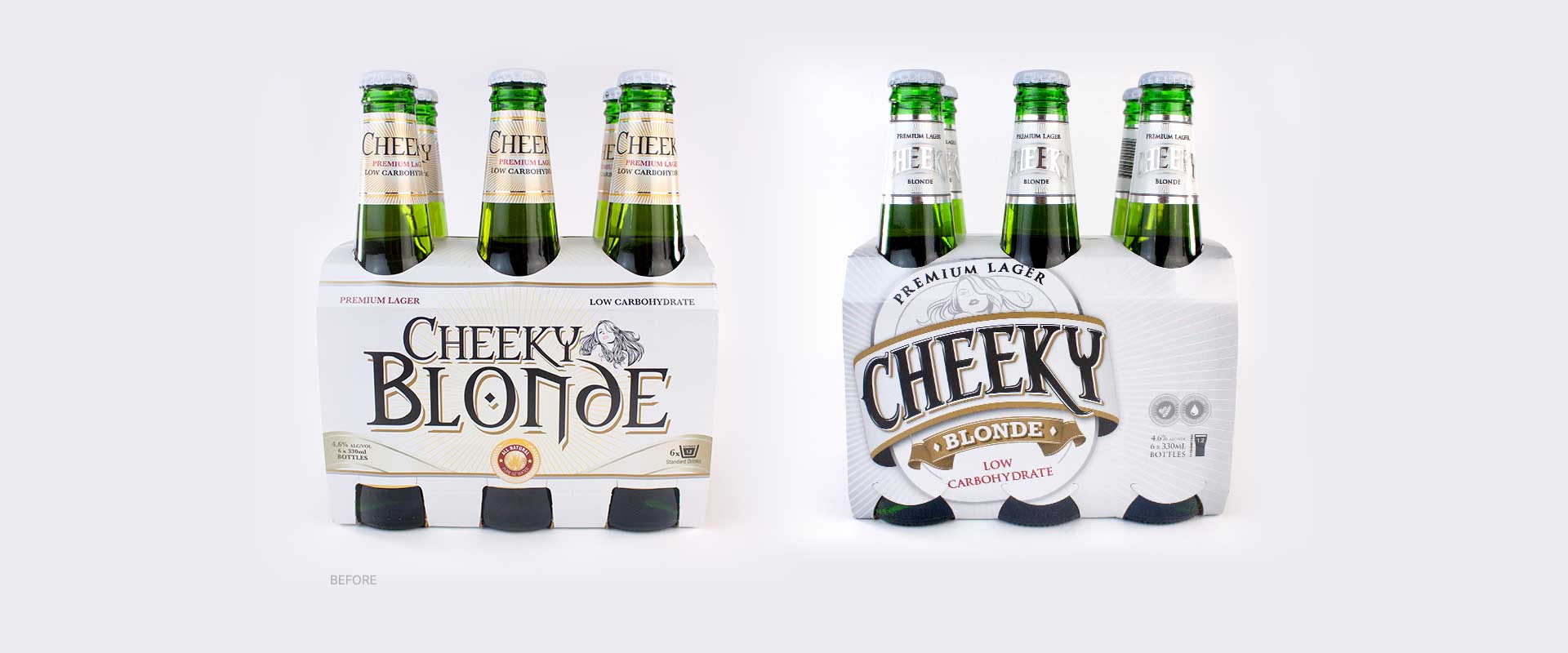
The typography itself also displays a cheeky character and shows that this is a beer brand and product with true personality. Effort was also made throughout the packaging design by Percept, to ensure that the typography was working as hard as it could with the limited real estate available on the beer label design. Packaging designer, Percept, was of the opinion that each individual element needed to be much stronger than it was on the original beer label design and when combined, the new packaging design as a whole, packs a bigger punch.
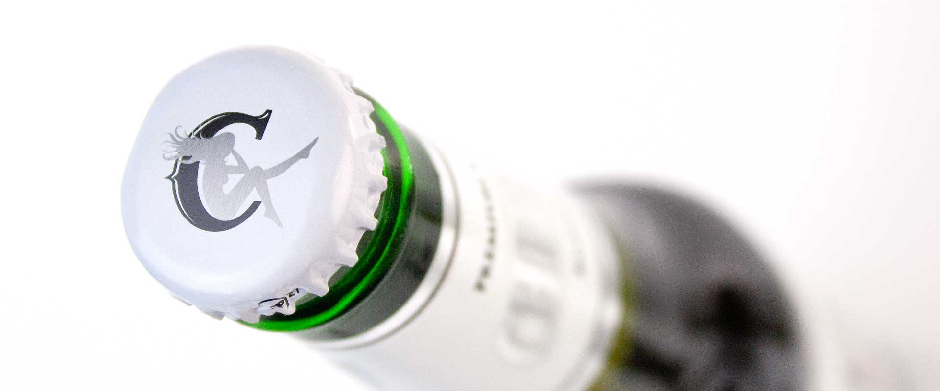
Packaging designer, Percept, respected the client’s requirements for the illustration of the girl to be retained. However, we ensured it was simplified, made smaller and knocked back in a monotone silver foil treatment. The reason for this was to elevate the beer packaging design to a more premium positioning in terms of branding, than what it was previously.
Subtle banners and ribbon devices have also been used to compartmentalise the information. At the same time they also add to the premium feel of the packaging design. The colour palette was also stripped back. The gold was changed as we felt the yellow gold felt a little tacky for a premium beer brand.
The final product is packaging design that features label design and an outer carton that is more premium, simple and confident than before. Both the client and Sydney packaging designer, Percept, is very happy with the outcome.
More importantly, from a retail point of view, our client tells us that this beer brand has seen a spike in sales since the packaging design to the more premium brand positioning. If you’d like to check it out, they’re available at Liquorstax outlets throughout Australia.
In the time since the launch, packaging designer, Percept, in Sydney, have also achieved international recognition as a Top Beer Logo Design Company on the packaging design industry-leading website DesignRush.
