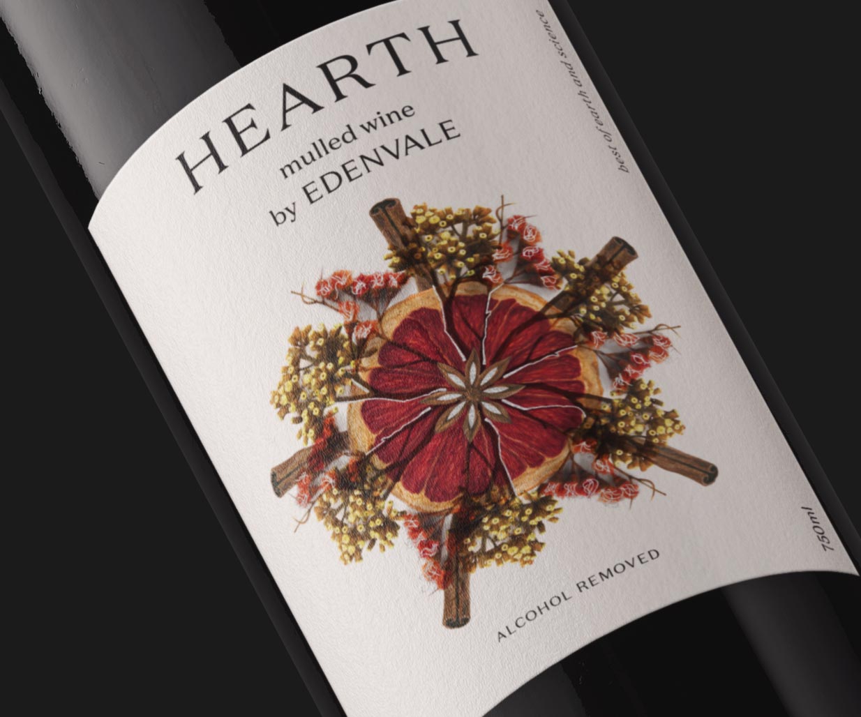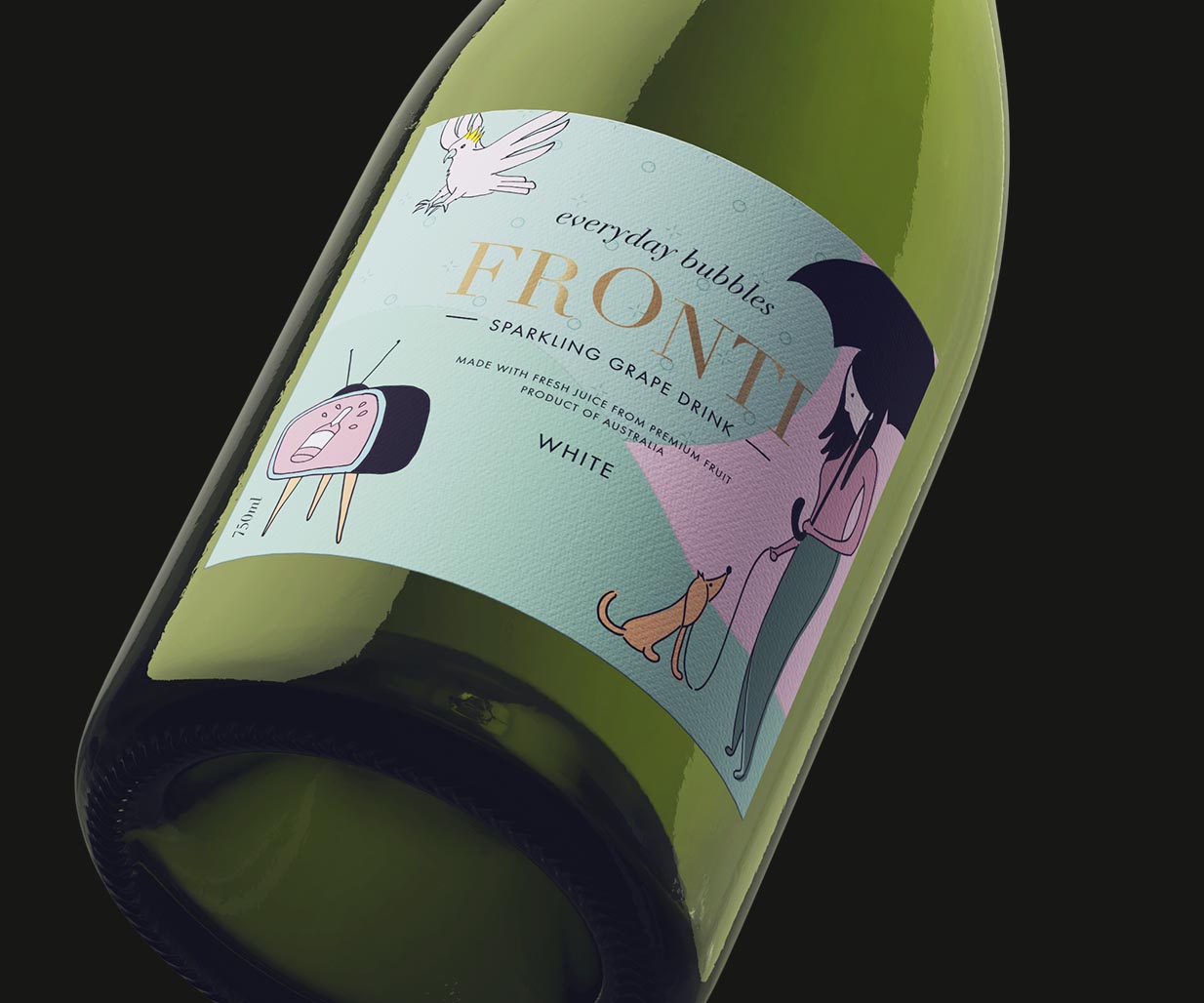
Brand Strategy / Brand Identity Design / Packaging Design
The Challenge
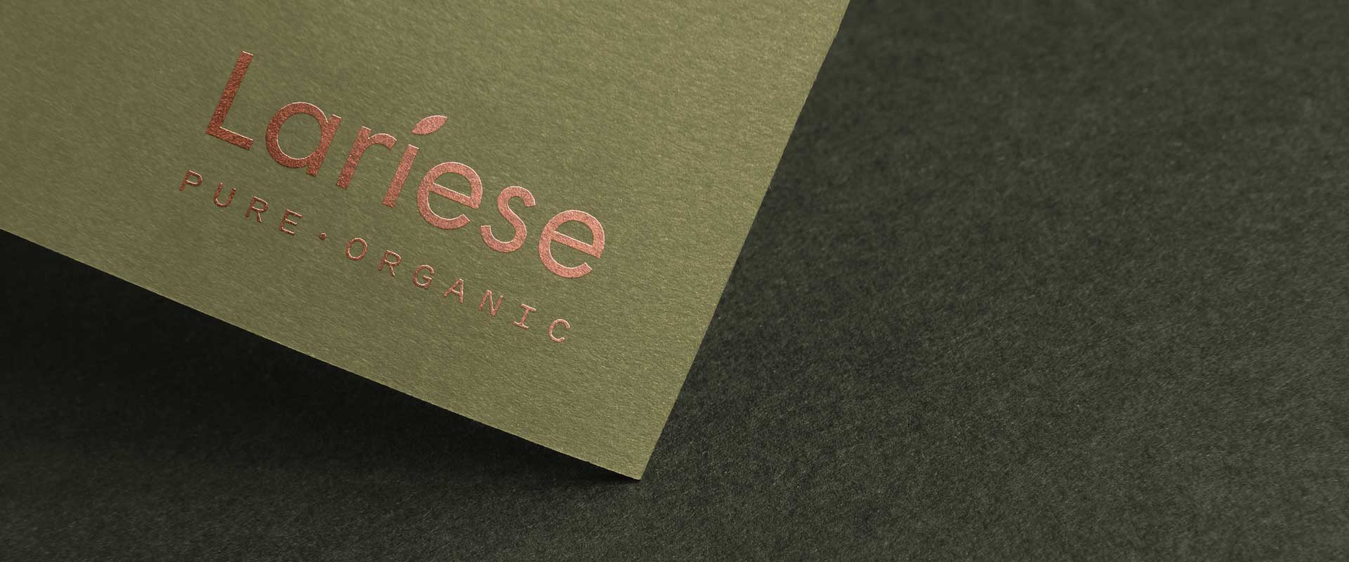
Lariese Purely Organic is a family-owned and run Australian company that emerged from a search for natural cures to ongoing allergy problems.
Lariese have been creating organic, toxin-free skincare solutions for over 10 years, and currently have three product collections specially designed for those interested in holistic wellness, including products for the face, hair and body, using nature’s finest ingredients.
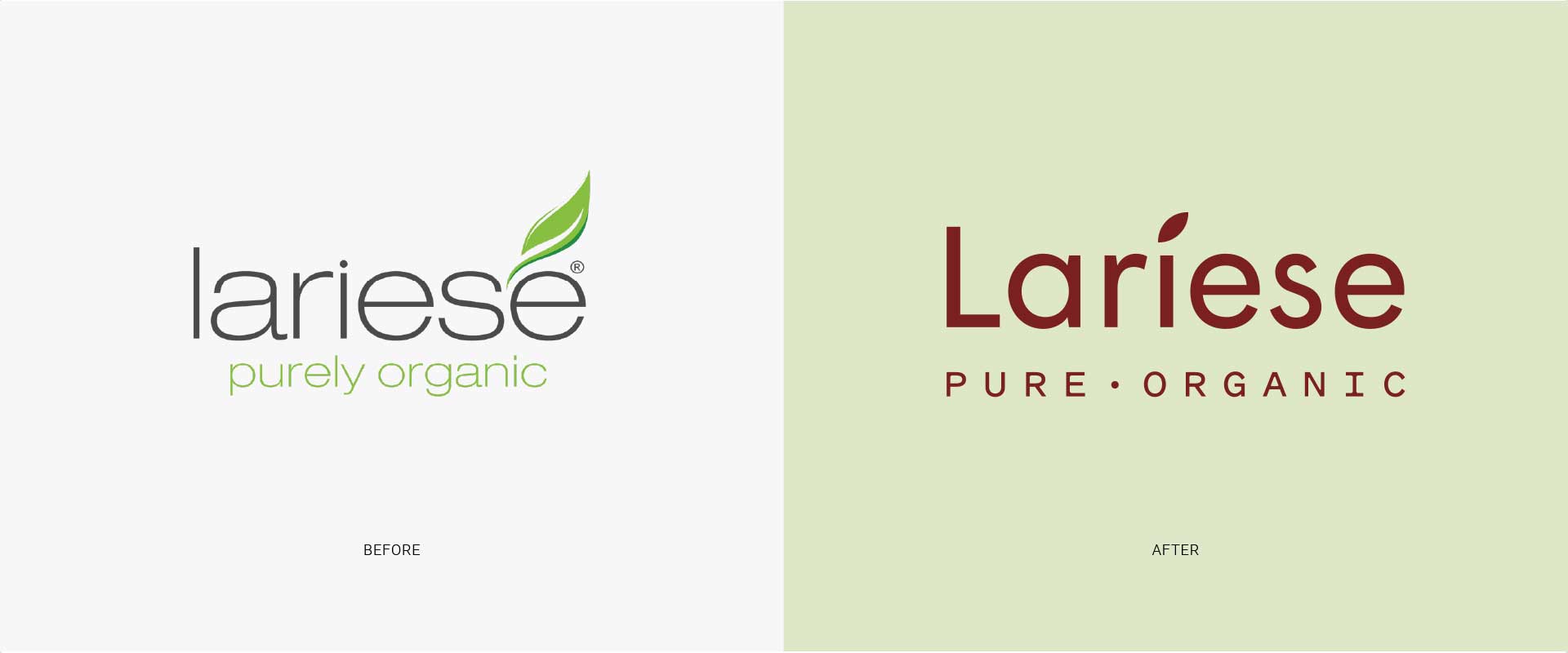
The existing range of packs had been introduced over an extended period of time resulting in inconsistencies and a dated look and feel.
As the company grew, with a view to expansion into international markets, it was important to conduct an audit and develop a new brand strategy. We felt it was important to bring consistency and a new, more sophisticated premium tone to the brand.
The Solution
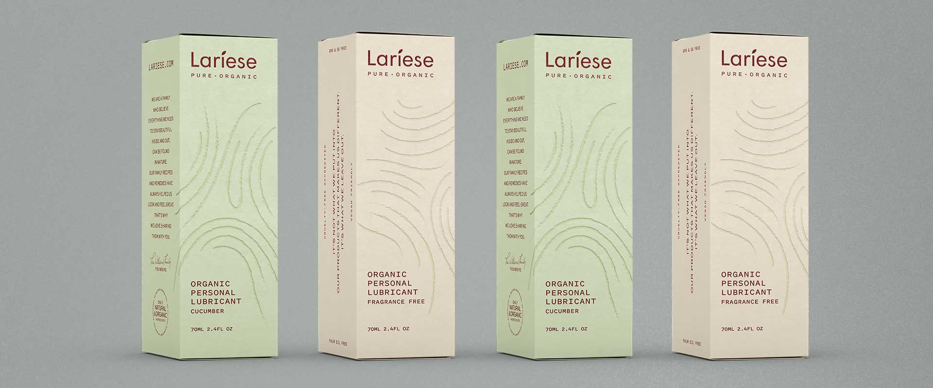
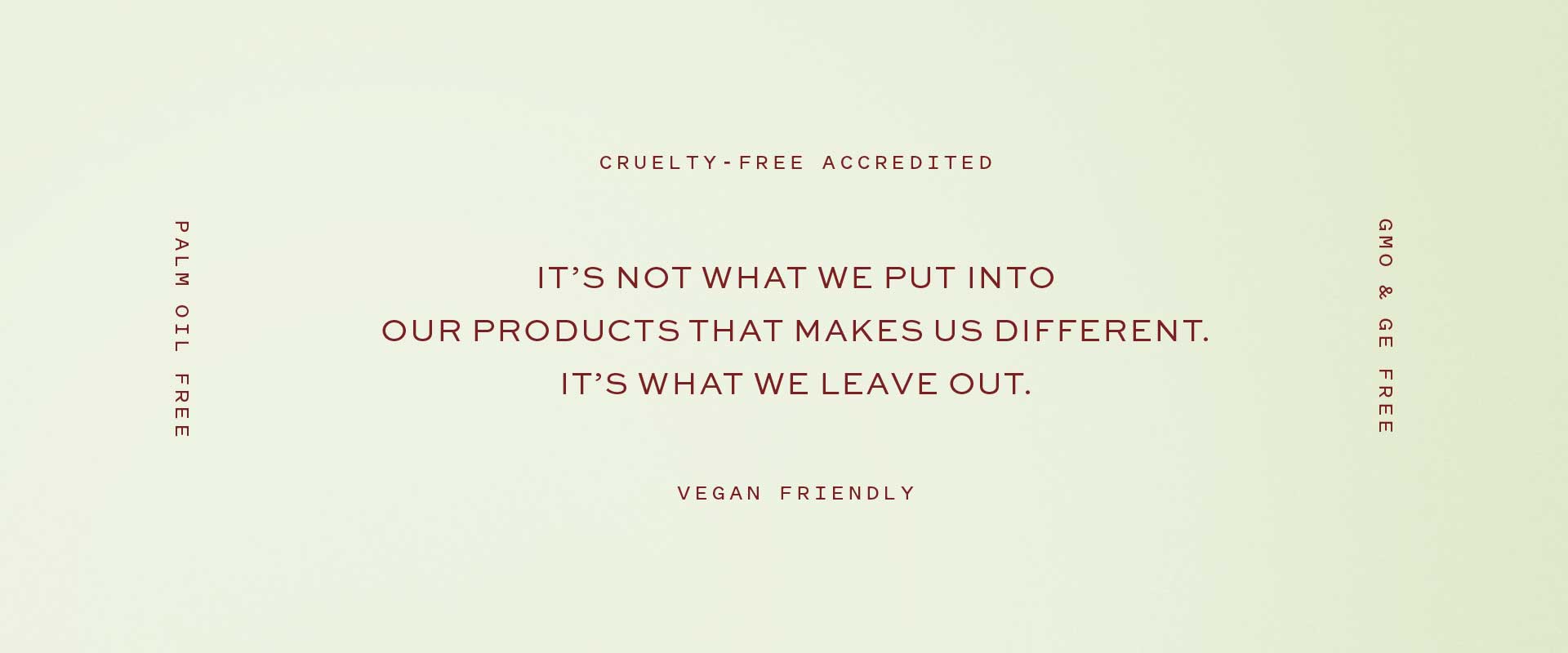
Lariese is proud of their all-natural ingredients. “It’s not what we put into our products that makes us different. It’s what we leave out.” Only the good stuff. This insight informed all our design decisions.
Percept developed a brand strategy, centred around the positioning of ‘Naturally Premium’. We conveyed this idea by employing reduction and refinement with a distinctly earthy, organic colour palette. Sophisticated. Simple. Natural.
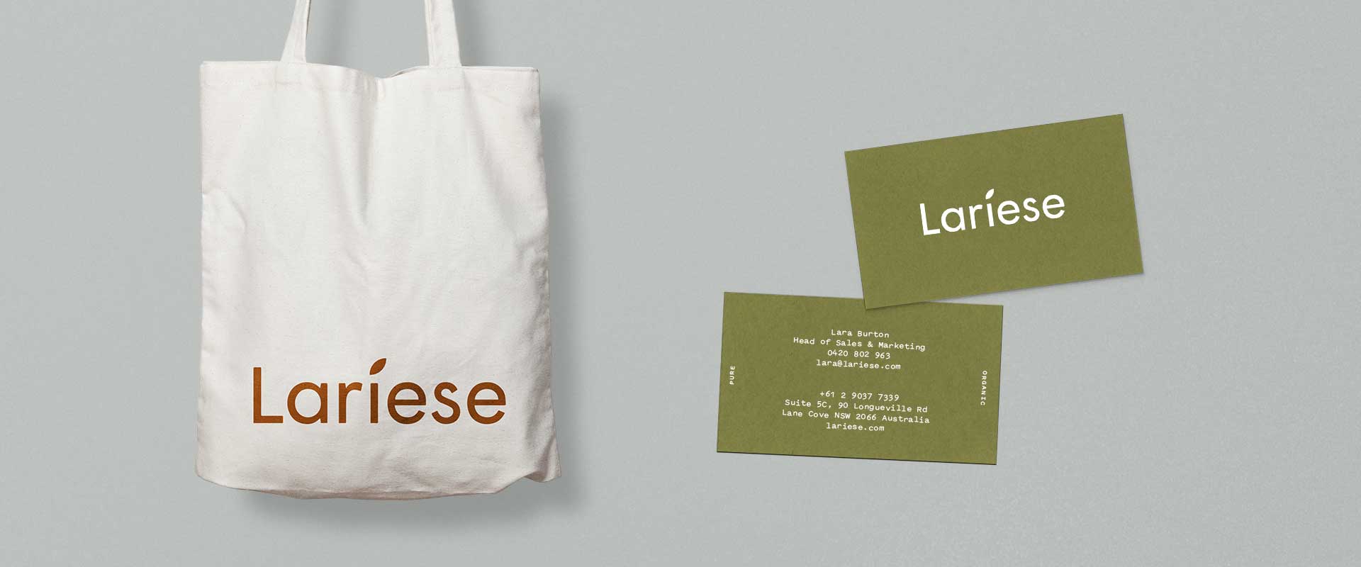
The brand identity design is a modern evolution that retains the equity of the previous mark. The packaging design creates a premium presence on shelf, using uncoated stock and blind embossed illustration unique to each product. Copper foil stamping further elevated the tone. More premium. More organic. Naturally.
Percept also worked closely with packaging manufacturers to recommend paper stocks and special print finishes, key elements in achieving an edge when it comes to premium beauty product packaging design.