Consumer Packaging Design Australia / Retail Product Branding
Quit Nits had a well established retail brand in the medical consumer products sector when their competitors moved in on the marketshare they enjoyed with similar visual cues in their consumer packaging design, such as colour and other elements that made distinguishing between the two brands a little difficult.
Wild Child Australia believed that to stick with the consumer packaging design that they had, would have caused confusion and not have allowed them to sufficiently stand out from the other brands on shelf.
They saw this as a great opportunity to reassess their consumer consumer packaging design and leverage their new regulatory status that allowed high level claims as a result of the success rates of their products in clinical trials.
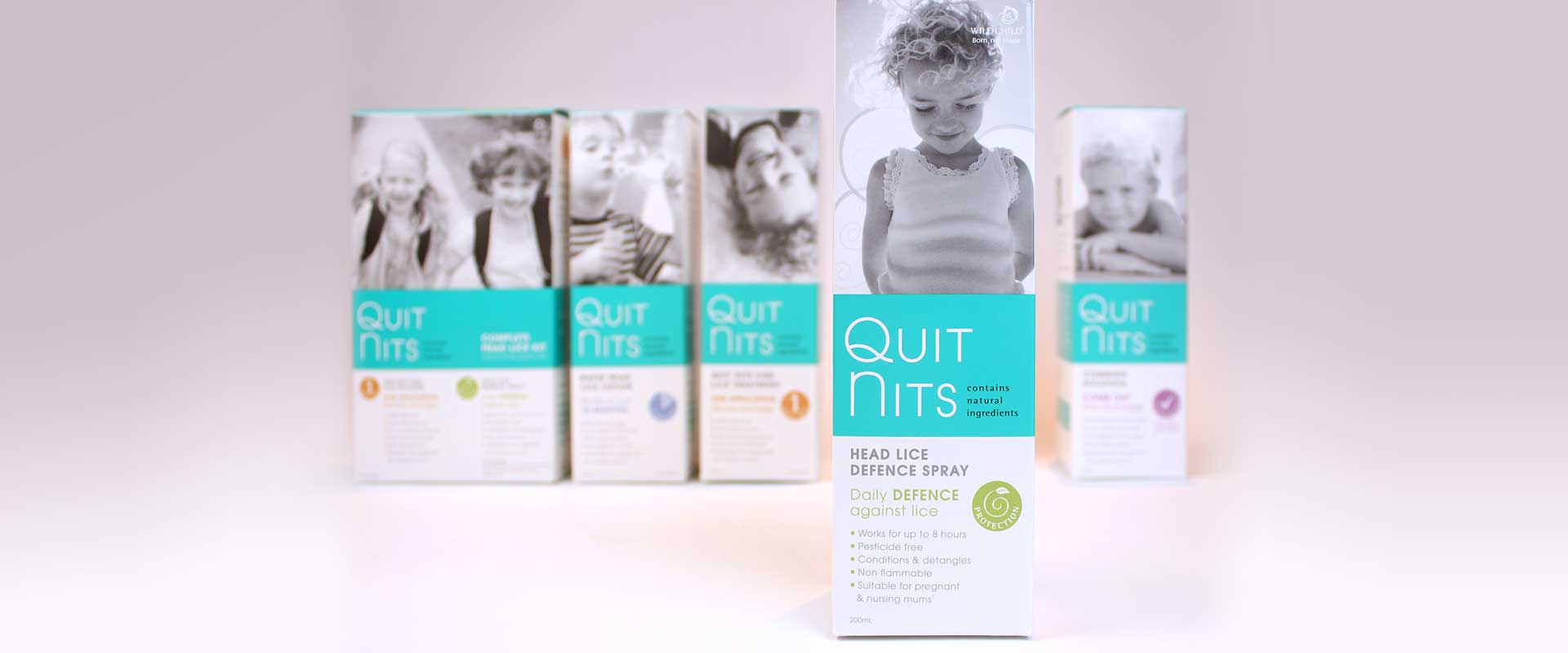
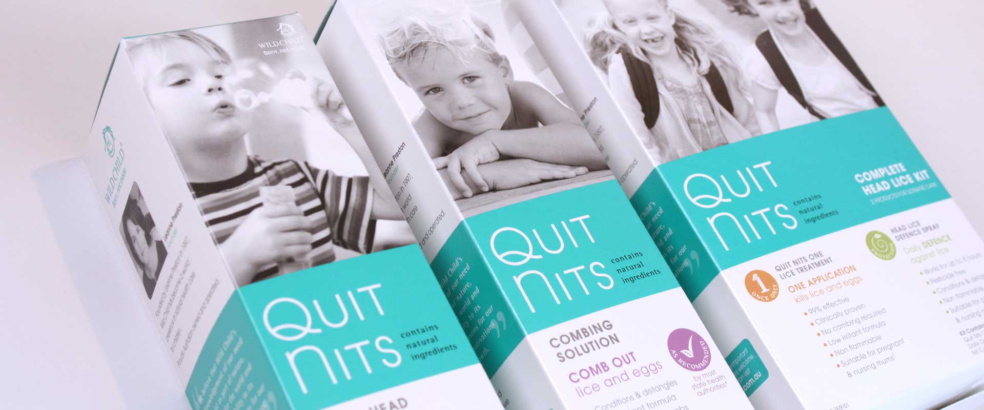
As their Australian design agency, Percept made a strategic decision to keep the focus of the re-branding and new consumer packaging design as one that speaks directly to the parent of the child rather than something more slanted to the appeal of the child themselves, a tactic which had become common within the category.
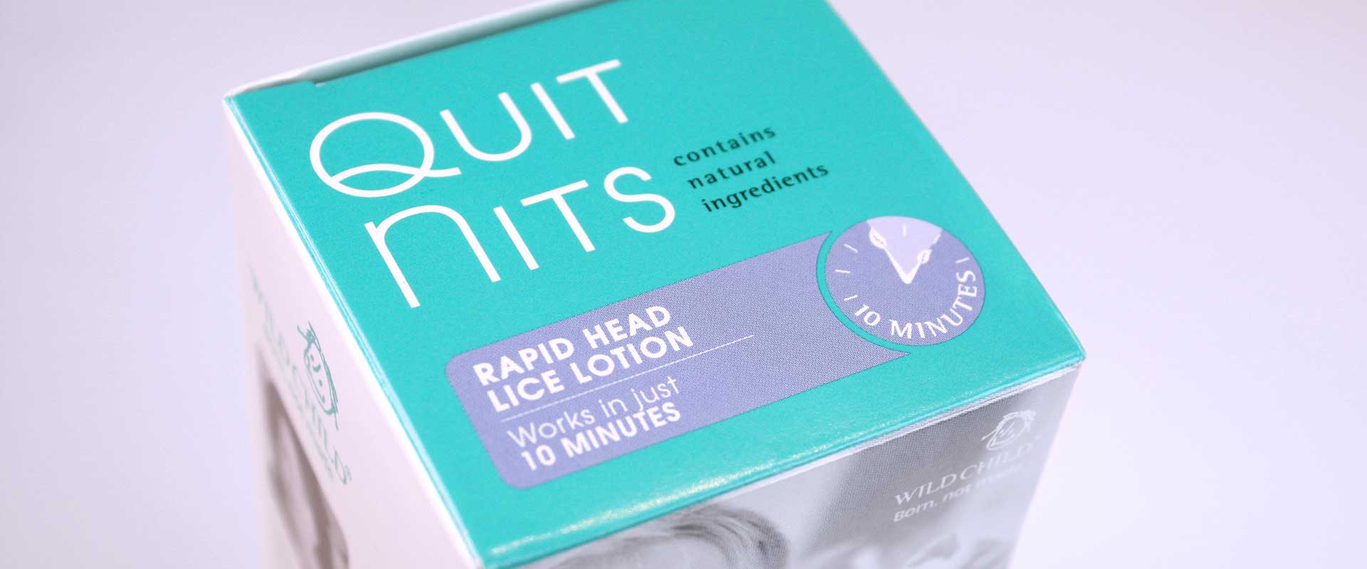
As the actual purchaser of the product, we felt it was of the highest importance to communicate directly with the adult consumer at the point of sale in a more serious tone, earning their trust by positioning Quit Nits as products of the highest quality.
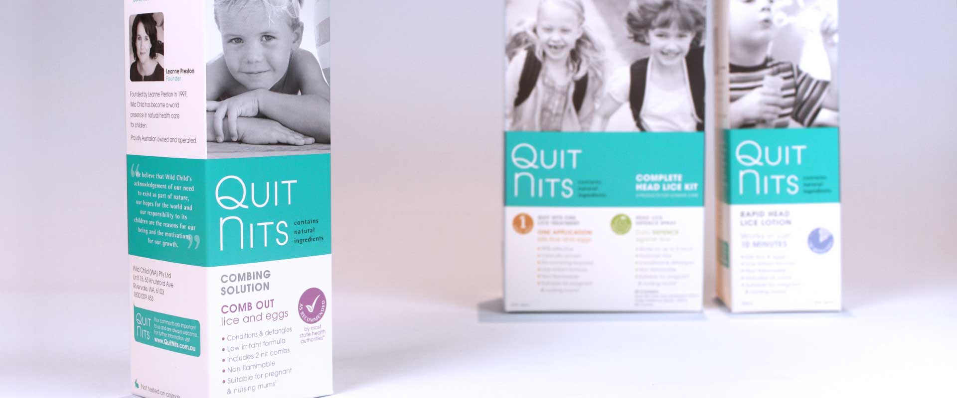
To establish this feeling of trust, we avoided characters and design styles with juvenile appeal. Instead, Percept opted for aspirational, lifestyle images of happy children that would connect with the parent and make a visual promise that Quit Nits is an effective choice in overcoming the problem of head lice and getting your family’s life back to normal.
The selected photography in the consumer packaging design was key in striking this emotional chord at the point of purchase.
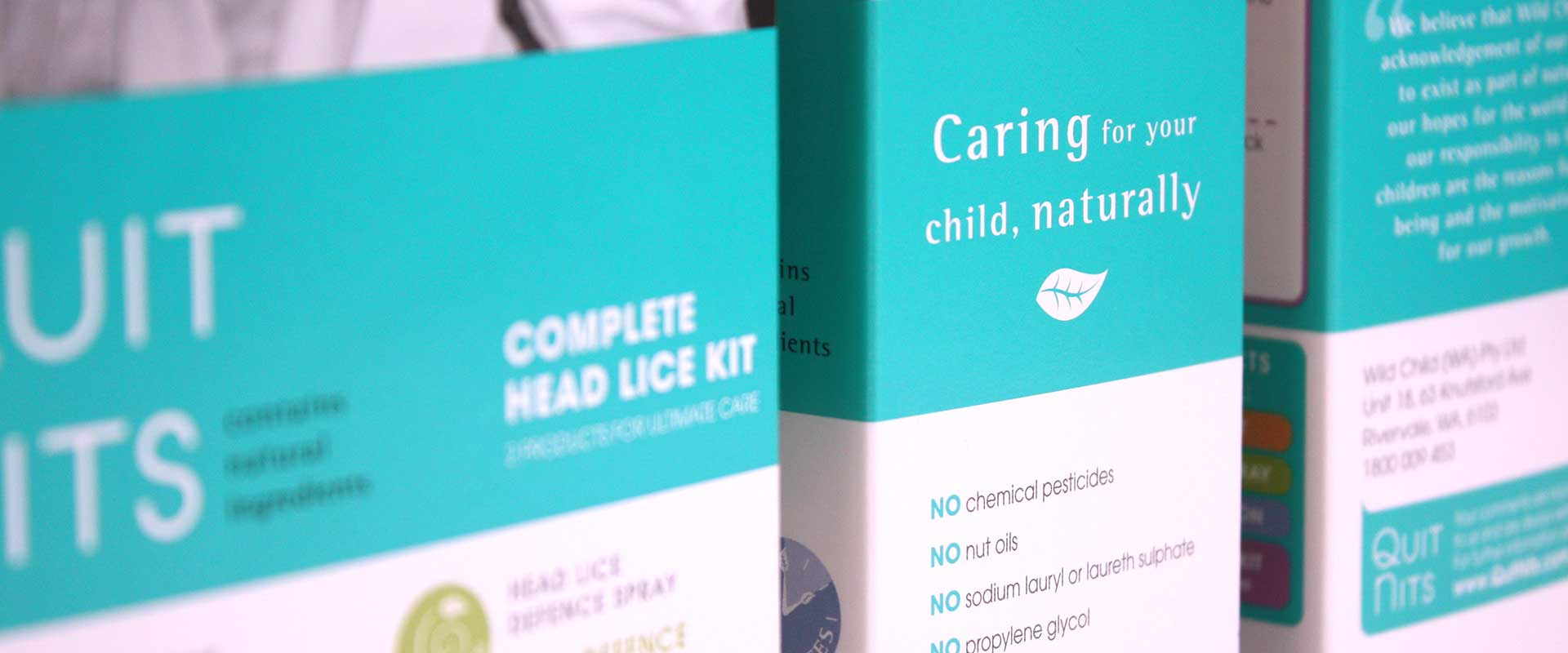
Caring for your child naturally, is the tagline used by Quit Nits and this is what Percept aimed to convey visually with the rebrand and refreshed packaging design.
It is safe to say that everyone wants the best for their child and we chose to convey the natural ingredients factor in a modern and sophisticated style without gimmicks or green-washing.
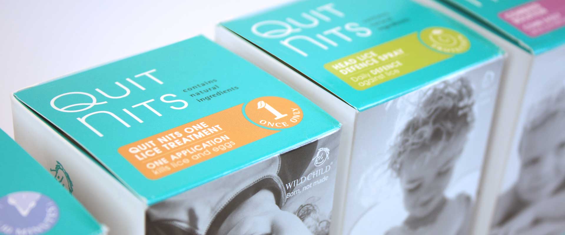
As these great products can feature many claims, we wanted them to be clear. It was also important with the rebranding to differentiate each product and quickly explain its use and benefits. A colour coded icon system was developed for this information.
The finalised consumer packaging design is just a clean finished product that says what it needs to and effectively positions Quit Nits within the category.
It also has a unique photography treatment with a soft metallic duotone and features a new brand colour, which is now ownable for our client.
Since the relaunch, the client has seen an upward trend in weekly scan sales, which has made the repositioning project a real success.
“Our customers love the look and feel of the new consumer packaging design. Although there are a number of contributing factors to the uplift in sales – I do believe that the new packaging design has certainly contributed and made a big impact – very pleased with the results”.
Leanne Preston-Found
CEO Wild Child Australia.