
Packaging Refresh
The Challenge
Unilever’s Sir Thomas Lipton (STL) Specialty Tea Collection is a quality range of black, green, flavoured and infusion teas. Research conducted showed that overall, STL is liked and perceived to be relevant for major customers, however, some would like a more sophisticated design which focusses key ingredients to create better distinction between each tea varietal.
Percept’s task was to design a packaging refresh of the STL Specialty Tea Collection for B2B clients and channels which include workplaces, hotels, cafes, restaurants, pubs and clubs.
This packaging refresh project aimed to maintain STL’s premium appeal and reconnect with the audience on a more emotive level. The objective was to increase market-share by creating more desirable packaging for the product range.
The Solution
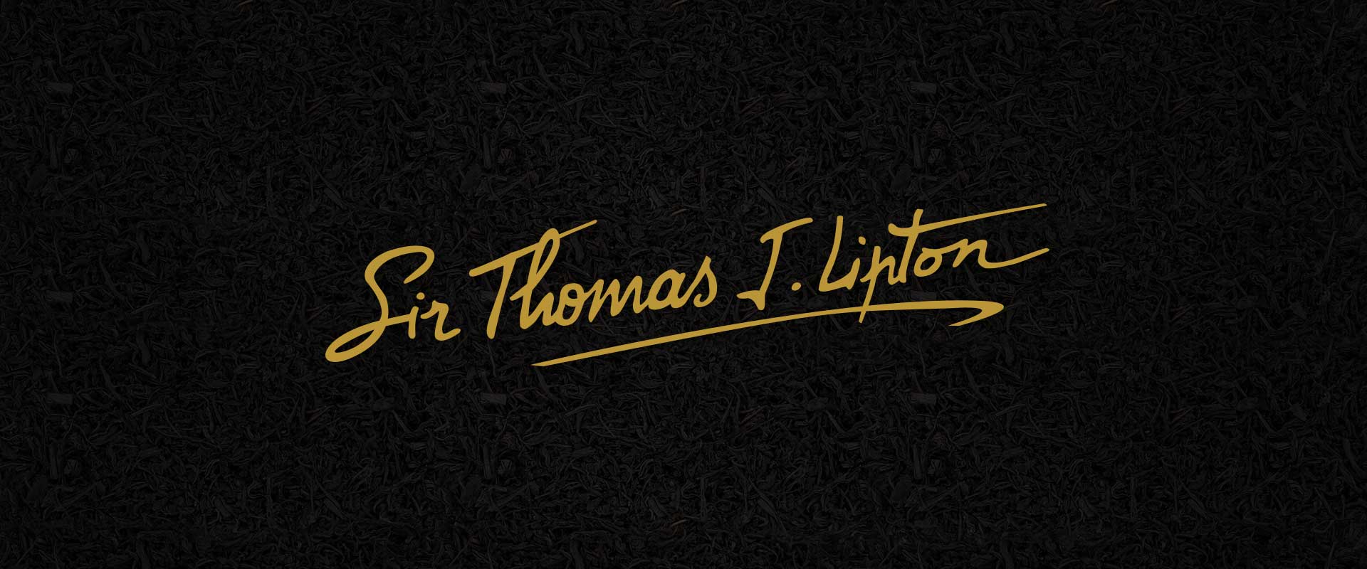
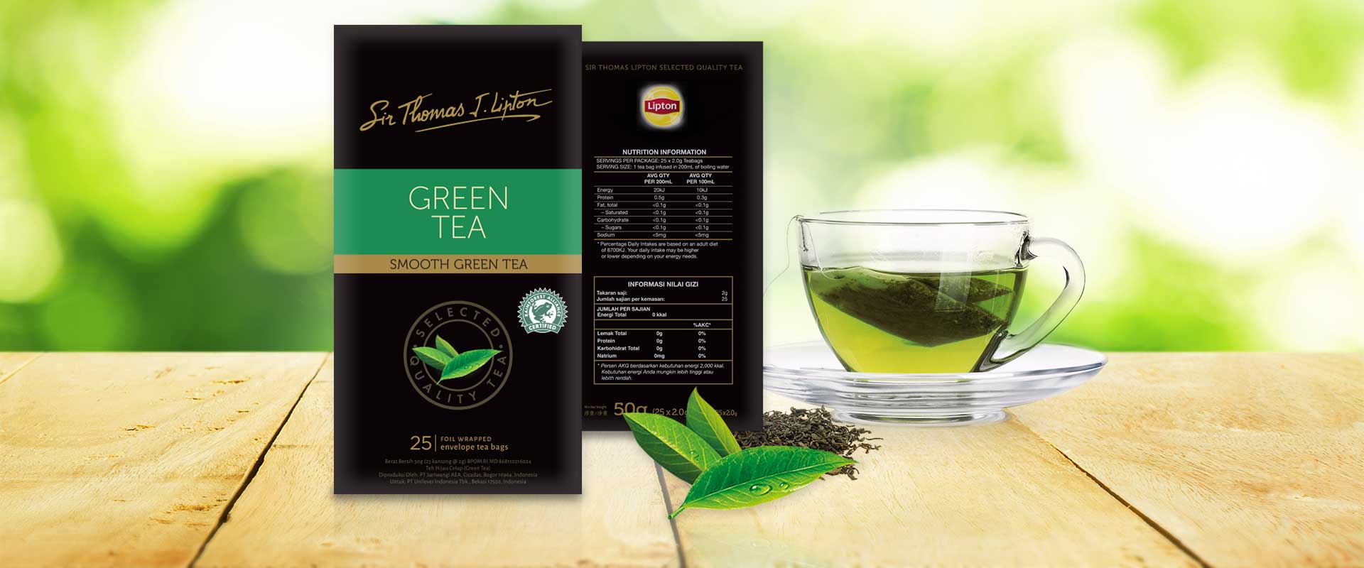
We began by refining the design of the STL signature logo, making it more legible and prominent on-pack in a gold foil.
To help product differentiation, we removed the Lipton logo to increase the emphasis that this was the signature STL collection, as previously there was some confusion between the two product offerings.
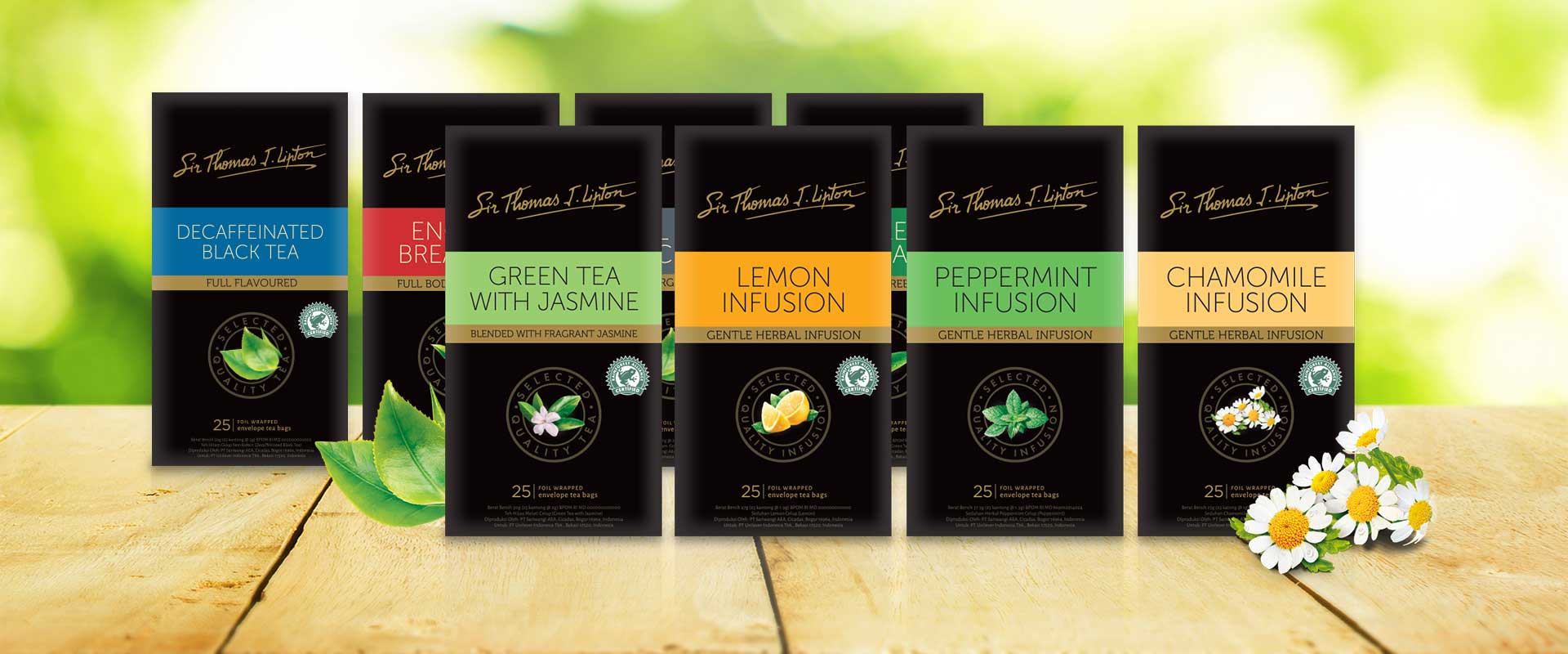
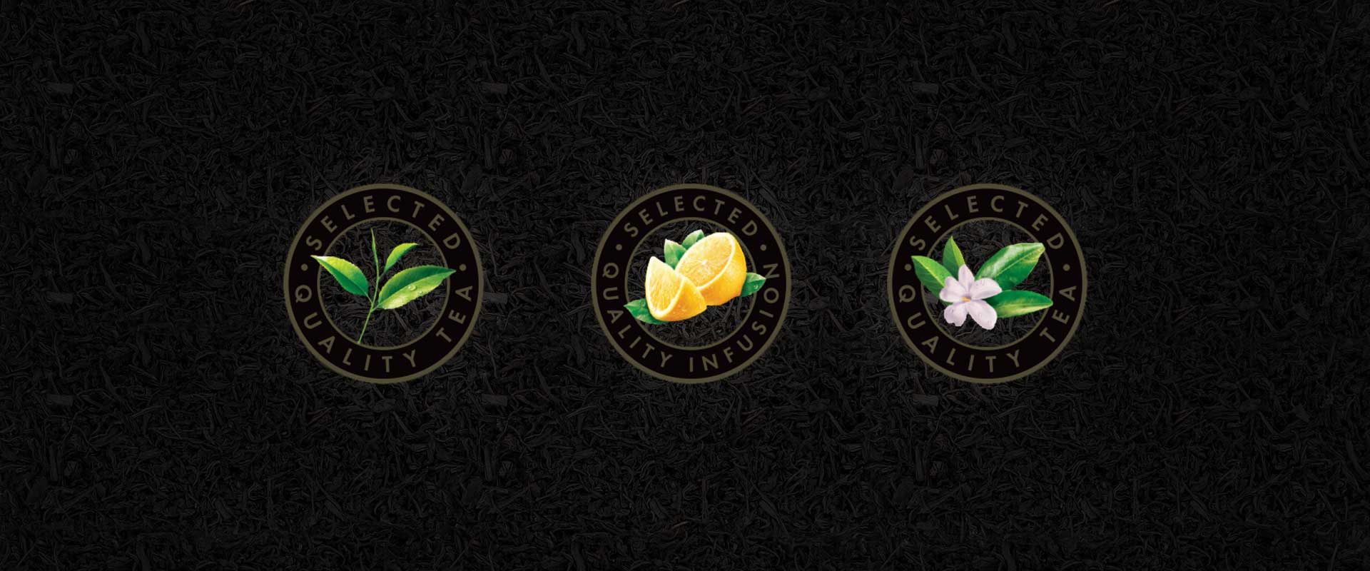
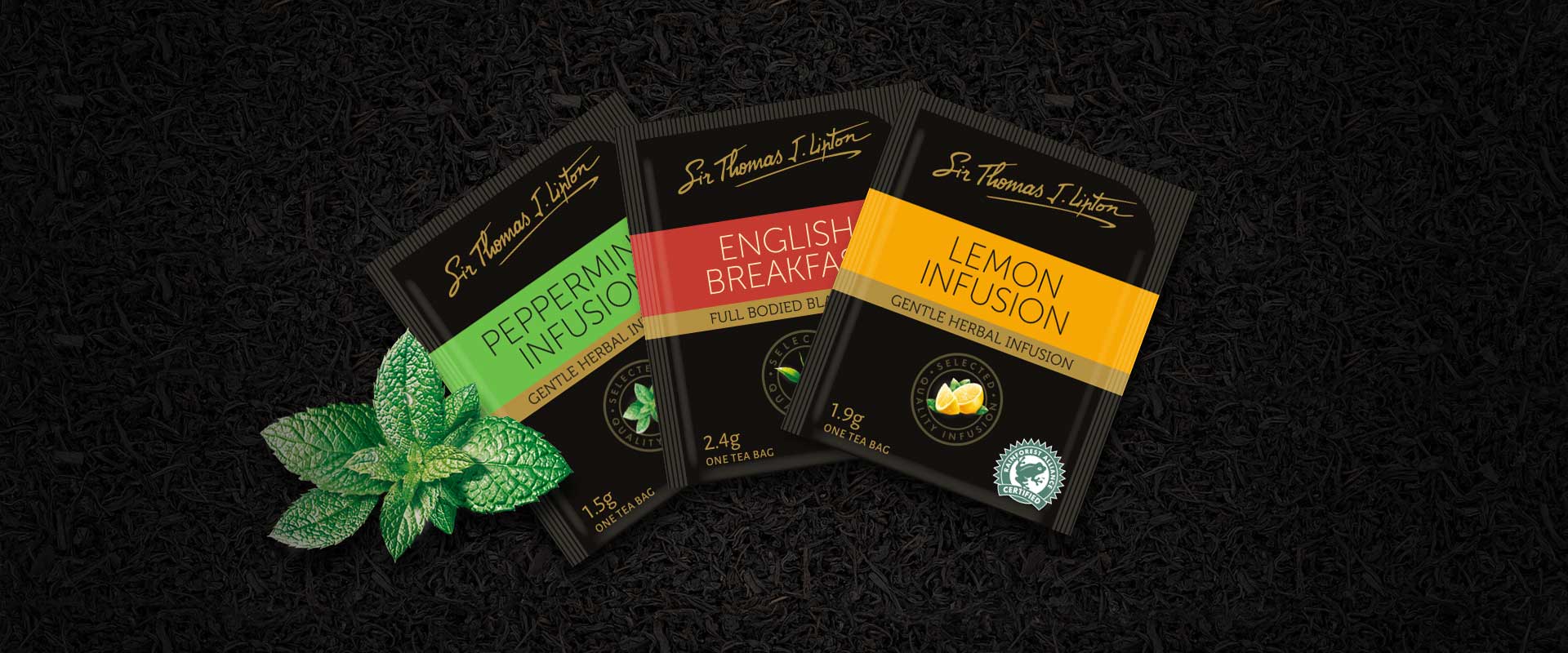
A dark, premium direction for this packaging refresh creates a classic and sophisticated feel. The key ingredients are a clear focal-point, highlighting flavour, and the strong colour banding helps to identify variants more easily in a food service environment.
The refreshed design was rolled-out across multiple pack executions for the nine SKUs; Earl Grey, English Breakfast, Decaffeinated Black Tea, Green Tea, Green Tea Jasmine, Orange Tea, Lemon Tea, Chamomile and Peppermint.