Brand Refresh & Packaging Design
The Challenge
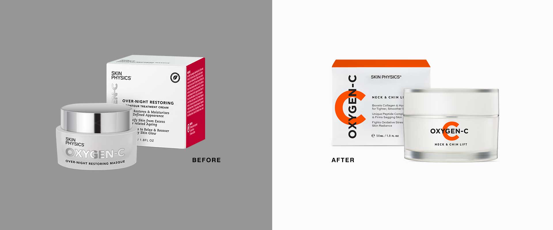
Biophysics were looking for a complete brand refresh and packaging design for their vitamin-c skincare range, Oxygen-C to set it apart from their Dragon’s Blood and Advance Superlift ranges. Sydney branding and packaging design agency, Percept Brand Design were engaged to create a new look and feel.
While the brand refresh and packaging design was to have its own personality, it was important that it still sat neatly within the larger Skin Physics family. The brief also required the new packaging design to be young and hip with a strong emphasis on the vitamin-c angle.
The Solution
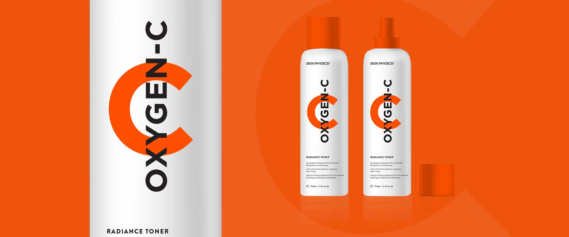
Inspired by the idea, ‘see the C’, where Oxygen-C brings the benefits of vitamin-c in a form that gives visible results, Percept created a new brand that is contemporary and confident.
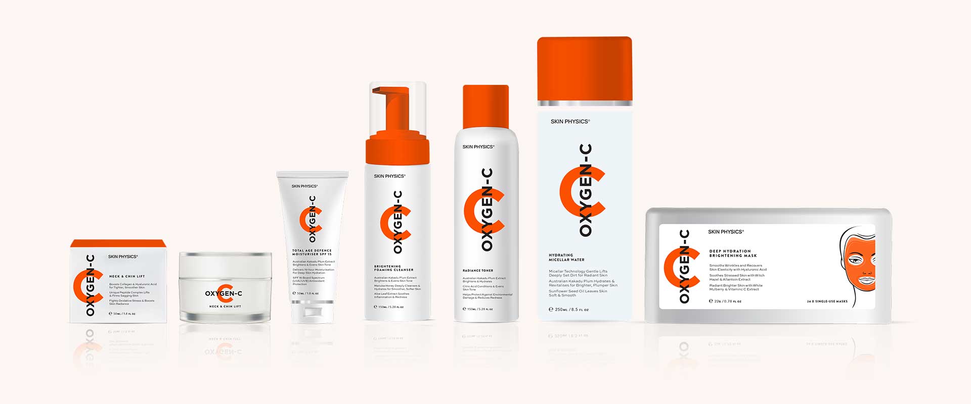
The ‘C’ is used as a bold graphic device with a deep, punchy orange for stand out on shelf. The clean white and orange colour palette is reminiscent of vitamin-c while keeping the feel light, clean and refreshing.
Keeping the importance of the over-arching Skin Physics brand in mind, Percept opted for a typeface treatment that ties back in to the larger family which also contains Dragon’s Blood and Advance Superlift.
The brand refresh and packaging design concepts were rolled out across a variety of pack shapes and sizes including a jar, outer, pump bottle, spray bottle, tube and mask box to demonstrate the flexibility of the brand on different products.
If you have a similar project you would like to discuss, Percept would love to hear from you.


