


Branding & Packaging Design
Discovery
Selected for expertise in both branding and packaging design, Percept was the natural choice for this beverage brand design project.
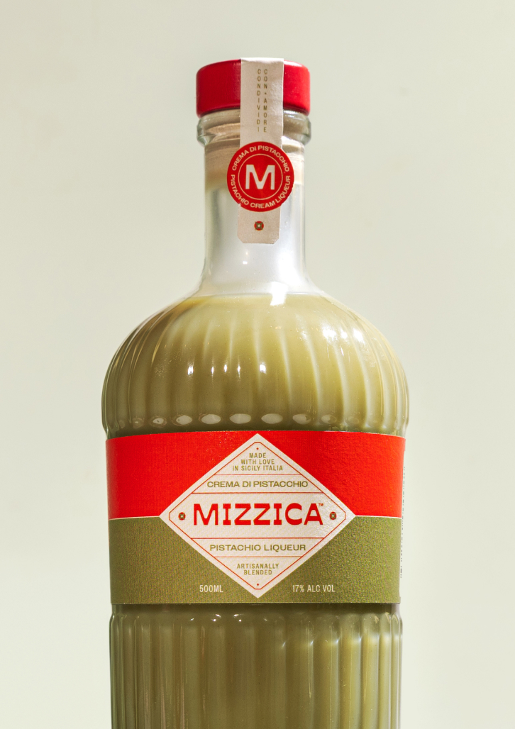
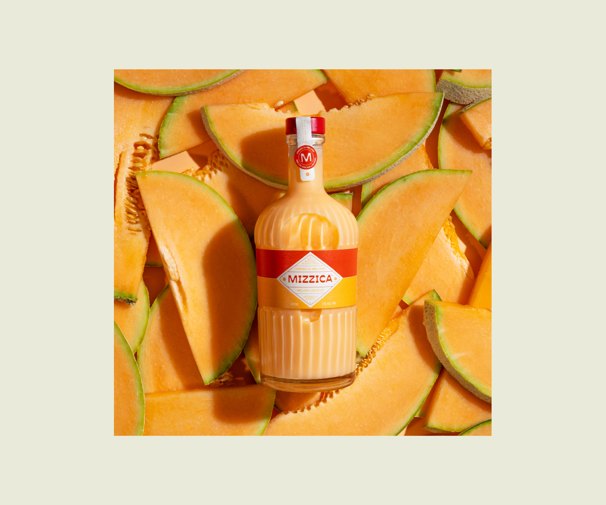
Mizzica is a smooth Italian crema liqueur, created to excite the modern Australian market. Rooted in Sicilian tradition with a flavoursome recipe, the drink is made for unwinding after dinner.
This unique alcohol beverage required branding and packaging design with a contemporary and accessible feel, as well as an unmistakable shelf presence.
Early conversations and discovery sessions revealed a strong emotional pull. Mizzica is for people who have been to Italy, tasted crema liqueurs there, and missed them ever since. The product carries reminiscence, ritual, and a sense of celebration, often shared after a meal and enjoyed slowly.
The liqueur category itself presented mixed signals and friction between conventions. Cream-based liqueurs are frequently perceived as heavy, dated, or overly indulgent, with the branding of many products leaning on traditional cues that feel inaccessible or off-putting to new generation consumers. At the same time, the packaging design needed to deliver impact on shelf while meeting Australian regulatory requirements.
The opportunity on this branding and packaging design assignment, was to reintroduce the crema liqueur through a modern lens — one that feels considered, indulgent, lively and easy to enjoy.
Design Strategy
The design strategy that Percept developed, positions Mizzica as a contemporary expression of Italian celebration. It honours tradition, but speaks clearly to the present to capture today’s audience.
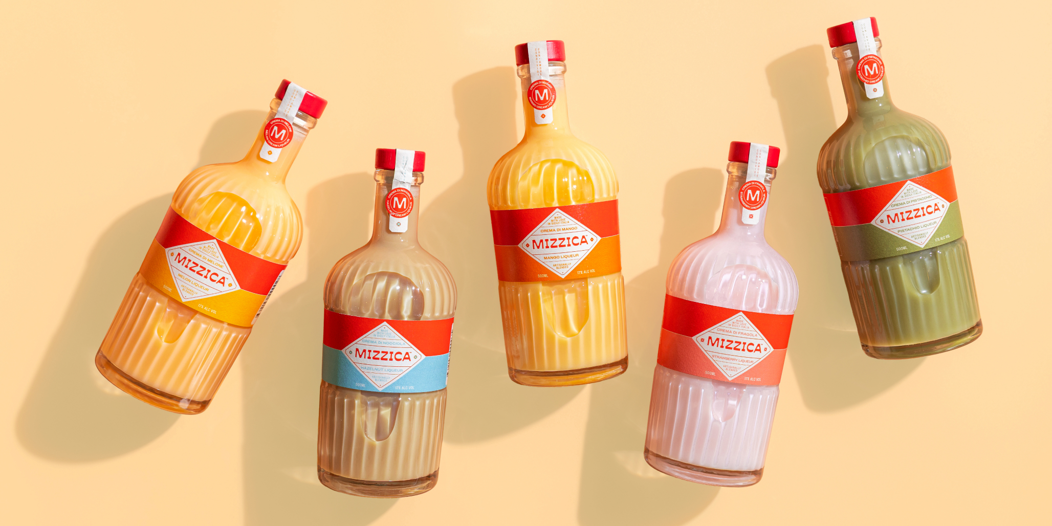
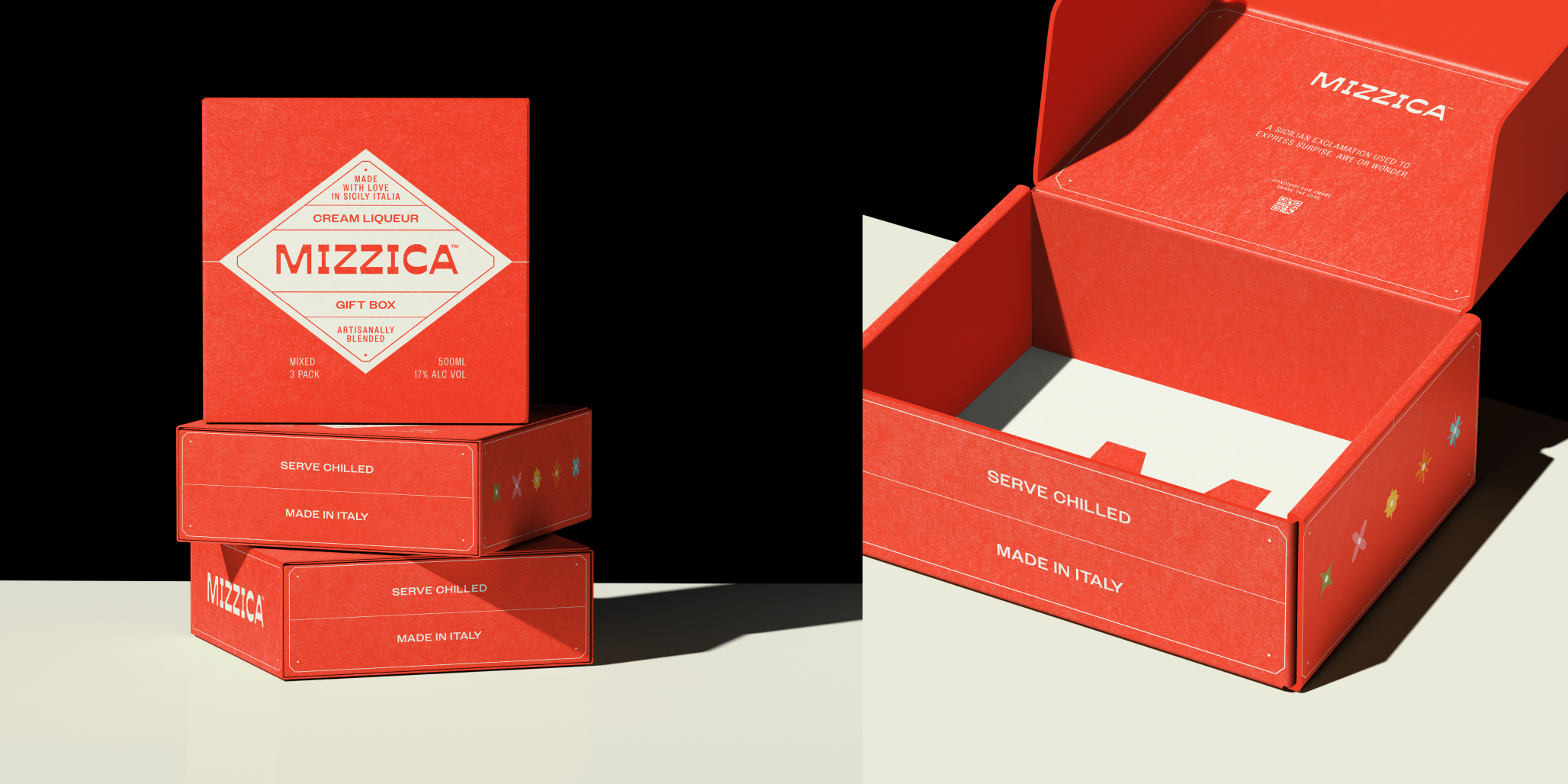
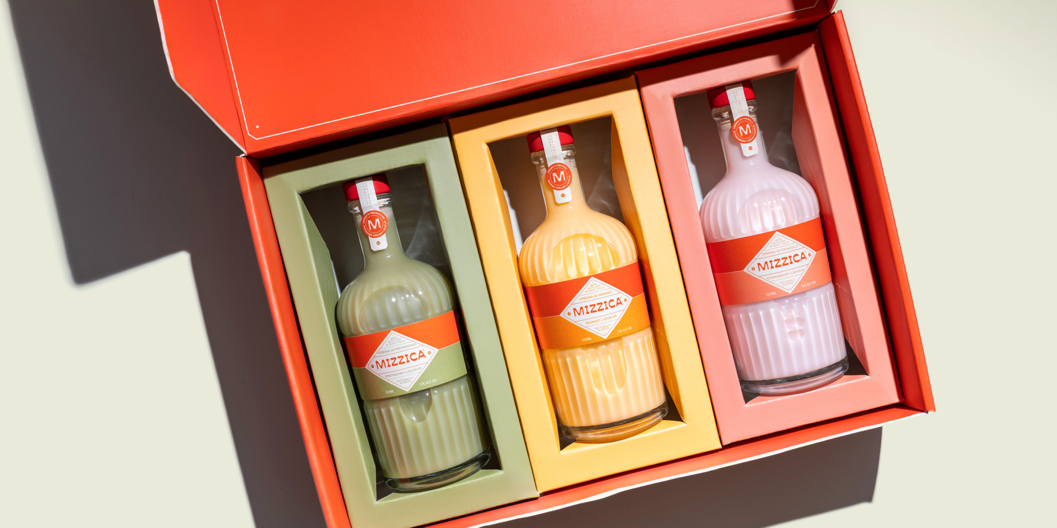
Clarity and restraint shaped the design strategy for the branding system. One core packaging design template needed to work across multiple flavours, sit comfortably within its price point, and feel at home on shelf, online, and as a gift.
The branding signals richness without heaviness, flavour without clutter, and heritage without falling into cliché.
Every brand and packaging design decision supports repeat behaviour. The design strategy makes the first bottle feel reassuring, with the next feeling inevitable. The brand system is built to scale across future flavours and gift formats without losing its sense of cohesion.
Brand Positioning
Percept created brand positioning for this product, to own the space of a modern Italian crema liqueur made for celebrating the small moments of joy in life.
Smooth, indulgent, and approachable, it brings richness without excess. It belongs at the end of a meal — poured, shared, and enjoyed at an unhurried pace.
Emotionally, the branding feels familiar and welcoming. Like Italy remembered, not recreated. A product that draws you in with its packaging design, rather than asking to be understood.
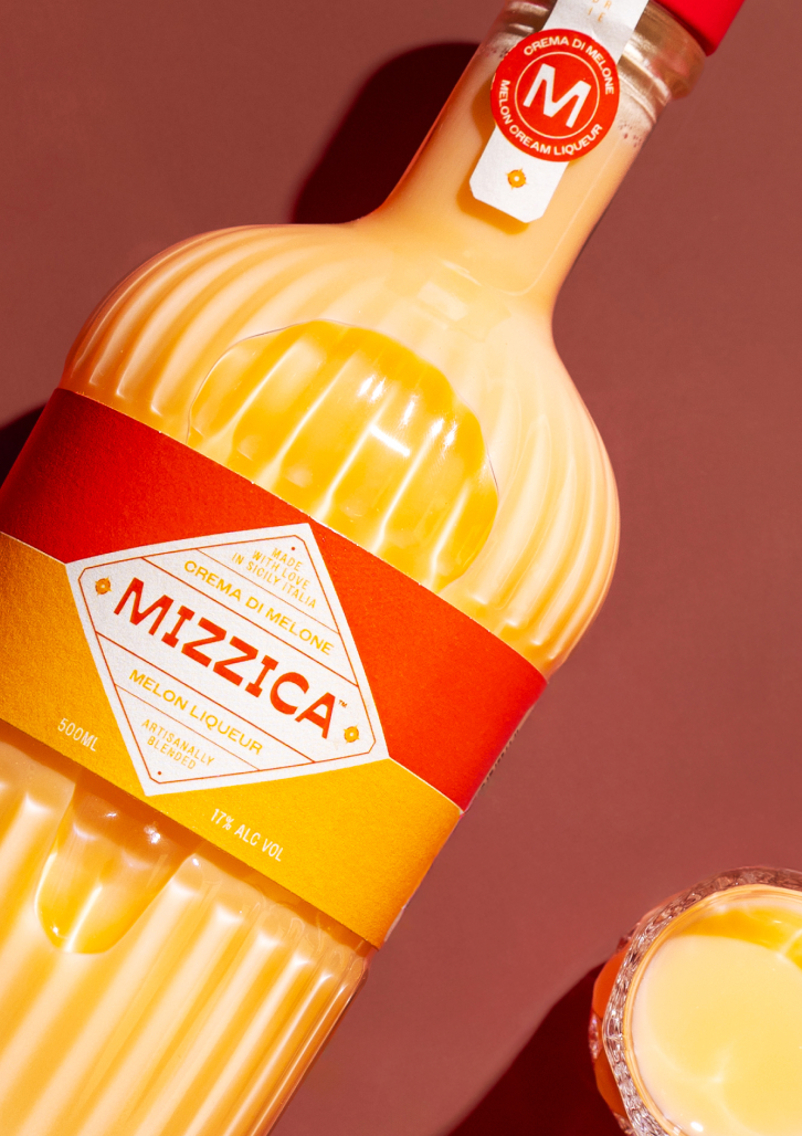
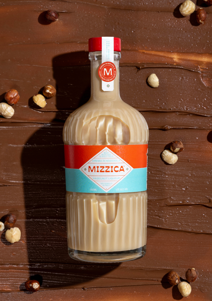
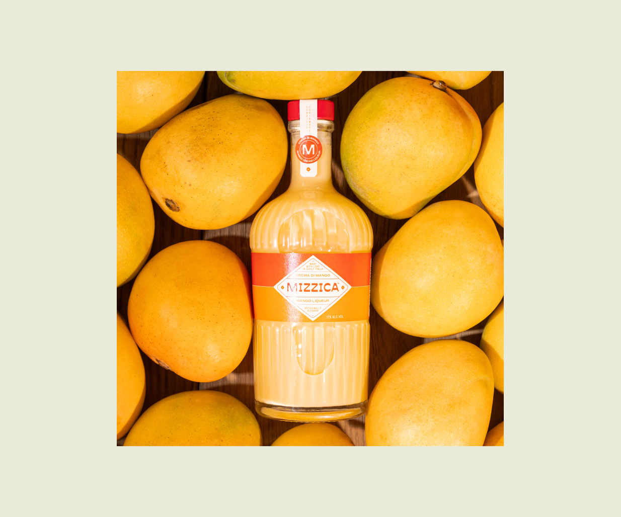
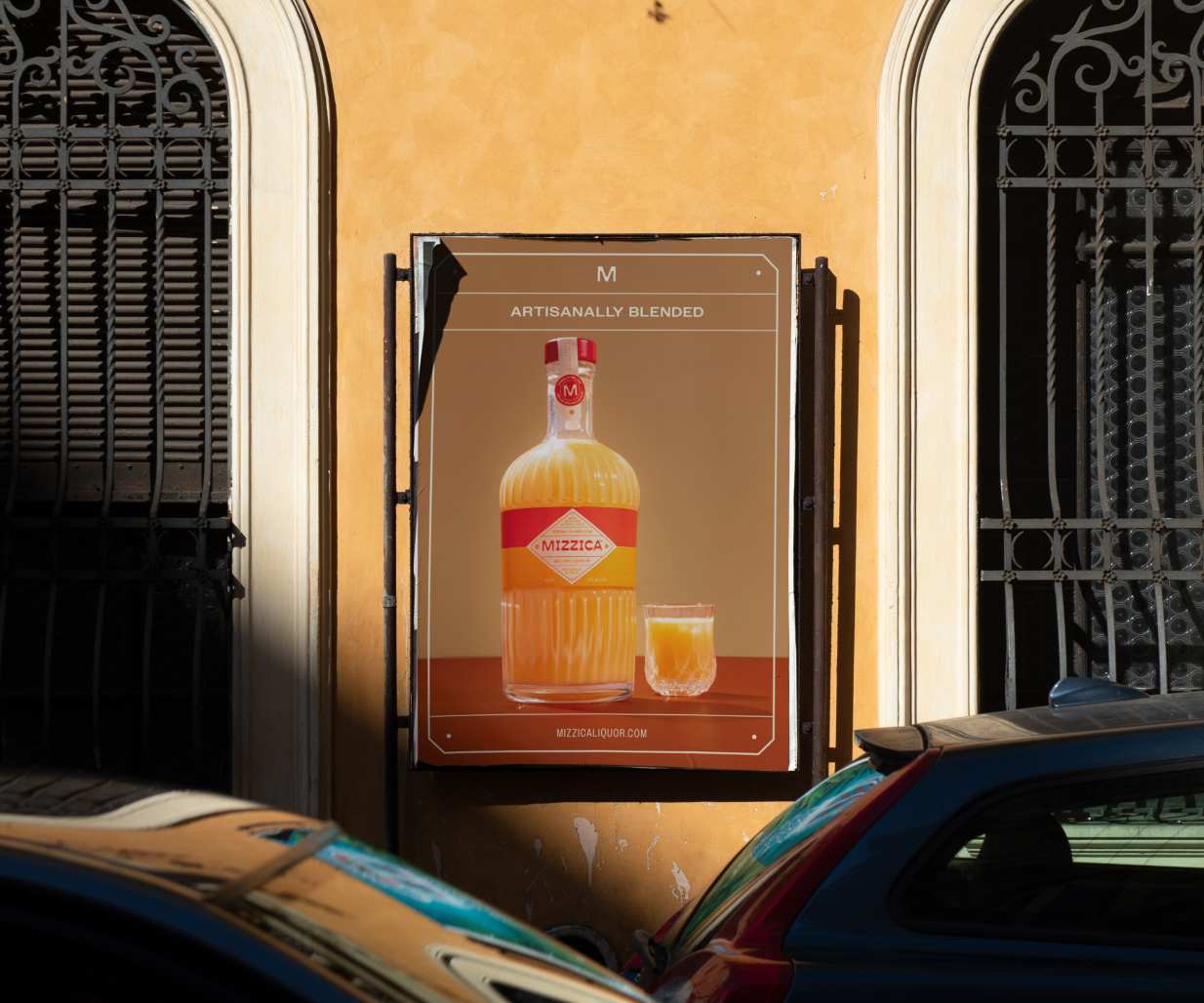
Packaging Design
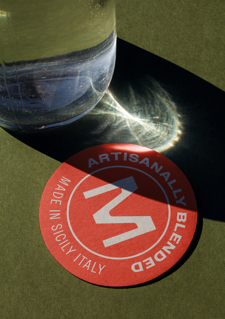
The packaging design is clean, confident, and unmistakably Italian, without leaning on nostalgia. The wordmark is contemporary and timeless, designed to anchor the range while allowing flavour and colour to take the lead.
Packaging design for each product is deliberately minimal. Strong contrast and clear hierarchy ensure shelf impact, while a consistent brand colour is paired with interchangeable accents to differentiate flavours and build recognition across the range.
Typography is restrained and functional, balancing brand expression with regulatory clarity. The wrap-around label works hard from front to back, delivering confidence, storytelling, and compliance in equal measure.
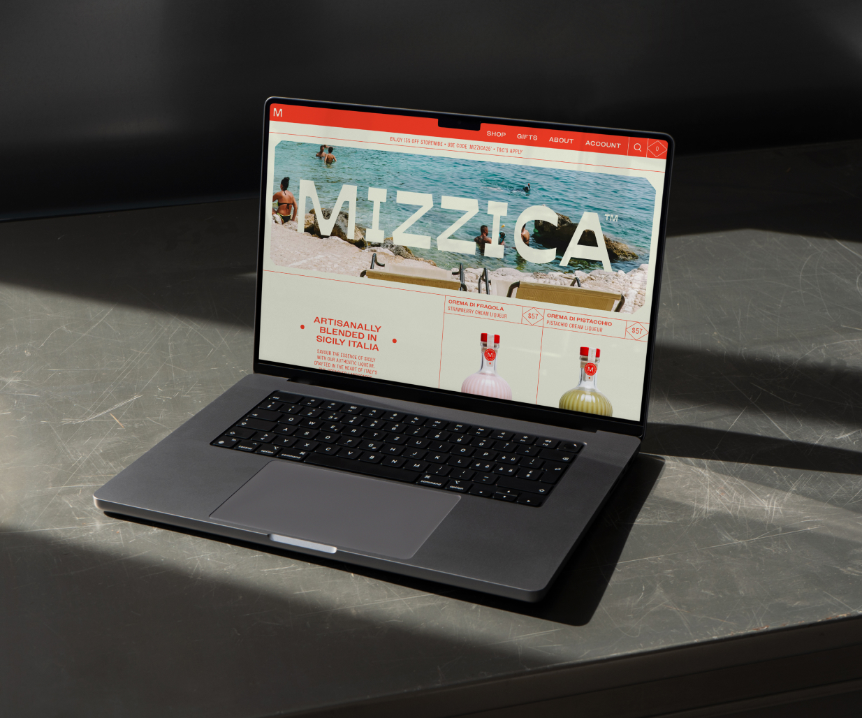
Overall, the branding and packaging design reflects an Italian lifestyle rather than an Italian past. It feels celebratory but composed, artisanal yet accessible — a brand designed to live comfortably across packaging, print and digital marketing, as well as future line extensions for new products down the track.