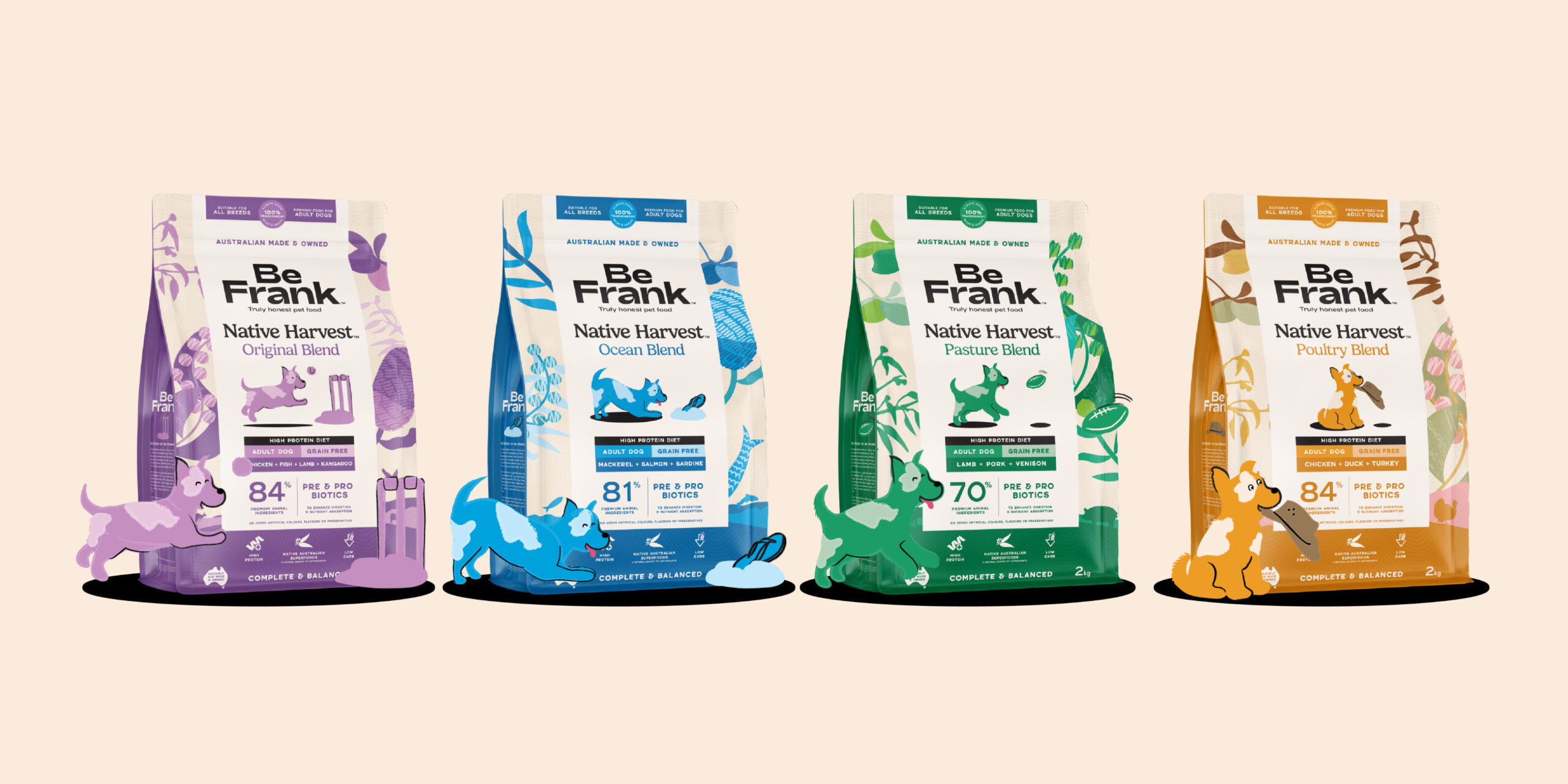
Native Harvest by the Packaging Designers at Creative Agency, Percept.
Brand Assessment
Be Frank’s dry dog food range was selling well, but navigating the expanding offering was becoming increasingly difficult for customers. Online, they often had to read the full product description to understand the differences between recipes, and adding more SKUs risked making the problem worse. The Be Frank range called for a clearer brand architecture system that could support growth without adding confusion.
The packaging designers at creative agency, Percept, were engaged to clarify the proposition and distinguish individual recipes, both on shelf and at a glance online.
The resulting packaging design also needed to feel distinctly Be Frank: straightforward, transparent and proudly connected to its Australian home in the Hawkesbury Valley.
Strategic Design
Percept’s packaging designers developed a strategic design solution that established a clear relationship between the masterbrand, range and recipe.
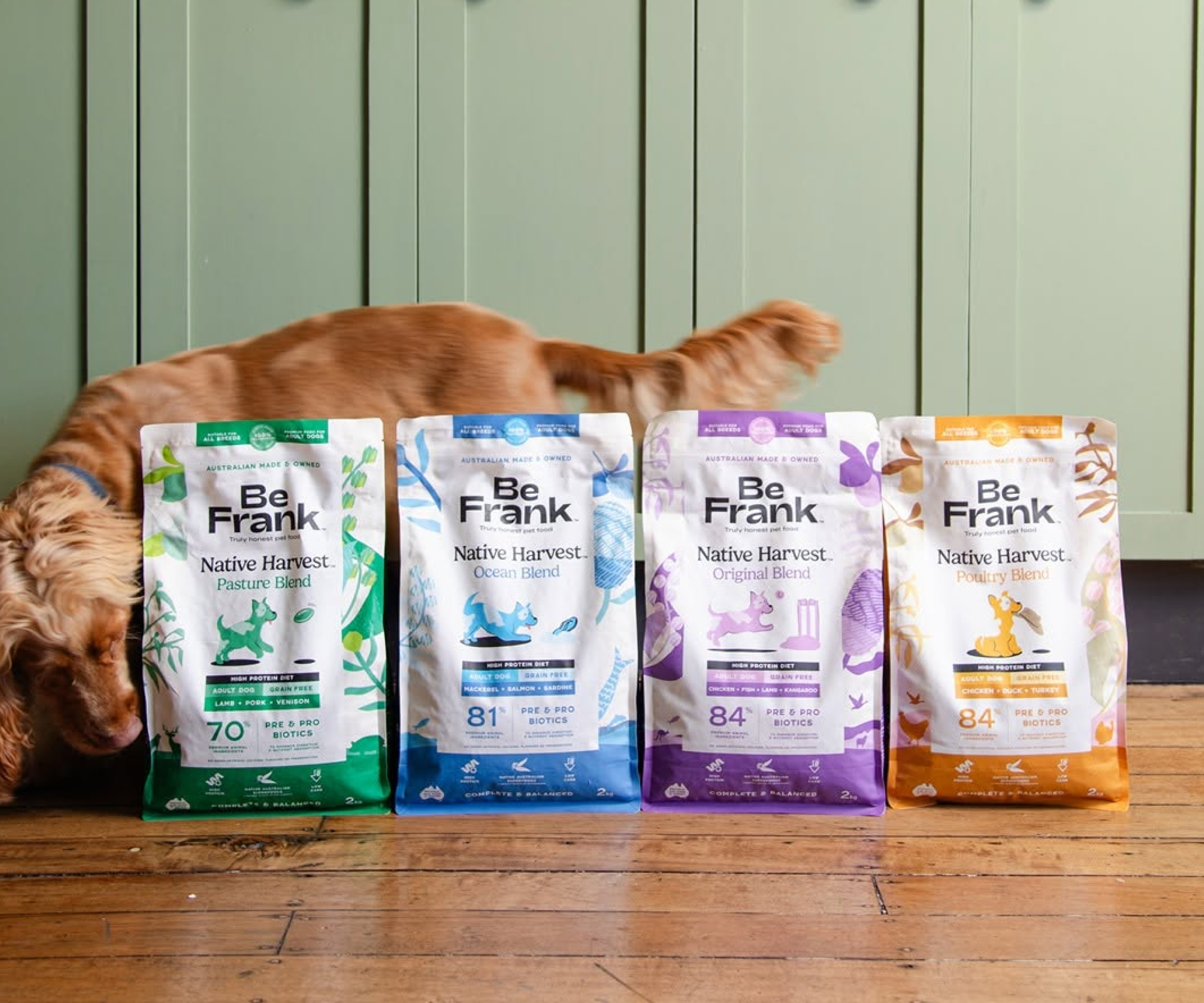
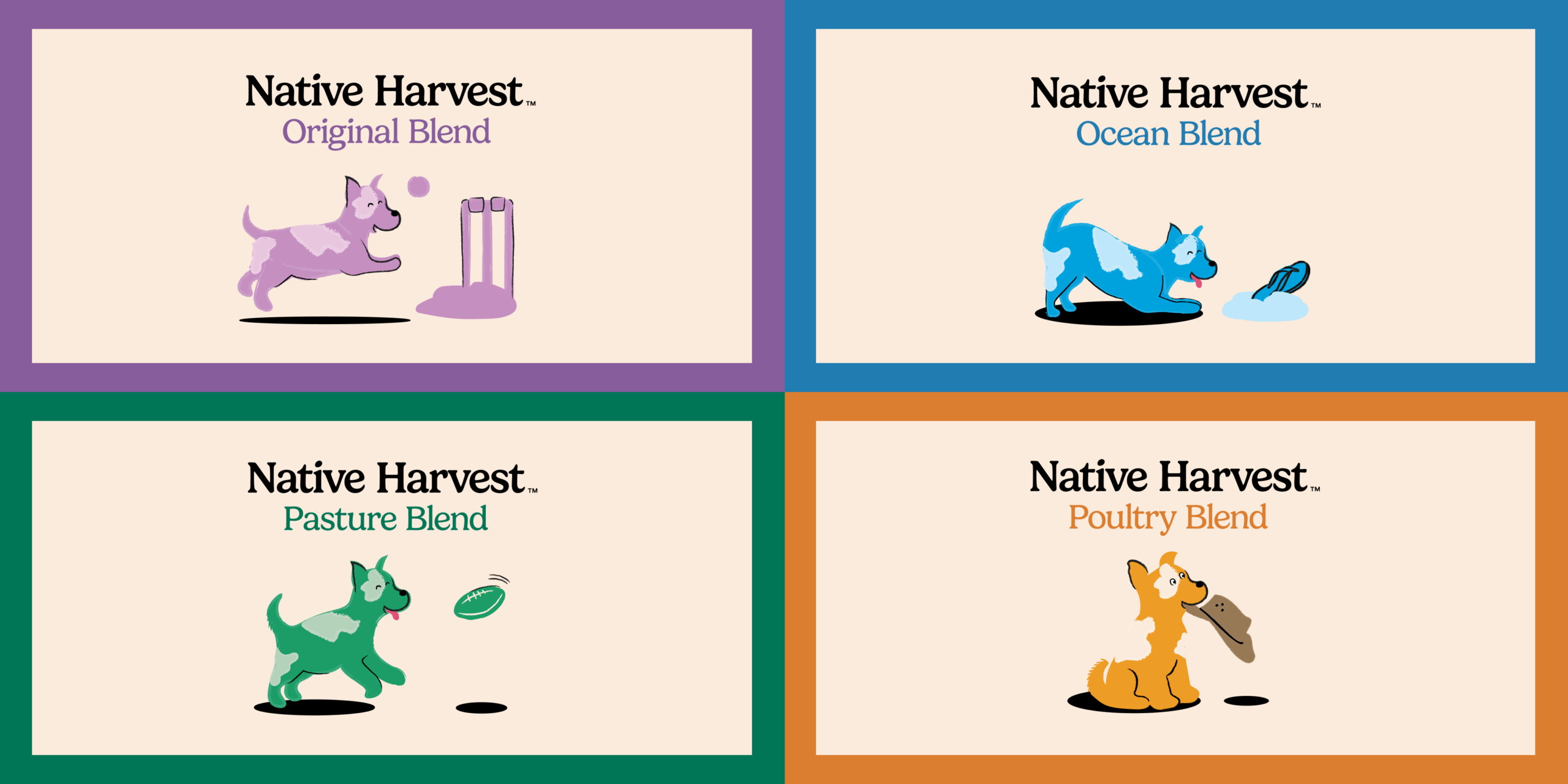
In terms of brand design, Be Frank leads the architecture as the masterbrand, with Native Harvest becoming a distinct premium tier of the range. Original, Ocean, Pasture and Poultry sit within a consistent system designed to make comparison of product types easier, and accommodate future growth and line extensions.
Native Australian ingredients bring the range’s story and nutritional proposition together. Explaining their role makes the Australian connection a clear reason to choose the product, especially when seeking differentiation in a crowded pet food market.
Product Positioning
Native Harvest brings two ideas together that pet food packaging often separates: nutritional proof and a genuine sense of place.
Inspired by Be Frank’s Hawkesbury Valley home in Australia, the range combines high-protein, low-carbohydrate, grain-free nutrition with native Australian superfoods. Its premium credentials are grounded in the ingredients and the benefits they offer. When developing the packaging design, creative agency, Percept, was conscious to focus on these attributes as a strong selling point.
The product positioning and brand proposition stays true to the central Be Frank promise: you should be able to know what’s in the bag, understand why it matters and make a confident, informed choice.
Packaging Design
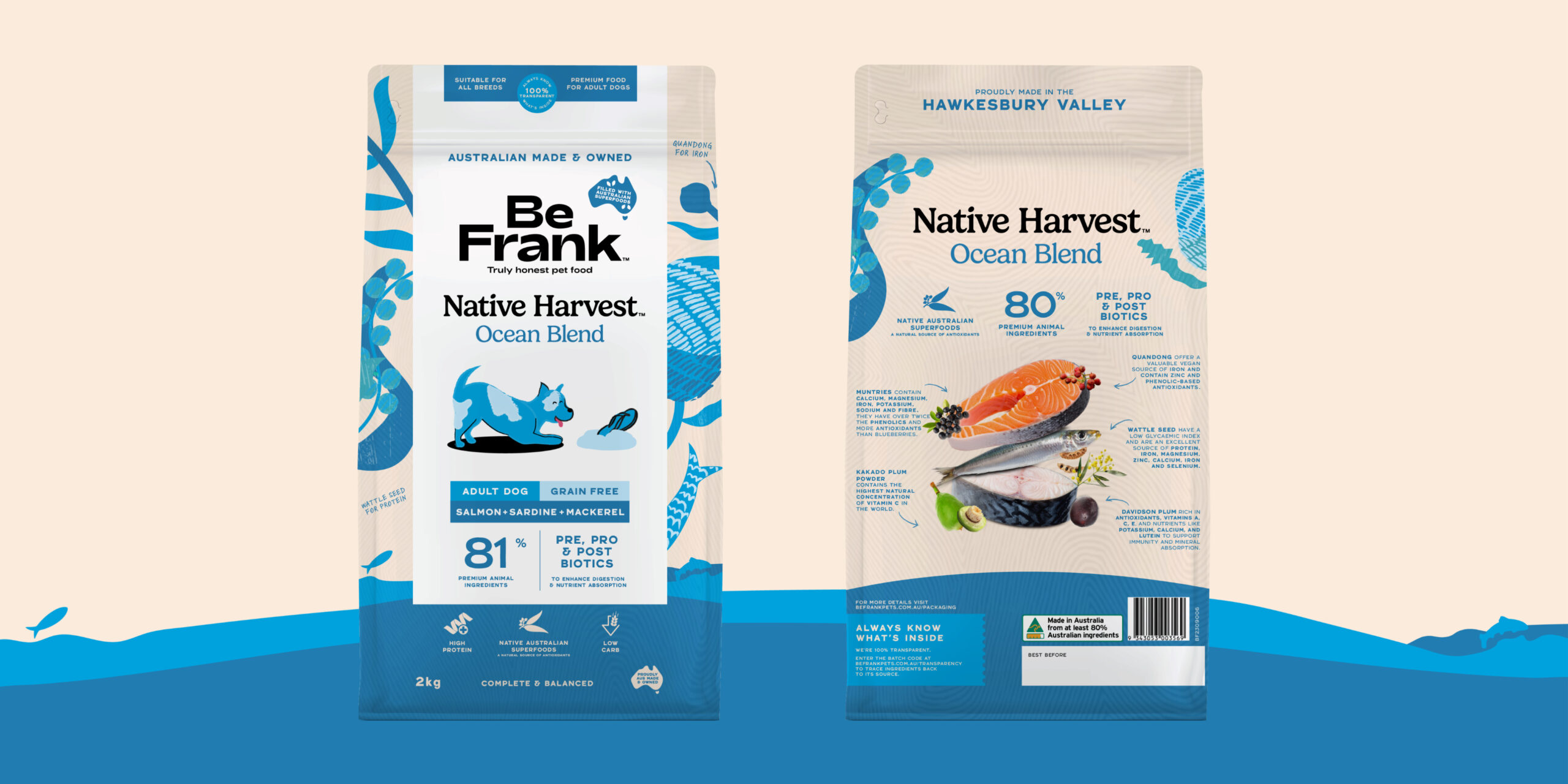
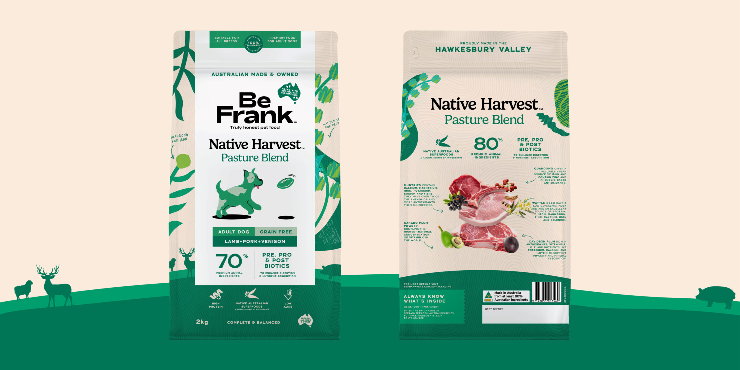
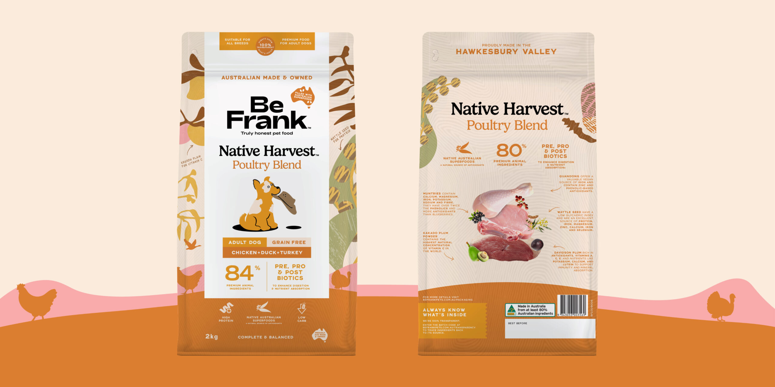
Percept’s packaging designers created a consistent pack layout that brings the hierarchy to life. Be Frank anchors the packaging design, with Native Harvest clearly identified beneath it. Colour and blend naming make the individual recipes easy to distinguish from one another, helping the customer navigate information for ease of choice.
In a pet food category saturated with animal photography, a unique style of illustration creates a more distinctive and ownable expression for the brand. The dog characters add humour and relatability, while the botanical forms give each recipe its own world.
Illustrations of native ingredients wrap around the packs, supported by handwritten callouts that explain their contribution — Kakadu plum for vitamin C, wattleseed for protein, quandong for iron. On the back of pack, real food and ingredient photography reinforces these nutritional cues, connecting the benefits with recognisable, real ingredients.
High protein, low carb, premium animal ingredients and digestive support can be understood quickly, with more detail available for owners who want to take a closer look.
Creative agency, Percept, has designed a result that is warm, inviting and full of personality. The products feel premium because there is more to discover, and Percept’s packaging designers have made that discovery easy, with a considered creative solution that communicates clearly.
This project is an AGDA Awards Finalist for 2026 in the packaging design category!