

Brand Identity
Discovery Session
Introducing Earthodic, a pioneering force in the realm of materials for the circular economy. Armed with a commitment to sustainability and a profound impact on recycling processes, Earthodic stands as a formidable guardian in the journey towards a greener planet.
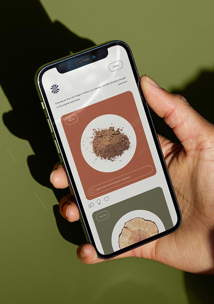
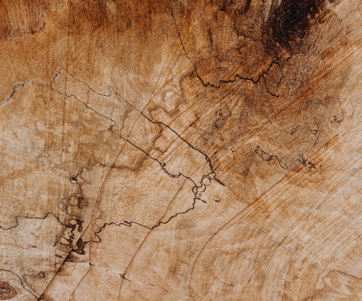
Strategic branding specialists, Percept, conducted a brand discovery session with Earthodic, which revealed a company deeply rooted in their mission to revolutionise the way materials, particularly paper, contribute to the circular economy. As Earthodic acts as a barrier to paper during its use, it facilitates the efficient reclamation of fibre during the recycling process. This innovative approach ensures that their products, backed by certification and scientific validation, can continue to circulate for extended periods, contributing to the reduction of environmental impact.
In delving into the core values of Earthodic, Percept unearthed a dedication to fostering a sustainable future by creating materials that seamlessly integrate into circular systems. With a focus on scientific certification and proven effectiveness, Earthodic products stand as a testament to the commitment to environmental responsibility.
Percept developed strategic branding for the company that leverages aligned collaborations, fostering a community dedicated to sustainable practices. Through exclusive partnership programs, companies that join the Earthodic family gain access to specialised solutions, discounts, and benefits, further emphasising their commitment to a circular economy.
Strategic branding agency, Percept, discovered that what sets Earthodic apart is not just their products but their relatable personality. They resonate with eco-conscious consumers, offering materials that align with their values. Unlike traditional manufacturers, their approach goes beyond production, embodying a commitment to global environmental stewardship. This was identified as something to tap into.
In a market saturated with conventional material providers, the strategic branding for Earthodic centres around brand positioning as a revolutionary force in their industry. Leveraging advanced technology in production, their materials seamlessly integrate into the circular economy, enhancing efficiency and sustainability. Through this strategic branding, Earthodic identify not merely a materials provider; they now represent a transformative journey toward lasting positive change.
Brand Positioning
Strategic branding agency, Percept, crafted the core brand house;
Brand Mission — We’re here to create a sustainable impact on a global scale.
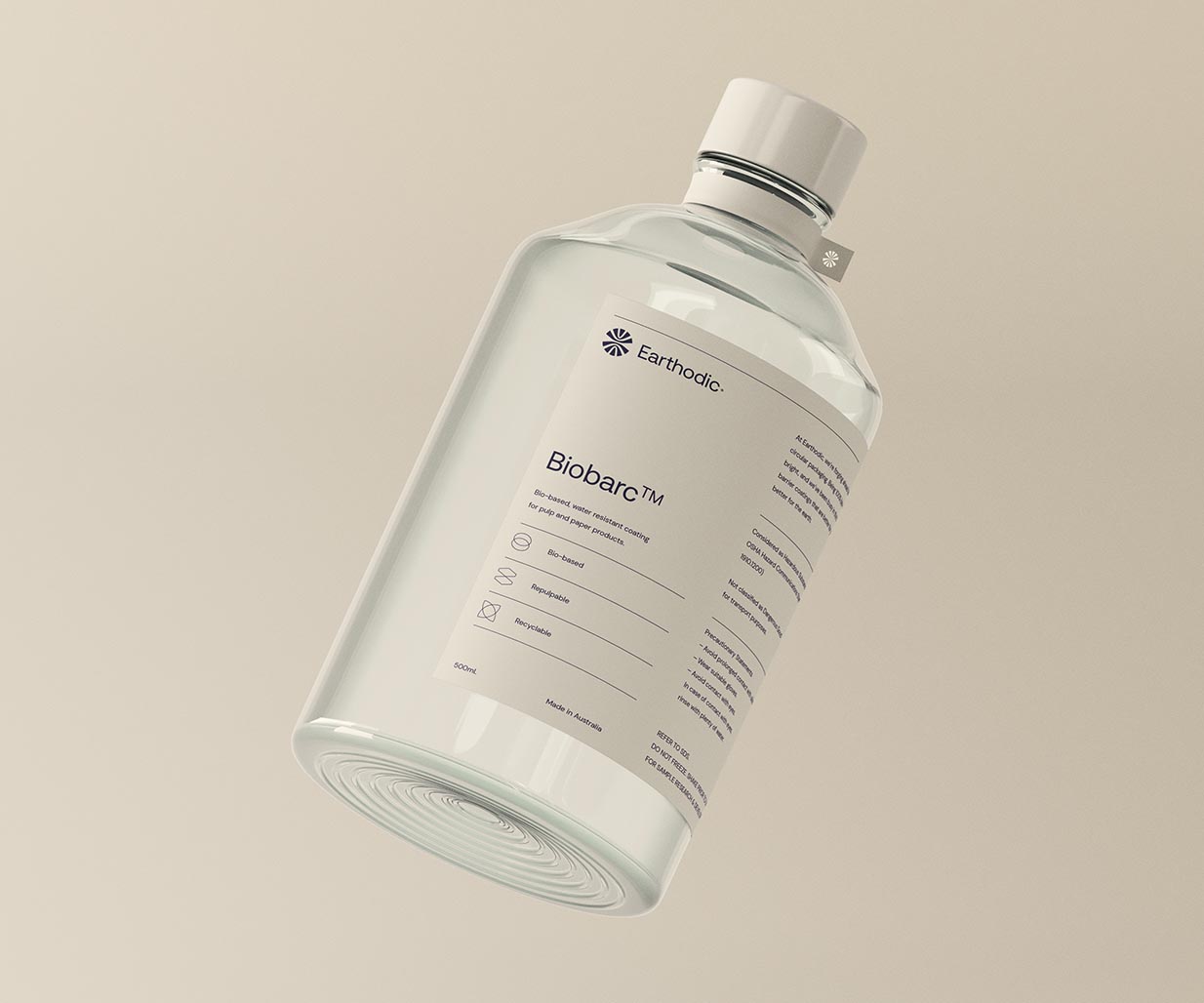
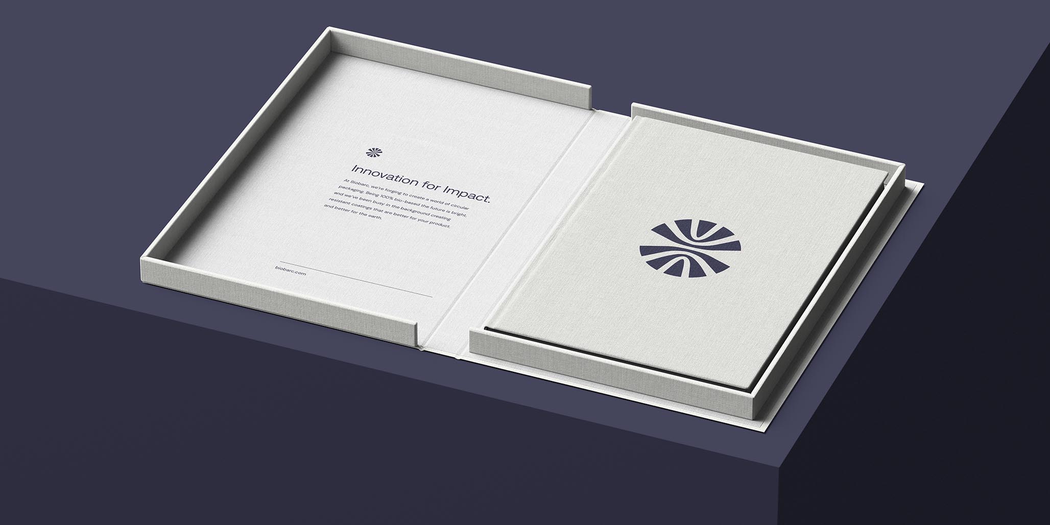
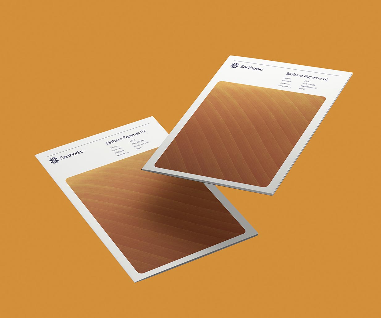
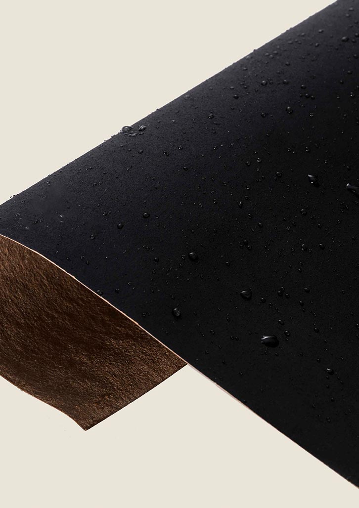
Brand Offering — At Earthodic, we’re forging ahead to create a world of circular packaging. Being 100% bio-based our future is bright, and we’ve been busy in the background creating barrier coatings that are better for your product, and better for the earth.
Brand Story — In a world of same, sames, we champion being different. We love creating things that people can’t, or simply won’t because the task at hand seems unreachable. But we strategise, we plan, we test, we break, we refine and we go again. It’s how we make innovative coatings that are truly unique, that enable products to be truly bio-based, repulpable, recyclable and compostable. At the end of the day, sustainability is what makes us tick, whilst our motivation and persistence enable us to make a positive impact on a global scale.
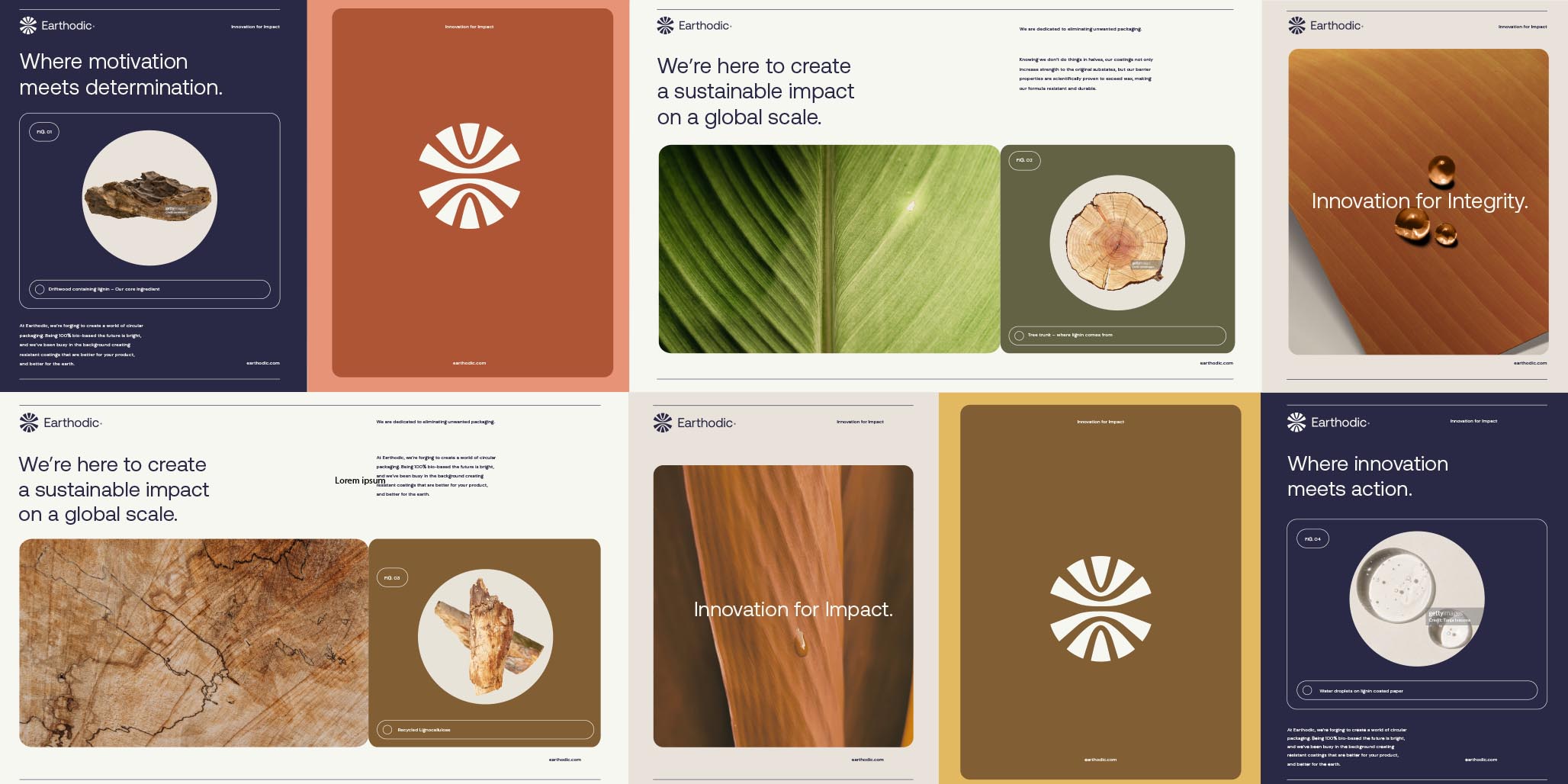
Brand Tagline — Innovation for Impact.
Brand Messaging Sets —
Where innovation meets action.
Where motivation meets determination.
Where people meet progress.
Where dedication meets transformation.
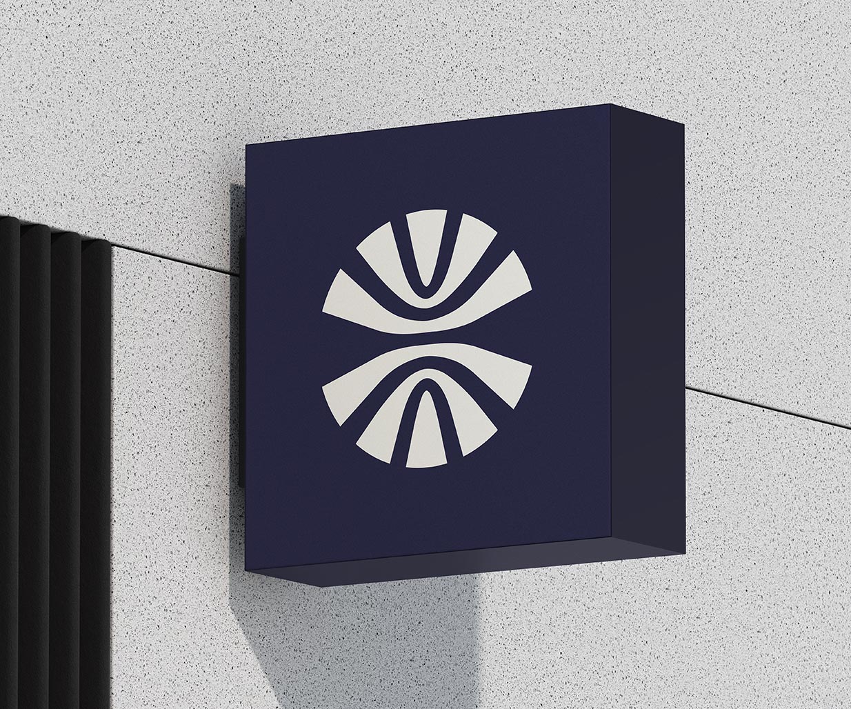
Percept created a brand identity that is a fusion of intricately layered elements meeting unwavering resistance, symbolising resilience and depth. The brand identity design incorporates four distinct shapes, each representing Earthodic’s core values, seamlessly intertwined to form a cohesive mark that is the foundation of the brand identity.
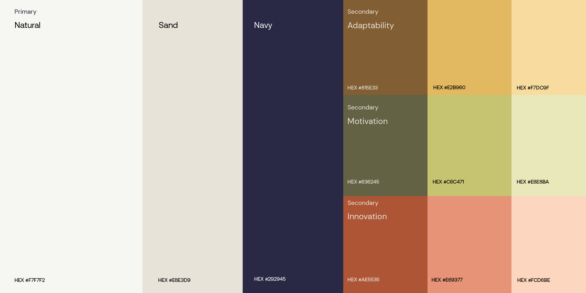
In a colour palette dominated by off-white and navy, their primary colours exude an organic and mature personality, grounding the brand identity in a sense of authenticity. Complementing these, the secondary colours convey the essence of their core values, infusing an earthy characteristic that softens the overall tone of the brand identity.
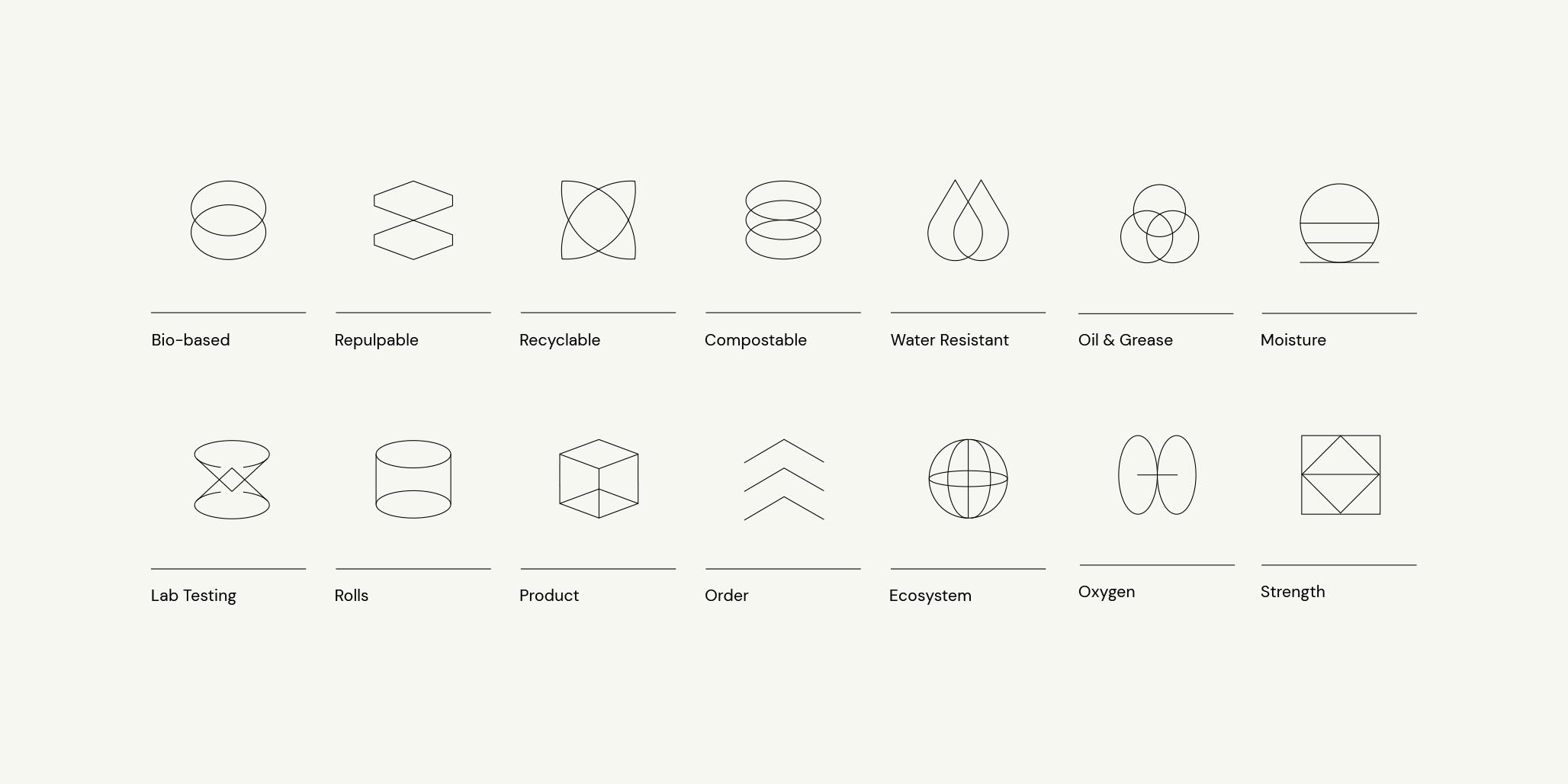
Symmetrically designed scientific iconography adds a touch of simplicity and intrigue to the brand identity. The layering effect within these icons harmonises with the brand narrative, creating a seamless connection between form and function.
The design structure and compositions are thoughtfully constructed using these modules throughout the brand identity, offering a practical framework for organising text and images. Rounded edges, a deliberate choice, contribute to a softened tone as the brand identity rolls out across all customer-facing assets, striking a balance between approachability and professionalism.