Brand Identity
2025 AGDA Awards, Merit in the Design for Good category.
Discovery
Searching for a brand designer, Stray to Stay selected Percept to create the brand identity for their not-for-profit organisation in Far North Queensland that rescues and re-homes pets in need.
Brand designer, Percept, worked in close partnership with Stray to Stay to gain deep insight into the challenges and opportunities the organisation was experiencing. Community-led and volunteer-run, they rescue abandoned and at-risk animals, and have earned the trust of their community through genuine, heartfelt work. However, their existing brand identity failed to capture the true depth of the impact, clarity of purpose, or the strength of their vision for change.
As the brand designer engaged for the project, Percept conducted a brand identity and competitor audit that revealed a saturated space where many animal rescue organisations relied on guilt or visual clichés, such as paw prints, cartoons, and emotive appeals, that unintentionally diluted the credibility of these organisations. Stray to Stay wanted to do things differently, and by hiring Percept as their brand designer, they aimed to develop a mature and well-respected brand identity that was rooted in empathy, professionalism and authenticity.
Percept’s brand identity development process focussed on answering the creative brief in order to build a brand identity that is grounded, human and unmistakably its own. A brand identity that, at its core, represents transformation. The task became about capturing the transformation from uncertainty to safety, from overlooked to loved, and ultimately, from stray to stay.
Strategic Branding
The strategic branding that Percept developed, centred on redefining the perception of the brand. Instead of leading with crisis, Stray to Stay would lead with care — adopting a warm, trustworthy and sincere tone that balances community spirit with professional ambition.
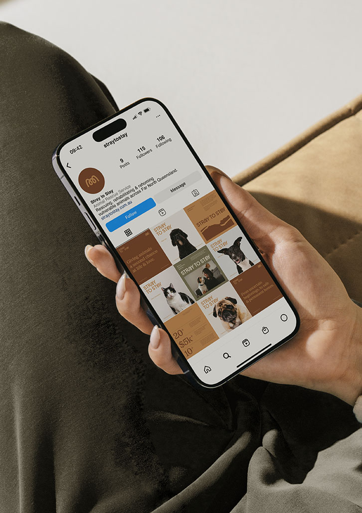
Functionality was key to creating a successful and usable brand identity. As a volunteer-led organisation, the brand identity system had to be intuitive and practical across real-world touch-points — from signage and uniforms to adoption forms and social media. At the same time, the brand identity needed to be able to grow with the organisation, supporting education, advocacy and fundraising as they would grow in years to come.
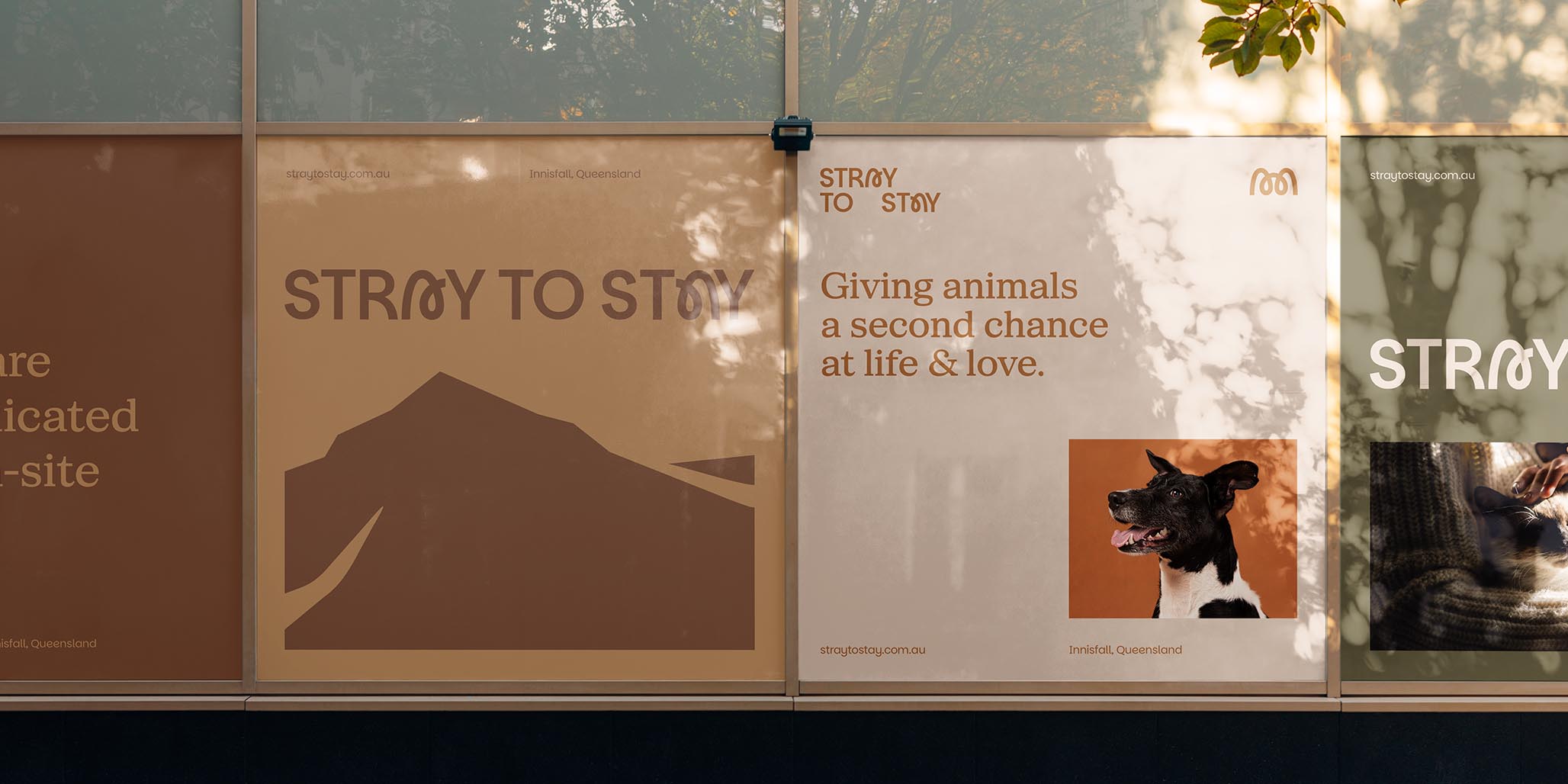
As an experienced brand designer, Percept also recognised that a sense of place was equally important. By drawing inspiration from the mountainous landscapes of Far North Queensland — its earthy tones, contours and textures — the brand identity could remain regionally authentic and recognisable, while resonating with a broader audience.
Brand Positioning
Brand designer, Percept, developed brand positioning for Stray to Stay that establishes the NFP organisation as a trusted and professional voice in the animal rescue space — one that shifts the conversation from urgency and guilt to empathy and action. While many other NFP organisations in the sector lean on sentimentality or shock value, the brand positioning of Stray to Stay is intentionally designed to build trust through professionalism, clarity and care.
The brand positioning and identity design purposefully represents the NFP organisation as one that doesn’t just re-home animals, but redefines pet adoption as a guided, supportive and hopeful journey from uncertainty to belonging. By basing the brand positioning in authenticity, regional connection and community spirit, the brand identity that was created from these foundations helped Stray to Stay become more than a rescue service — now it is a catalyst for change.
This brand positioning ensures the organisation stands apart in a crowded NFP category, inspiring confidence among adopters, volunteers, and donors, while remaining deeply rooted in its mission to save lives and transform outcomes for the better.
Brand Identity
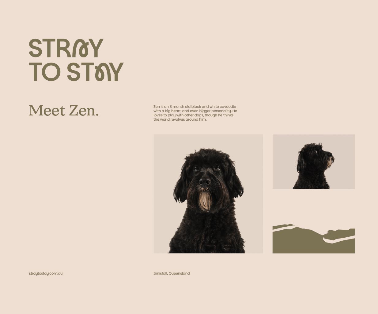
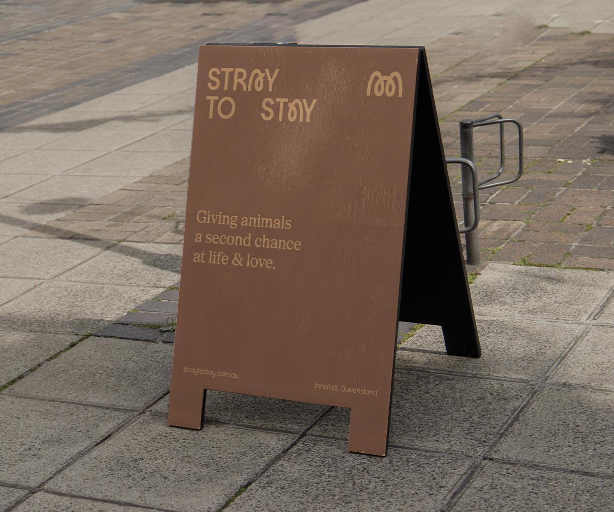
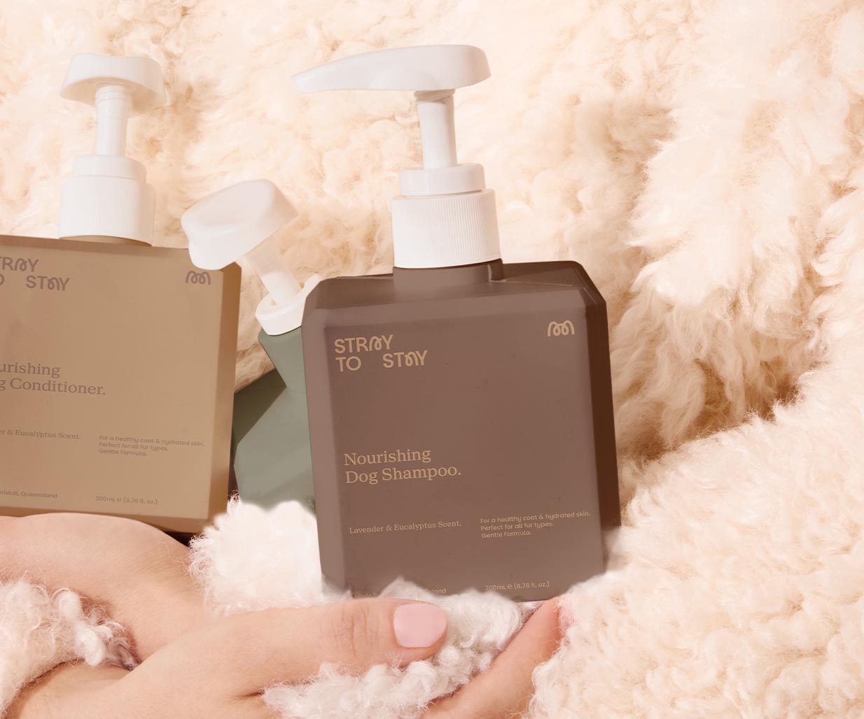
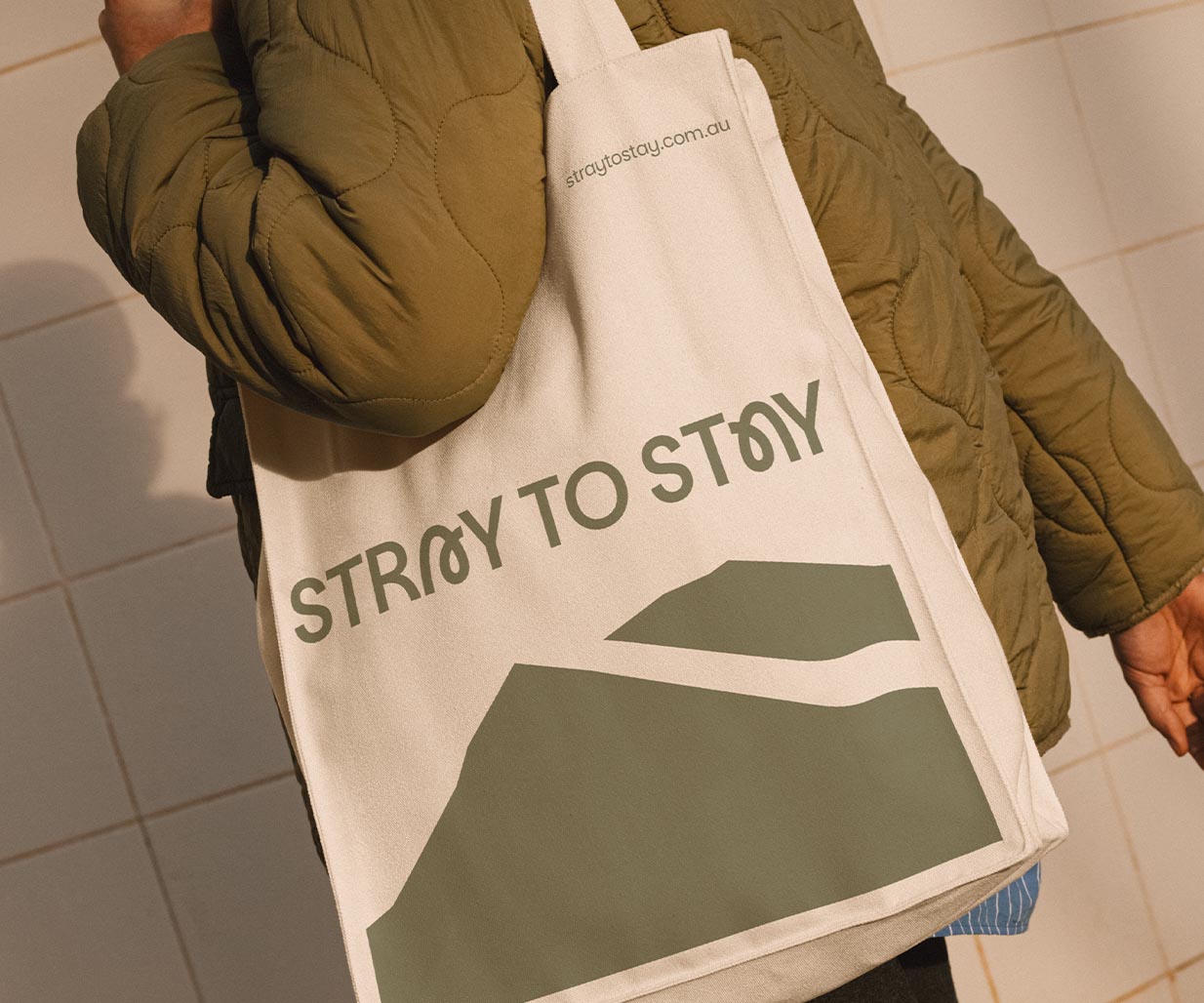
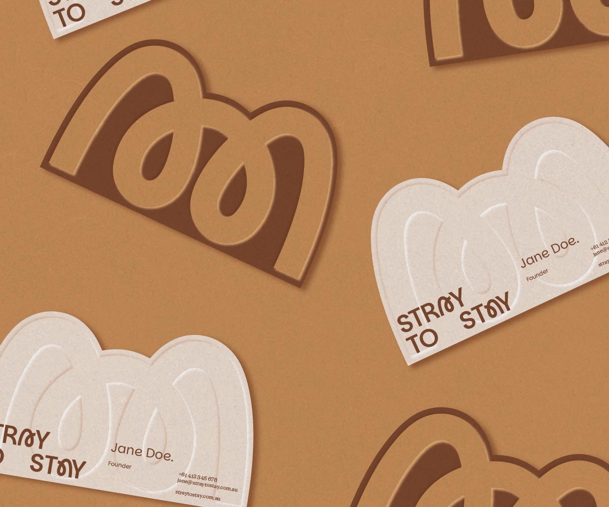
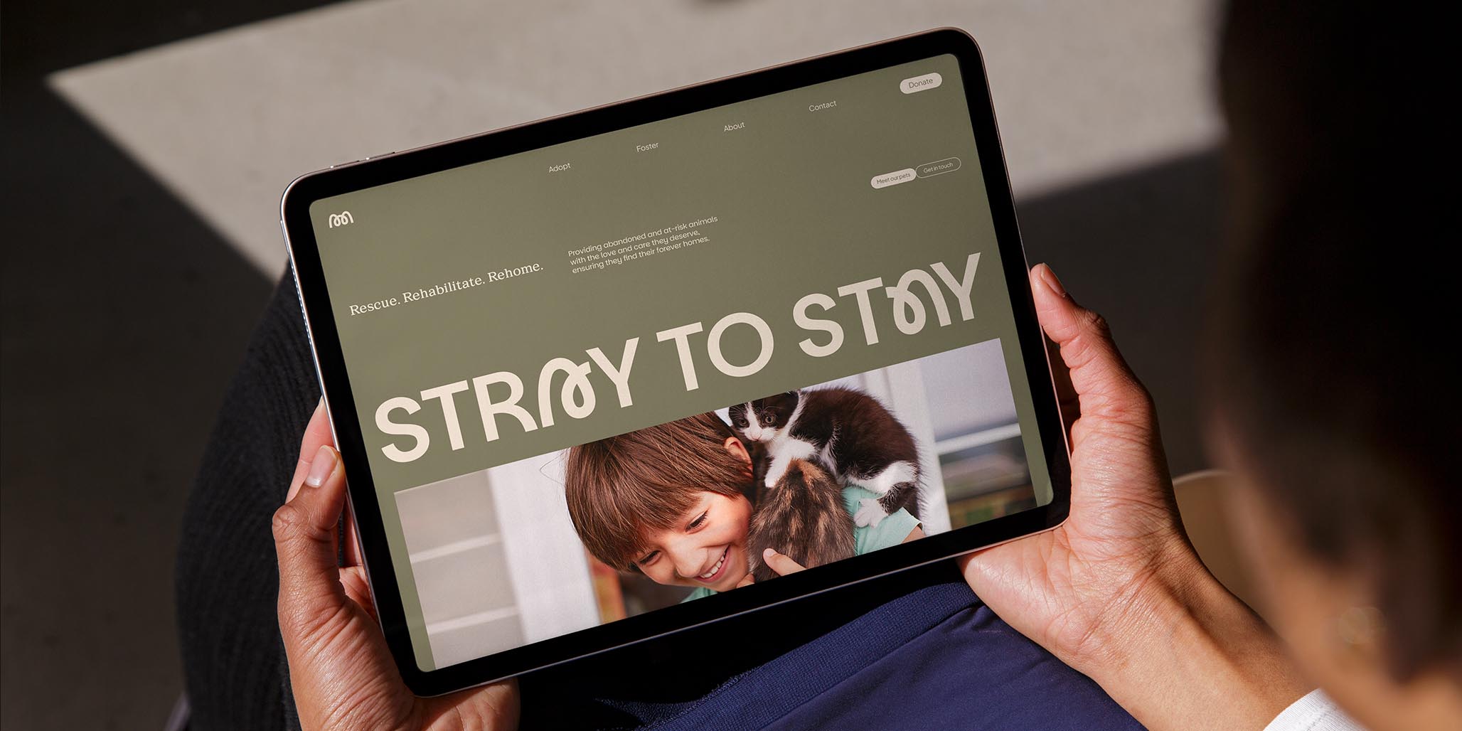
At the heart of the brand identity, Percept created a custom wordmark that embodies transformation. The curved letterforms of Stray to Stay capture the journey each animal makes — from uncertainty to belonging.
Within the logo, the letter ‘A’ evokes the shape of a home: a safe space, a new beginning, and a symbol of trust. Together, these elements form a brandmark that not only stands strong on its own but also subtly resembles an animal’s face, deepening the emotional connection around the pet re-homing process.
A warm, earthy colour palette, drawn from the Far North Queensland landscape, anchors the brand identity, giving it connection to place. Graphic elements inspired by the contours of the local terrain add rhythm and flexibility, while enhancing the brand identity and its link to the surrounding area.
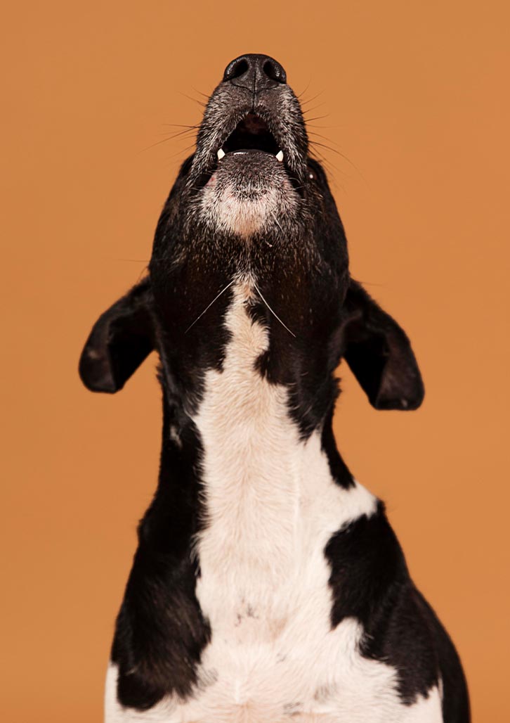
A distinctive photography style was prescribed by brand designer, Percept, with subject matter that is intended to capture real, candid moments between people and animals. This helps elevate the character-rich, humanity of the new brand identity.
The broader design system for the brand identity is built for ease and scalability, ensuring consistency across printed, digital and physical touch-points. Simple layouts, clear hierarchy and adaptable assets make the brand identity accessible to customers and volunteers alike.
With the new brand positioning, Stray to Stay doesn’t just look different, it feels different. It’s no longer just another NFP organisation that re-homes pets, it’s an animal welfare movement. The new brand identity helps to convey that every stray has the right to stay, and every person has the power to make that possible. Hopefully the change will be effective in achieving positive outcomes, motivating more animal adoptions, resulting in better quality of life for both pets and their new owners.