

Brand Designer, Percept, Creates Brand Identity for Construction Education Company
Brand Assessment
Brand designer, Percept, was a great fit for this assignment because of their brand identity expertise. A successful track record as a brand designer for both the construction and education sectors also proved to be advantageous to this project.
In a category saturated with institutions focused on credentials rather than capability, a persistent gap was uncovered — professionals were leaving education without the practical skills or confidence to perform.
Learning existed, but it wasn’t translating, and the industry remained fragmented with limited connection across roles and experience levels.
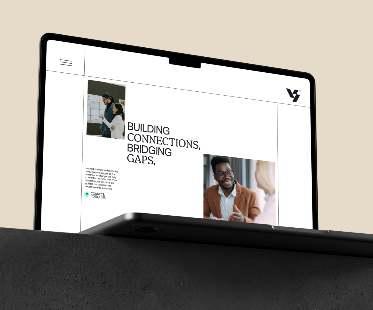
This tension revealed a clear opportunity — to bridge the gap between learning and doing. Vartas could become the connective layer the industry was missing.
Brand Strategy
Vartas is not an educator in the traditional sense — it is a coach, a connector, and a catalyst for progress. This was a key insight for brand designer, Percept, to define a brand strategy that focussed on the USP, which was action.
The brand strategy operates through a clear behavioural model: Connect, Coach, Conquer. Each principle directly addresses industry fragmentation, lack of practical guidance, and unresolved challenges.
The result is a framework for the brand identity that feels both grounded and progressive — balancing credibility with forward progression.
Vartas exists to make learning usable. To turn knowledge into capability, and capability into momentum.
Brand Positioning
The brand identity that Percept created helps Vartas reframe how learning shows up in the construction industry, enabling a more seamless, connected way forward.
It bridges the gap between trades and professionals, creating a more cohesive and practical approach to industry progression. Through applied coaching, it translates knowledge into real-world performance. Not abstract theory, but usable skill.
The brand positioning and identity design combine to create confidence. They reduce complexity and connect people across roles, levels, and disciplines.
At its core, Vartas’ brand positioning is about empowering professionals to move forward — with clarity, capability, and control.
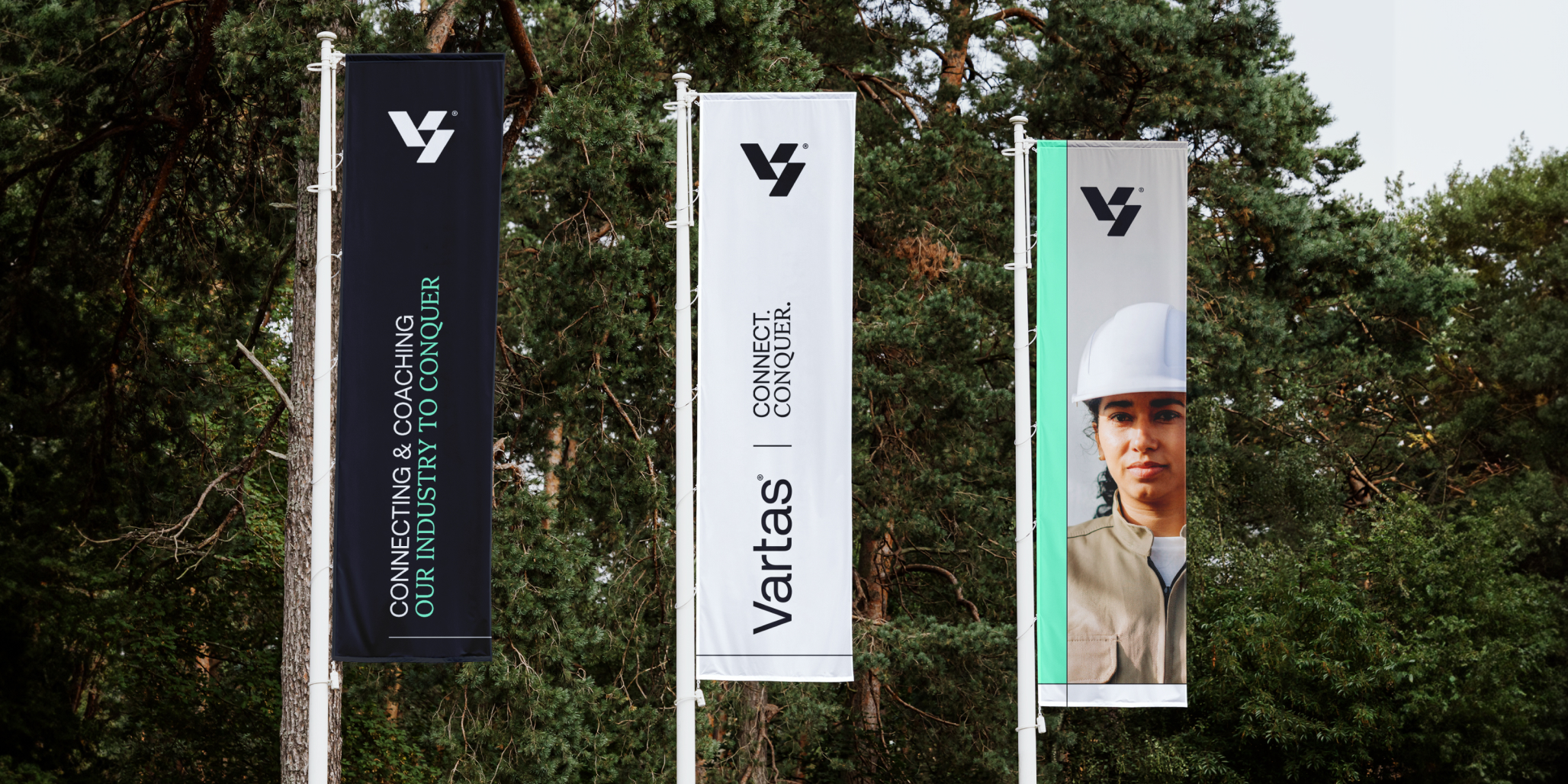
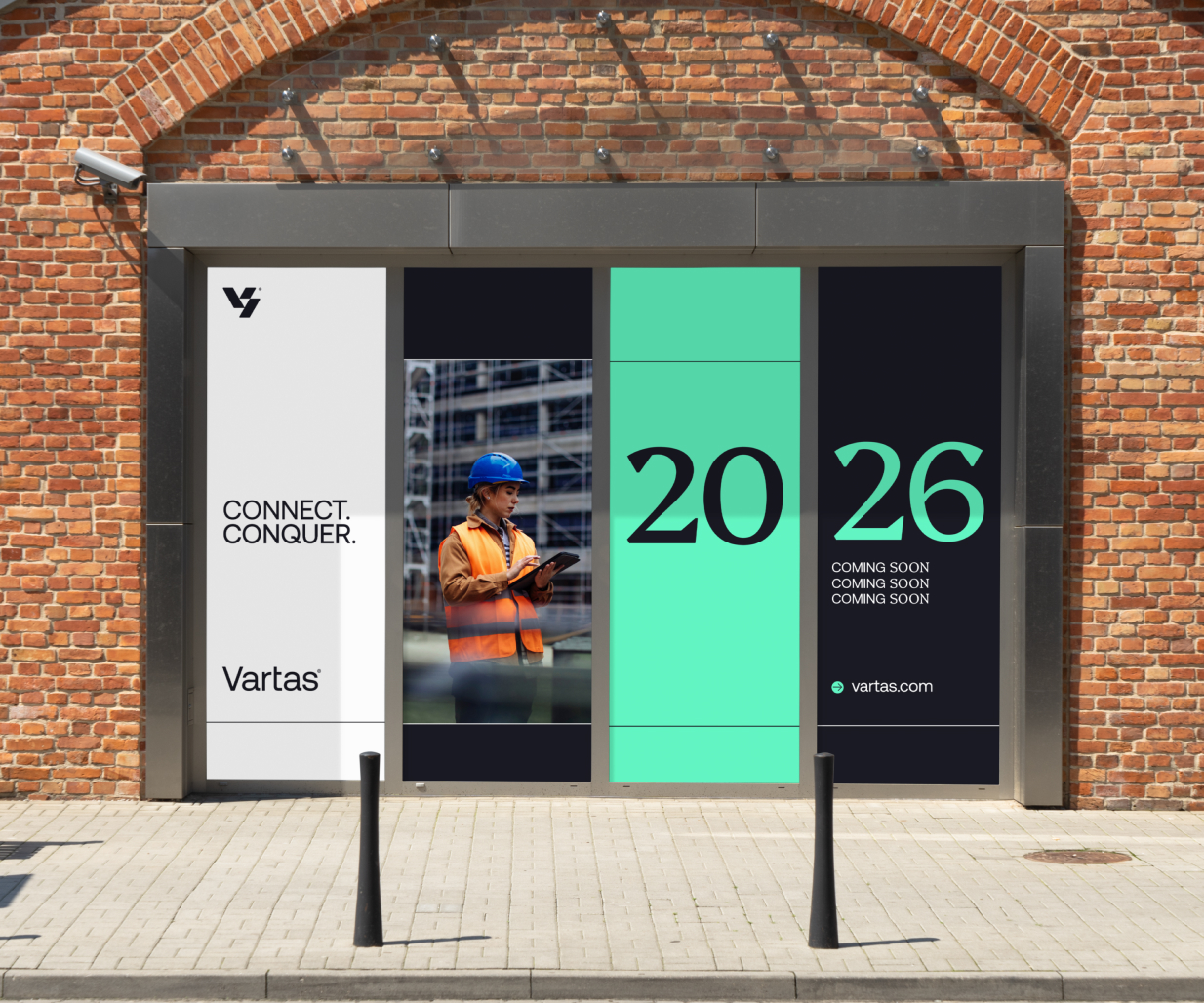
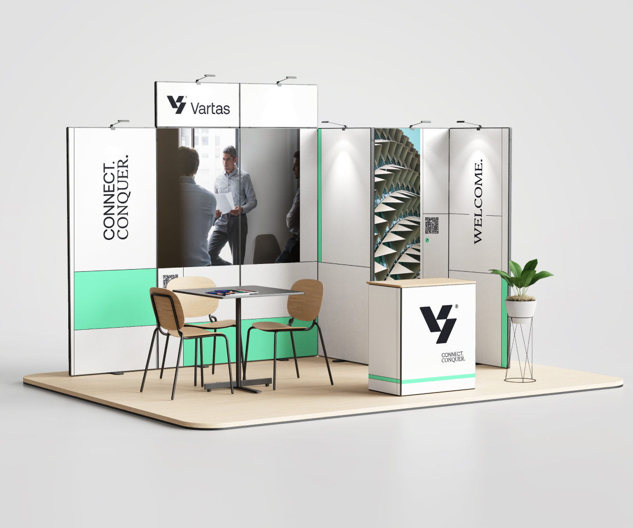
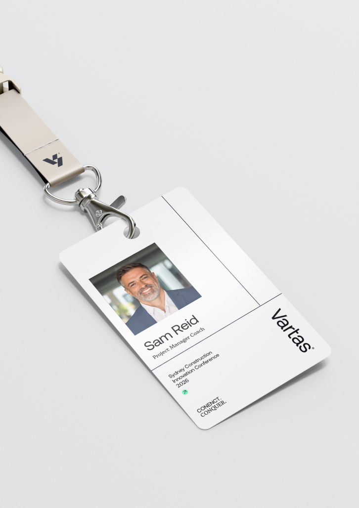
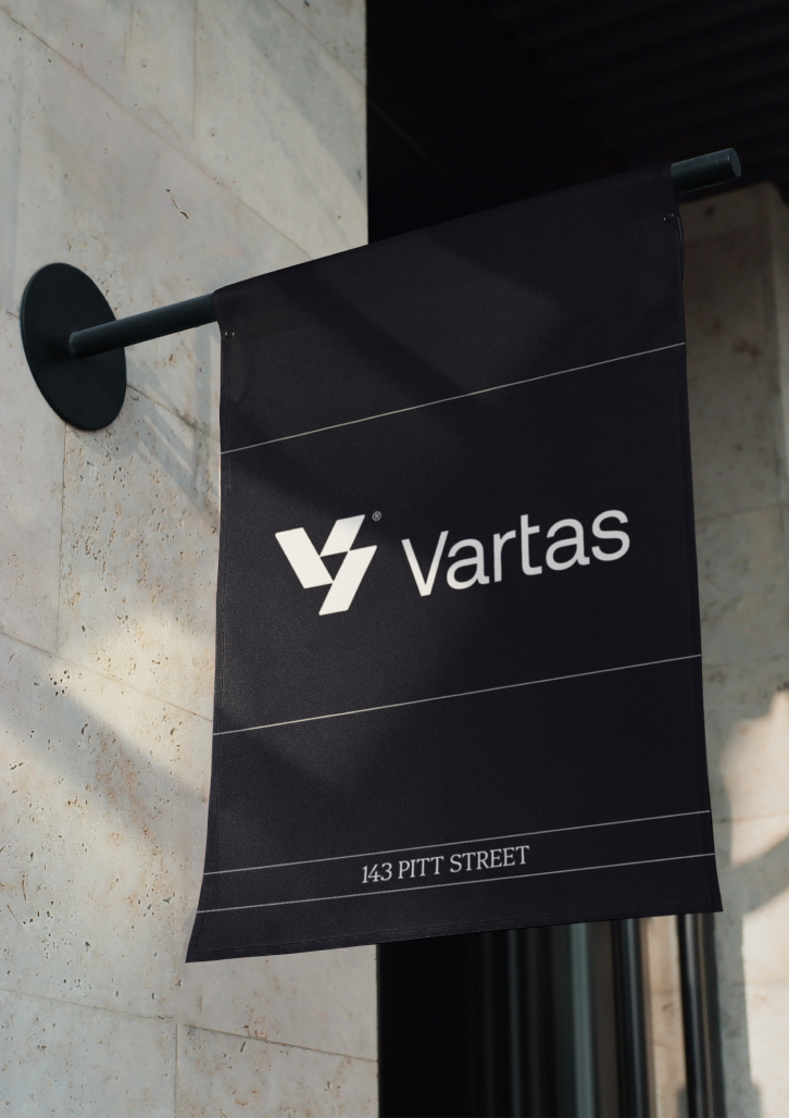
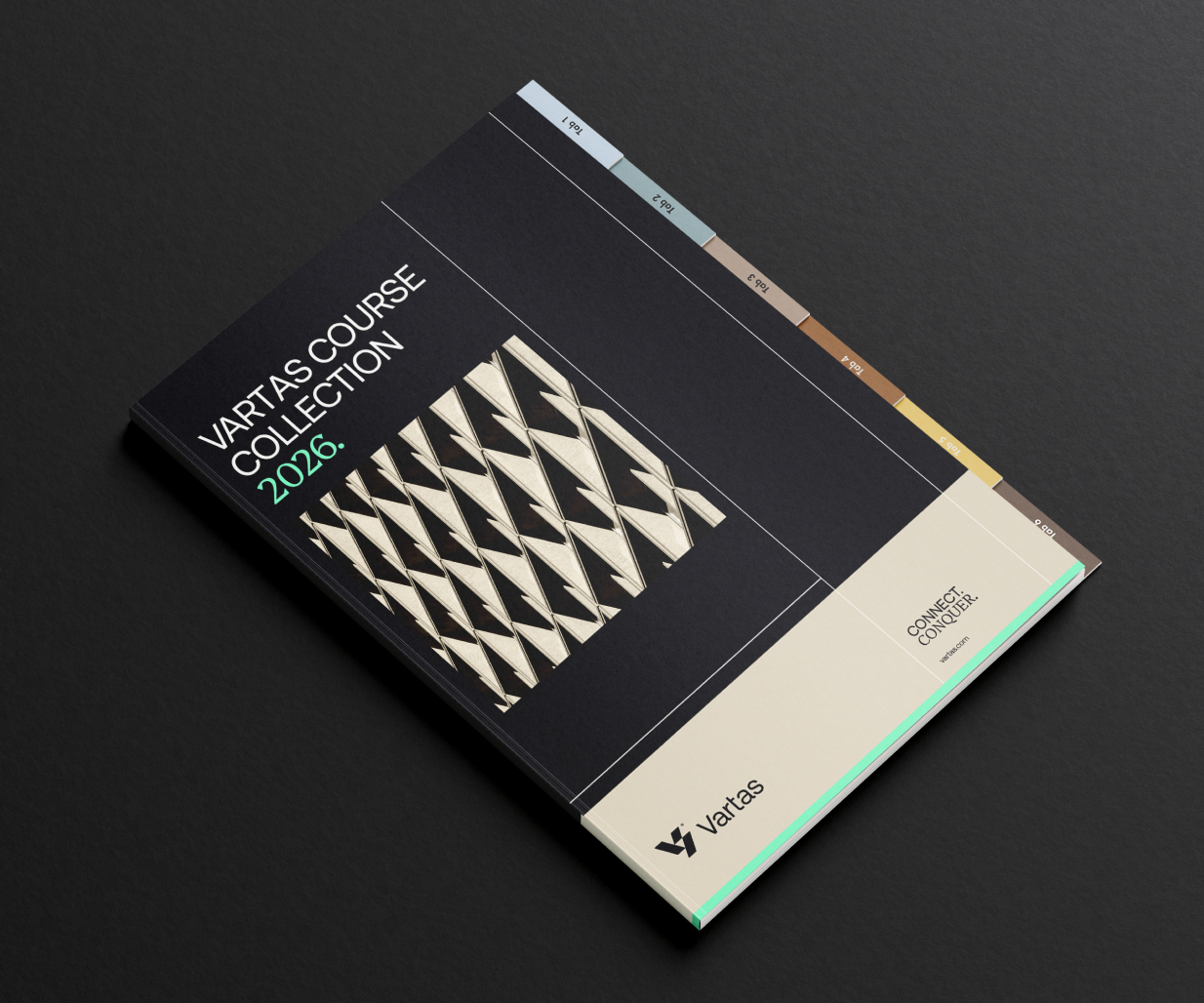
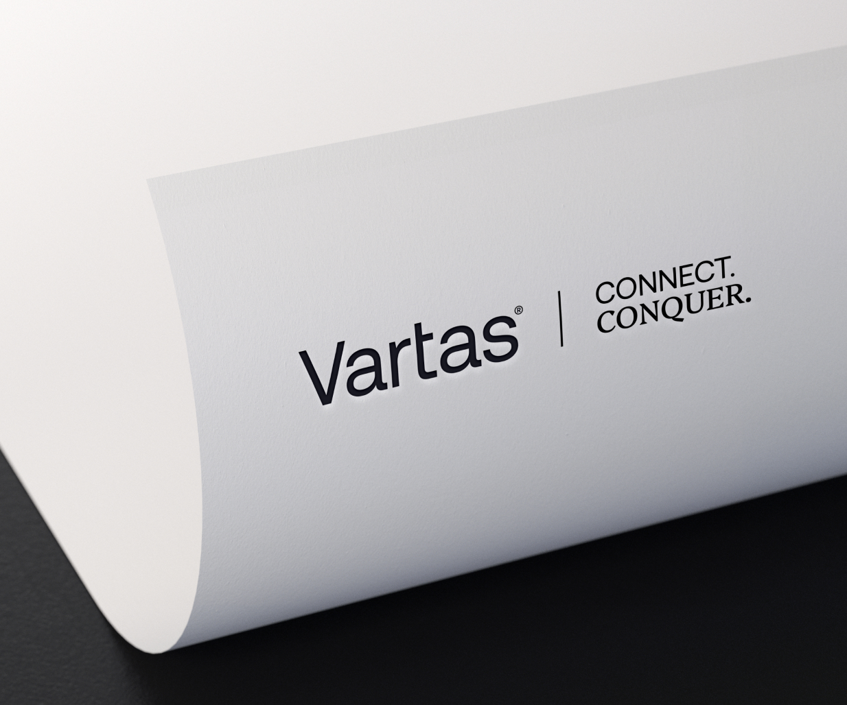
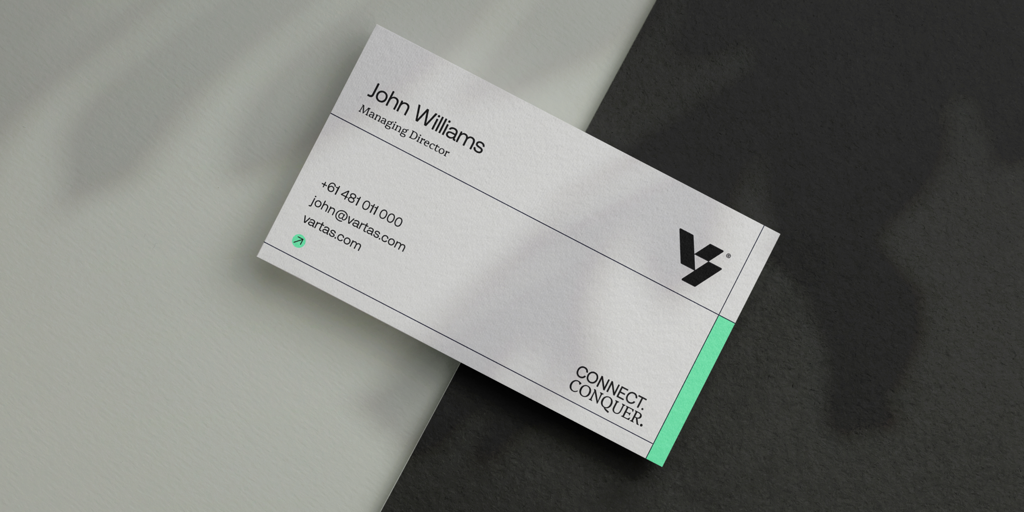
The brand identity is built on three core actions — Connect, Coach, Conquer — expressed through a brandmark that distils these principles into a single, strong symbol of progression and cohesion, acting as a visual shorthand for how the organisation operates.
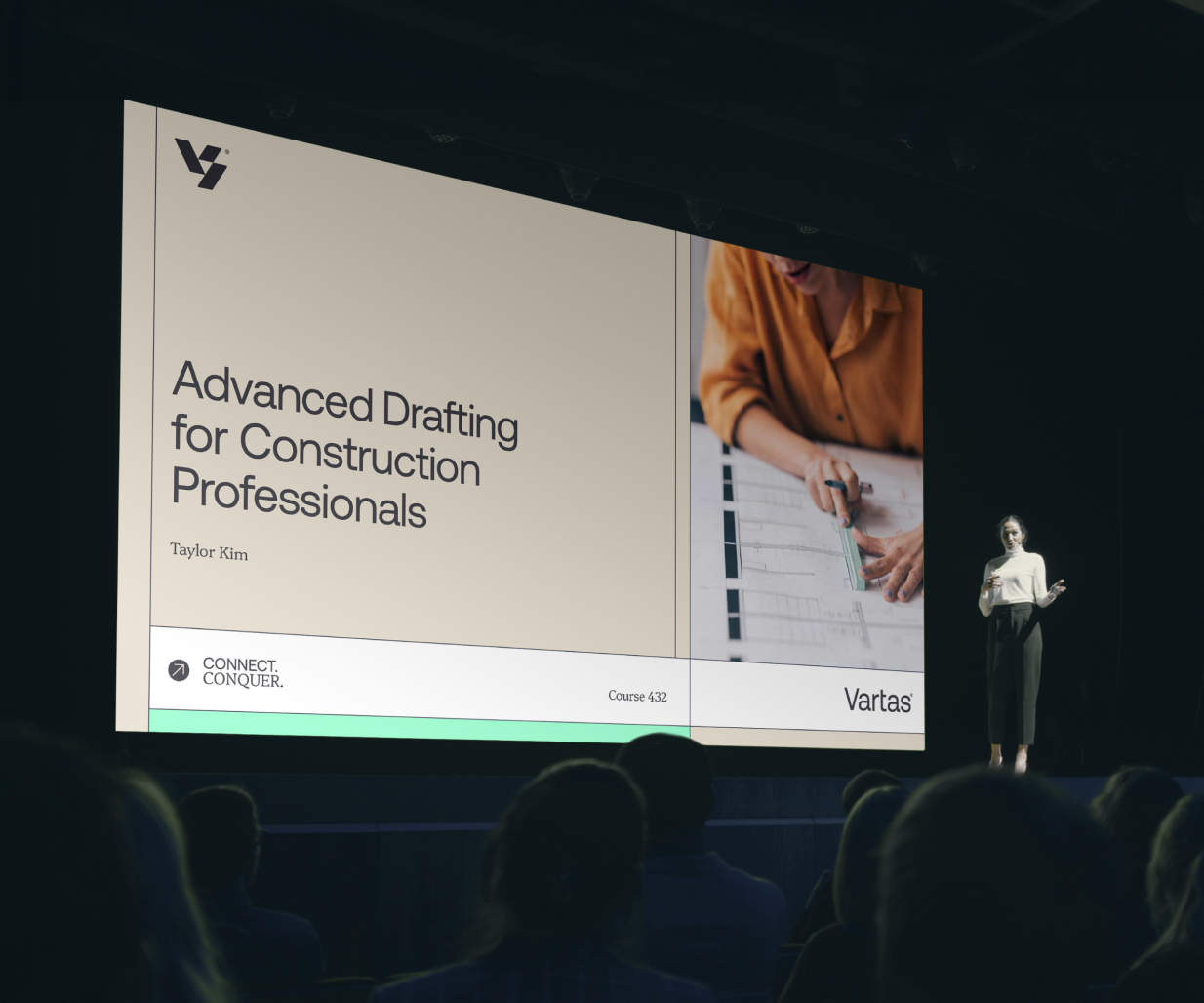
The brand identity uses a considered pairing of serif and sans-serif typography. This allows the brand identity to move between institutional credibility and on-site practicality without friction, balancing authority with accessibility across all branding.
The intentional use of vivid green cuts through a traditionally muted category, signalling progress and energy. Black and white anchor the brand identity, echoing the feelings of clarity and control.
A curated photography style captures real environments and people with a sense of momentum and intent. It reflects a construction industry in motion — connected, capable, and evolving.
Every element works to reinforce a single idea: learning that moves you forward.
If you need a brand designer to transform the brand identity of your company, contact Percept. We’d love the opportunity to share our expertise.