
Rebrand for Sharks FC by Brand Identity Agency, Percept
Brand Assessment
Seeking a rebrand, Sutherland Sharks FC teamed up with brand identity agency, Percept, to develop branding that celebrates its proud history and aligns with its vision for the future.
The rebrand kicked off with a brand assessment workshop, where Percept explored the club’s values, legacy, and aspirations, honing in on what makes Sharks FC a vital part of its community.
The brand assessment revealed the importance of balancing tradition with innovation for the rebrand, ensuring the club’s brand identity resonates with long-time members while inspiring a new generation. By delving into the unique story of Sutherland Sharks FC, Percept established a framework for the rebrand that encapsulates its enduring spirit and forward-facing ambition, ready to unite players, supporters, and the broader community.
Rebrand Strategy
The rebrand strategy for Sutherland Sharks FC was built around the idea of honouring the past while shaping the future.
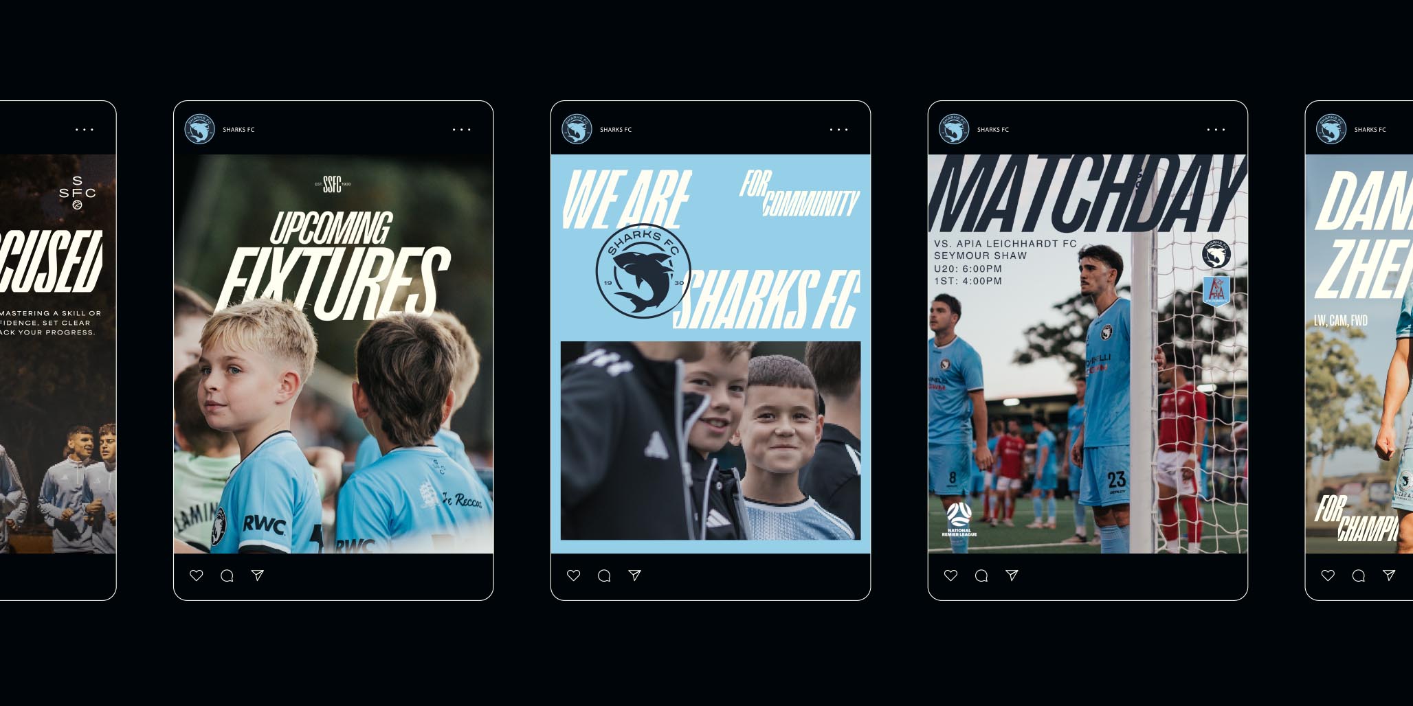
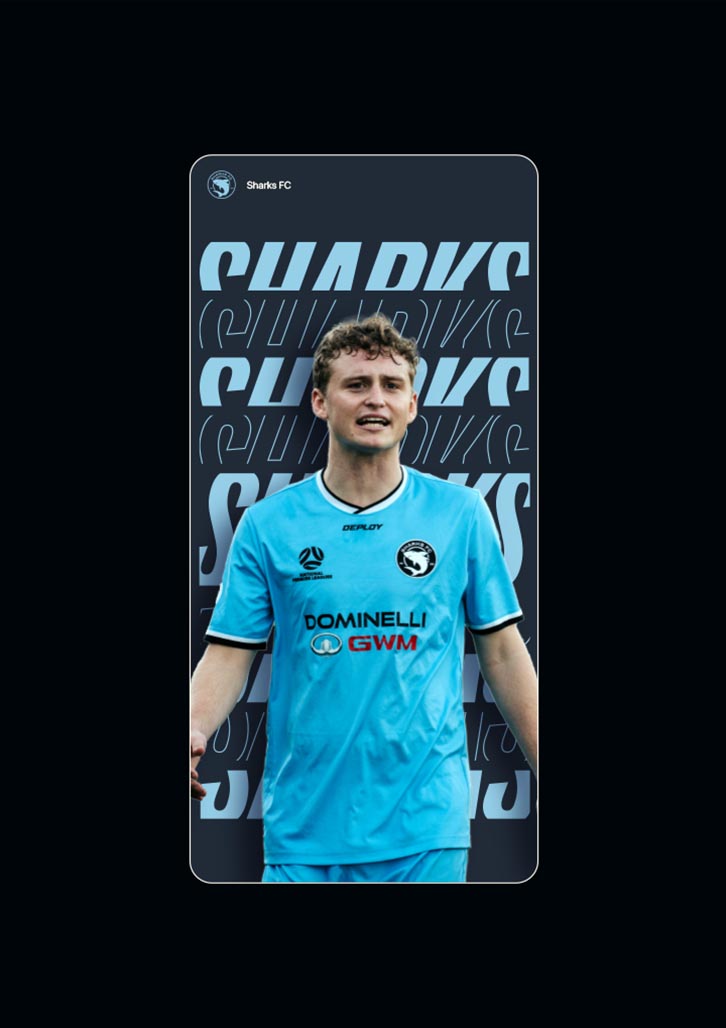
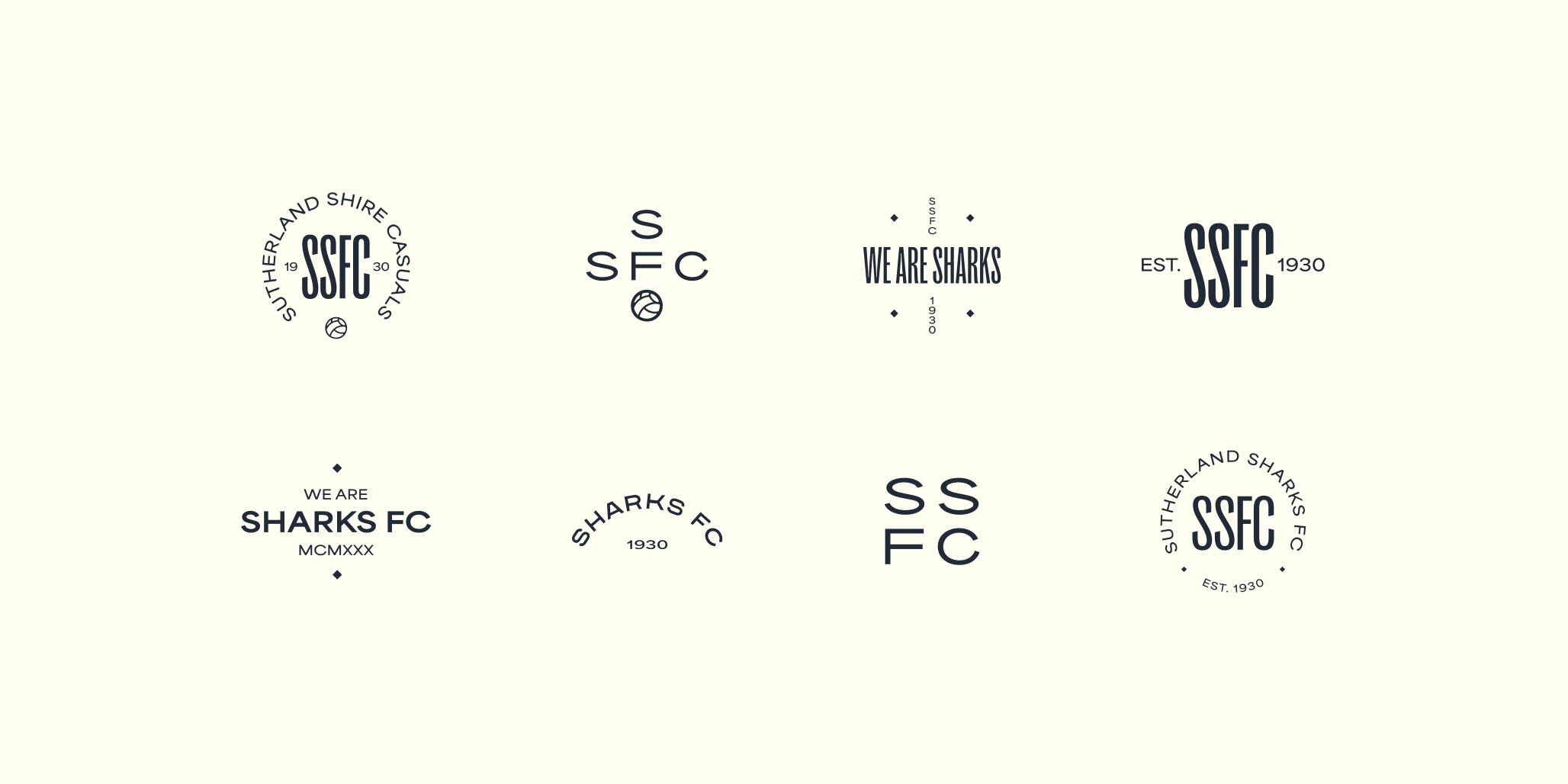
Brand identity specialist, Percept, developed a clear roadmap to reflect the club’s unique identity as a community-focused organisation with a rich history and bold ambitions. This strategy for the rebrand centred on creating a dynamic and inclusive brand identity that speaks to all generations of Sutherland Sharks FC members. By refining the iconic shark logo, evolving a bold yet approachable colour palette, and developing progressive typography, the new brand identity symbolises a football club that’s proud of its roots and poised for growth.
Brand messaging was carefully crafted to reflect the club’s core values of teamwork, respect, and progress. This strategic approach for the rebrand ensures that Sutherland Sharks FC’s new brand identity communicates consistency, celebrates community, and inspires pride, resonating with players, supporters, and future members alike.
Brand Positioning
To create a footballing community where excellence meets integrity, as we build strong athletes into stronger characters.
Brand Story — Founded on the principles of community and unity, Sharks FC is more than just a football club – we’re a family. With deep values and a proud history, we have built a legacy that celebrates grit, determination, and discipline.
Every player who wears our jersey is part of something – a club bound by hard work, united in strength. We inspire more than just victories; we create a champion’s mentality that extends far beyond the pitch. We are Sharks.
Brand Proposition — Sharks FC: Building Footballers, Shaping Leaders, Uniting Community.
Brand Operators
— For Champions
— For Community
— For Connection
— For Character
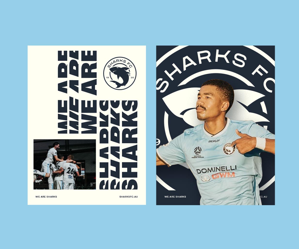
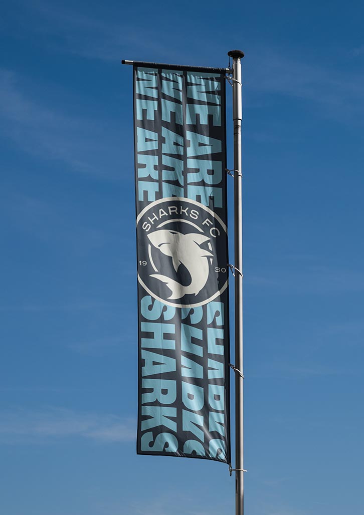
Brand Tagline — We are Sharks.
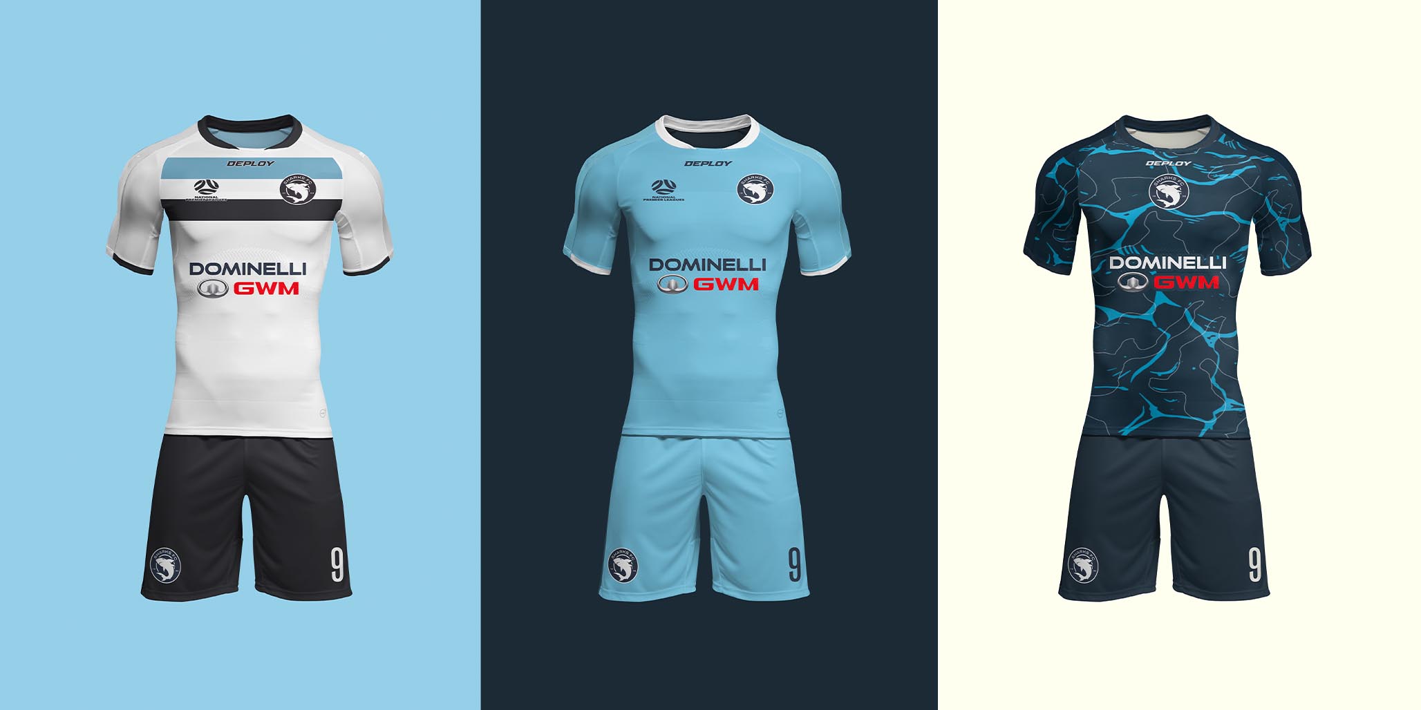
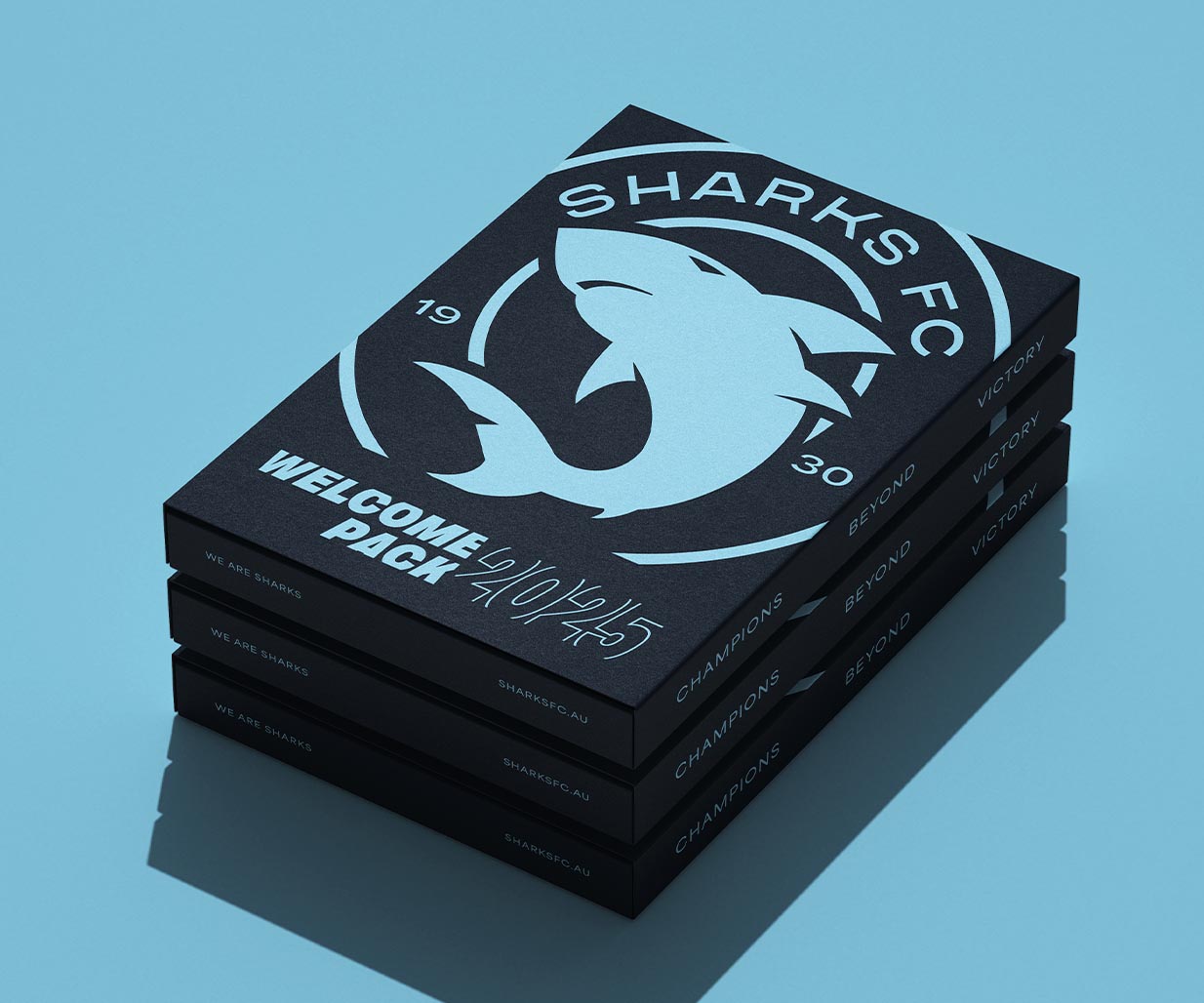
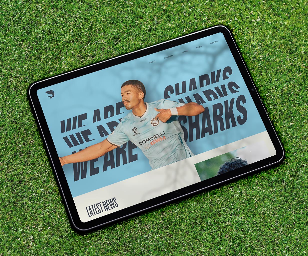
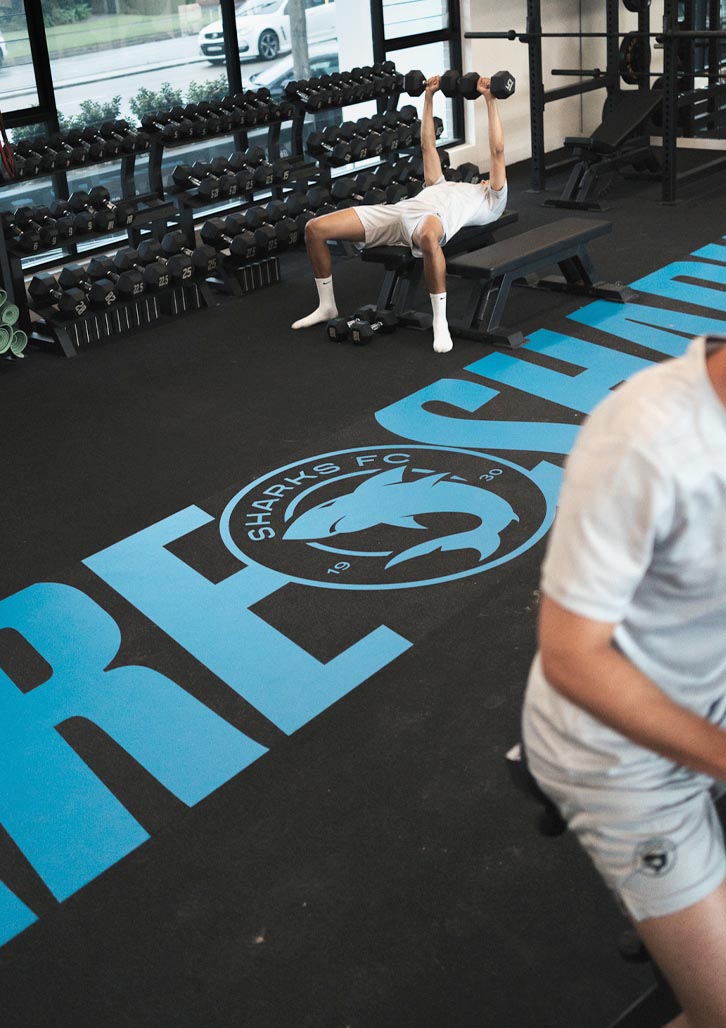
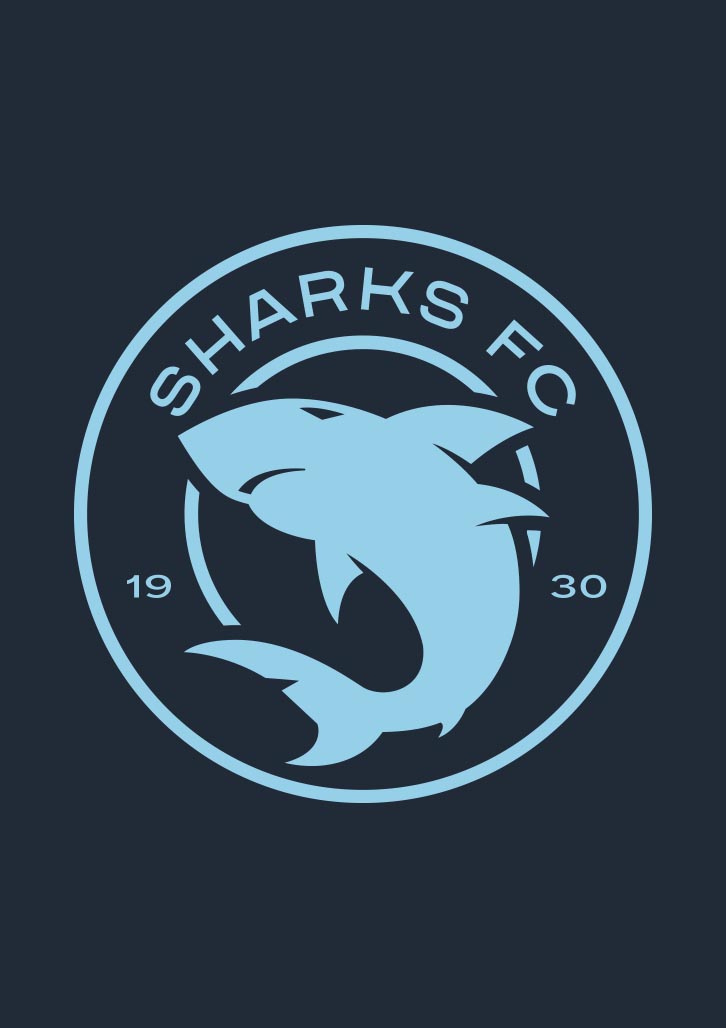
The brand identity for Sharks FC has been refined to reflect an iconic and positive future for the club. Subtle adjustments have made the shark emblem more dynamic and confident, ensuring it feels inclusive and approachable to all members of the club, regardless of gender or age.
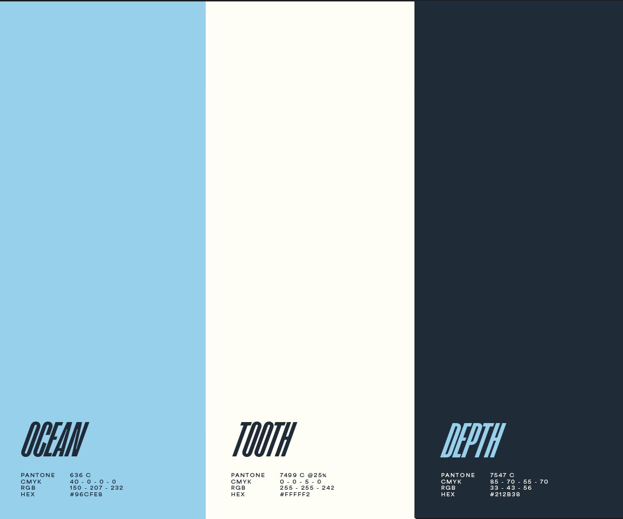
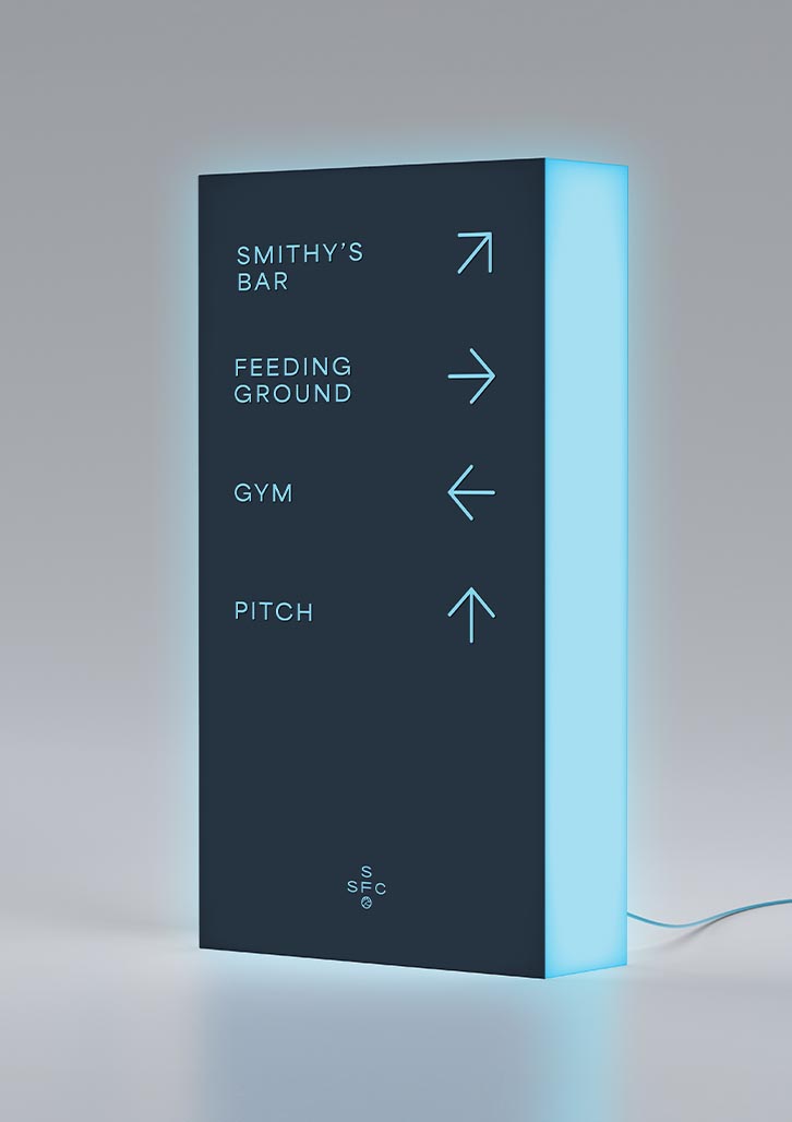
The inclusion of “1930” nods to the club’s proud heritage, bridging past and present. The primary colour palette is bold yet refined, evoking the strength of the ocean and the club’s beachside roots. Typography choices are progressive and forward-moving, designed to convey the club’s dynamic spirit.
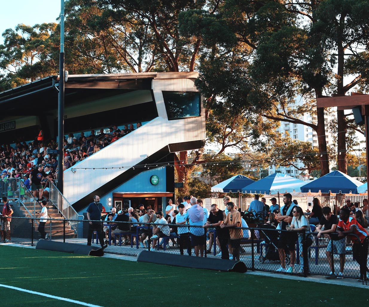
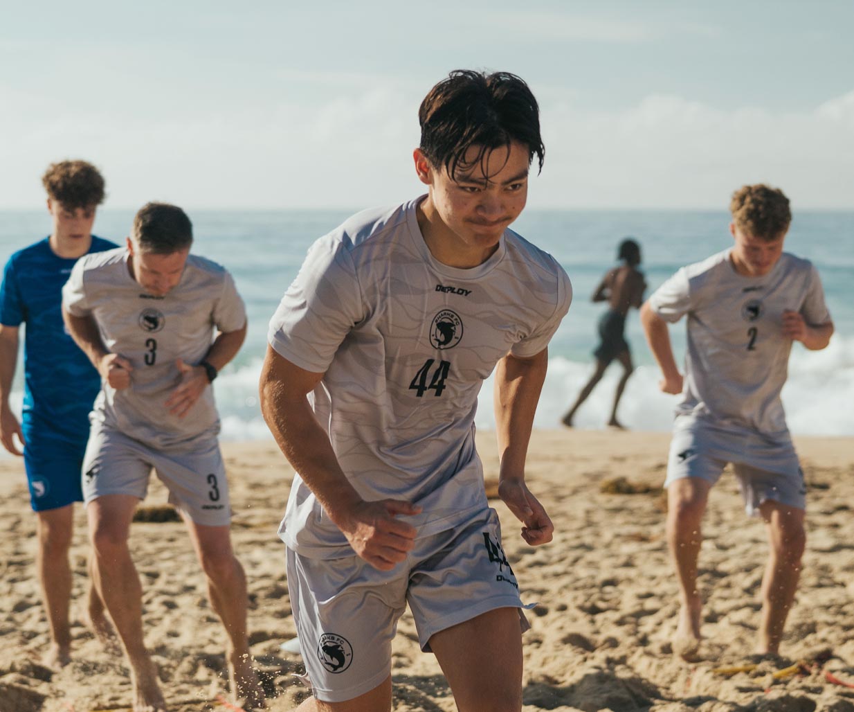
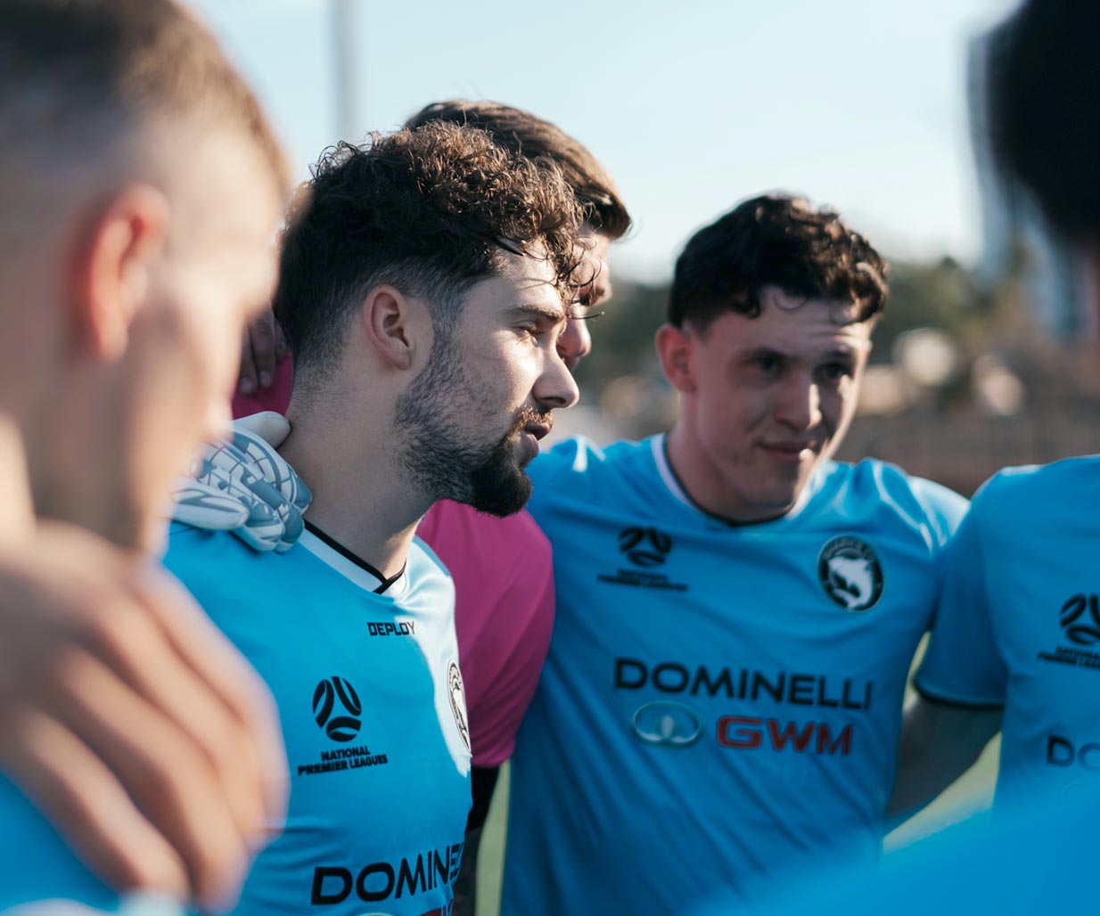
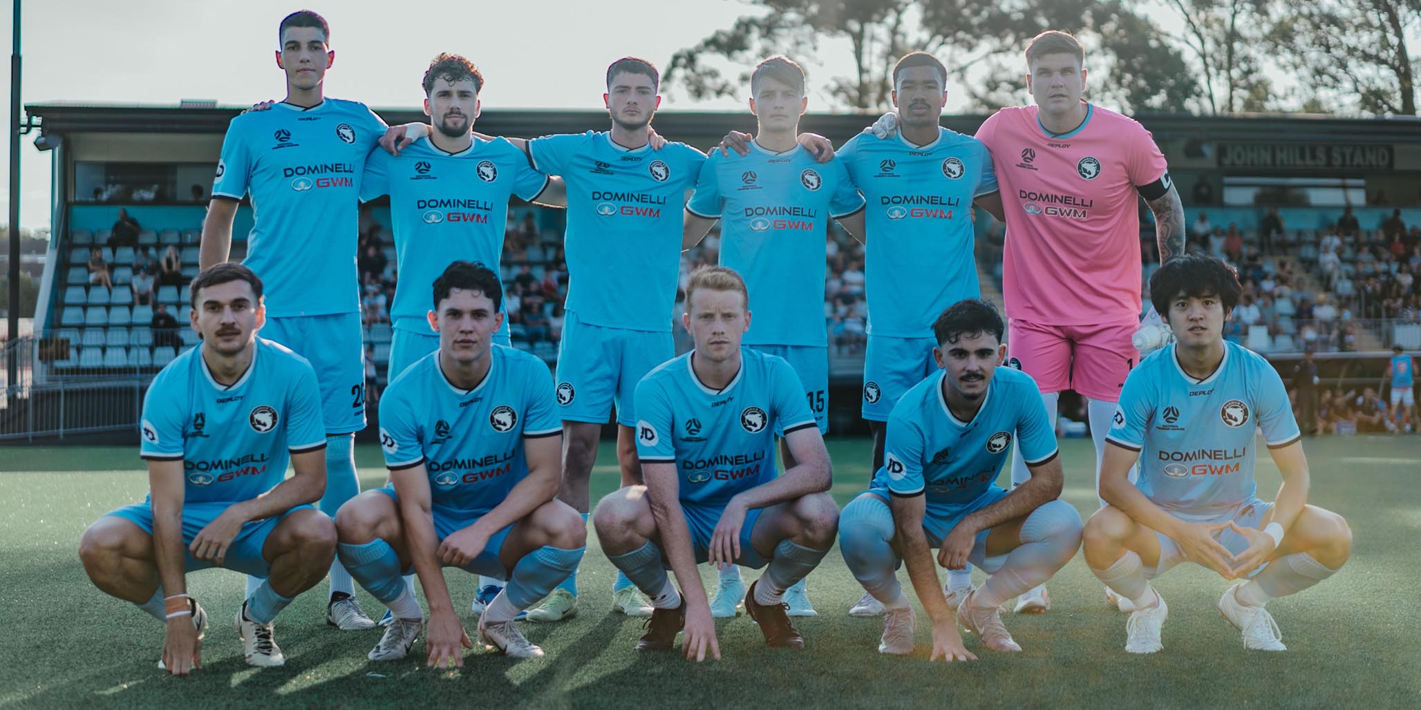
Photography focuses on capturing candid, emotional moments that celebrate the essence of teamwork, camaraderie, and the love of the game. This rebrand ensures Sharks FC remains a symbol of pride and progress in its community with their strong new brand identity.