


Brand Positioning & Brand Identity Design
The Challenge
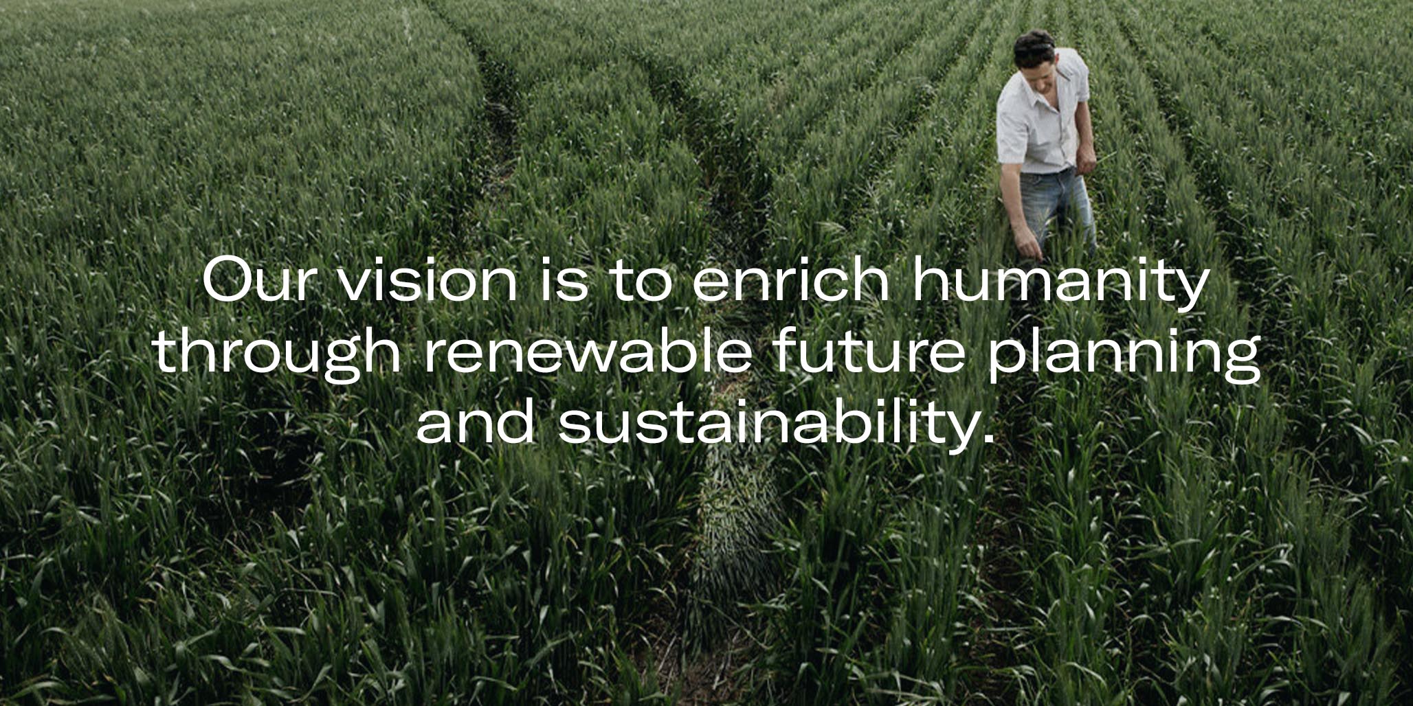
The Australian Forest Products Association (AFPA) is a long-established national organisation that is committed to bringing to life the best in forest production, regeneration and sustainability.
To coincide with their 10 year anniversary, the AFPA leadership team decided it was time to completely overhaul the existing visual identity and brand positioning. Percept developed a new brand identity that aligned with the internal values and vision of the organisation.
The primary challenge was to ensure the final solution represented each segment of the association equally and communicated effectively to the targeted audience.
The Solution
To make sure we understood each segment of the organisation thoroughly, we prepared and facilitated a digital brand workshop. We used this session to extract all necessary information to develop the brand’s positioning which included brand values, brand vision, brand story and messaging sets.
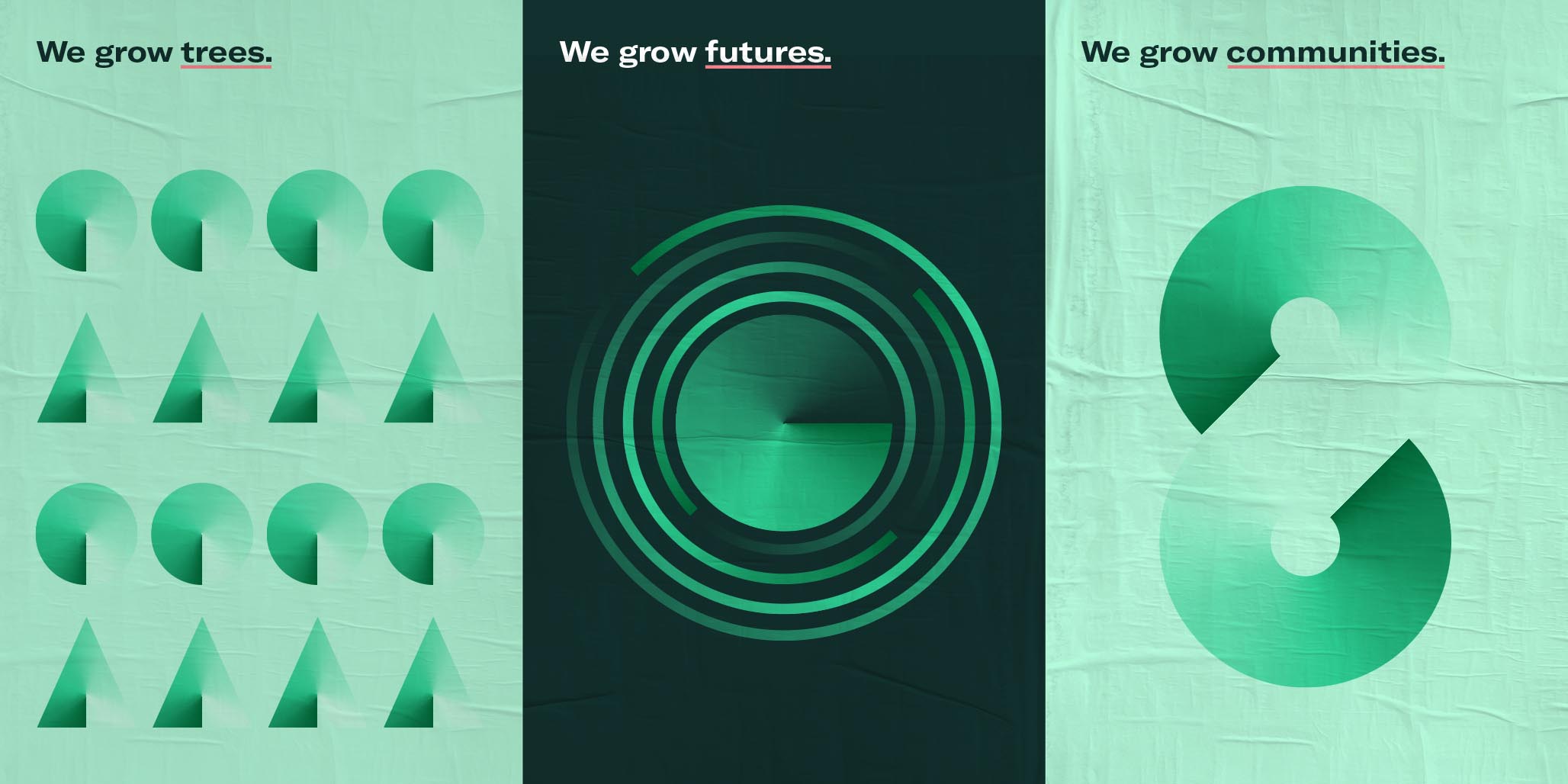
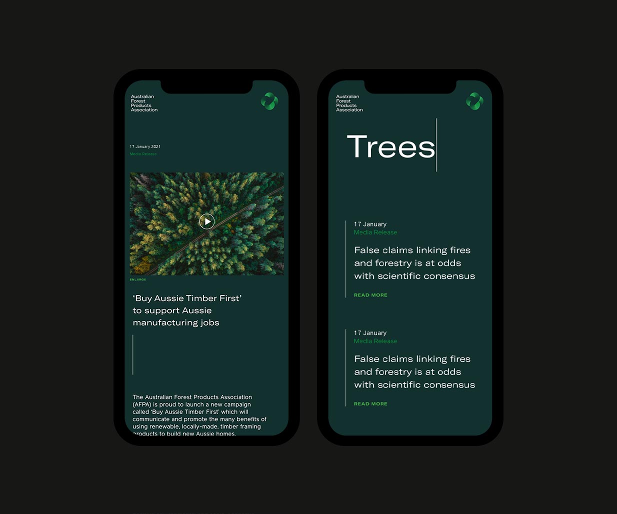
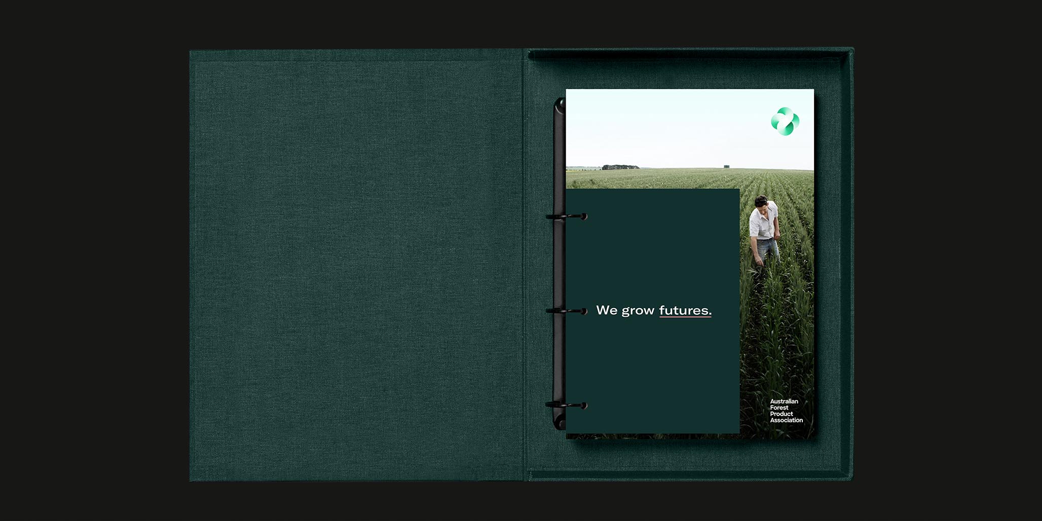
Using the brand positioning as the basis for our concept development, we created a head-turning brand identity system by introducing an ownable vibrant green gradient.
We amplified the new AFPA brand positioning through a strong constant/operator system built around the idea of “We grow…” to speak to all audience types.
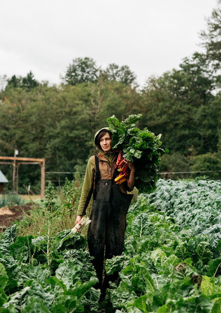
Tied together with an expansive suite of graphic devices derived from the logo mark and a set of beautifully shot images, the final solution was a holistic, well-rounded brand identity that is ready to lead AFPA into the future.