Brand Designers / Brand Strategy / Brand Architecture / Packaging Design / Brand Design
The Challenge
Aaxis Pacific engaged Sydney brand designers, Percept, for their branding and packaging design project.
They are the Oceania sales, marketing and distribution arm of Aaxis, a leading manufacturer of consumer and medical healthcare products. Aaxis Pacific found themselves with an excess of brands to maintain, with many product/brand crossovers, as well as many types of customers and channels to satisfy.
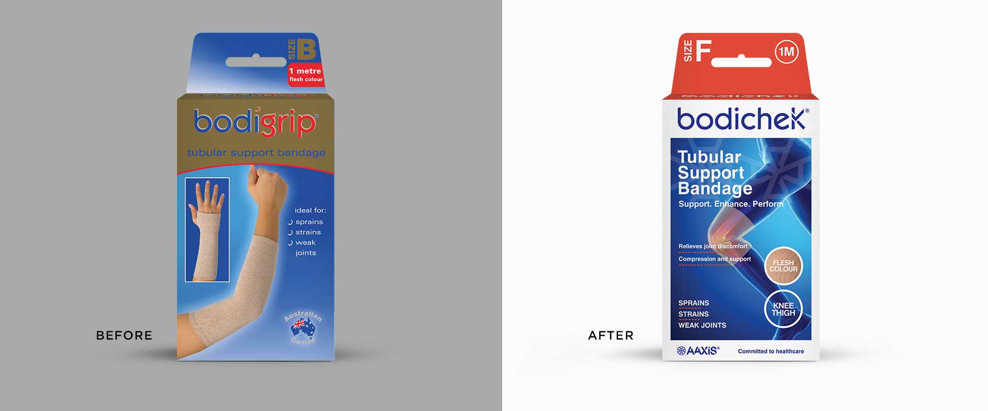
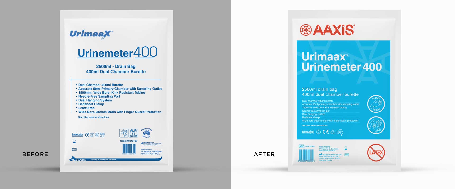
Complicated architecture in their branding, packaging design and marketing communications were making things difficult with no foundations to drive the business forward. Following the company’s decision to consolidate and reassess their future, brand designers, Percept, were engaged for this branding and packaging design project. The task was to develop a brand strategy, brand architecture and packaging design system. It was important that the new branding and packaging design separated the distinct distribution channels – medical and consumer – while keeping in line with the over-arching Aaxis brand.
The Solution
Percept are brand designers that work in collaboration with their clients, encouraging their input and expertise to achieve the best outcomes for their business.
Following the development of a solid brand strategy by Percept, including a brand story, brand positioning and brand architecture. Consideration was given to a staged launch for the branding and packaging design roll-out.
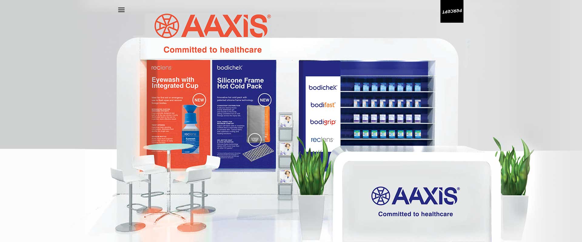
Brand designers, Percept, created a modern brand identity to reflect Aaxis’ pivotal role within the medical and healthcare industry. Utilising typography to highlight turning points and movement, a stylised ‘A’ extends and expands across all branding and packaging design as well as their marketing communications, creating an iconic visual language unique to Aaxis and its ‘DNA’.
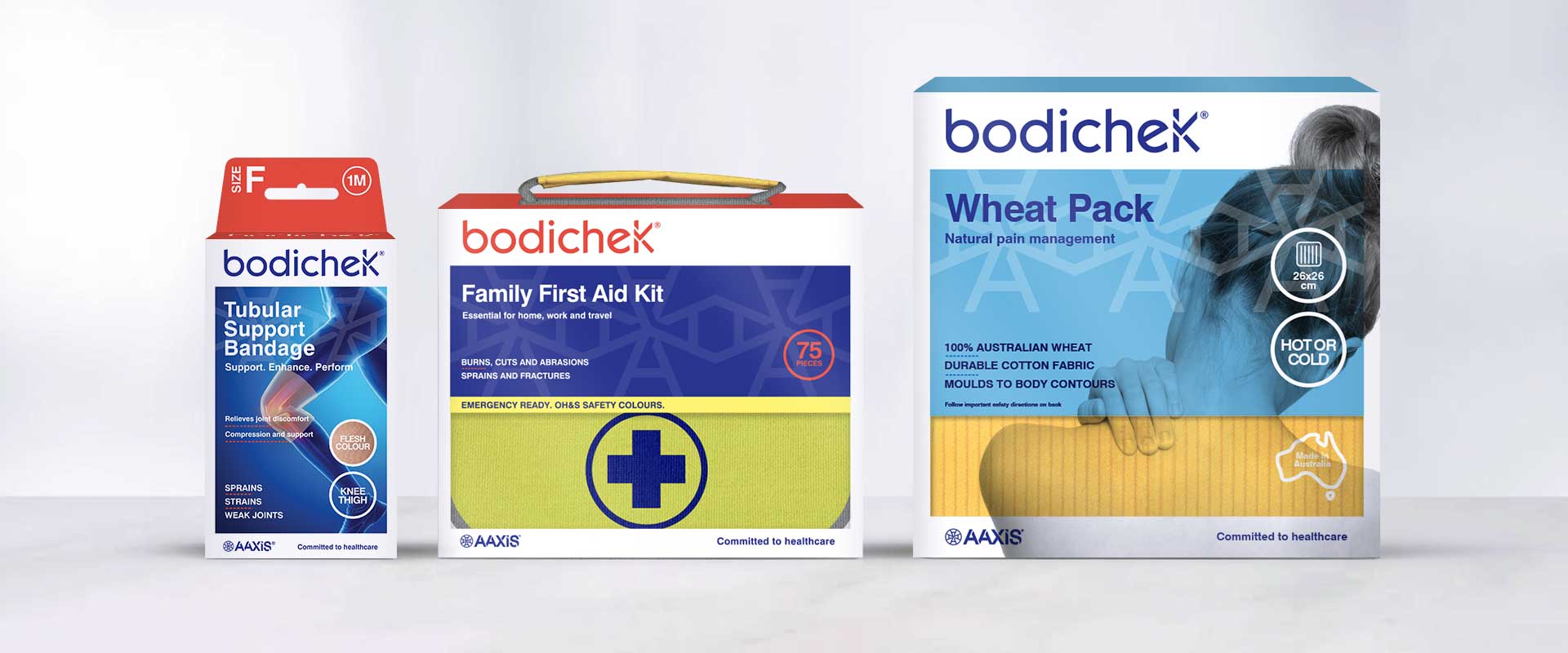
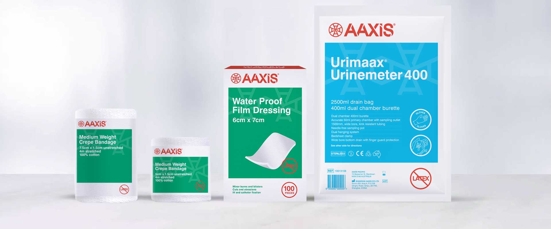
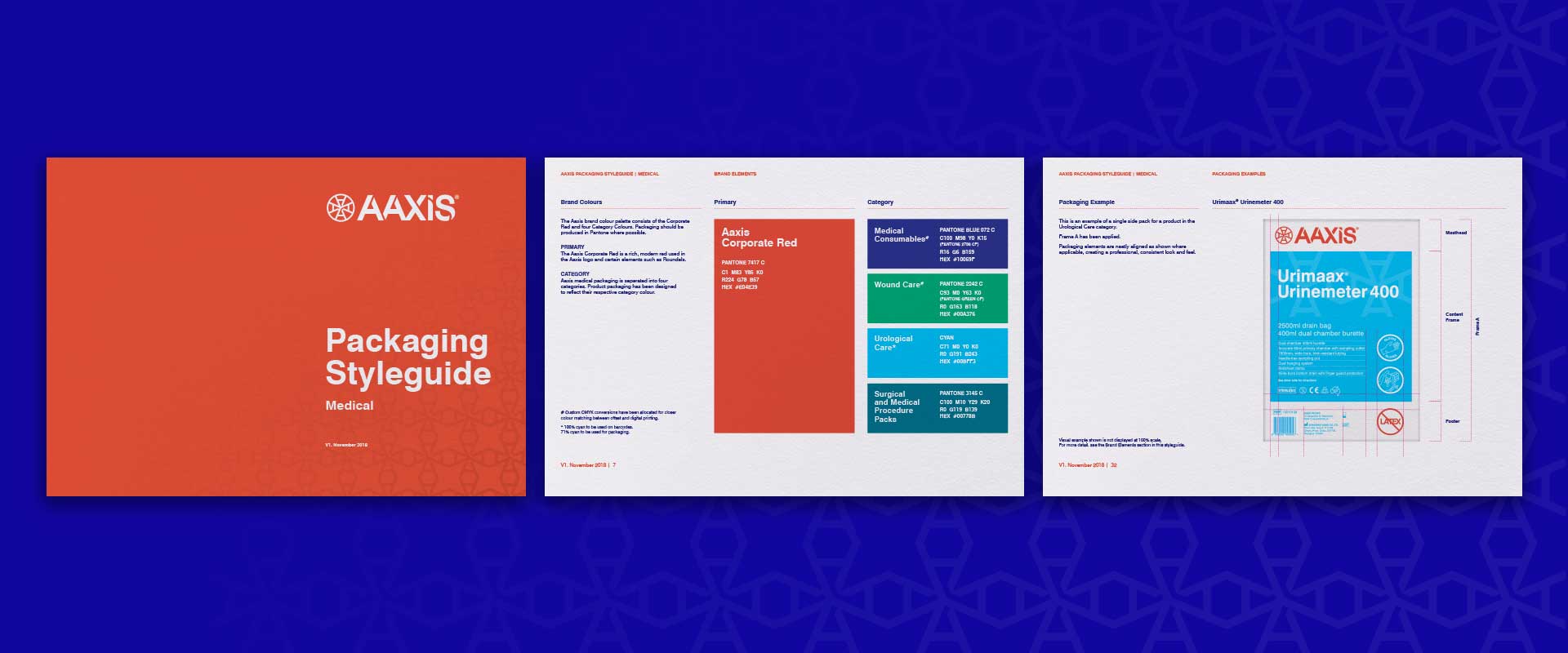
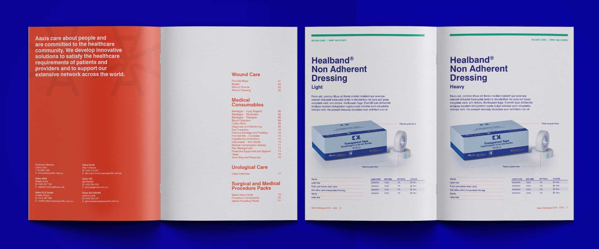
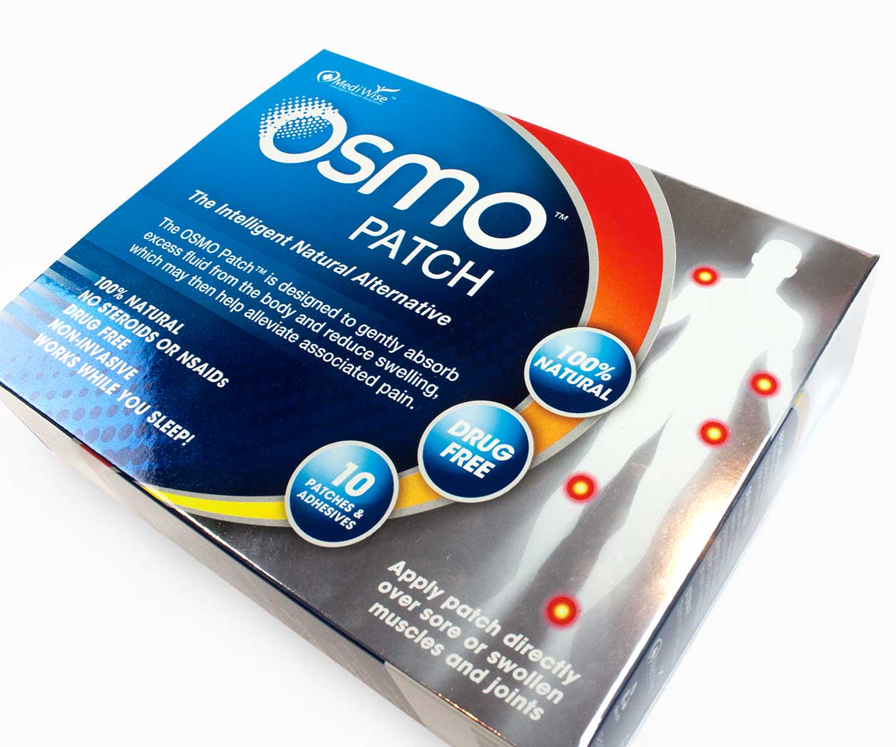
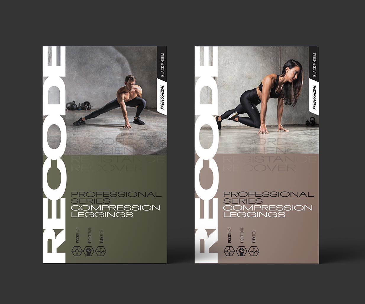
The Aaxis ‘DNA’ connects the new branding to their relaunched medical and consumer packaging design, creating a cohesive look and feel. Type hierarchy, colour blocking and pull-out devices were key in the refresh, ensuring each pack communicates well, holds its own on shelf, and keeps in line with the broader family.
If you need brand designers for a packaging design project you would like to discuss, Percept would love to help.

