
Food Packaging Design
Evolution is just a natural progression. In the world of food packaging design, a label design refresh is quite often a very effective way to stay relevant in an ever changing market.
Whilst a brand base may already be established, things can always be honed, tweaked and improved to ensure the overall design is working as hard as possible.
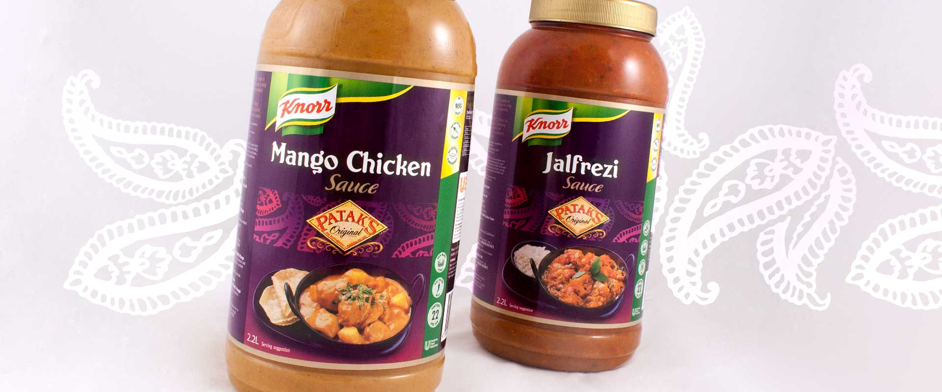
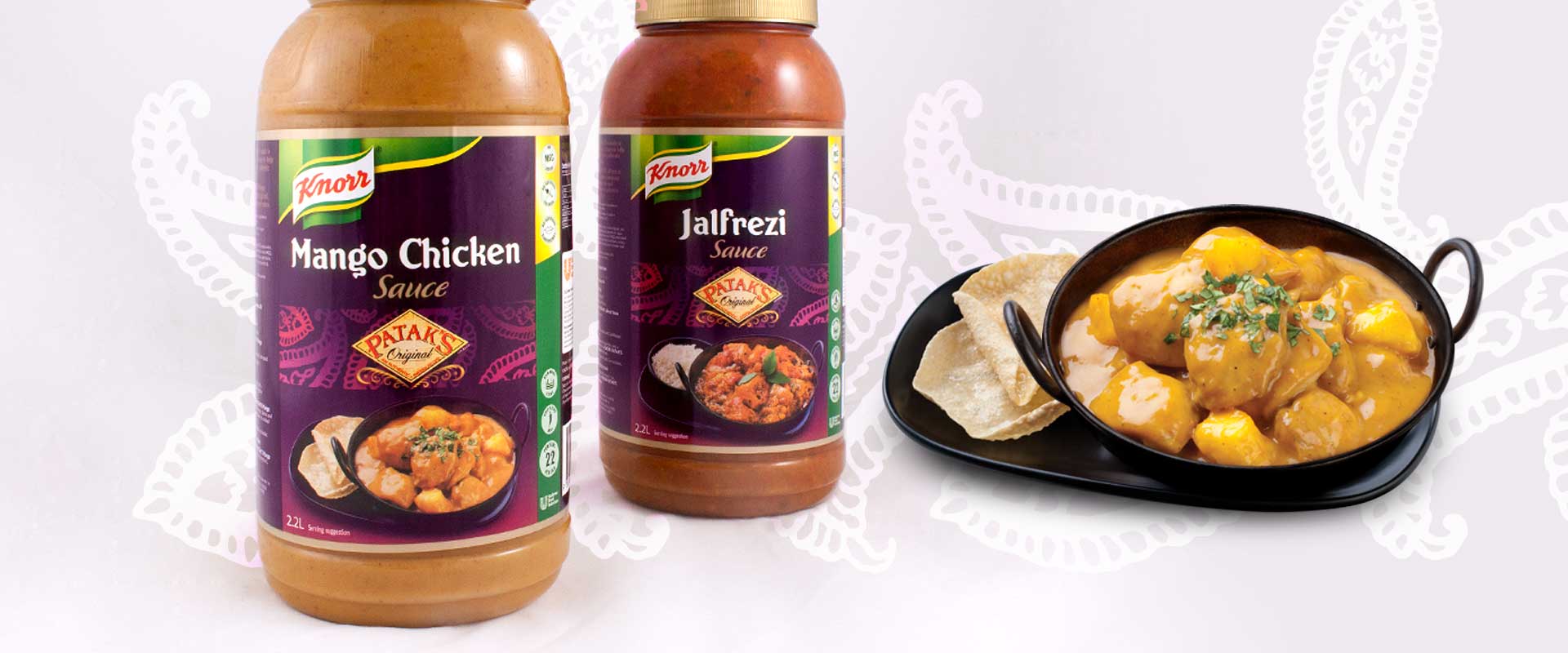
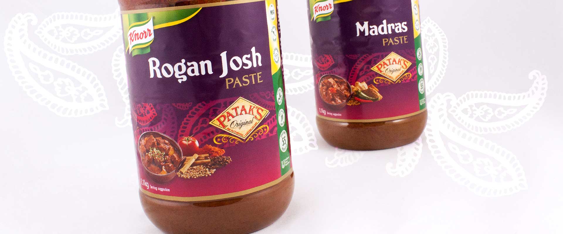
Unilever Food Solutions came to Sydney brand agency Percept to refresh the label design of their Knorr Patak’s pastes and sauces used within the professional food service market.
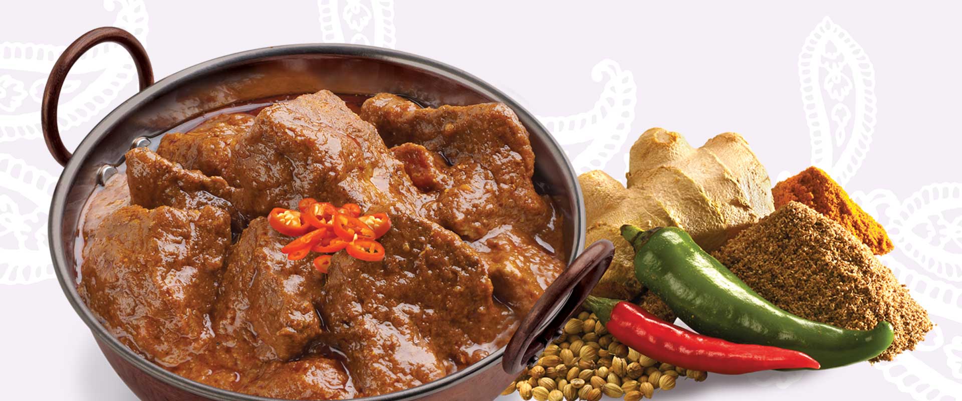
Authenticity is high on the agenda of the professional chef. Brand agency, Percept, addressed this point with typography that had an Indian flavour as well as a strip of pattern in the background that also alludes to the origin of the product on this food packaging design project.
The purple colour and Patak’s logo were already well recognised symbols on their brand labels, so these were obviously retained. How they work with the hierarchy of the Knorr motherbrand which is familiar to chefs also took some consideration.
In a practical sense, the vitality bar on the right is a quick communication tool which helps chefs with important information that is required at a glance when they are on the go. A suggestive recipe bar was also included to improve product uptake for our client and sales for its end users.
A photo shoot also took place with contemporary styling, ensuring that the food photography on the label resonated with the level of presentation a professional would expect as an end result.
Since the launch of the new food packaging design, Unilever Food Solutions inform us that they are receiving great feedback and results with the refreshed Patak’s brand labels.