Brand Creation by Packaging Designer, Percept
Discovery
Percept was hired as a packaging designer with expertise in brand creation for this product packaging design brief.
The sports nutrition category had become crowded with loud packaging design, technical claims and artificial performance cues.
While products were competing for attention, few brands reflected the mindset of athletes balancing endurance and strength, or the growing demand for clean, plant-based nutrition.
REHYBRID saw an opportunity to create something more intentional, and chose to work with packaging designer, Percept, to achieve cut-through. This product is not simply another fuel source, but a brand that champions people who move — athletes who train consistently, value transparency and care just as much about what goes into their bodies as the results they achieve.
Conceived as the foundation of a broader performance ecosystem spanning fuel, recovery and hydration, the brand creation for REHYBRID was developed to grow alongside a community of everyday competitors committed to continual improvement.
Creative Strategy
The creative strategy that design agency, Percept, came up with, strips performance nutrition back to what matters most: clean ingredients, purposeful design and complete transparency.
This thinking shapes every touchpoint, so that the brand creation reflects the discipline, focus and consistency of the athletes it serves. Whether preparing for a first HYROX event, chasing a marathon personal best or training across multiple disciplines, REHYBRID supports performance without unnecessary complexity.
Rather than speaking only to elite athletes, the brand creation and packaging design by Percept, gives a sense of belonging for everyday competitors. It balances scientific credibility with human ambition, creating a performance brand that feels aspirational, approachable and enduring.
Brand Positioning
REHYBRID exists for people who move.
It creates clean, purposeful products designed for endurance and strength, supporting athletes through every stage of training and recovery.
Built in Melbourne, REHYBRID is a premium Australian performance brand for the modern hybrid athlete — people who care equally about performance and what goes into their bodies.
Because performance isn’t just measured by effort, it’s determined by the energy absorbed.
Packaging Design
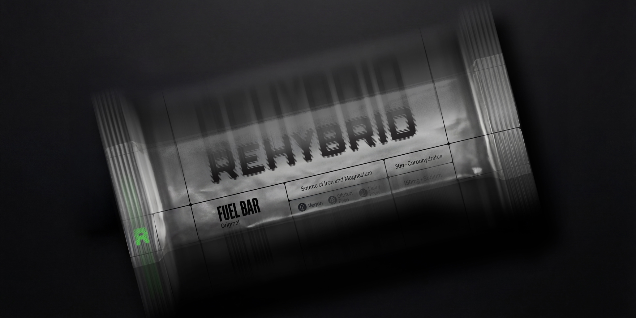
The brand creation by packaging designer, Percept, captures the rhythm and momentum of movement.
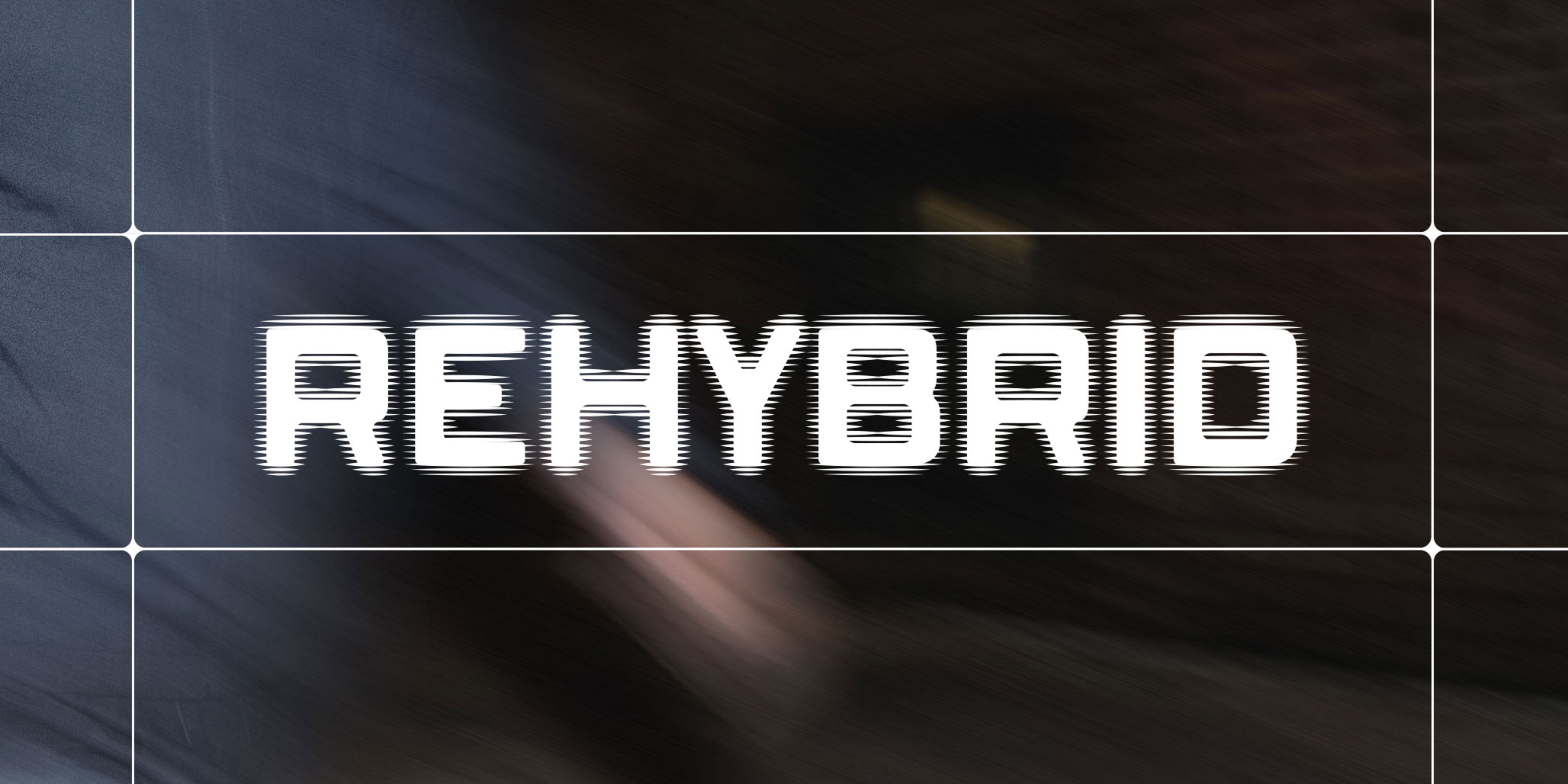
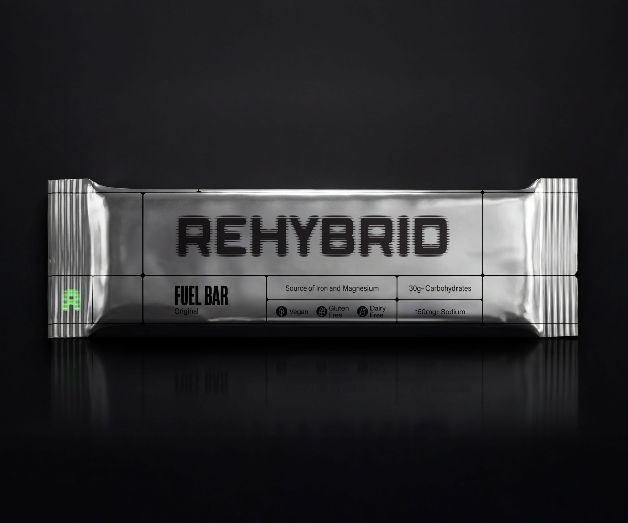
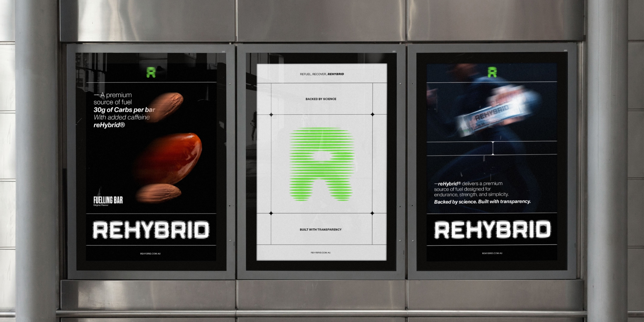
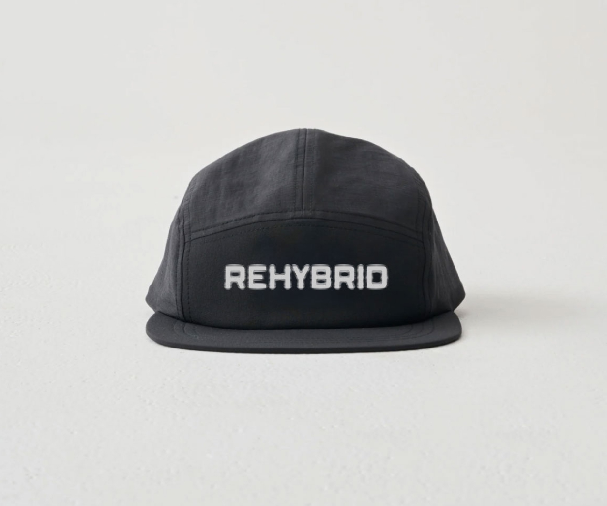
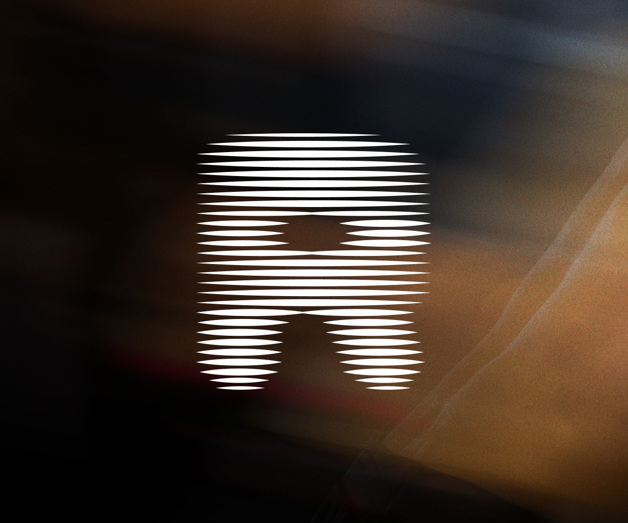
A distinctive scanimation-inspired wordmark creates a constant sense of progression, reflecting the continuous cycle of training, recovery and improvement.
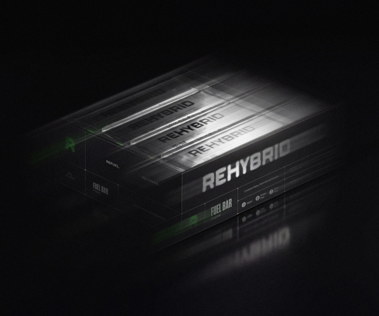
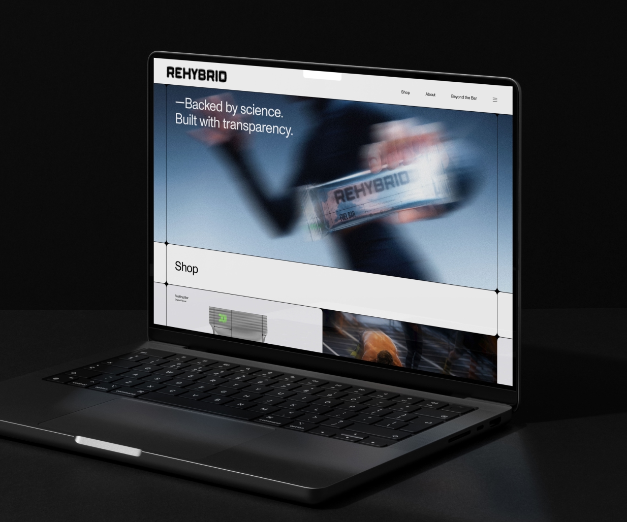
Design agency, Percept, created a disciplined grid system that reinforces precision while providing a scalable framework across all branding, packaging design, digital design and brand communications.
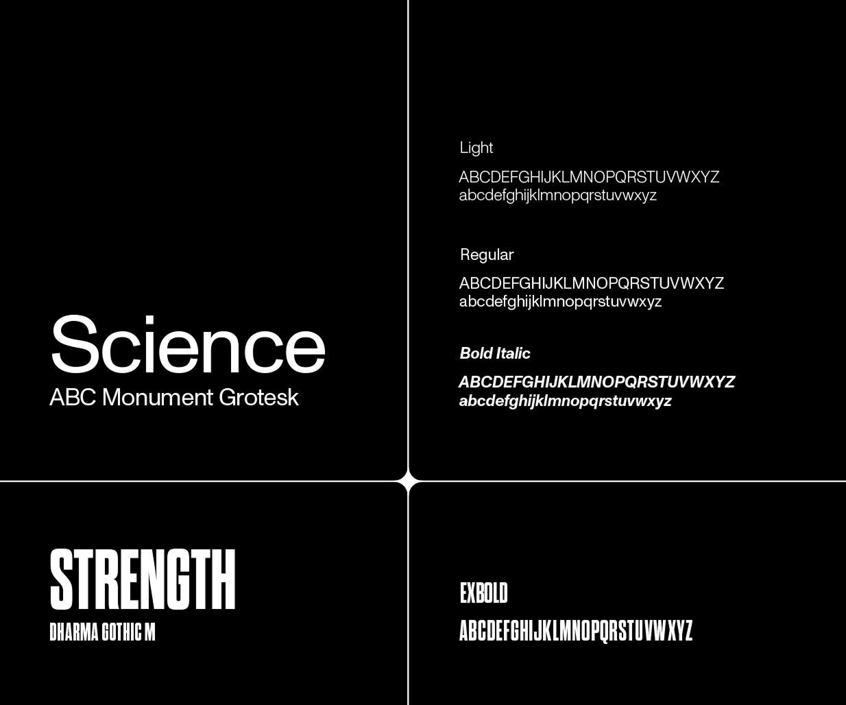
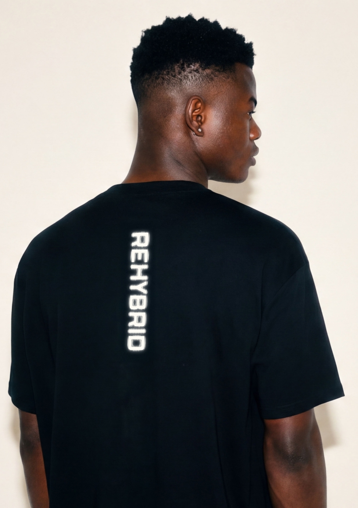
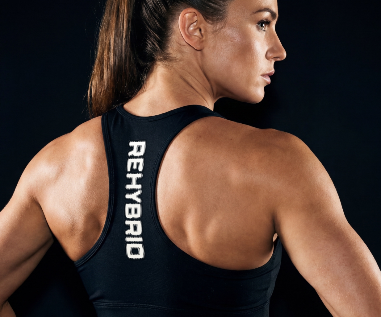
A restrained palette of black, white and chrome establishes a premium foundation, punctuated by fluorescent accents that inject energy without compromising simplicity. The result of the brand creation feels technical, confident and unmistakably recognisable.
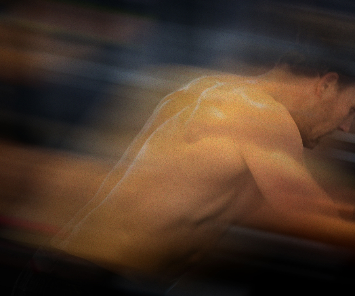
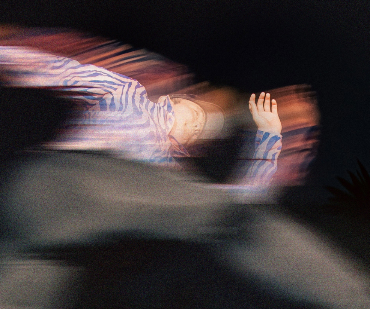
A distinctive photography style embraces movement over perfection. Motion blur, raw training moments and honest product interactions celebrate effort as it happens, connecting the brand with the lived experience of hybrid athletes.
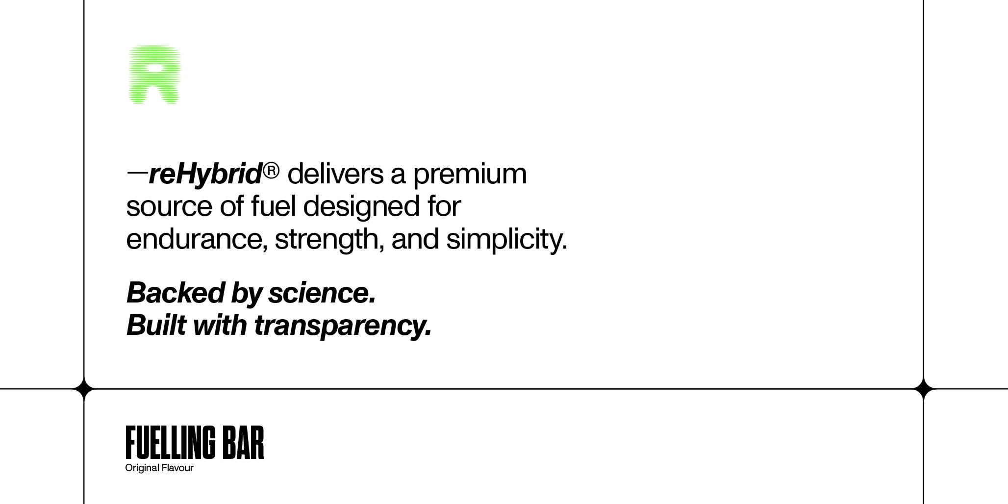
Messaging such as ‘Backed by Science. Built with Transparency.’ reinforces REHYBRID’s commitment to ingredient integrity and functional performance.
From packaging design through to creative brand communications, every element is designed to move with the athlete. The result that packaging designer, Percept, created is a cohesive branding system that performs with the same discipline, clarity and intent as the community it was built to serve.