Digital Design / Website / Graphic Design / Ads / Brand Manual
The Challenge
Established in July 2016, Worth Property Investing is a research based, buyer’s agency that looks at property markets throughout Australia. The company searches for the best investment properties for its clients to maximise their returns. Since launching, the company had released 20,000 mailbox ads, magazine advertising and a website with little to no callbacks.
It was at this point that the company reached out to branding company, Percept, for creative assistance with refreshing their digital design, including website design as well as the graphic design for their brand communications. It was important that all branding, advertising and marketing communications would appeal to both local and interstate investors who are time poor, don’t know where to start, or don’t have the confidence or network of contacts to support their decision-making.
The Solution
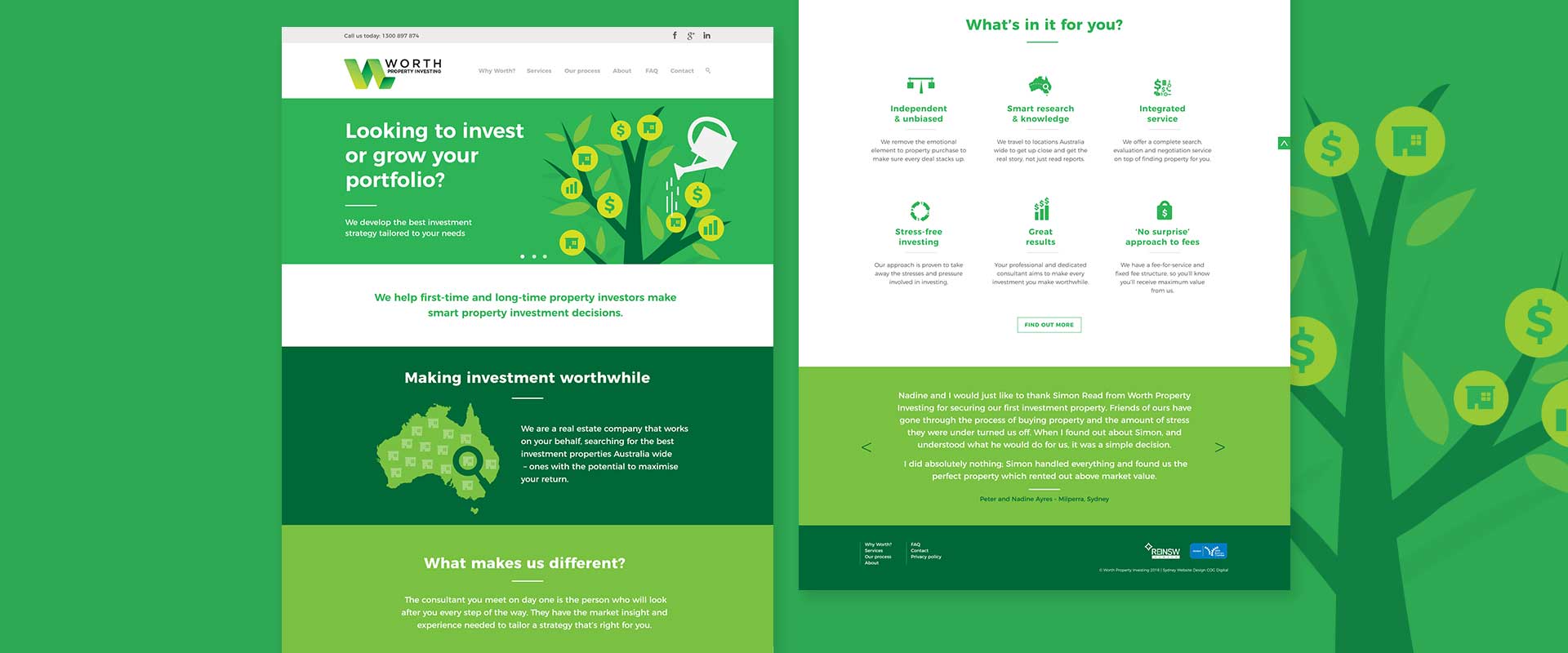
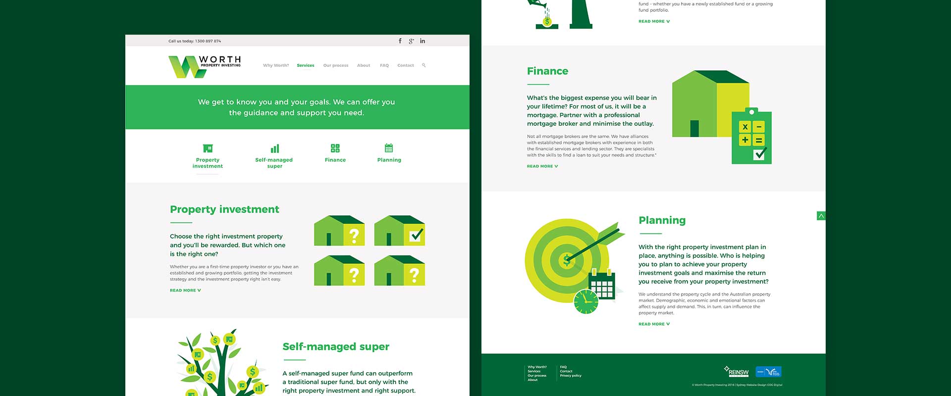
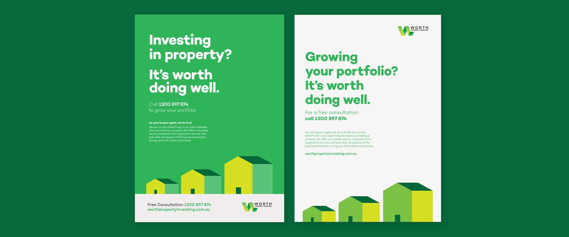
Following a branding workshop with the client, digital design agency, Percept, identified issues with the style of the current brand communications and company website design. In fact, across all digital design touch-points, there was a lack of consistency and decisive personality. Percept initially designed a creative advertising campaign that would appear in an exhibitors magazine for a trade show. Punchy, bold, headlines and a conceptual graphic design approach was used to clearly communicate their offering whilst giving their branding more personality and setting the company apart from its competitors.
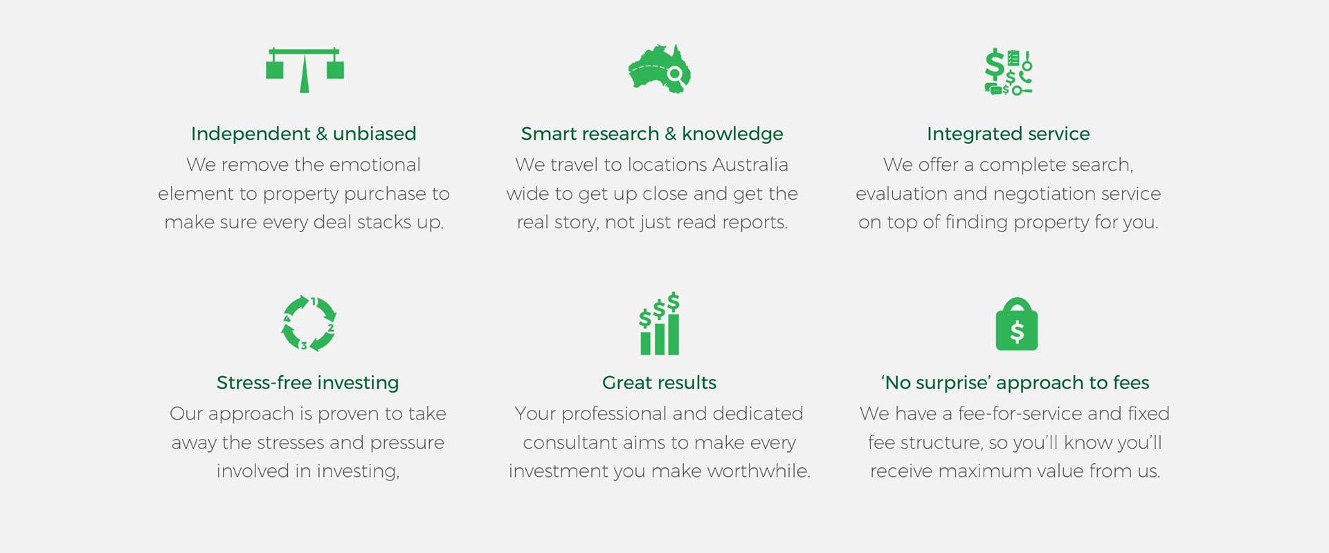
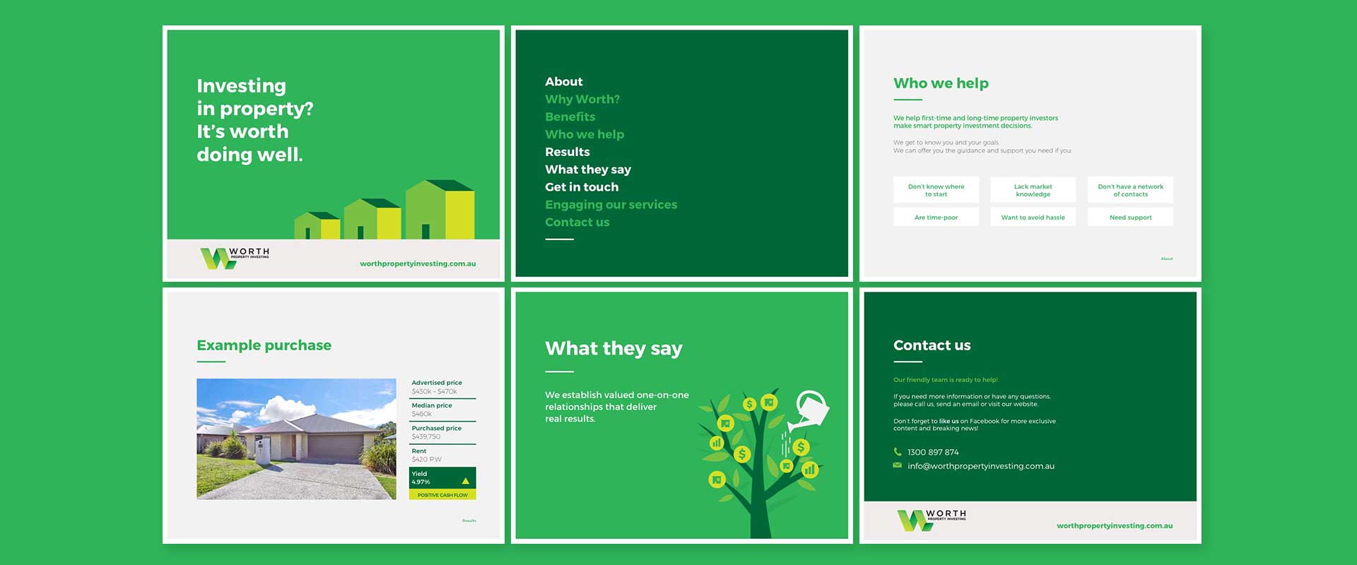
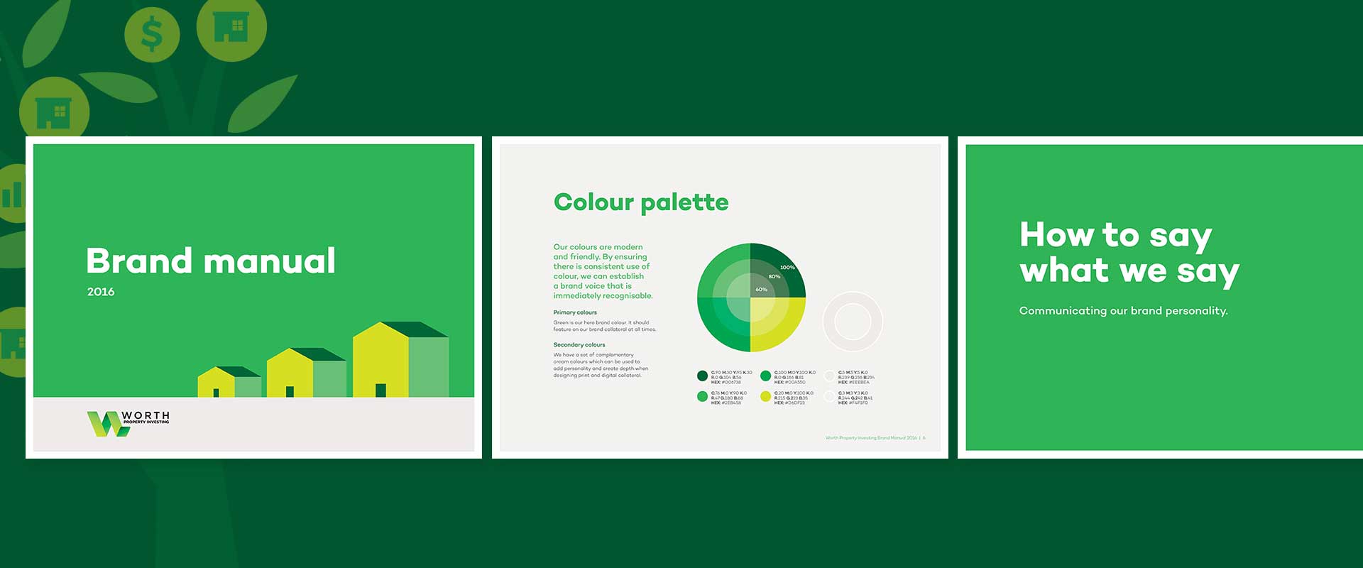
After the advertising campaign, a company presentation, new website design and digital design style were also developed. Branding company Percept worked on the creative copywriting to ensure the new website design projected the correct tone of voice and presented succinct information in an easily digestible manner. Further to this, a brand manual and set of infographics were created as a solution to reposition their branding and set a new look for their digital design based off the new ads, website design and graphic style that had been established.
