Packaging Designer
The Challenge
Packaging designer, Percept, was approached by this food product manufacturing client with a packaging design brief.
Eclipse Organics is a high quality, family owned, hand made product. Their consumers trust the Eclipse Organics brand and expect a high quality product.
After sharing their packaging design brief with select agencies, the client engaged Sydney packaging designer, Percept, with the aim of creating a new look that was clean, fresh and modern, while reflecting the values of the brand. Eclipse felt their muesli and granola products looked amazing, yet the old packaging design did not live up to this.
The existing labels were not placed appropriately in relation to the product, and due to settling the pack sometimes appeared a little empty at point of sale, which was misleading as the full portion of this beautiful looking product was just being obstructed. They wanted their new packaging designer, Percept, to fix this problem.
The Solution
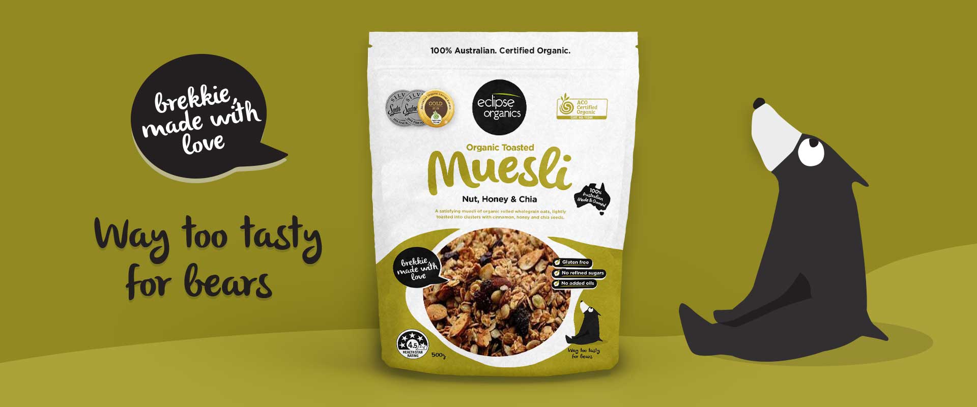
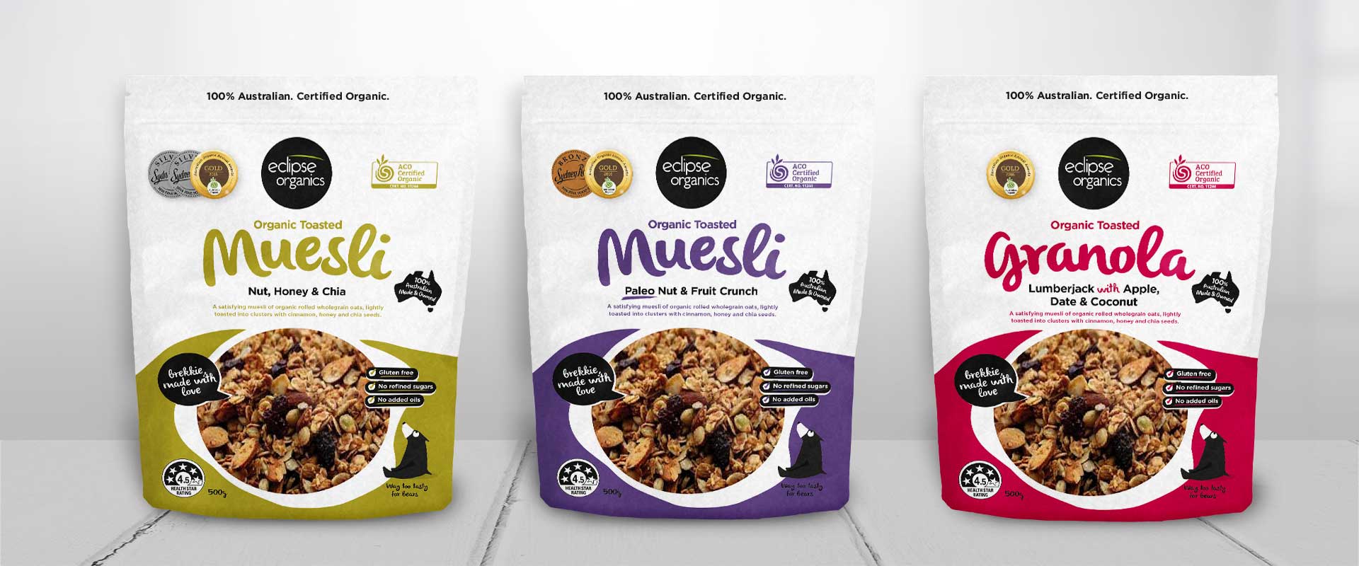
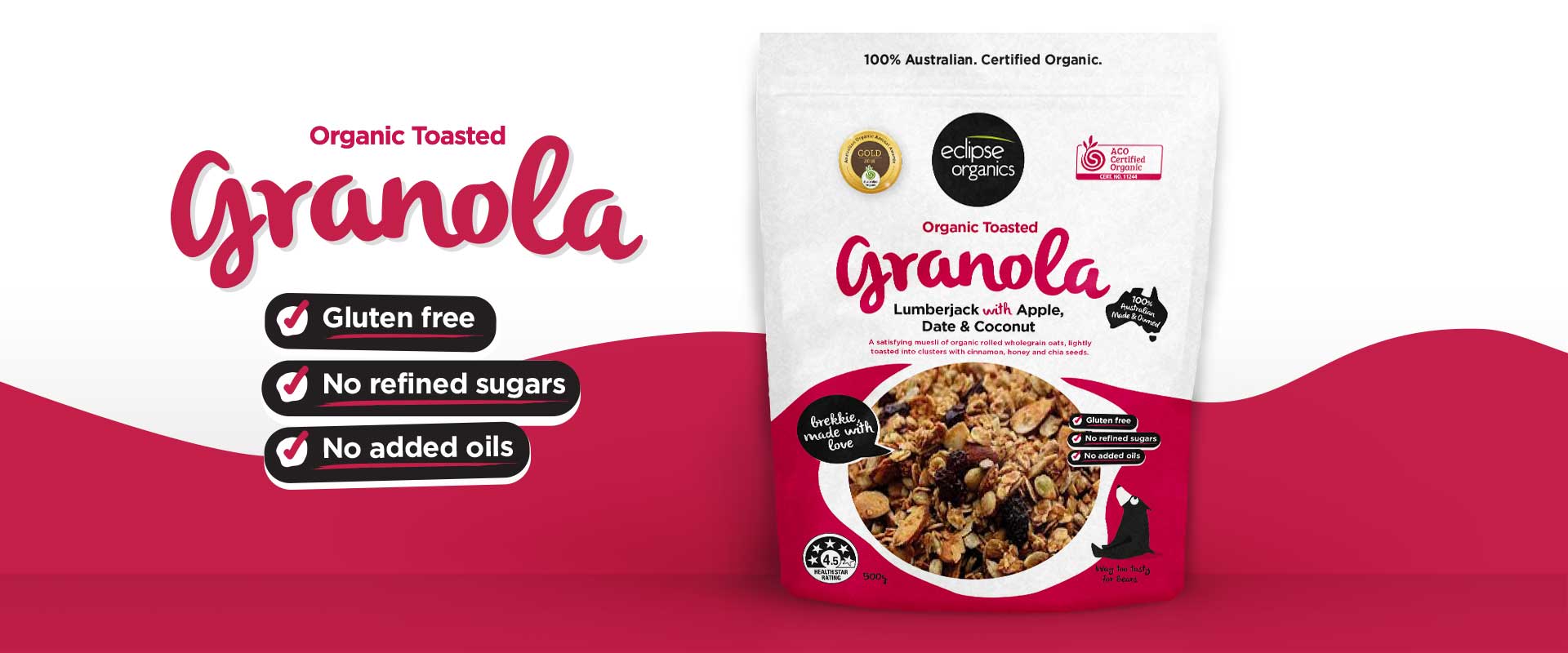
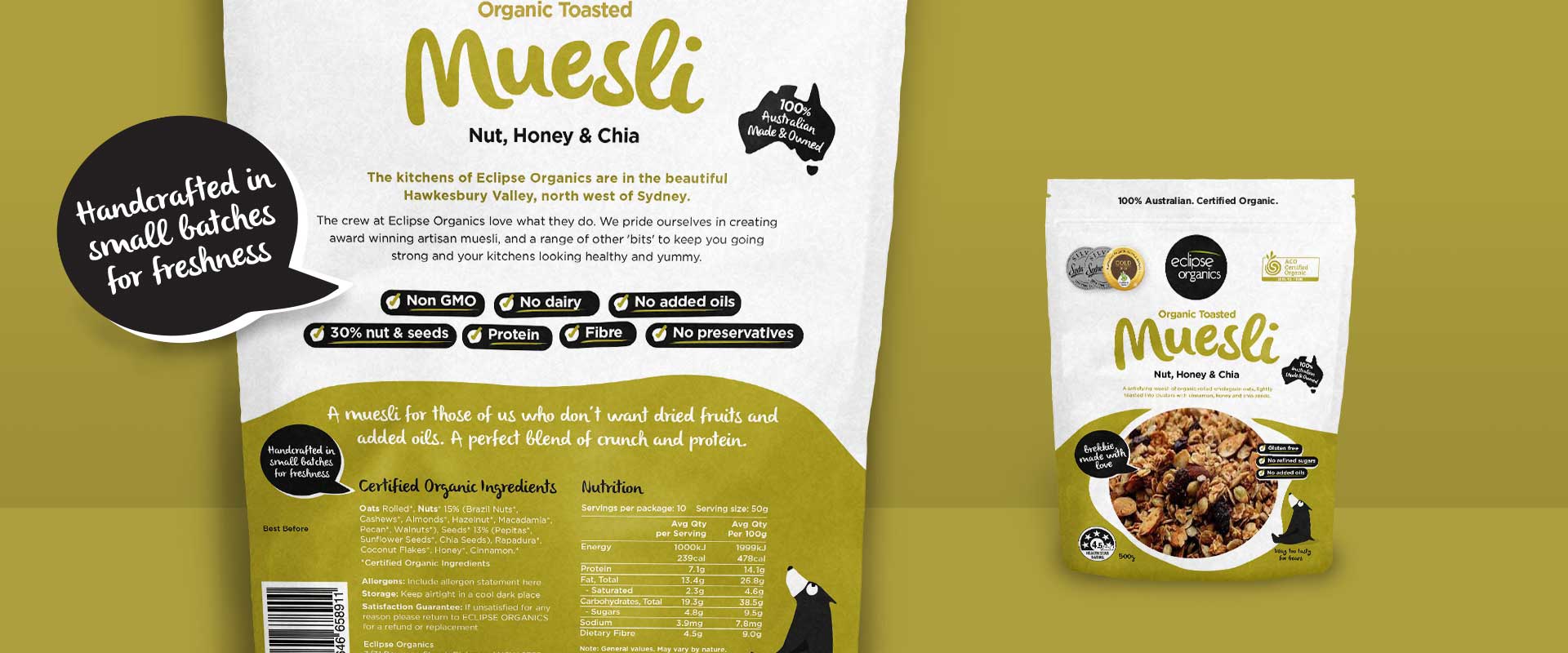
To resolve this issue, Sydney packaging designer, Percept, created altogether new packaging design for these natural food products that covered the top of the pack, allowing the organic product to be seen through a window positioned lower on the front face. The entire range was taken into consideration in terms of colour differentiation, ensuring each flavour was easily distinguished by consumers.
Inspired by the organic nature of the natural product and the feel of the user-friendly website, a similar approach was incorporated into the packaging design with hand drawn elements paying respect to the ‘handmade’ nature of the business. Important claims were highlighted with the messaging featuring strongly in order to appeal to the health conscious consumer.
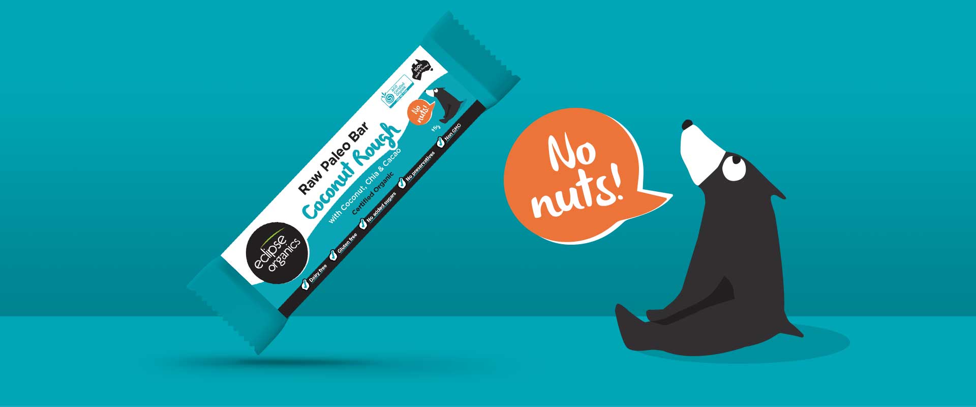
The bear from the previous packaging design was incorporated into the new design, and it provides a playful feel for the brand. Overall, Percept, the packaging designer wanted the simplicity of the packaging design to provide the shelf shout, allowing the natural product to be the hero, which makes Eclipse Organics stand-out in comparison to the text-heavy and cluttered competitor designs.
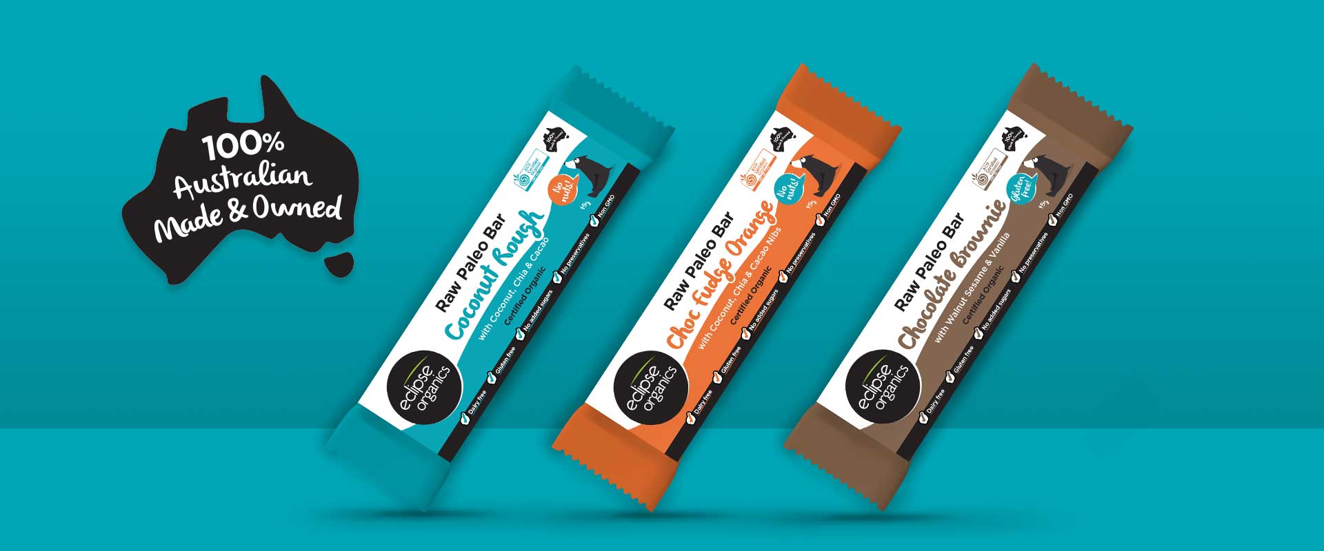
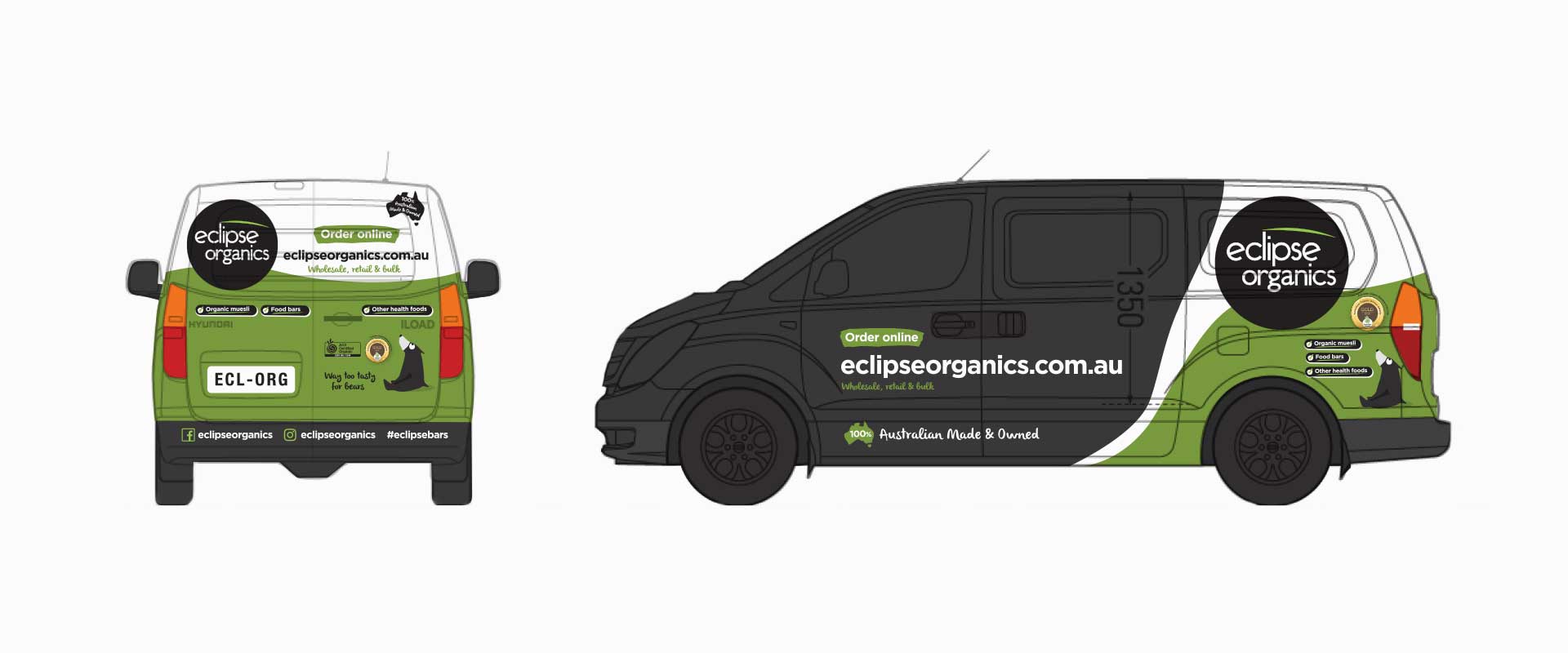
Since the launch of the packaging design, the range has also extended to include snack bars and we also designed graphics for the brand’s vehicle livery.
With the new packaging design now on shelf, Eclipse Organics have been delighted to announce a 25% jump in sales within two months of the new packaging design implementation by their packaging designer, Percept, and they continue to see substantial growth.
