
Adaptive Packaging Design & Artwork
The Challenge
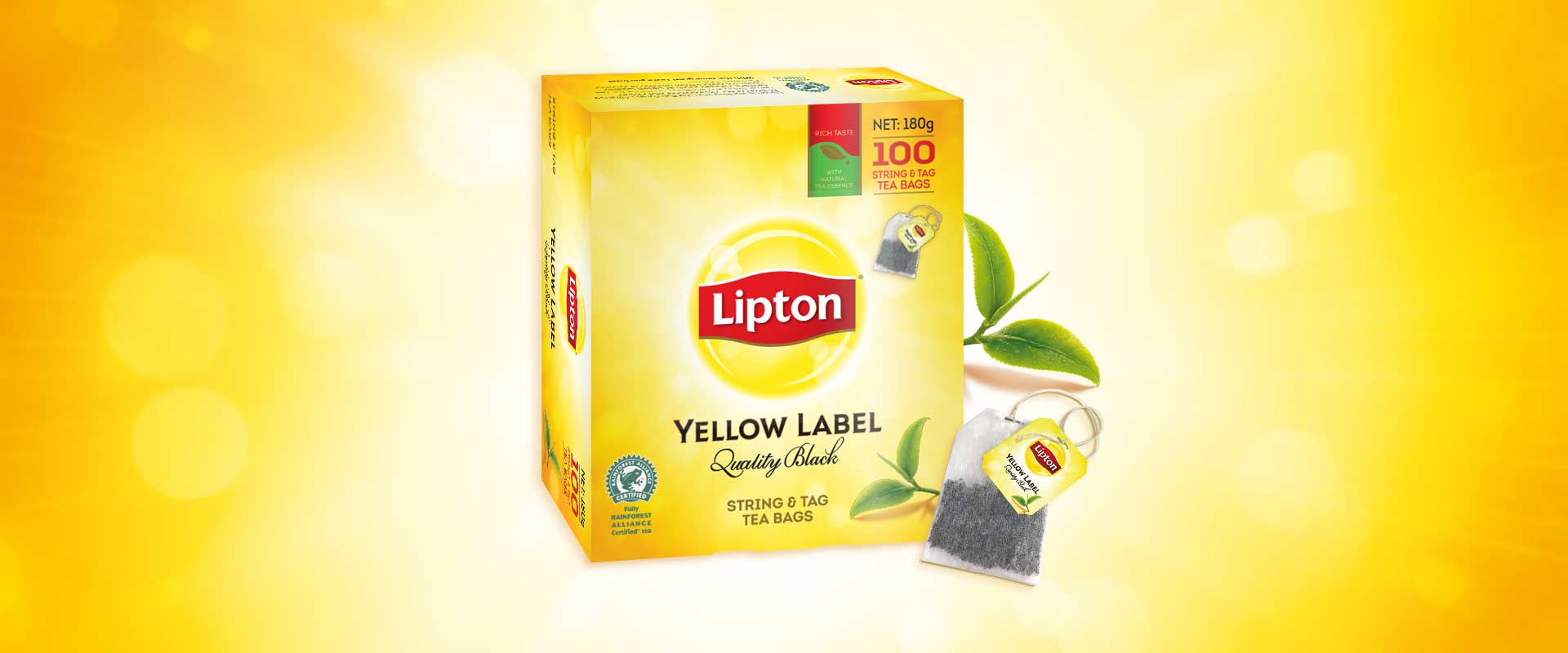
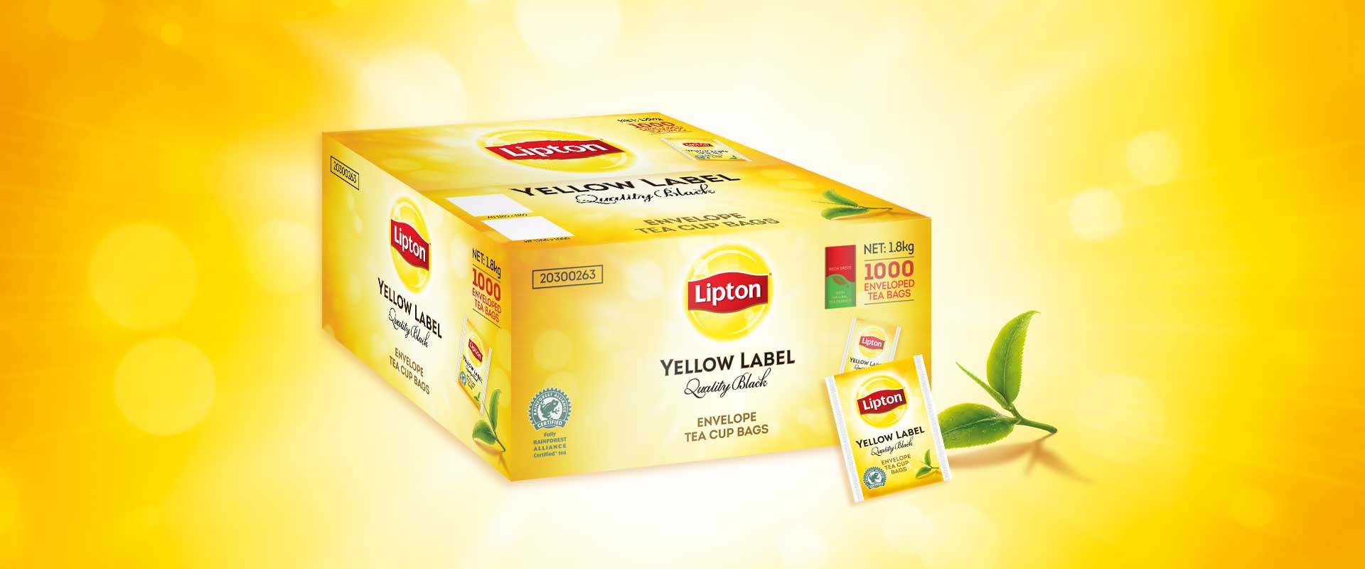
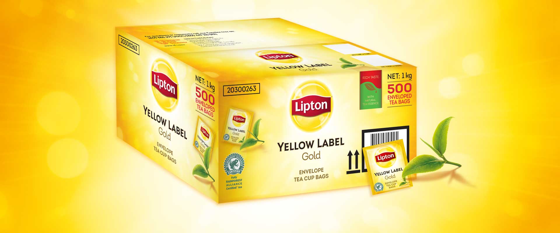
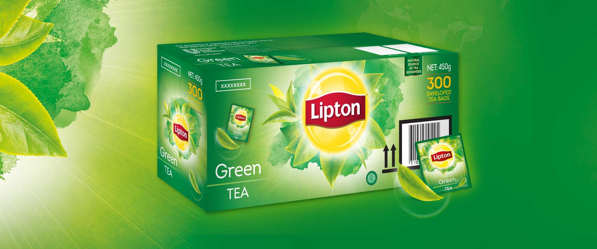
This adaptive packaging design and artwork project was to take the established design for Lipton Yellow that existed globally and develop new adaptive packaging design and artwork for B2B food service clients in the Asia Pacific region. Channels included workplace, hotel, cafe, restaurant, pubs and clubs.
This existing design (created by another design agency in the UK) for this iconic brand connects with the target audience as a ‘favourite’, so the adaptive packaging design and artwork task we were given, was to use these established assets and update the food service range of products to leverage the good reputation of the retail brand.
The Solution
After assessing all brand elements across Lipton Yellow Label Quality Black, Lipton Yellow Label Gold and Lipton Yellow Label Green, that we were provided with, Percept simply built new packaging artwork. We used the existing brand elements as they are so well recognised in their retail counterparts.
We then constructed artwork, with clear hierarchy across all packaging SKUs, so they adhered to brand guidelines, which firmly linked these products to their retail counterparts, whilst satisfying food service practicalities.
It was also important to evaluate the outer cartons and shippers, as these cartons are a key element of the brand’s visibility in the unique food service environment.
The adaptive packaging design and artwork was implemented across envelopes, string tags, inner cartons, outer cartons, shippers and tea pot bags for all flavour variants.