Parallax Website Design by Branding Design Agency, Percept
The Challenge
ORDR approached Sydney branding design company Percept for a parallax website design. It needed to be both informative and engaging for potential customers and venues alike with the aim of educating these audiences about the benefits of their app.
ORDR is a point of sale app created to streamline ordering of food and drinks in the hospitality sector. This new app gives both customers and venues a seamless and efficient experience, without customers having to leave their seats.
The Solution
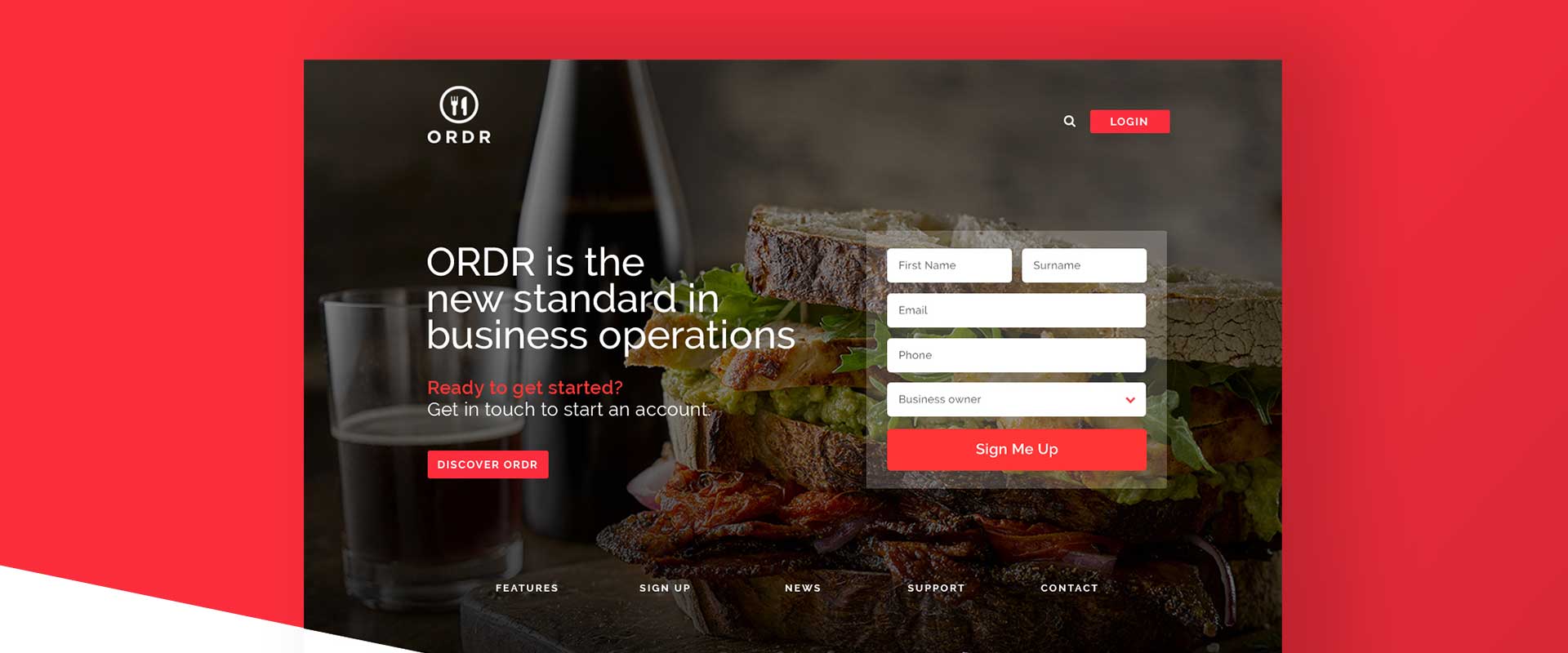
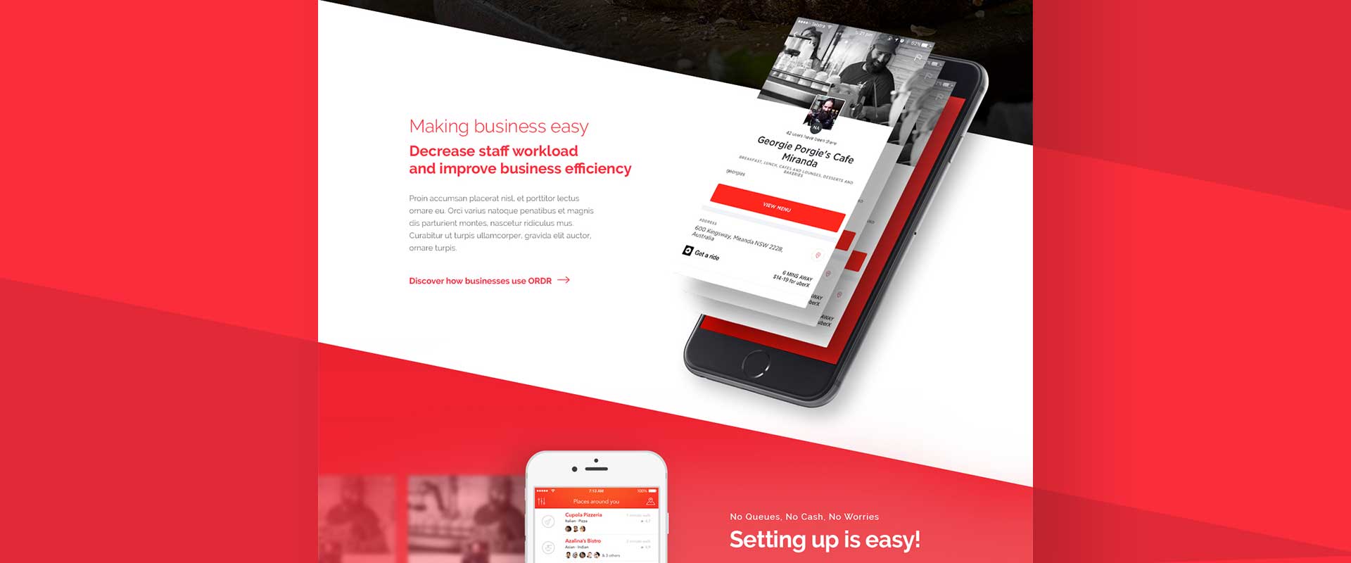
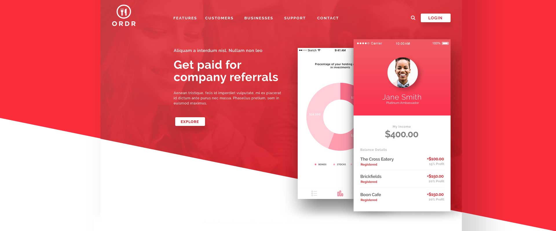
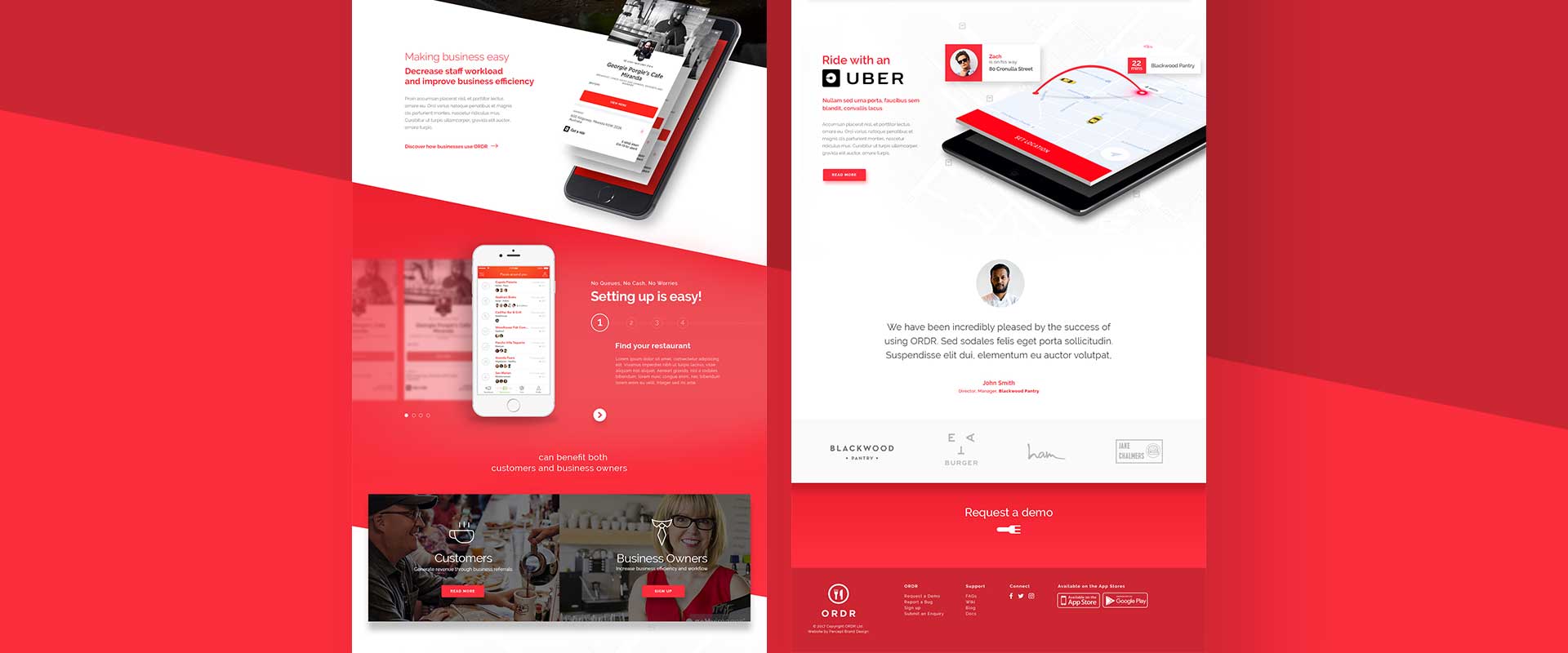
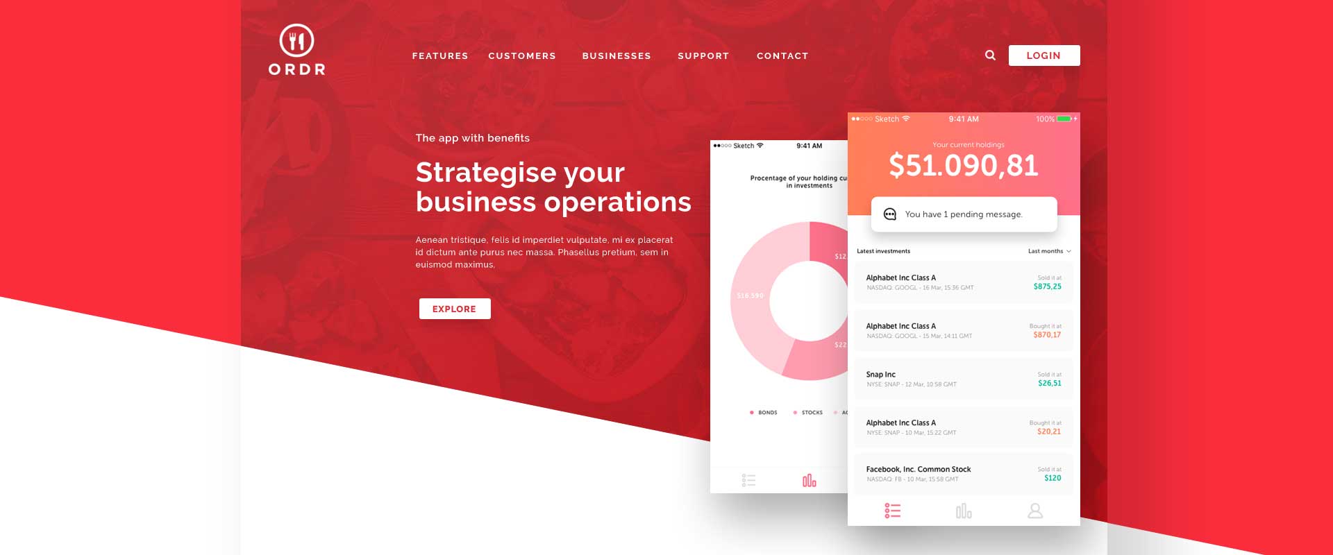
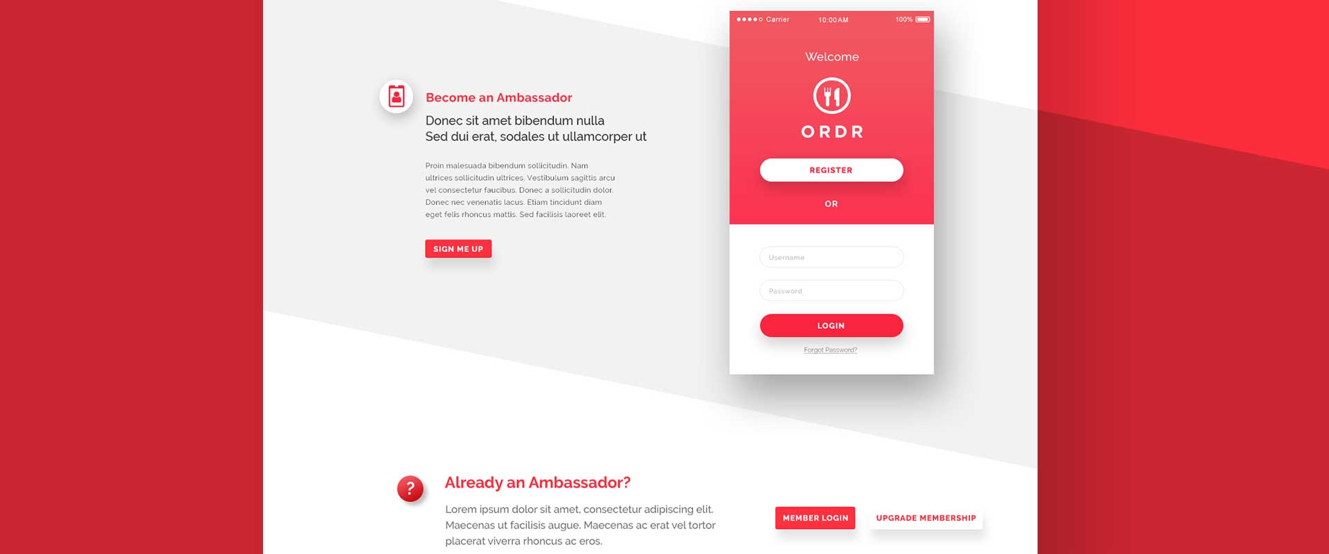
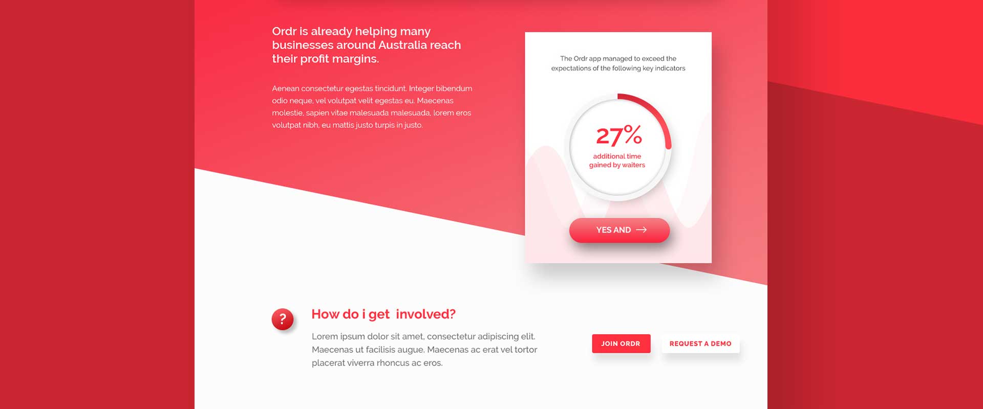
Branding design specialists, Percept developed a modern, parallax website design, which is a type of visual effect when scrolling. This helped to engage the user as they explored the content throughout the site, providing an interesting experience that was slick in feel. The navigation is clean and simple and the modern layout allows the content to shine.
The branding design is predominantly red, which is powerful and features prominently throughout this dynamic parallax website design to tie everything together. This colour palette, when combined with white-space and clean graphics, provides a good balance for the look of the branding design and the overall result feels approachable, which was important for the client.
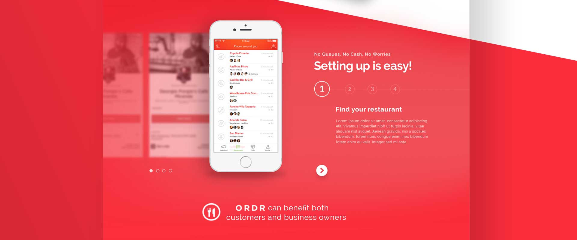
The parallax website design focuses on a great user experience. The fixed header allows easy navigation throughout the website’s moving parts, and an interactive carousel clearly details the steps involved to install and use the app.
If you need a branding design expert, contact Percept today.
