


Rebrand from NGP to Emora by Branding Agency, Percept
Discovery
Formerly NGP, Emora teamed up with rebrand specialist, Percept. They were committed to improving how they communicate their services to their target audience and the best way to do this successfully was to rebrand.
The rebrand saw Percept consult with NGP throughout the transformative journey of a discovery workshop. This immersion session delved into the core of NGP’s operations and aspirations, setting the stage for the most pivotal stage of any rebrand, which is the brand positioning and brand strategy.
Once the information was extracted for their operations and aspirations, the focus shifted to the competitive landscape and assessment was made in regards to how the rebrand would help them gain an edge on their rivals. Decisions on what the revitalised brand identity may become were discussed, not from a stand-point of personal preferences, but from an analytic angle that considered the perceptions of their competitors, in order to make this rebrand commercially effective.
The key findings from the discovery workshop formed the foundations of the rebrand, which in this case was a complete reimagining of their branding.
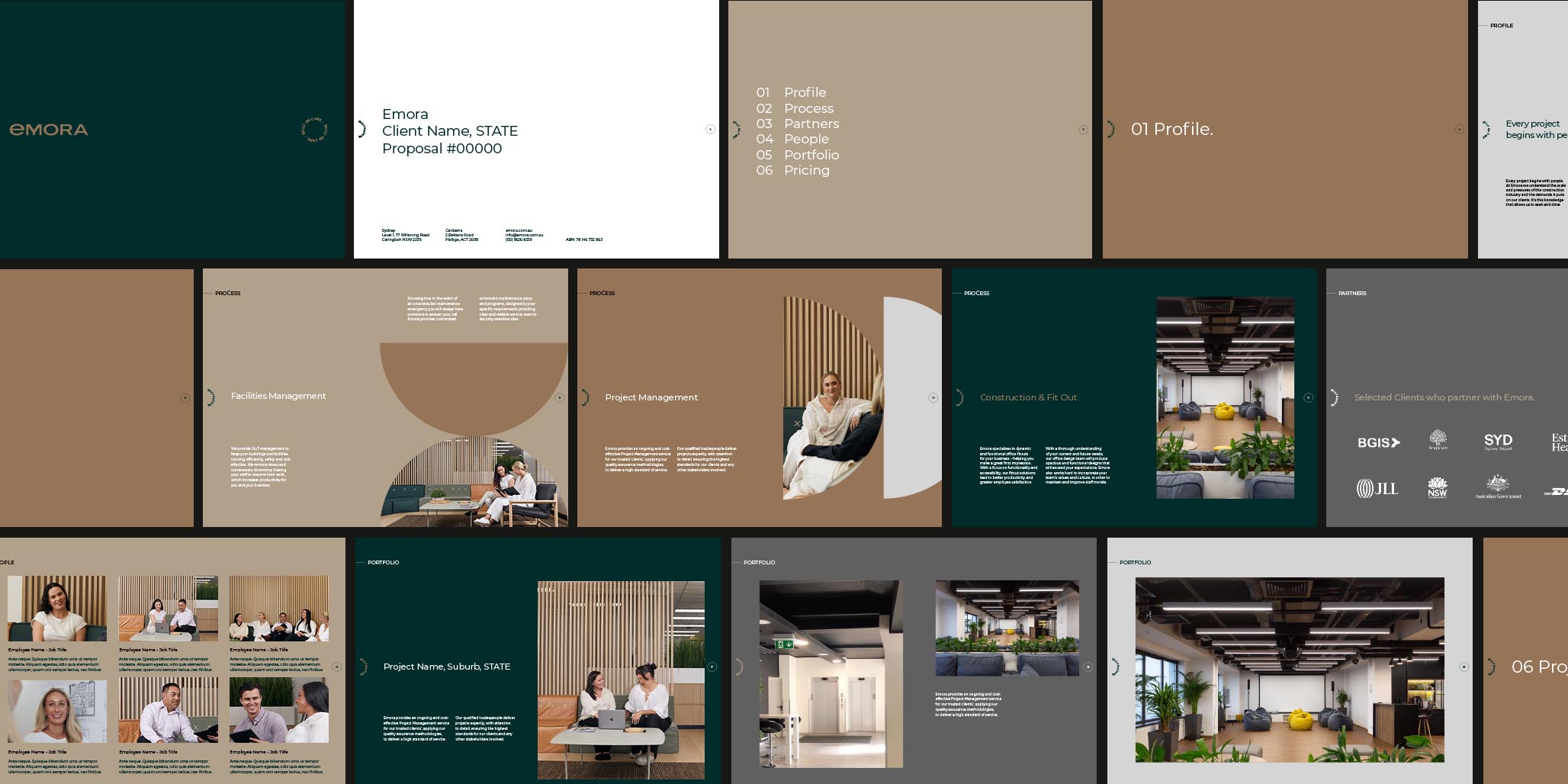
The rebrand was to encompass a new brand name, positioning, and identity design. The rebrand would also be complemented by a full rollout of a branding and marketing communications suite, from signage to website design. The design of these individual items along with a brand manual ensures a seamless integration of the rebrand into all their forthcoming activity.
Branding Strategy
Guided by desired outcomes from a business point of view, rebrand specialist, Percept, delved into the company history, addressing challenges, and opportunities, steering the rebrand toward a truly revolutionary brand transformation.
NGP unyielding allegiance to its core values signalled a notable shift toward a full rebrand rooted in communication and empathy for the individual.
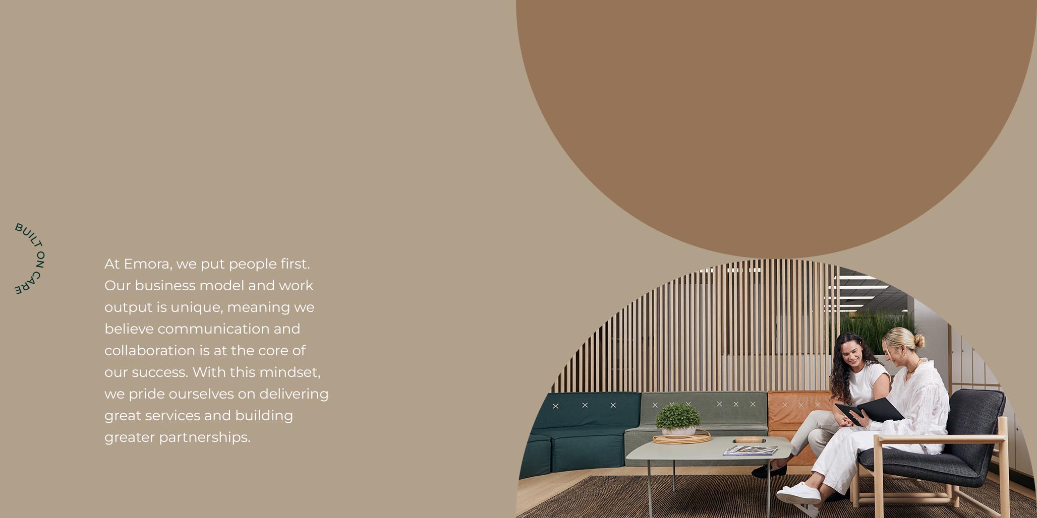
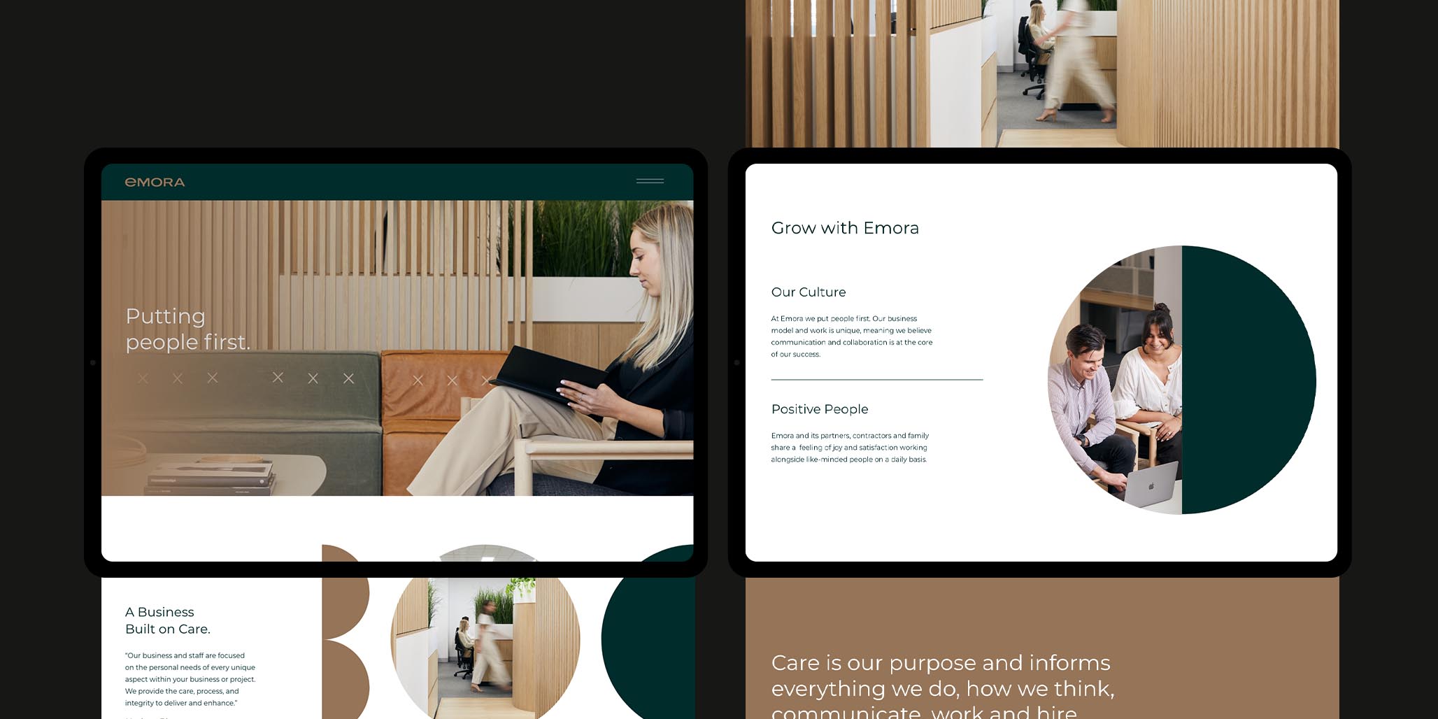
At the heart of the narrative lies a resolute dedication to prioritising a people-first approach. This philosophy, equally valuing both the partner network’s team and clients, infuses the company with a collaborative spirit that transcends mere business transactions.
Beyond commerce, this rebrand is about being personal. The company values resonate through the rebrand showing empathy, respect, and security. These are key factors for the people in their world, so Percept approached the rebrand from an angle that would forge a legacy that extends beyond financial success. In essence, it is a likened to the individual person, with the story being one of growth, resilience, and the impact achieved by placing humans at the centre of every point along the way.
Brand Positioning
Percept crafted the core brand house;
Brand Purpose — To provide care in the construction industry whilst enhancing the daily experience for our people and partners.
Brand Stance — We have an obligation to care about two things; our clients and our culture.
Brand Story — Every project begins with people. At NGP we understand the scale and pressures of the construction industry and the demands it puts on our clients.
It’s this knowledge that allows us to seek and drive communication, care and respect for all involved.
Our process and attention to detail builds working environments that are streamlined and more rewarding for everyone.
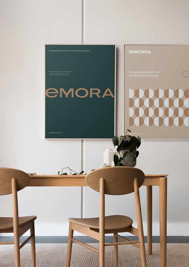
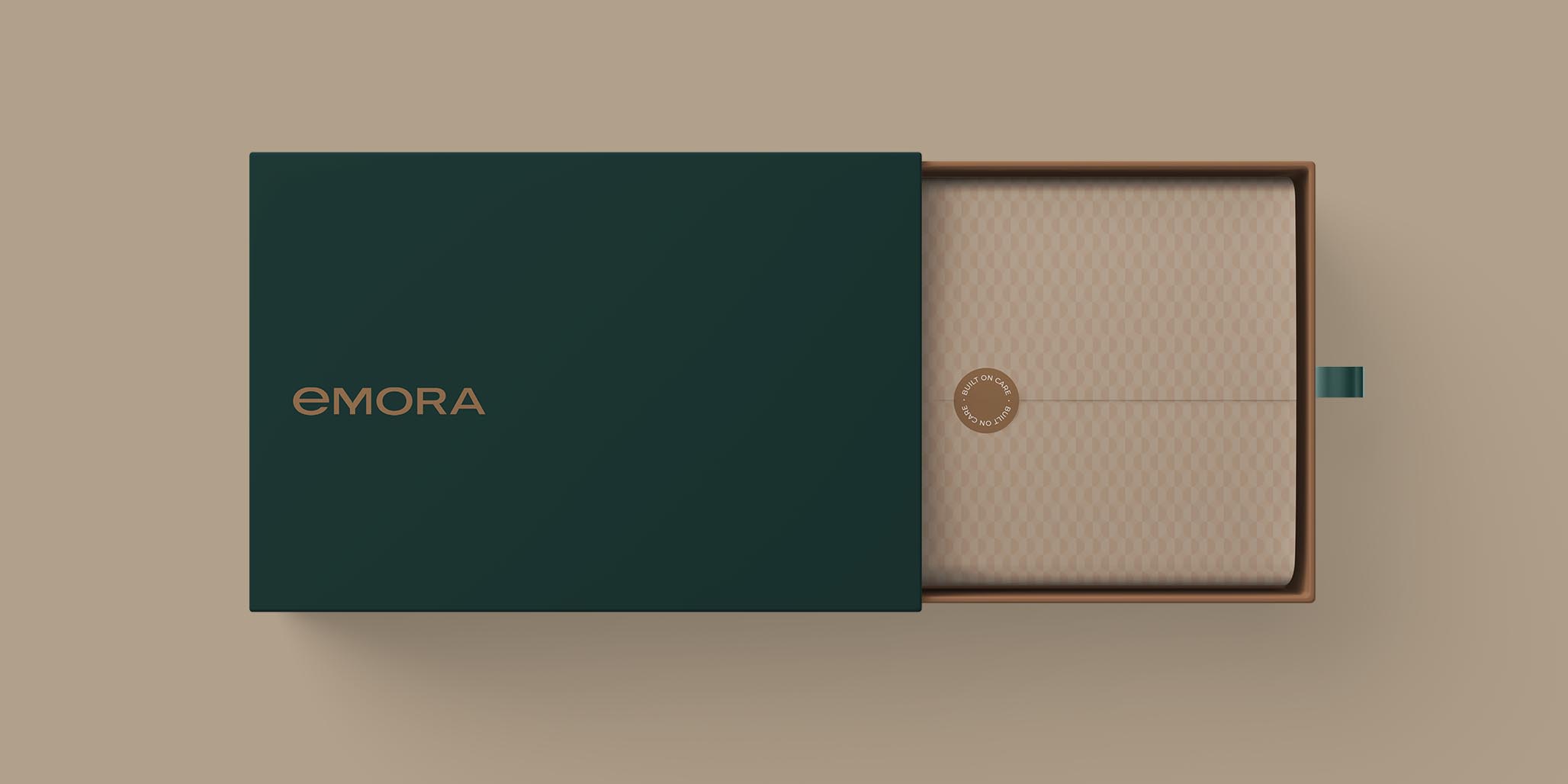
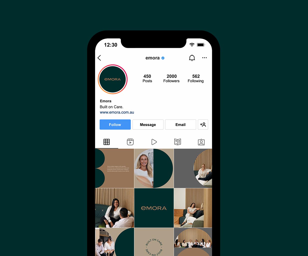
Brand Proposition — Built on communication and care.
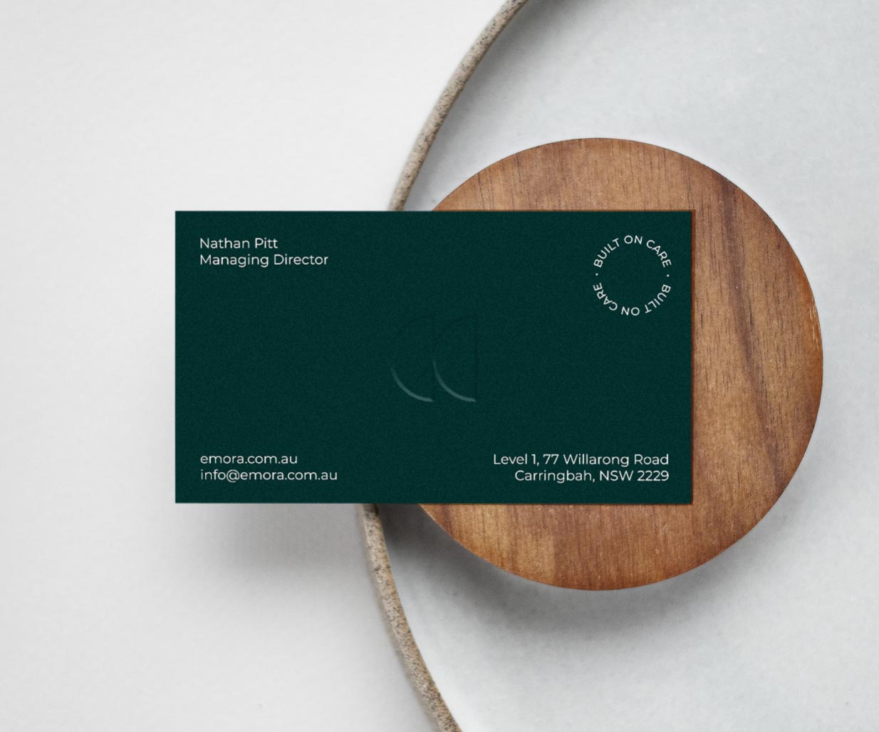
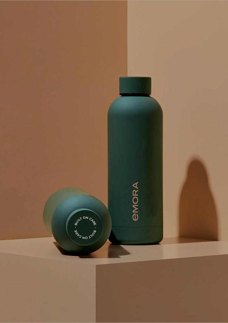
Brand Tagline — Built on care.
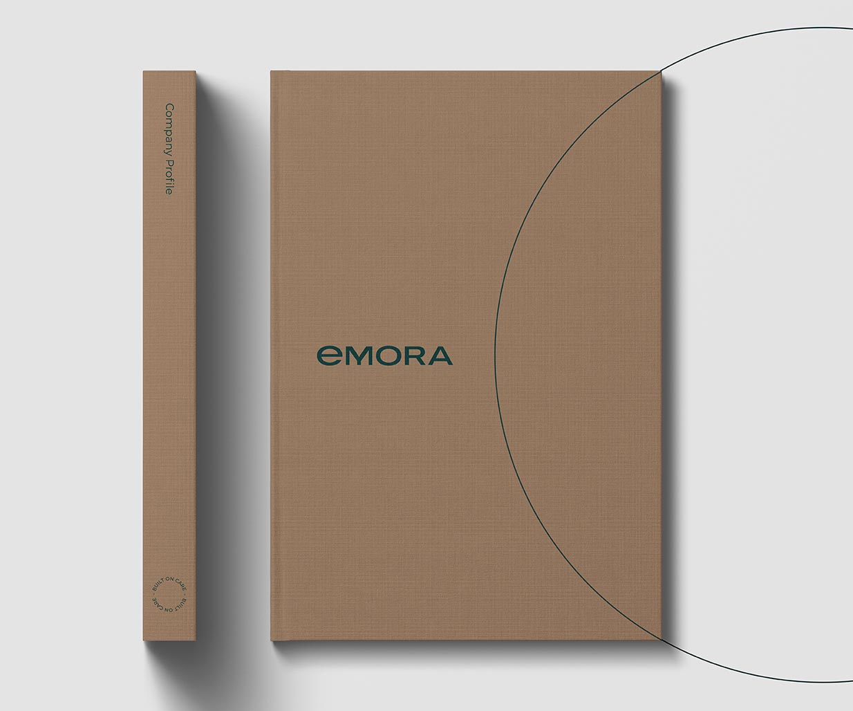
The rebrand and resulting brand identity is more than just a label; it’s a synergy of values and principles. At the centre of this ethos is the brand naming; Emora – the harmonious blend of “Empathy” and “Collaboration” – encapsulates the essence of this approach. The wordmark is a timeless embodiment of these ideals, serving as a beacon of our commitment to harmonious working relationships and a shared sense of understanding.
A trusted colour palette envelops the new branding, infusing it with an aura of reliability. The hues that Percept chose evoke feelings of assurance and stability, reflecting the trust cultivated with every interaction.
Percept’s approach to typography in this rebrand echo the characteristics of Emora’s people; approachable and legible. The rebrand has highly considered messaging sets. All communication clearly delivers a deliberate message, facilitated by type systems that invite engagement and comprehension.
At the core of the rebrand lies a powerful graphic device, symbolising the essence of “Built on Care.” The emblem takes the form of the letterforms B, O, and C – a visual representation of the company philosophy.
Everything about this rebrand is a tapestry woven from authentic threads of empathy, collaboration and care, which are all true to the new people-centric brand, Emora.