Brand Image & Identity Design
Brand Discovery
In need of a befitting brand image, North Foundation, collaborated with identity design specialist, Percept, to create a new look, appropriate of their ambitious vision. In order to get the ground-work of the brand image right, Percept held a brand workshop with the client’s key stakeholders, to deeply understand the organisation’s mission and its positioning within the disability sector. This session was designed to uncover the essence of North Foundation’s approach to personalised support and to explore how they envision their role in creating inclusive communities.
By examining their goals and the competitive landscape, identity designers, Percept, were able to establish a clear framework for the brand positioning of North Foundation, as a leader in people-centric care and advocacy.
Branding Strategy
The branding strategy for North Foundation was developed through a focused methodology that prioritised understanding the organisation’s core values and mission. Identity design agency, Percept, defined a brand tone through detailed extraction exercises, that reflects their commitment to empowerment and inclusivity. Percept’s branding strategy decisions emphasised a narrative that blends transformation, encouragement, and engagement.
This approach ensures that North Foundation has messaging that resonates deeply with its audience while highlighting its dedication to holistic support.
Brand Positioning
To create the best brand image, Percept crafted the core brand house;
Brand Mission — Our mission is to provide personalised support to individuals from all disability backgrounds with our participant’s needs and preferences at the forefront.
Brand Vision — To create inclusive communities that empower and support each other in achieving a holistic life.
Brand Purpose — To collaboratively create a safe space for individuals living with disabilities, where we celebrate individuality through meaningful conversations that are person-centred and advocate for wellbeing-focused care.
Brand Story — Our motivation for founding North Foundation stemmed from witnessing the profound impact of burnout within the support industry. We aim to create space where individuals with diverse abilities and their allies can genuinely enjoy and appreciate their contributions while receiving the support they have the right to. We recognise that a work culture that fills us with pride enhances our ability to address the unique challenges our industry brings. Allow us to take care of our colleagues, and in turn, our colleagues will take care of you and your loved ones.
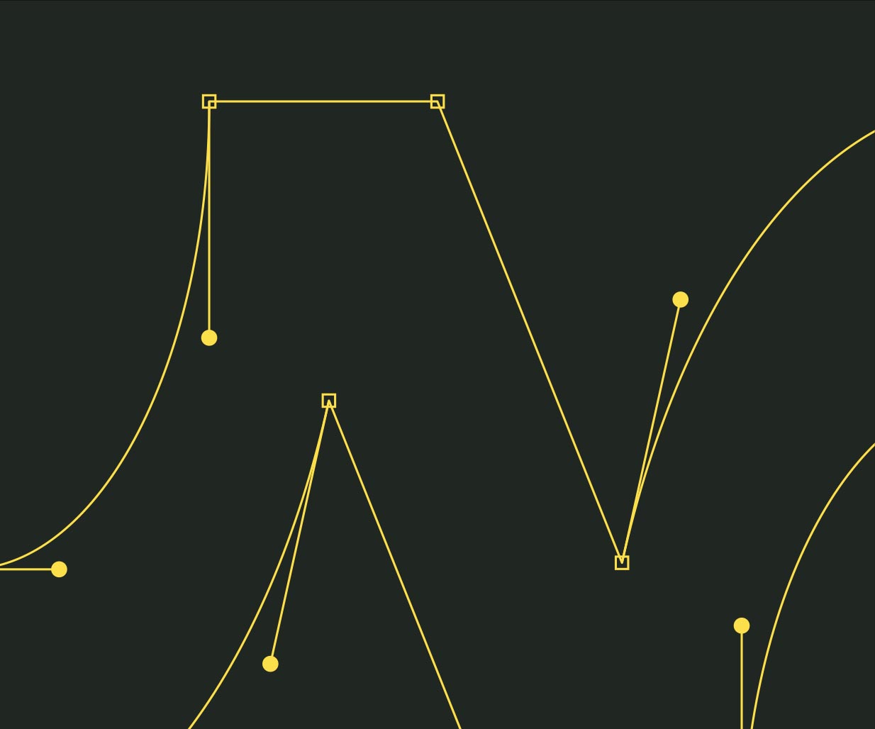
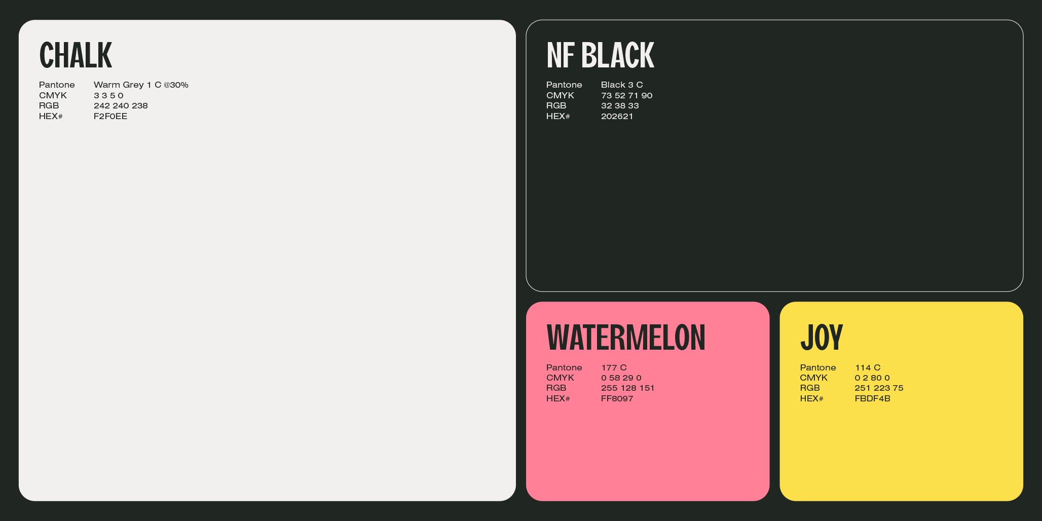
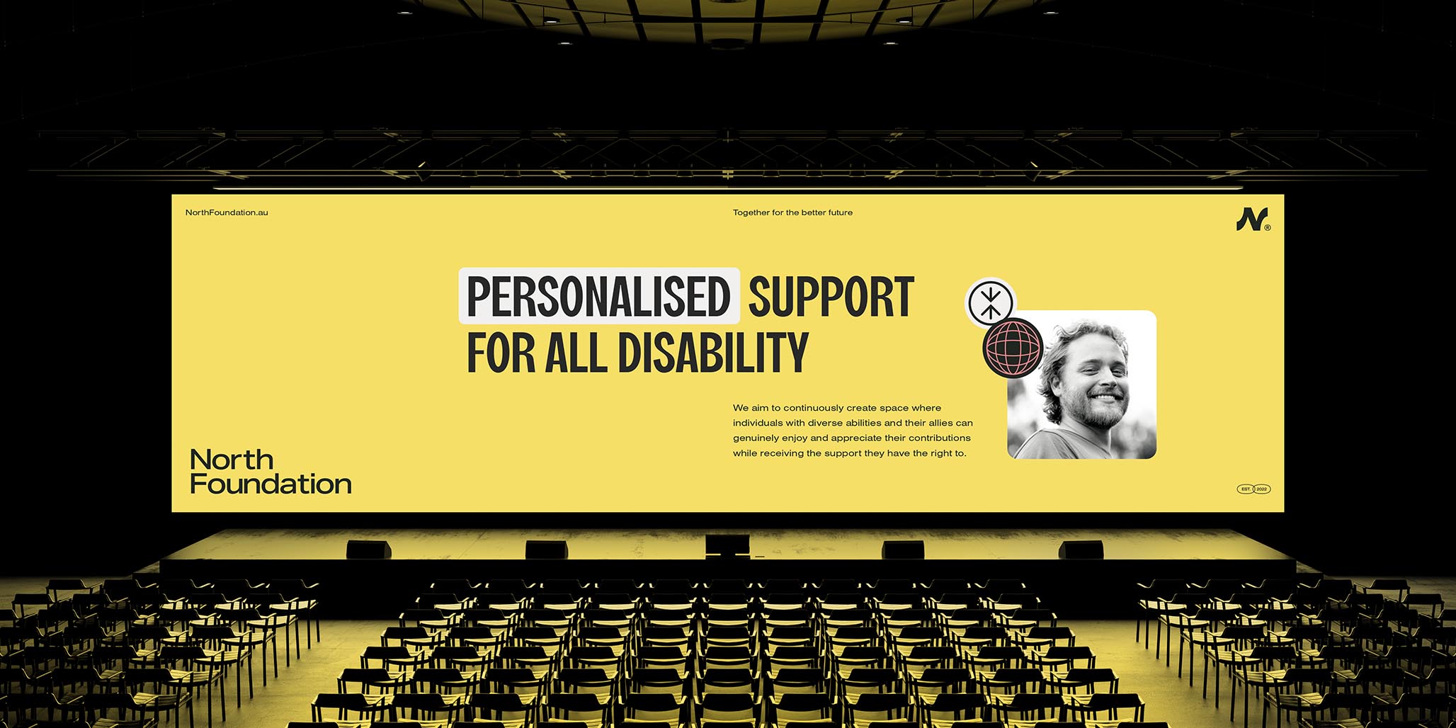
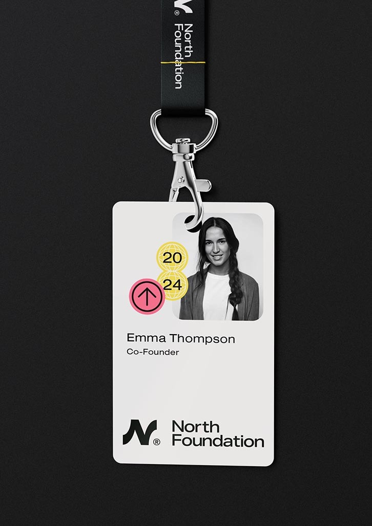
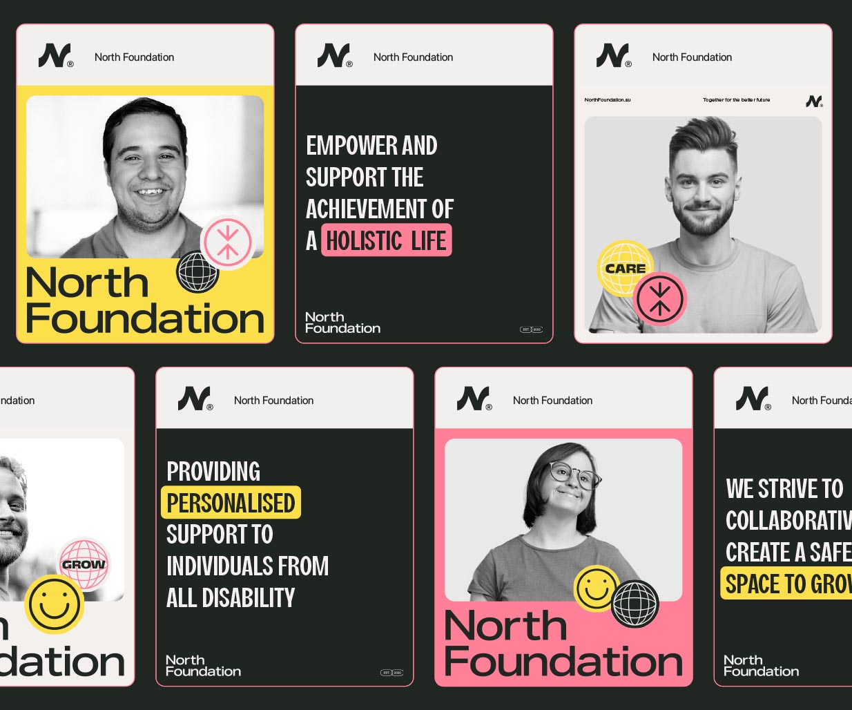
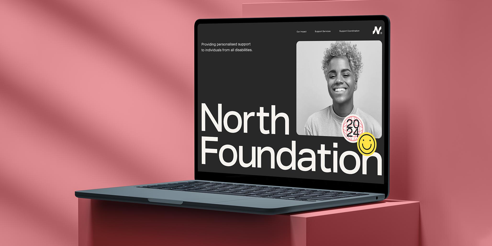
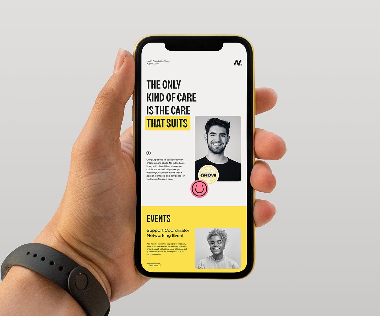
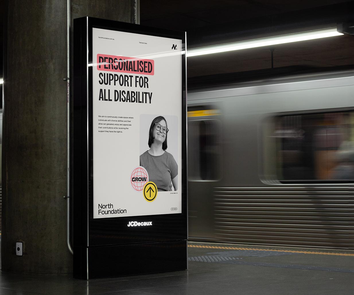
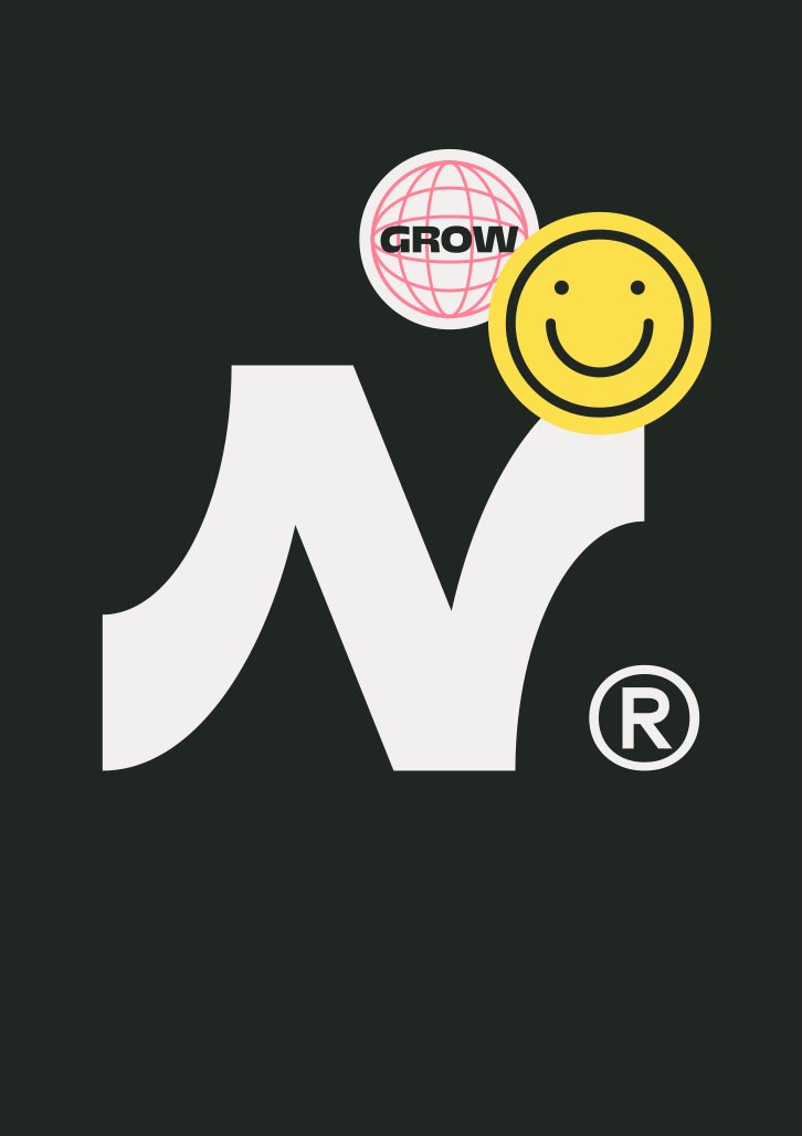
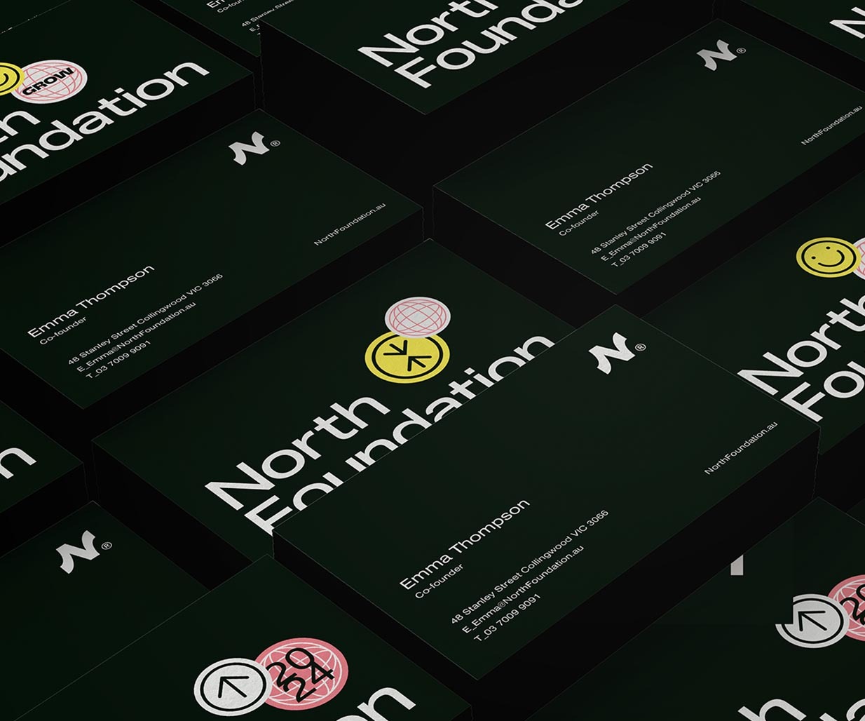
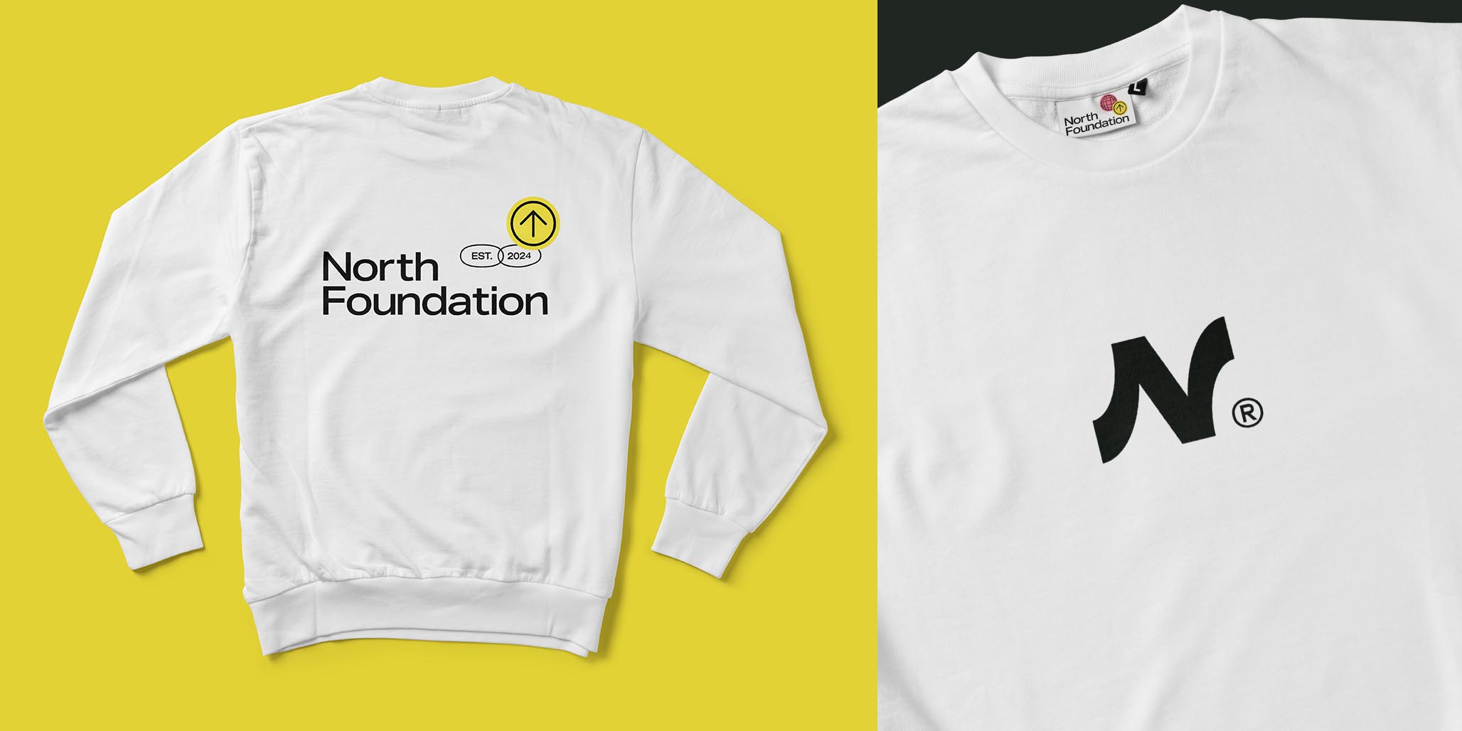
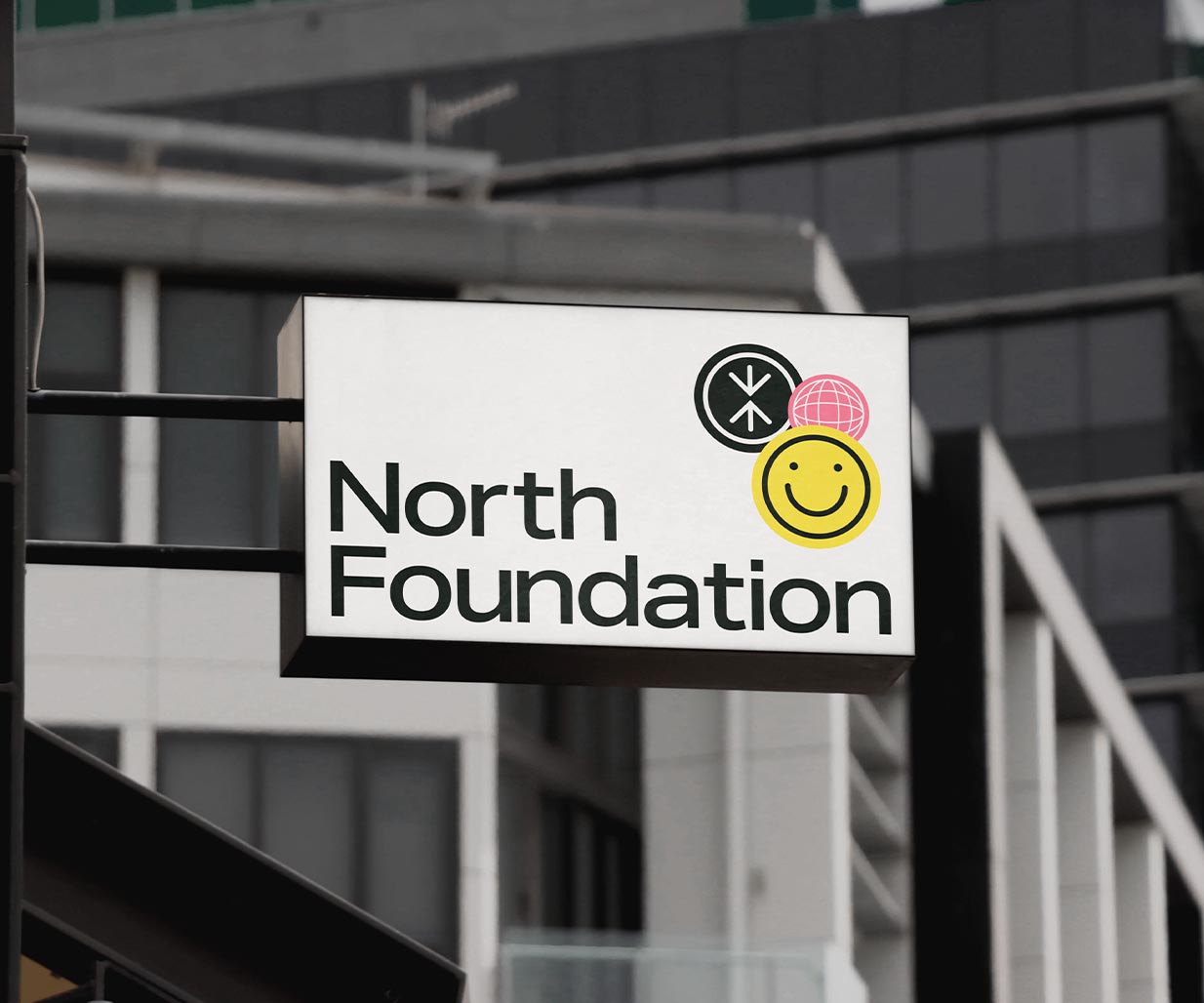
The North Foundation’s brand image features an iconic “N” combined with two arrows: one facing downward to signify the Foundation’s supportive role and one pointing north to represent progress. The brand image features a colour palette of deep charcoal and off-white which contrasts two primary hues ensuring both boldness and accessibility. The photography throughout all brand image assets focuses on the diverse individuals served by the foundation, capturing their empowered presence.
The brand image uses typography that is a characterful condensed sans, designed to highlight key messaging, while a suite of stamps adds fluidity and a contemporary, flexible feel to the rigid brand image design system. The identity design by Percept represents North Foundation’s commitment to progress and support within the disability sector.

