Brand Identity Design Sydney / Branding / Marketing Collateral Design
The Challenge
Formerly under the banner of St George Child & Family Health and Sutherland Child & Family Health, these two departments have now amalgamated to become South Eastern Area (SEA) Child & Family Health.
SEA has a large footprint within Sydney, with a culturally and ethnically diverse audience, providing free support to families in the community with children aged 0–5. However, with no cohesive brand identity design, it had become apparent that SEA’s offerings were not being communicated effectively to the broad community.
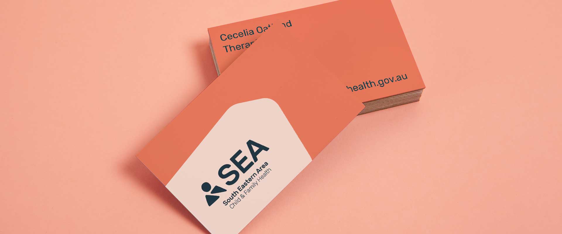
As experts in the area, Sydney branding agency, Percept, were engaged to create a cohesive and flexible new brand identity design as well as marketing collateral design to address the issues.
The Solution
The new brand identity design projects SEA as trustworthy, professional, accessible and approachable – a non-directive partner offering tailored support to their community within Sydney.
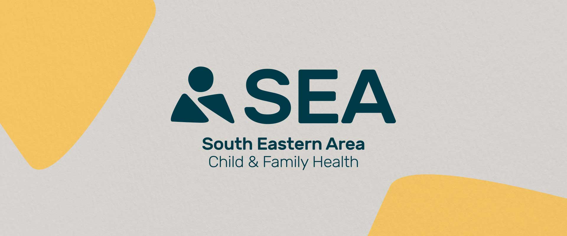
The friendly icon of a person built with organic shapes creates a welcoming personality, inspired by building blocks to help families achieve a better tomorrow. This works in harmony with the rounded typography, adding a softness that represents care and commitment.
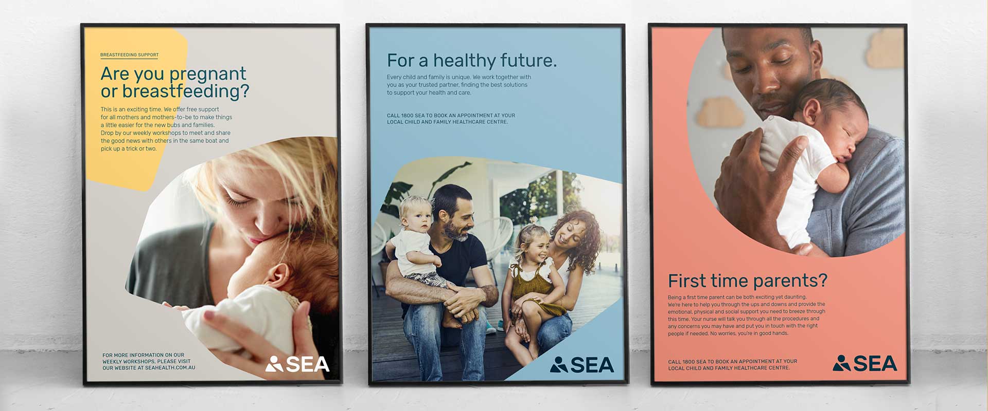
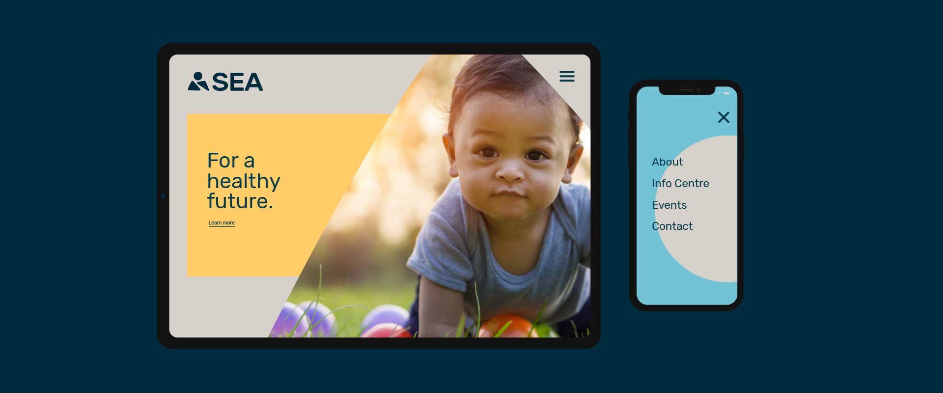
Aspirational and authentic images of everyday people living their lives, feels relatable, safe and open to diversity in ethnicity, age and gender. The organic shapes used throughout the marketing collateral design are brought to life with a bright and soft secondary colour palette, putting the focus on people.
The end result is a brand identity design and marketing collateral design that truly represents the organisation’s service and its values.
If you want help with a similar project, branding specialists Percept as here to help.
