Responsive Website Design Sydney
The Challenge
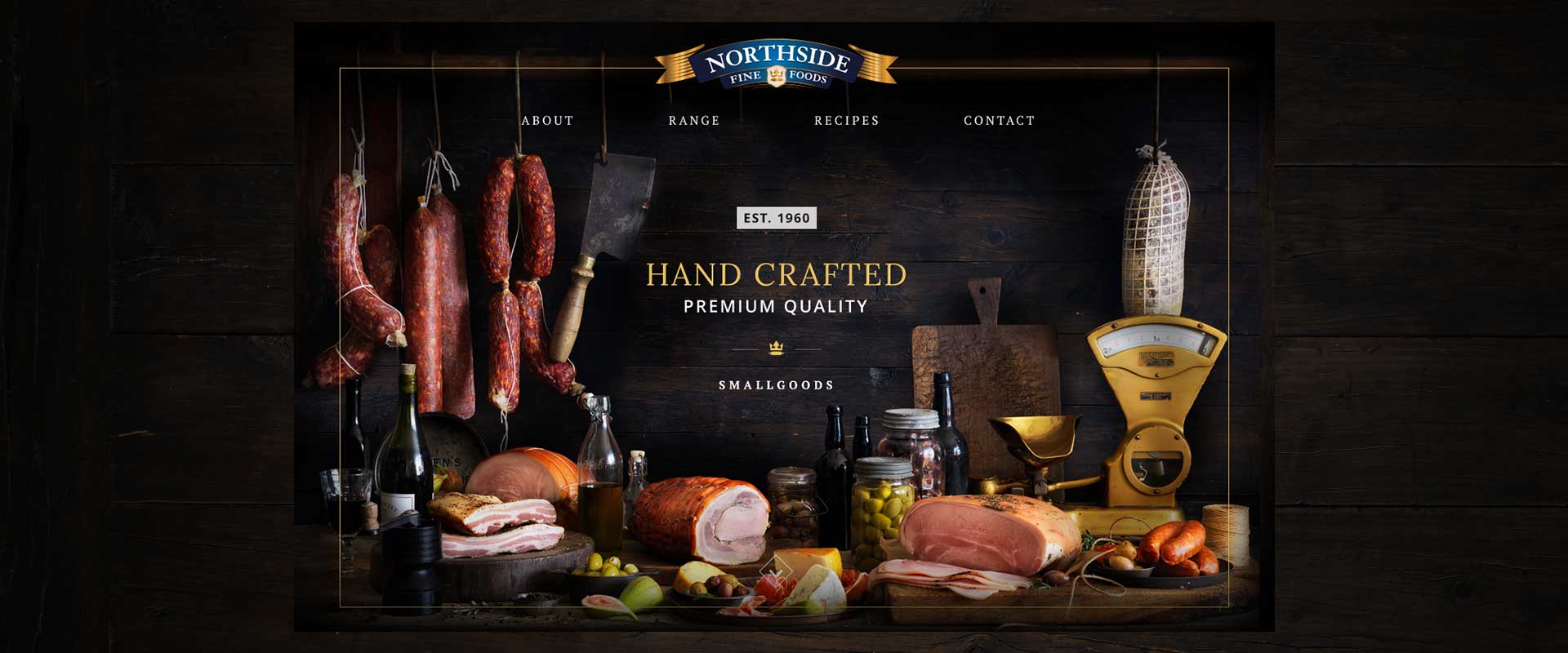
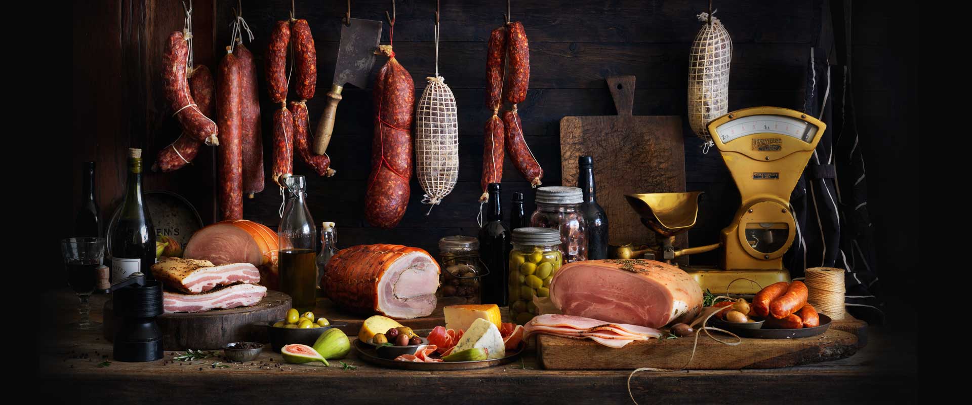
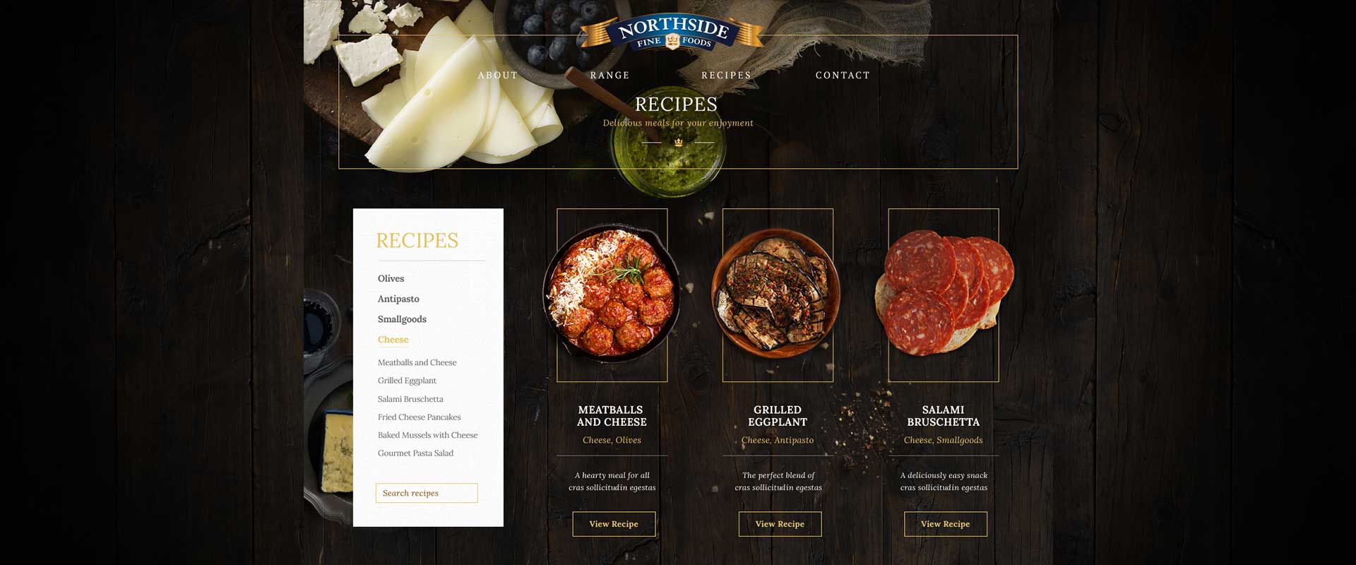
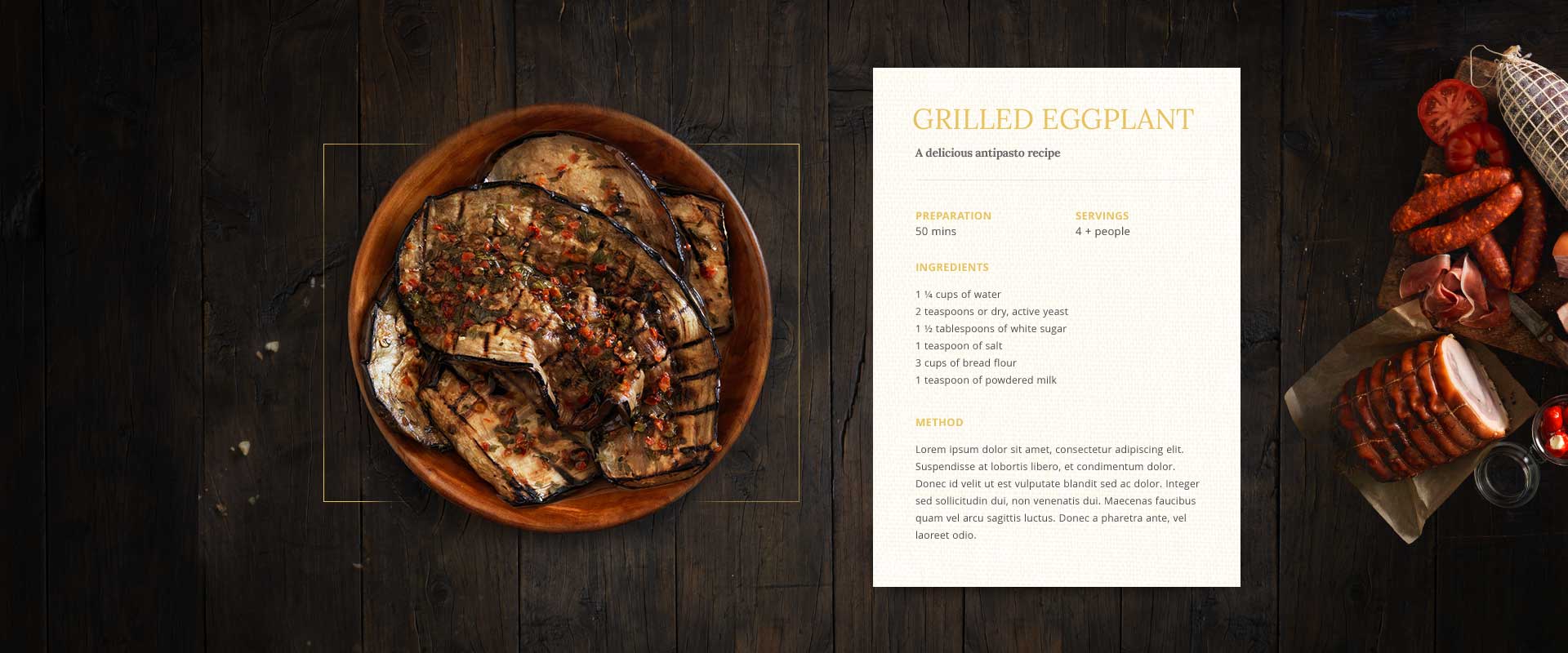
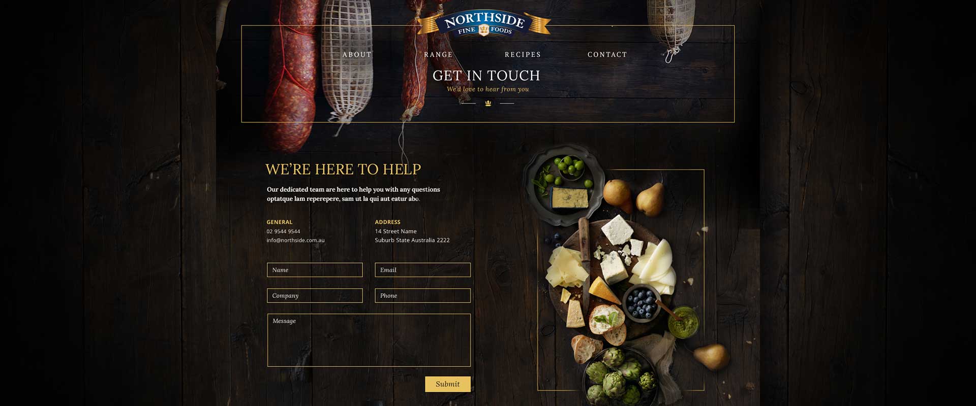
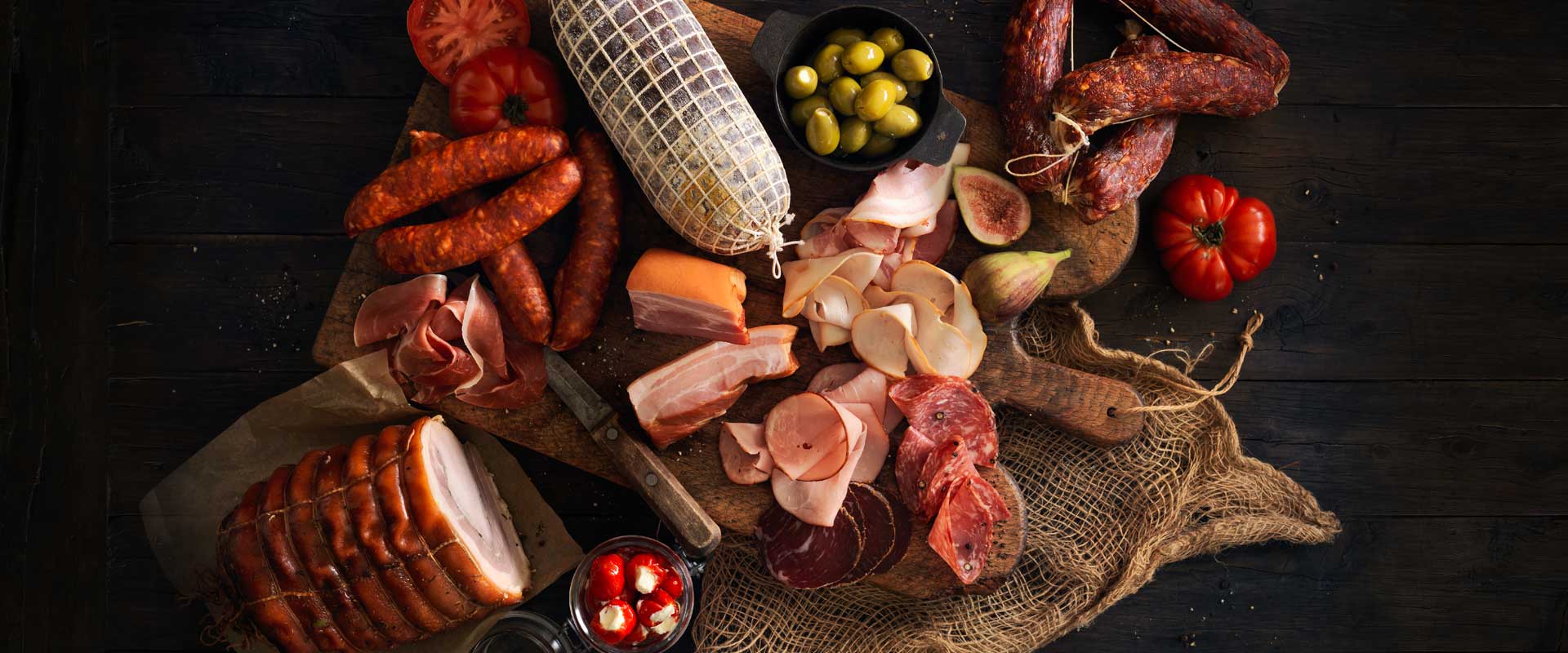
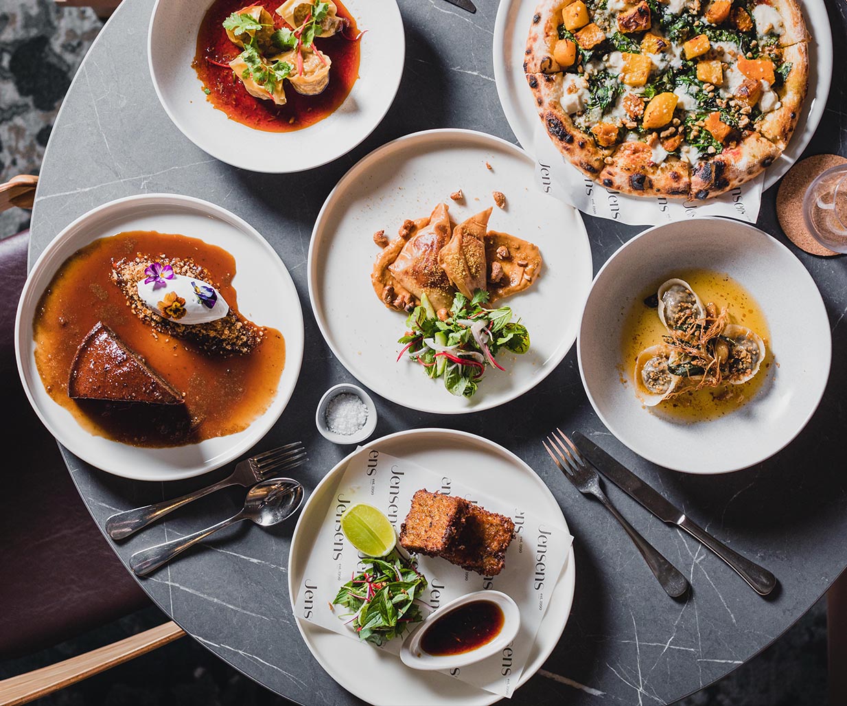
After a successful redesign of their packaging and a product photography shoot, Northside Fine Foods engaged Sydney creative agency, Percept, to develop their new responsive website design.
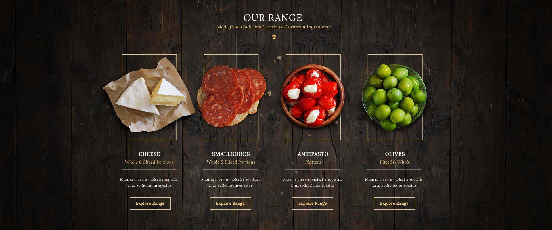
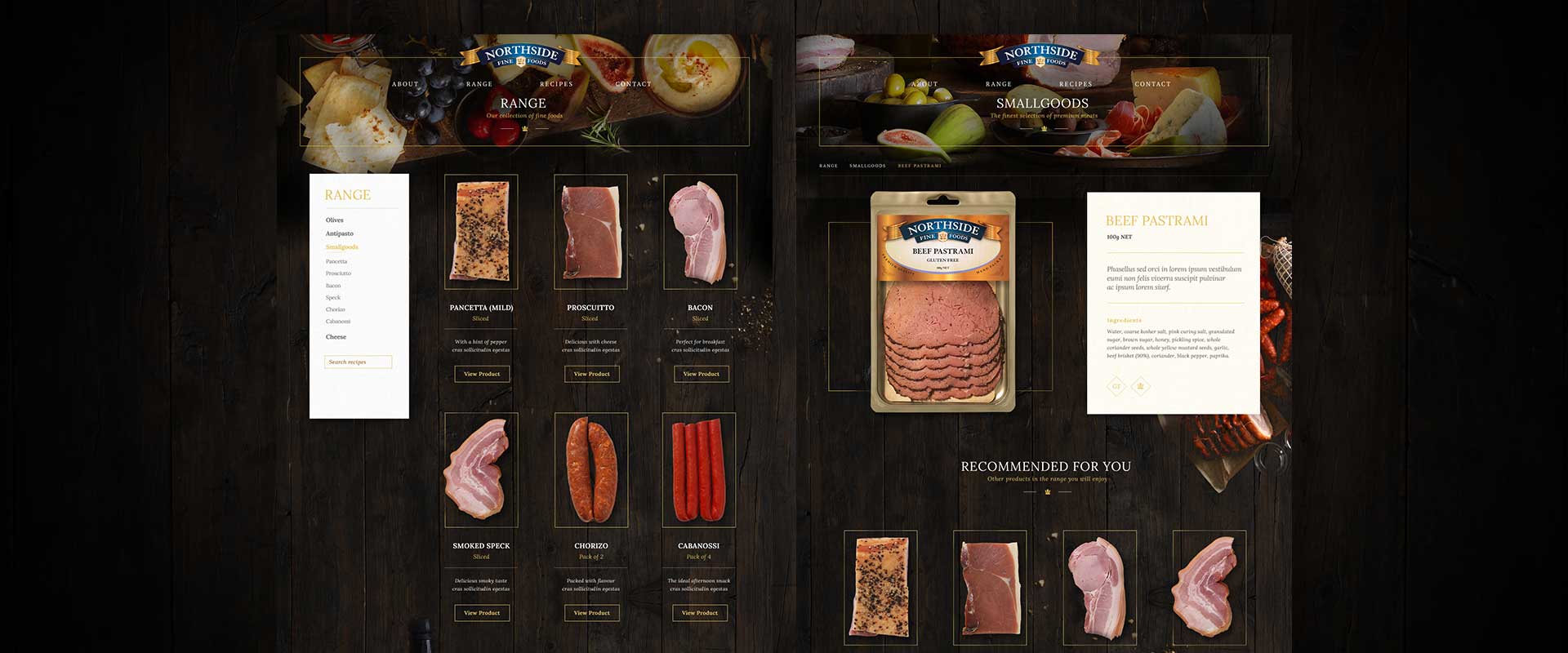
As they had no existing site, the brief was to showcase the premium hand-packed quality food products and tell the story of the rich heritage and history behind the brand. It was also important that this responsive website design displayed well on a variety of device types, including phones, tablets, laptops and desktop computers.
The Solution
Using the visually rich, well styled, food photography that Percept had already art directed, we created a responsive website design that uses a simple centered navigation and let the hero product visuals on an image carousel speak for themselves.
An elegant typography treatment reflects the artisan nature of Northside Fine Foods’ product range, with a feeling of tradition and quality. The combination of this type style, with the high-end photography creates the premium positioning that the client desired.
This adaptive and responsive website design Sydney transitions the way it displays the content depending on the screen resolution and dimensions of the device that is being used. This makes for a versatile and ideal layout no matter how a user chooses to view the website.

