Website Design and Development
The Challenge
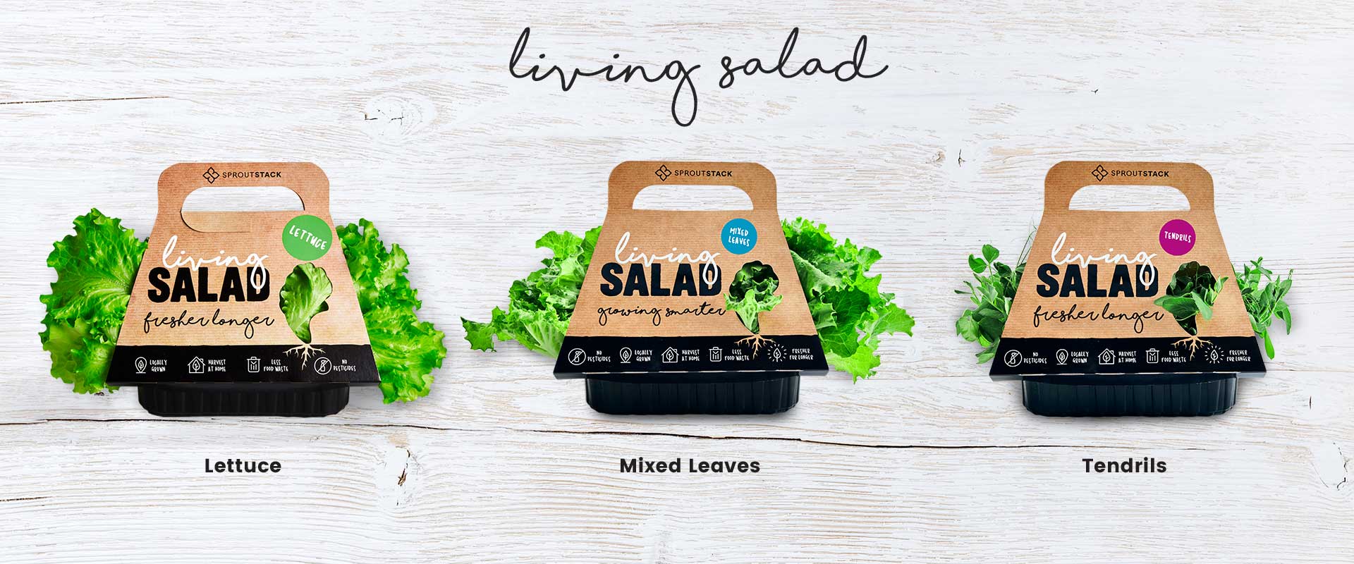
Sprout Stack use eco-friendly, vertical hydroponics to grow edible plants. Their Living Salad products are distributed still alive, with their roots intact, for ultimate freshness, allowing you to harvest when required. This benefit is of great appeal to professional chefs and home cooks alike.
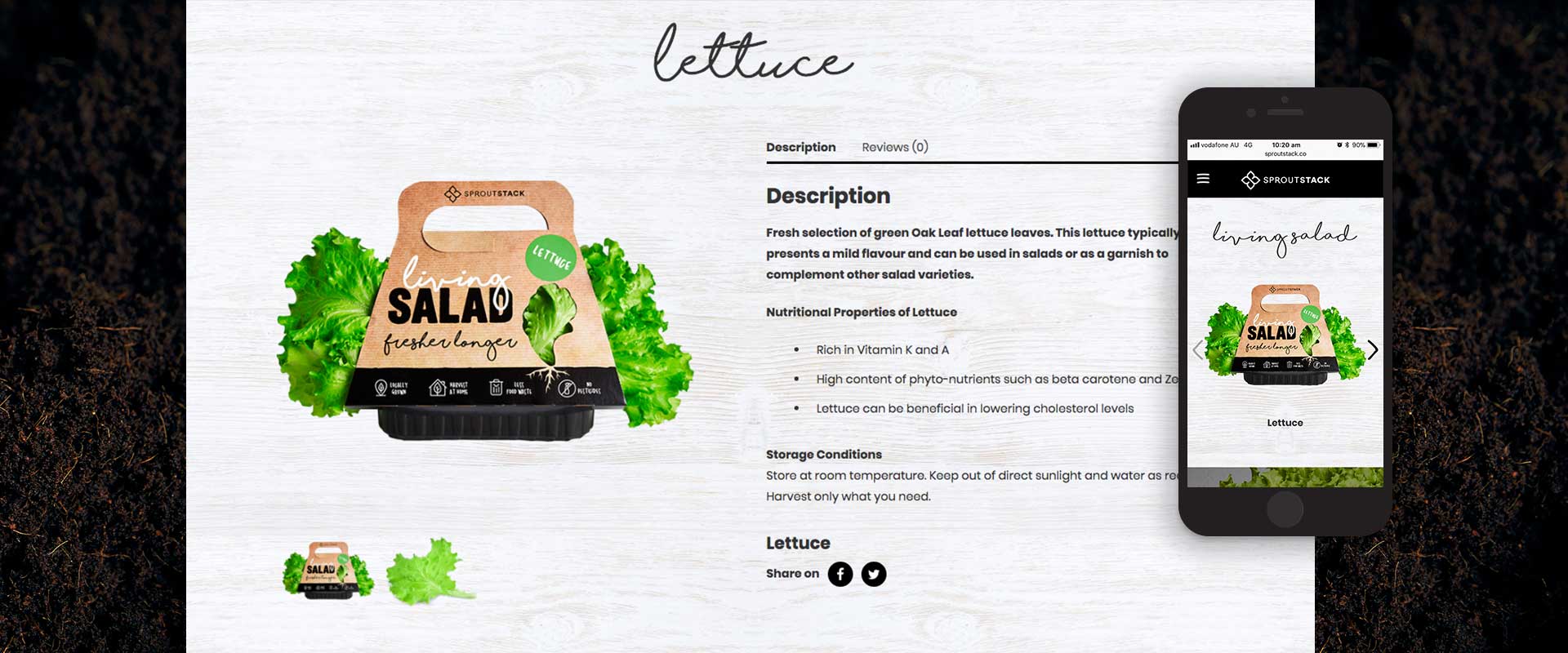
Following the packaging design for Australian company Sprout Stack’s, Living Salad products, Percept were also tasked to create a consumer friendly website design that puts these products front and centre in their market. It was imperative that their point of difference was communicated quickly and simply i.e. the fact the products are ‘alive’, healthy, nutritious and eco-conscious.
The Solution
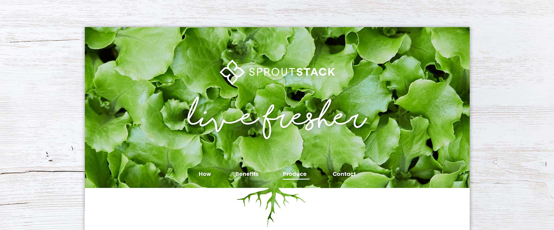
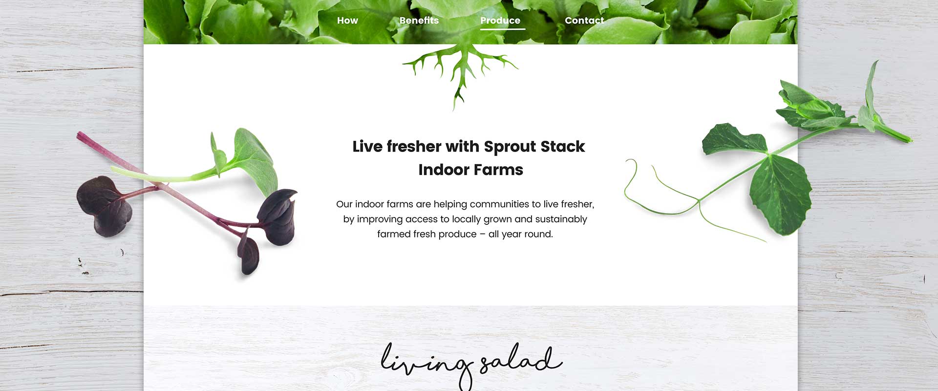
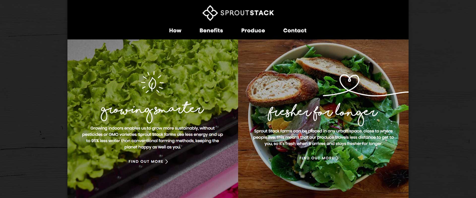
The website design and development uses fresh white backgrounds to complement the rustic wooden textures, building a contemporary take on an authentic farm fresh feel. This natural look is created with luscious and inspiring imagery of lettuce bursting with freshness.
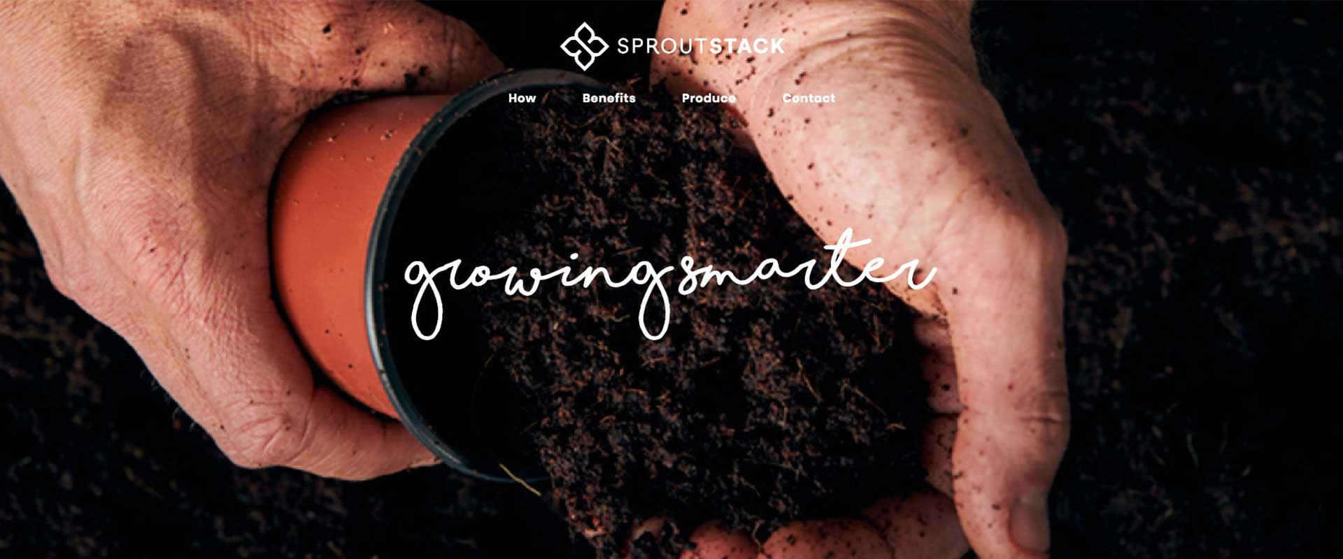
The roots in the image panel lead the viewer down the page to the introduction statement. Friendly, handwritten headlines with short, punchy statements help convey key values of the brand – live fresher, grow smarter and fresher longer.
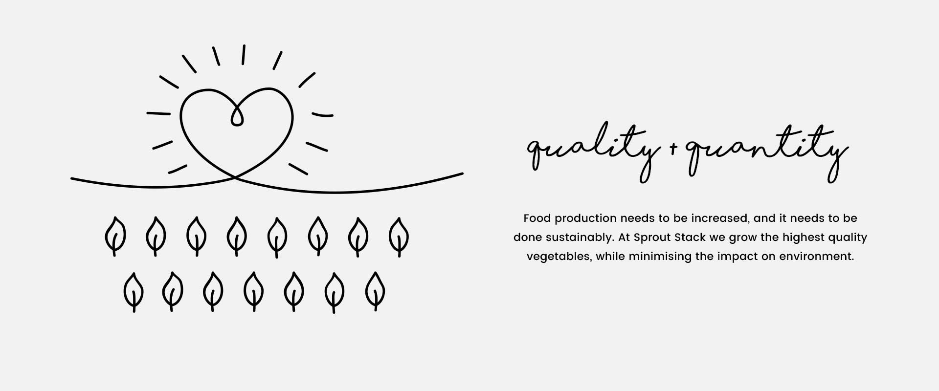
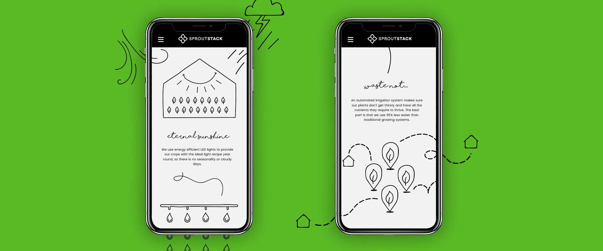
The organic and earthy touch of the new packaging design finds its way into the icons and infographics used in various locations throughout the website. They provide a succinct and visually engaging summary of the benefits and process behind Sprout Stack products.
The website design and development combines cohesively with the new packaging design, creating a uniform brand presence that is integral to the brand’s success. The resulting digital experience not only looks good, but feels great when users engage with it.
