Brand Design & Packaging Design
The Challenge
When Frutex were looking to work with a top design agency, Percept was selected for this job because of their expertise in brand design and packaging design.
A project 4 years in the making, Frutex prepare to launch a new product in major Australian supermarkets called 24-7. More than a soup, 24-7 is to be marketed as a healthy, nutritious and complimentary snack, a wholesome meal that can be had any time of day.
Knowing that Percept is a top design agency, the client raised the importance of highlighting the product’s use of nutritious Australian oats, natural flavours and seasonings, all without the nasties. The brand design and packaging design needed to highlight the health benefits to consumers whilst having strong standout in a saturated market against renowned competitor brands with a dominant presence in this space such as Campbell’s and Continental.
The Solution
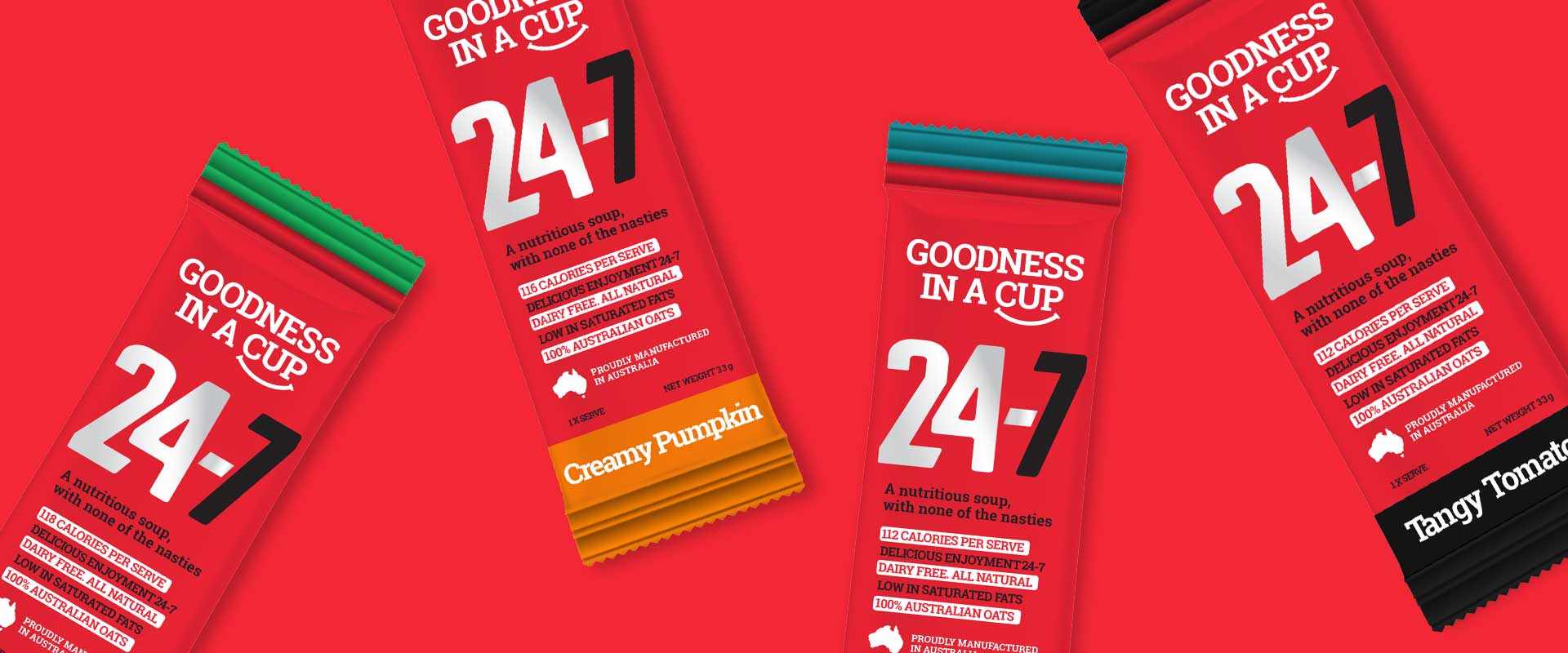
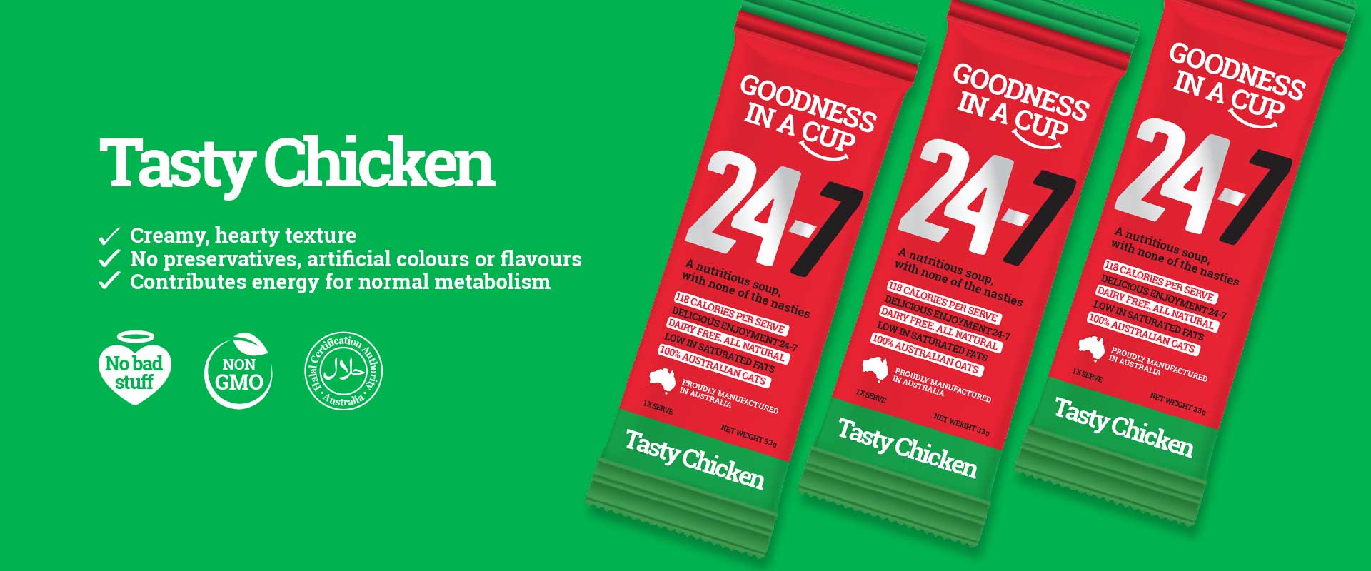
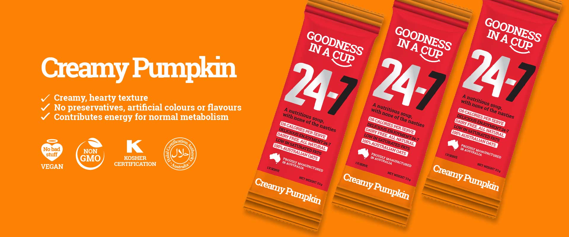
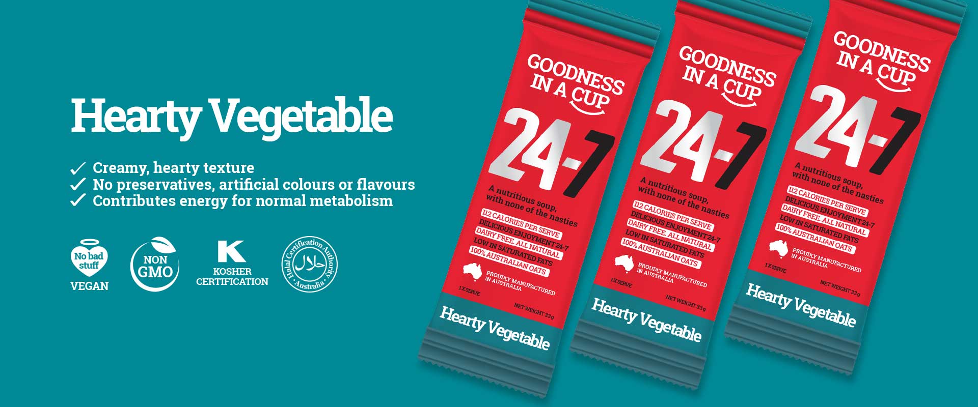
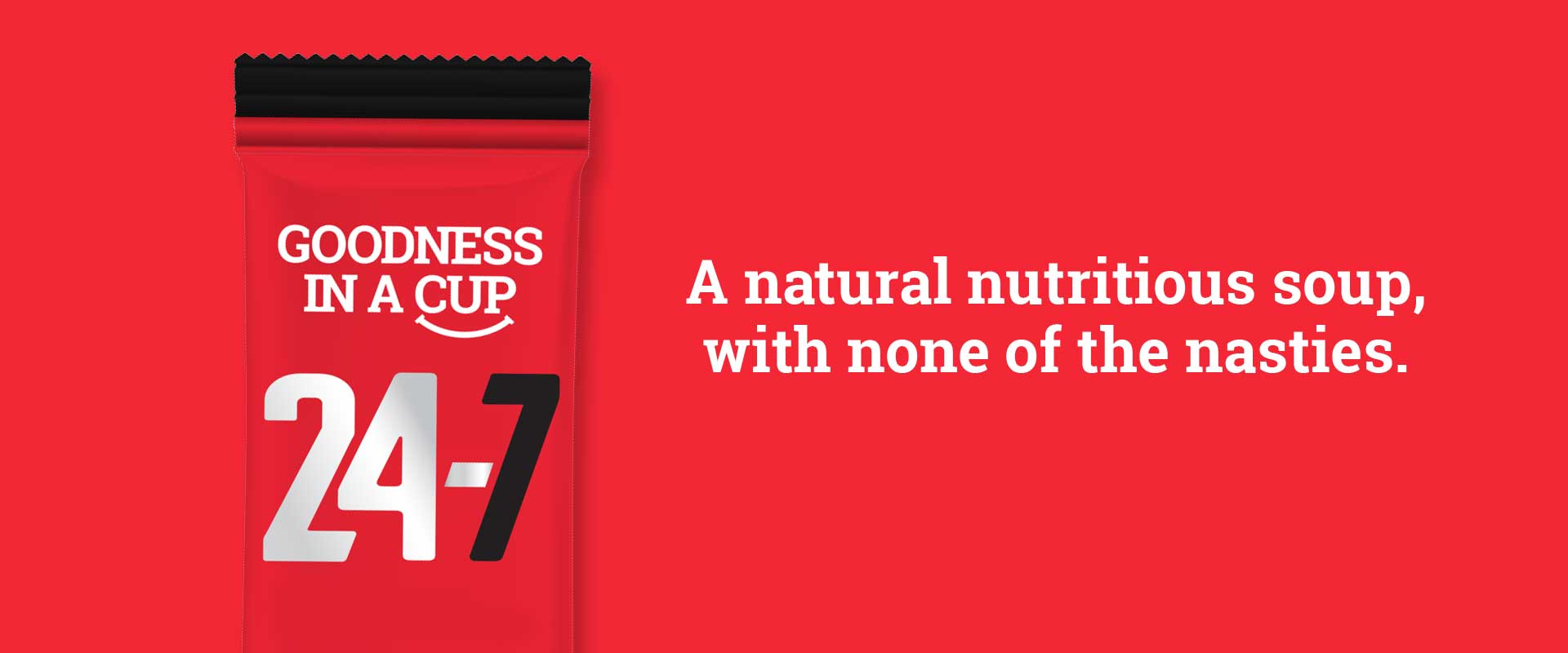
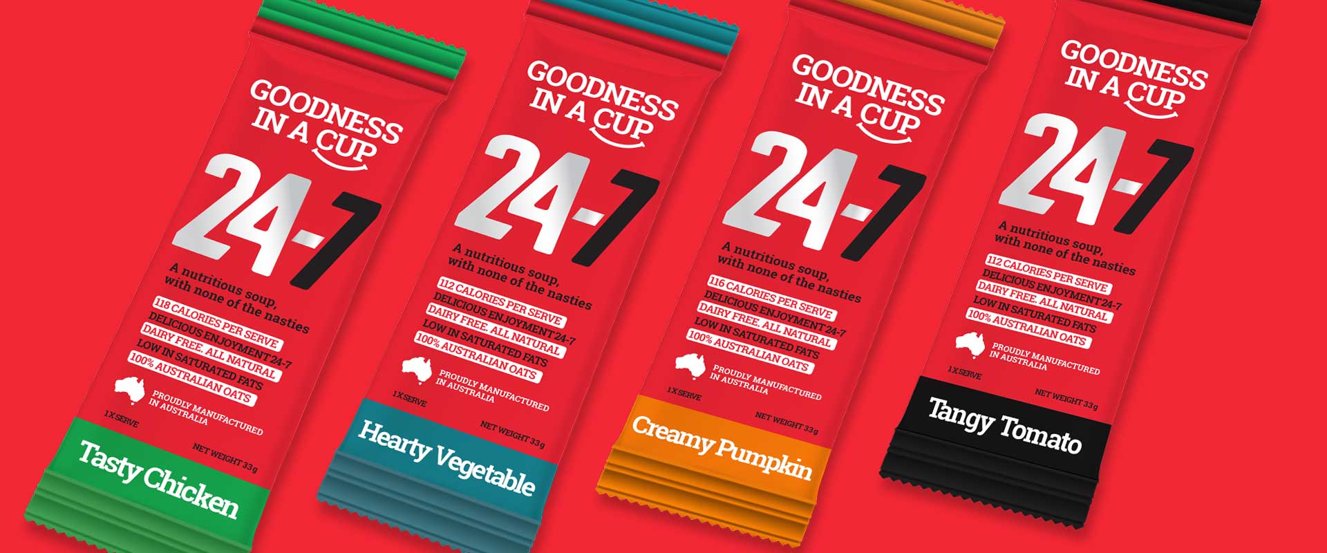
Design agency, Percept, made the brand led packaging design take shape with a bold, typographic approach highlighting the product claims through words and colour blocking.
A brand design approach, which amongst its competitors, is unexpected, however in return, delivered outstanding shelf shout, contrast and visibility when applied to the packaging design. The vibrant full red coverage and differentiating flavour colours creates a noticeable and memorable brand design for consumers in the busy retail situation.
Engaging the customer with a strong, yet personable tone of voice, ensures the brand design and messaging is quickly communicated and easily understood front and centre on the packaging design.
The packaging design utilises a silver foil print treatment on the 24-7 branding, further contributing to the product’s positioning, contrast and recognition within the market.
If you have a similar project, Percept is a design agency that can help. Contact us now.
