Snack Food Packaging Design
The Challenge
Spiroski Foods has been trading to consumers since 1991, and part of its ongoing success is its forward-thinking approach of sourcing new product opportunities.
With approximately 90% of their products in the snack food and confectionery range, a new product is being introduced under the Wice Foods brand, helping to keep Spiroski Foods at its rightful premium position within the food supply industry.
Percept were approached to create a fun and engaging new packaging design for this new multi-pack snack food that is a healthy, tasty and convenient alternative to most snack foods.
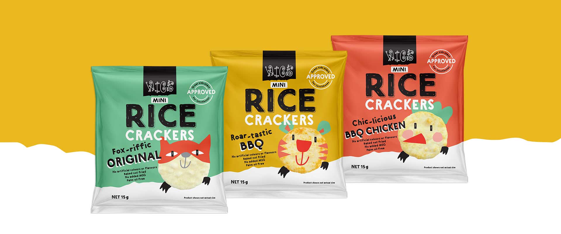
The Solution
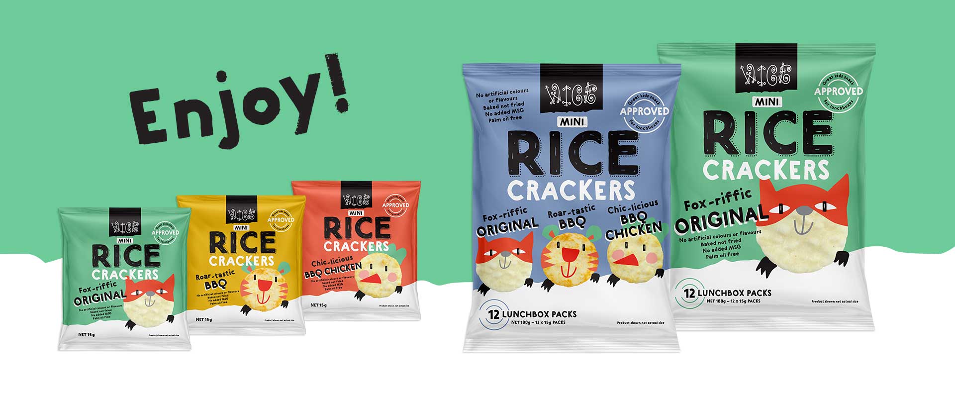
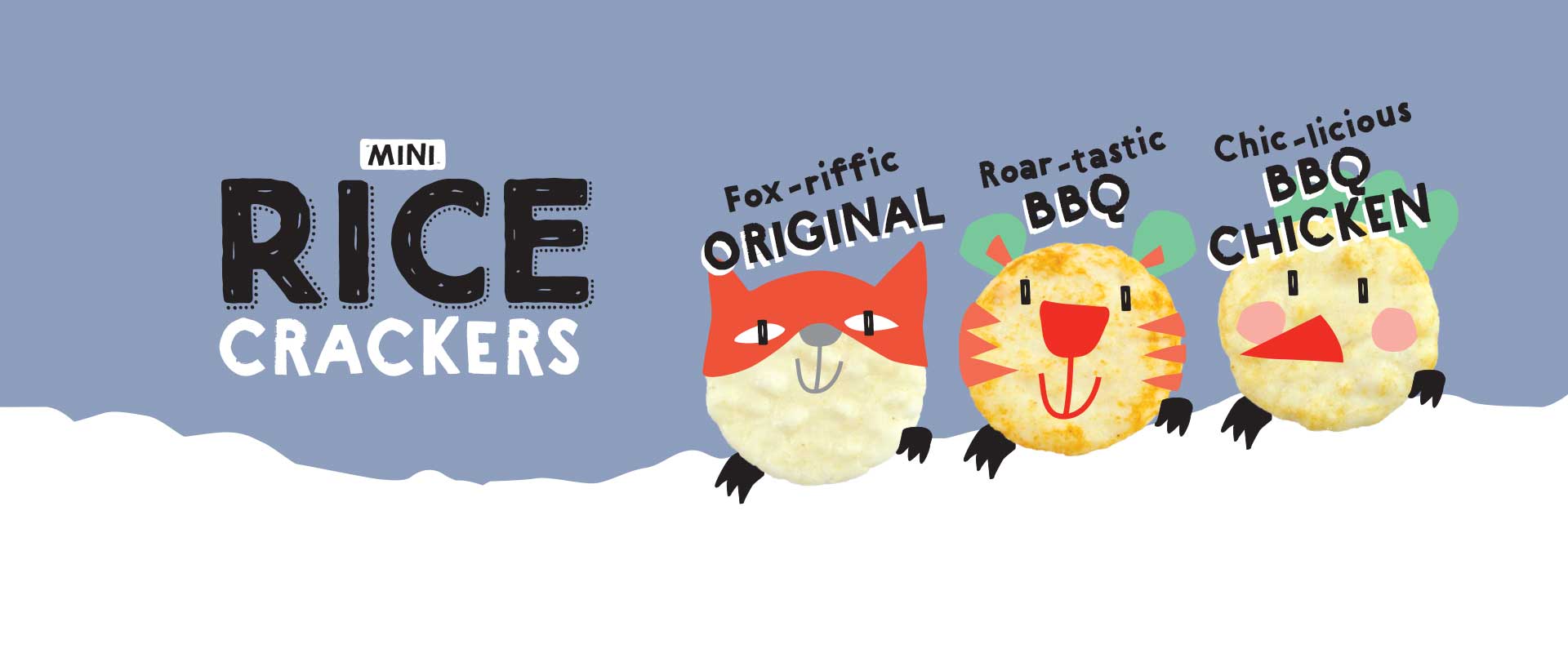
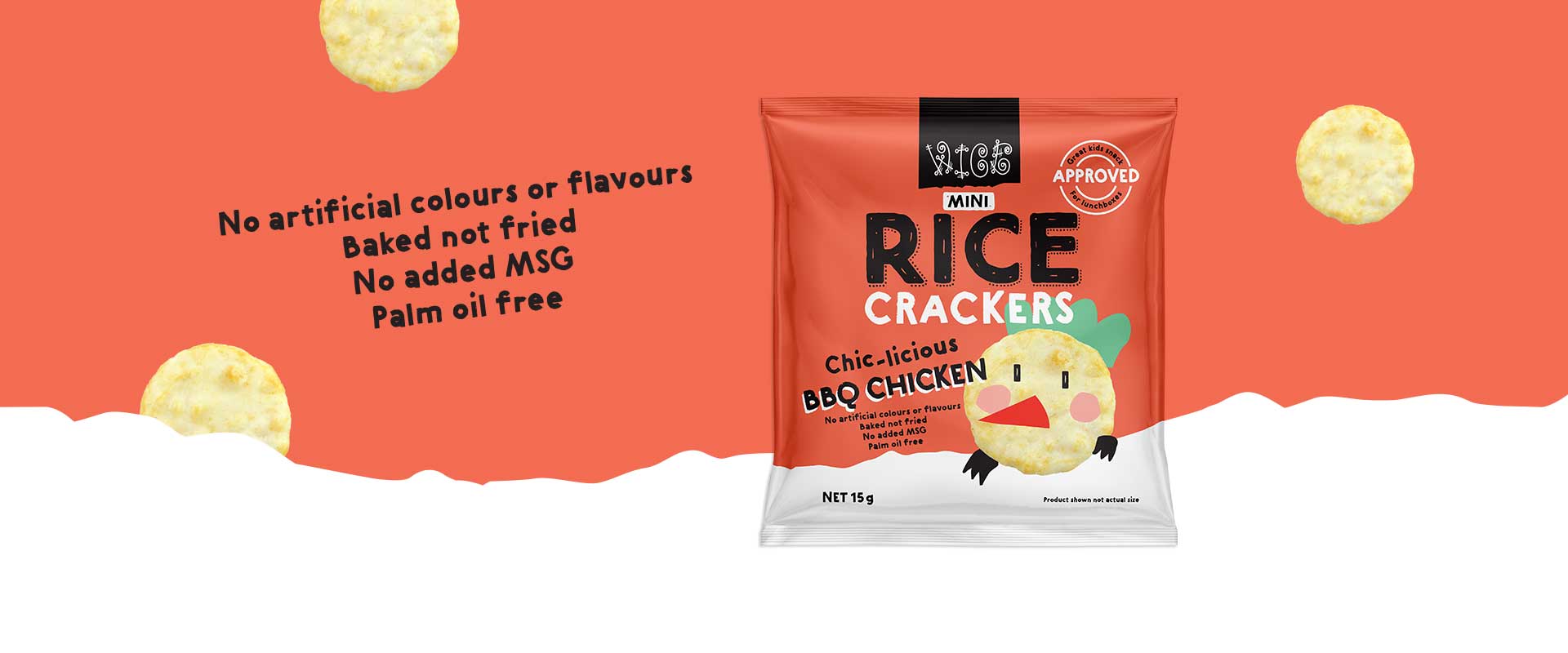
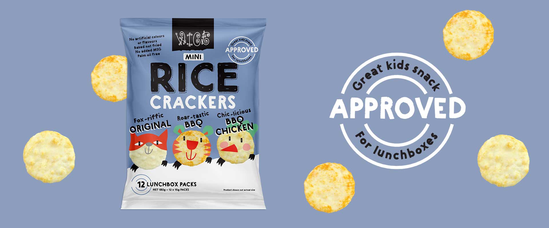
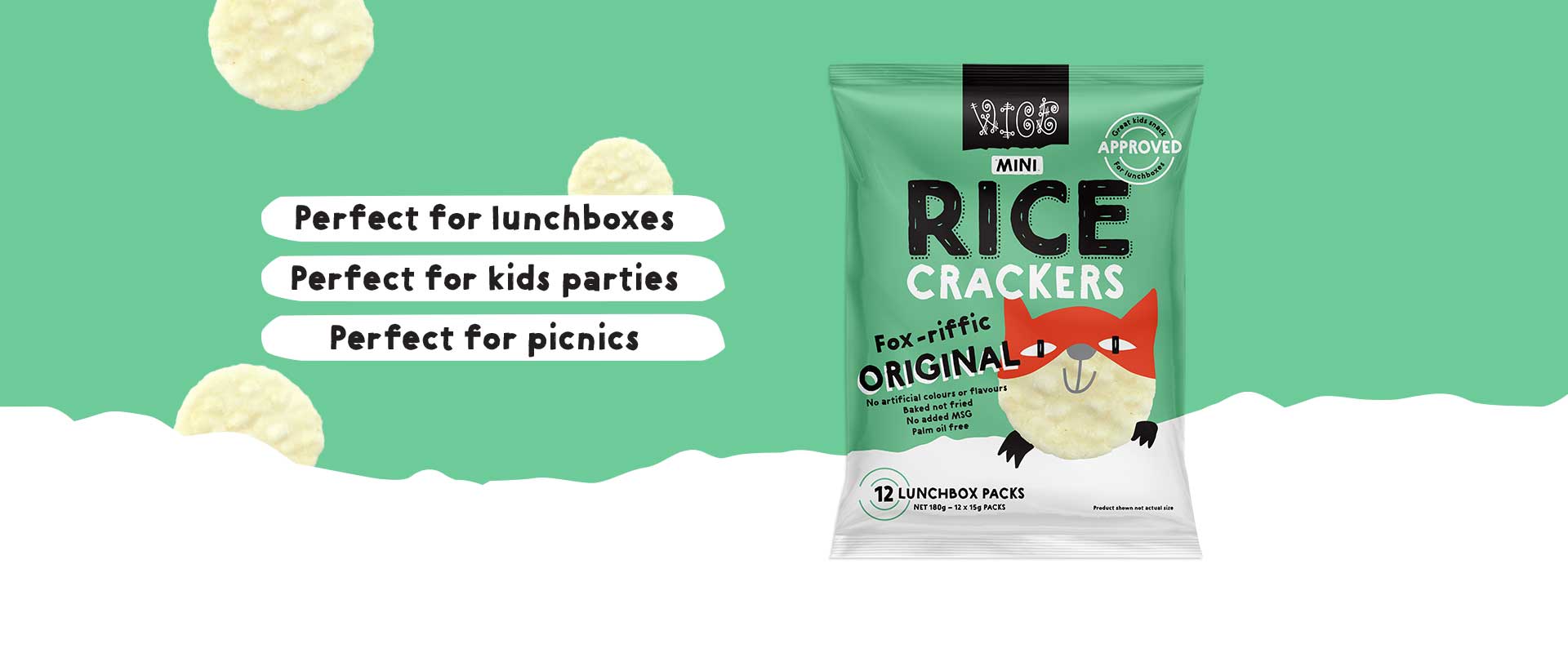
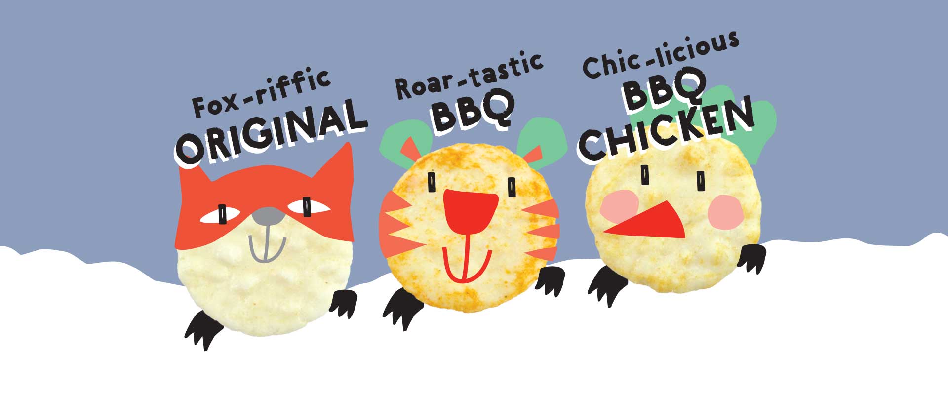
Percept created a set of playful and engaging Wice characters using the hero rice cracker as a base. A central part of this snack food packaging design project, they are the face of each flavour and form a distinct personality that is perfect for consumer engagement and ease of recognition.
The product led packaging design utilises fun typography combined with colour blocking for strong presence on shelf. Clear information hierarchy was developed with the Wice organic holding shapes, used to house important information and dietary claims, ensuring that key details are easily identified and read by the consumer.
The new snack food packaging design successfully captures the essence of the Wice Foods brand as a healthy but inviting convenience food. Eye-catching and bubbling with personality, the Wice characters alone ensure the packs are memorable with clear standout and appeal in a saturated market.