Packaging Design Refresh by Percept Packaging Design
The Challenge
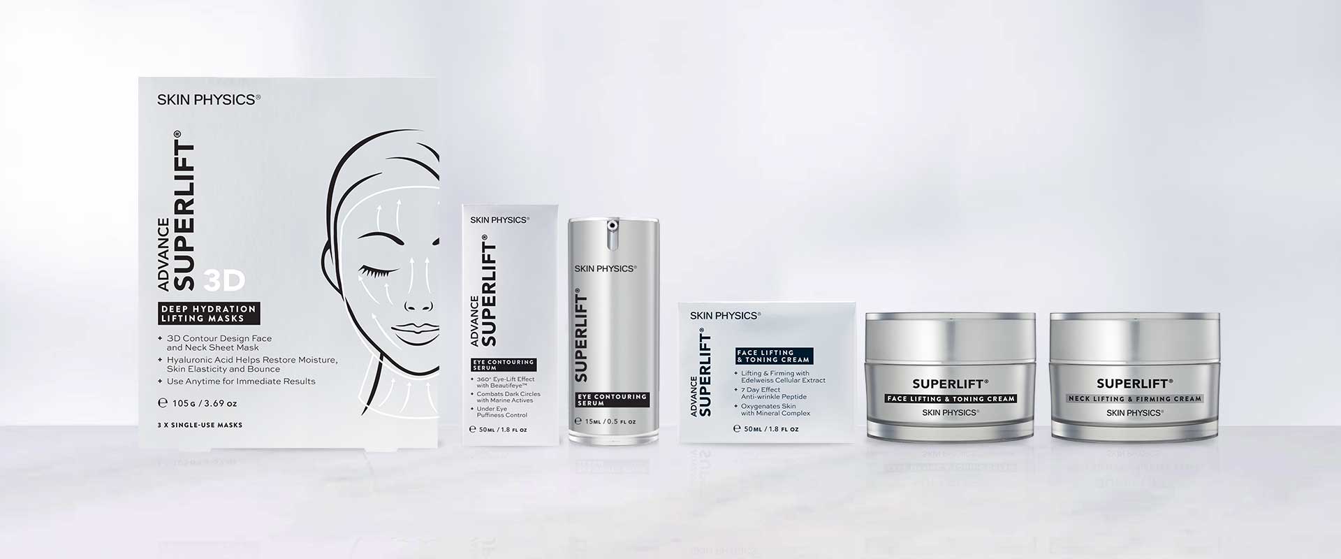
Skin Physics provide natural cosmeceutical skincare solutions that combine innovation, science and nature. Advance SUPERLIFT is one range of many, formulated especially for maturing skin for a tighter, smoother complexion.
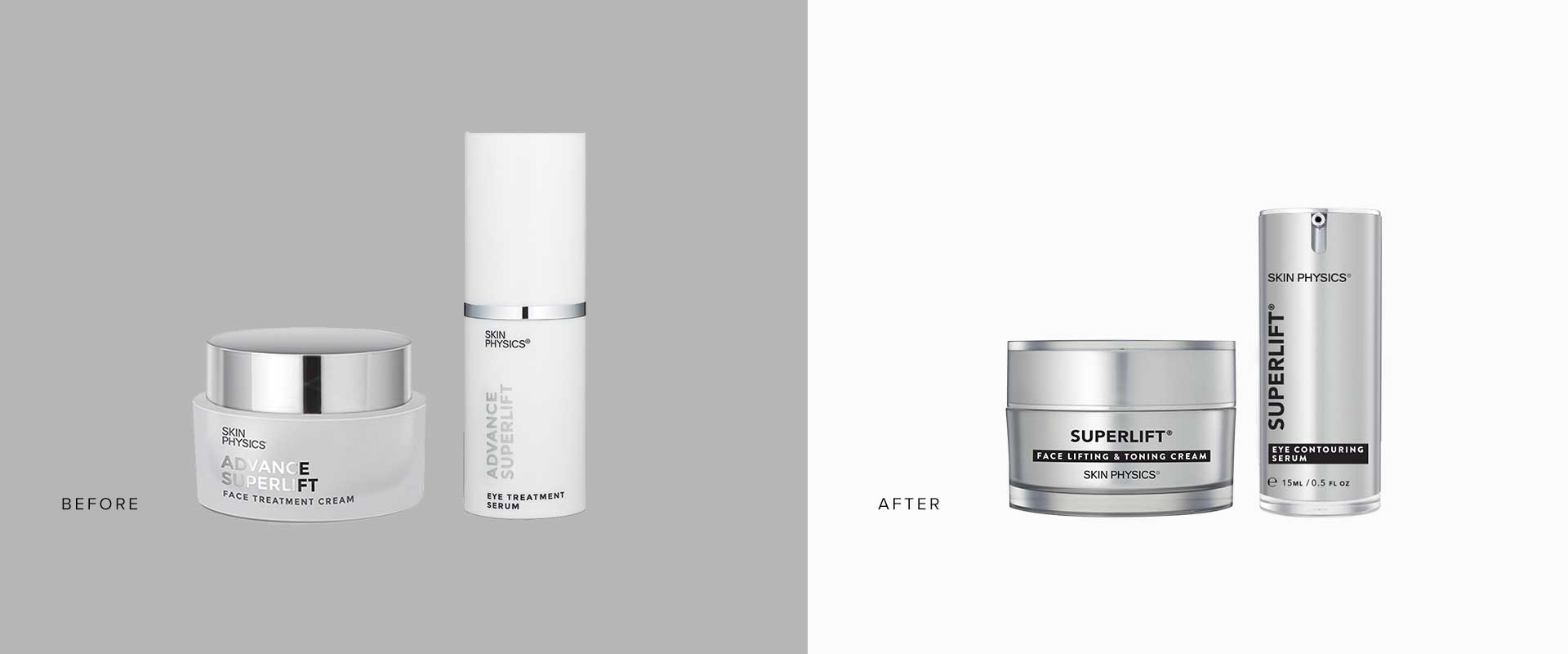
Following the successful packaging design refresh of their Dragon’s Blood range by Percept – Packaging Design, to better connect with their audience, the Advance SUPERLIFT range was next in line.
The Solution
Percept – Packaging Design had redefined the overarching structure of the Dragon’s Blood range, through careful selection of typography, stock, print finishes and aesthetic styles. This became the foundation for the Advance SUPERLIFT packaging design refresh.
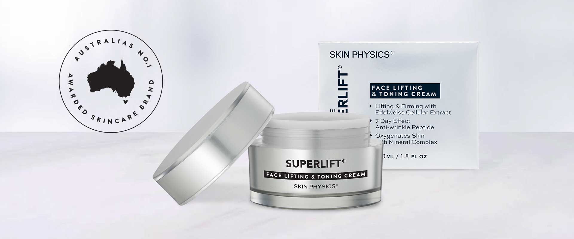
The new typeface is light, refined and contemporary, immediately elevating the perception of the brand. Clear hierarchy on pack ensures key information is easily identified on shelf, creating a sophisticated system that positions the brand in the premium spectrum.
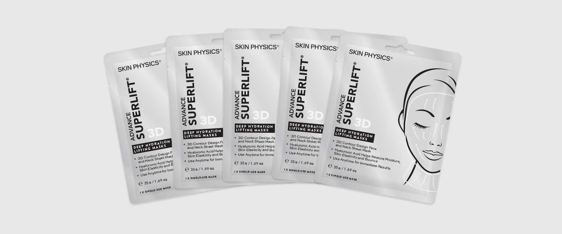
The packaging design refresh was applied to multiple products and sizes including masks, outer boxes, jars and bottles.
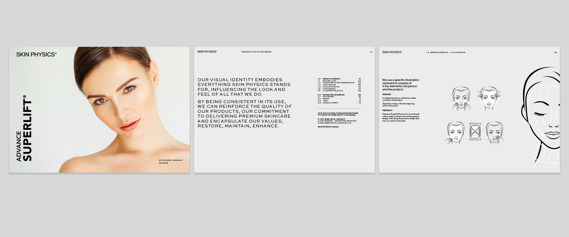
As part of the project, a style guide was also developed by Percept – Packaging Design, to ensure future application of the brand would maintain the new packaging architecture.
