Packaging Design / Art Direction
The Challenge
Fertile Mind, a maternity wear company, approached Percept Brand Design to refresh the packaging design and art direction for their newly acquired brand, Hug-a-Bub. The scope of the project included a packaging design refresh which had to consider brand equity and positioning, whilst bringing in some of the learnings from the rest of their family of brands.
The Solution
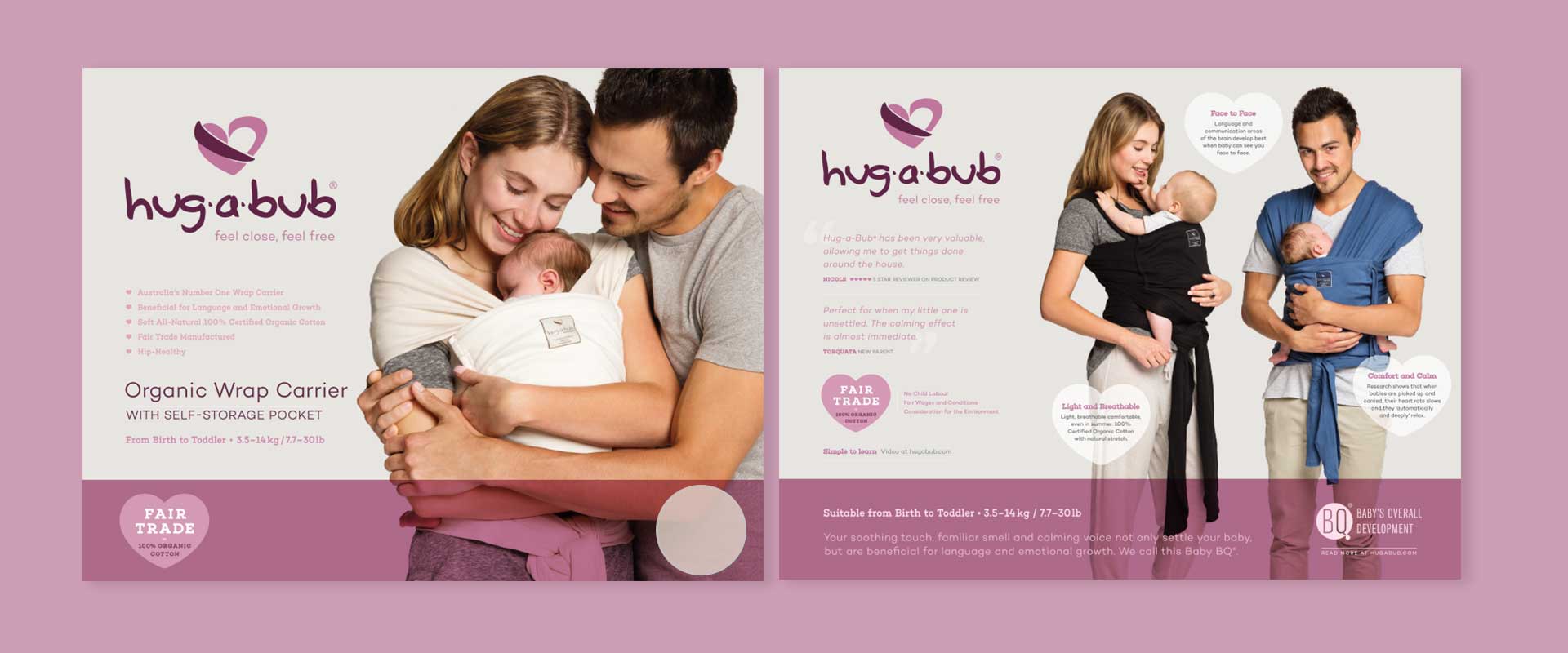
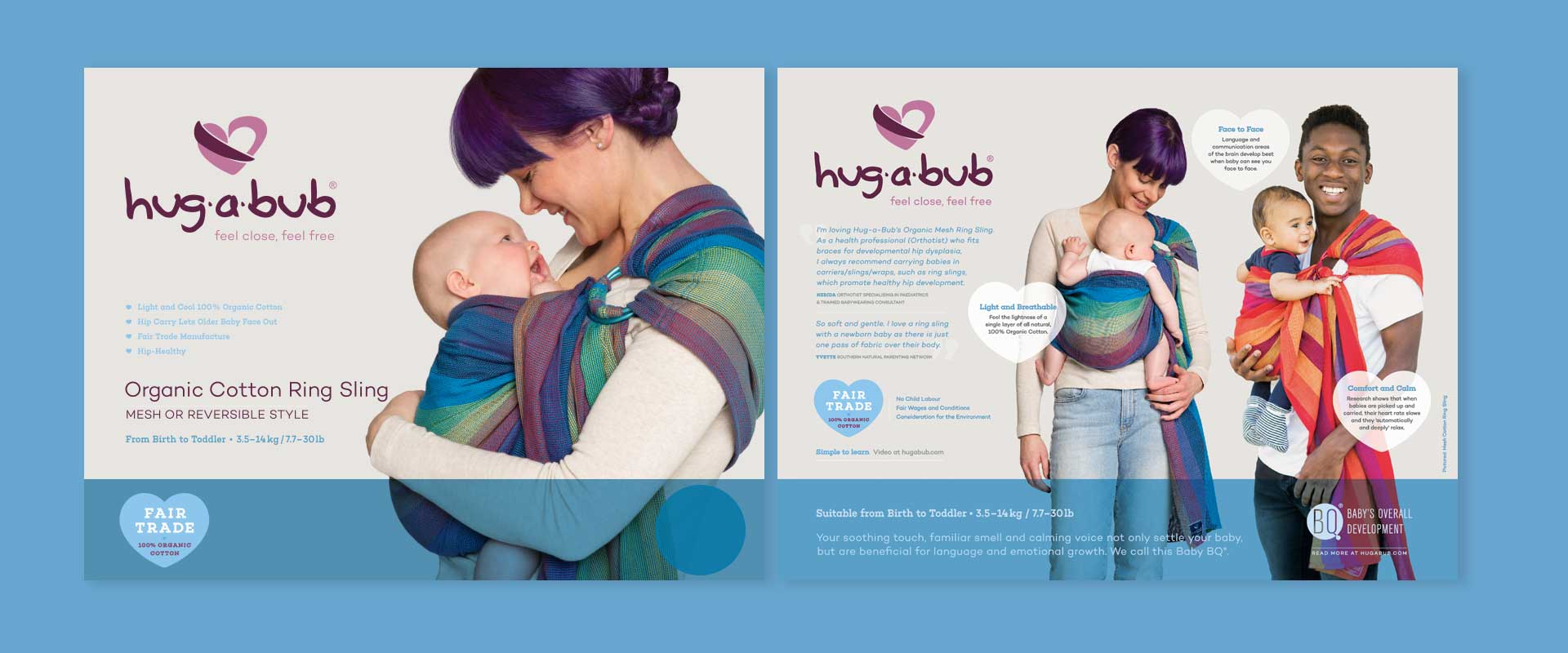
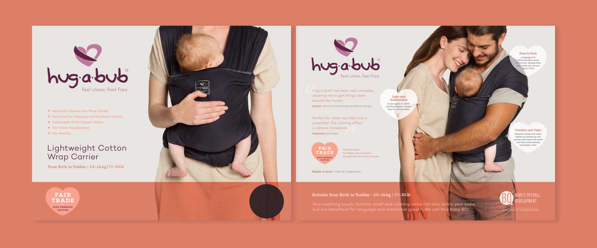
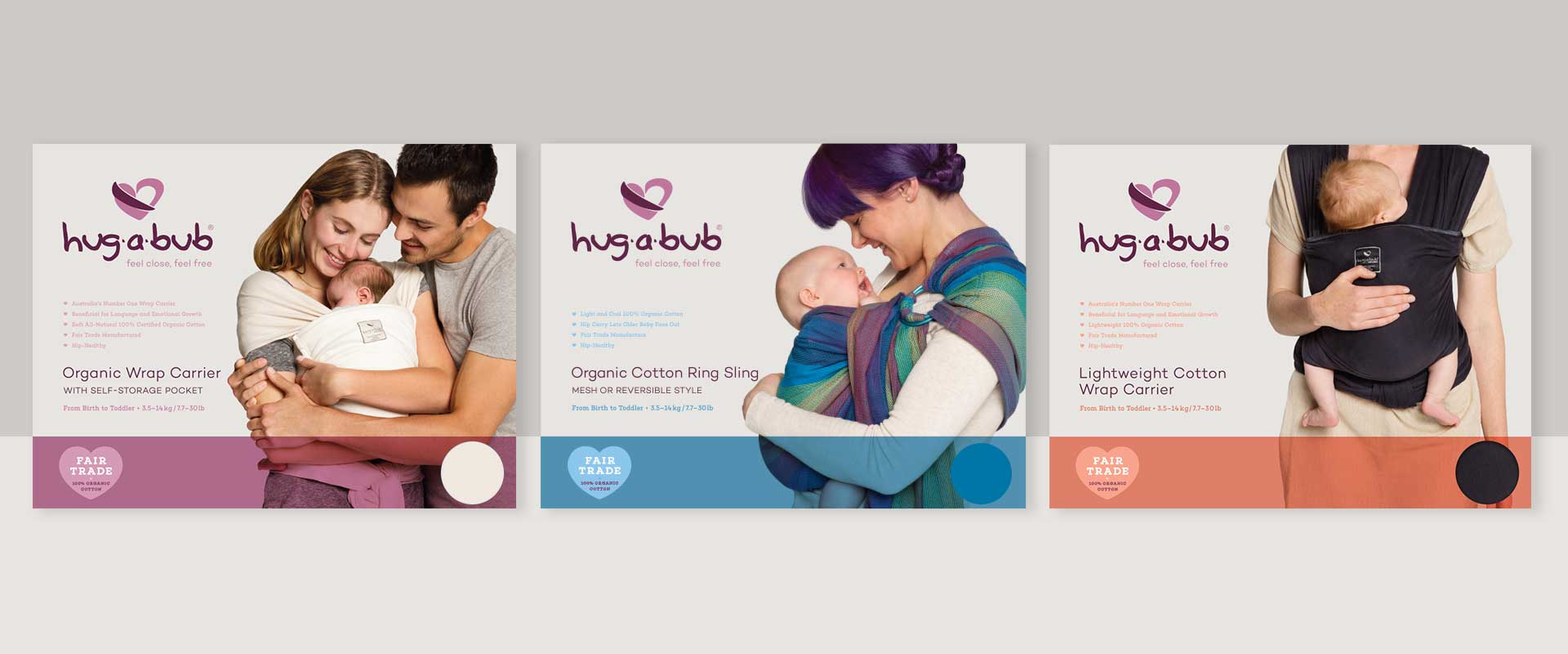
When exploring packaging design concepts, Percept looked at both an evolution and a revolution of the existing Hug-a-Bub packs. The client chose the evolution option, which was a modern design which the consumer could relate to, making strong use of photography, colour blocking and hierarchy of key sales information.
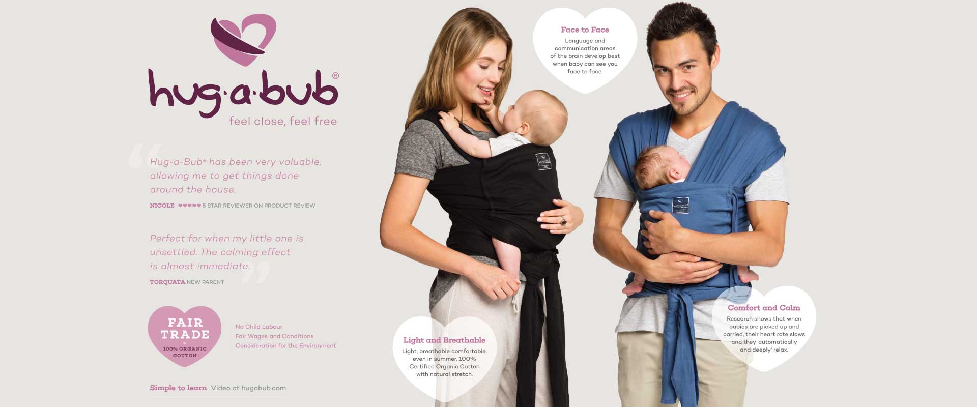
A warm, neutral background complements the base colour overlay that houses the image, taglines and stylised icons for clear communication when on shelf.
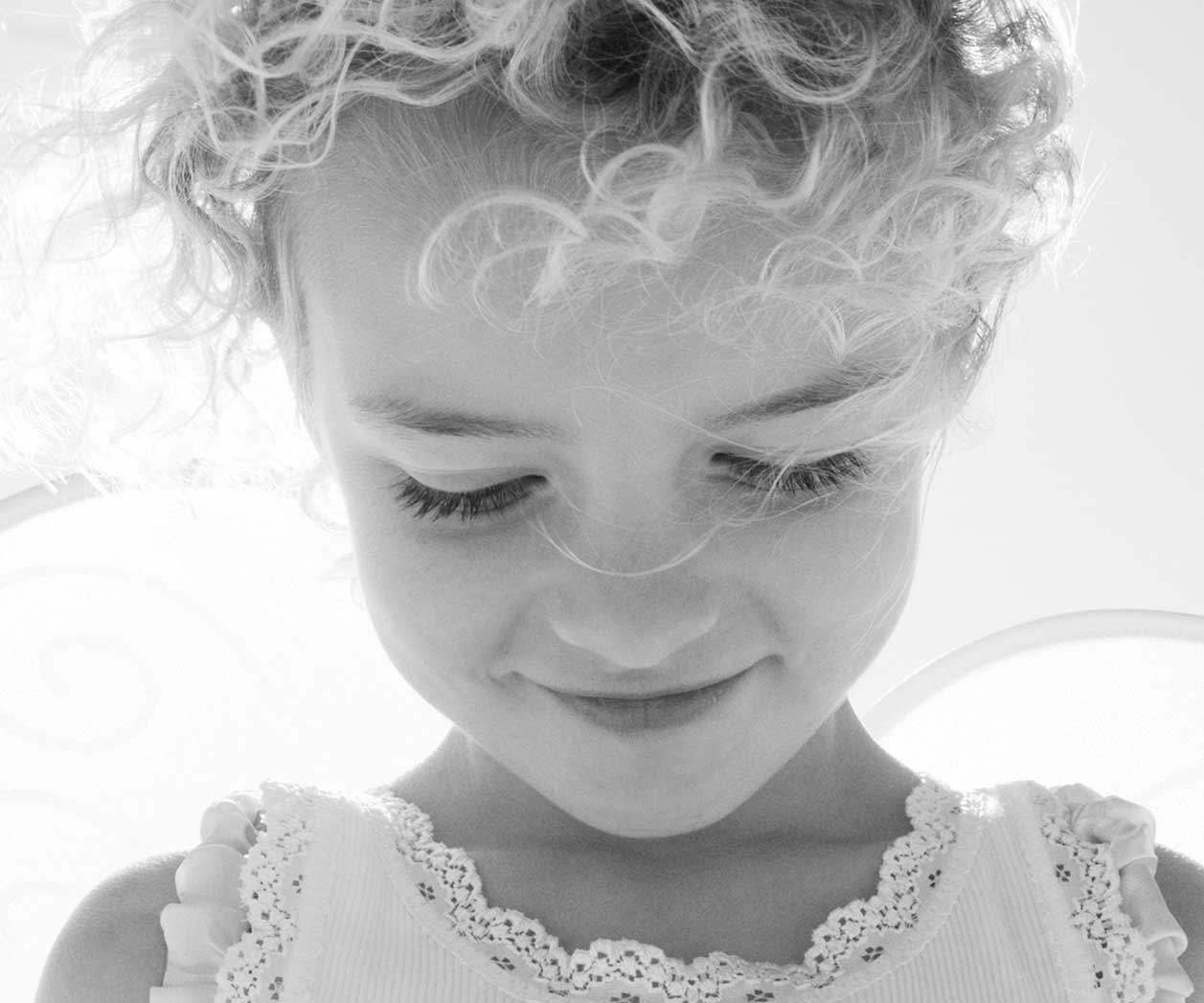
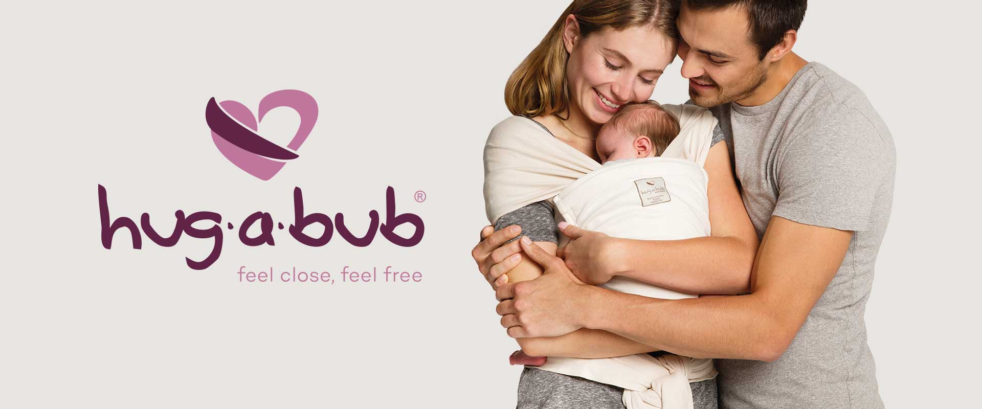
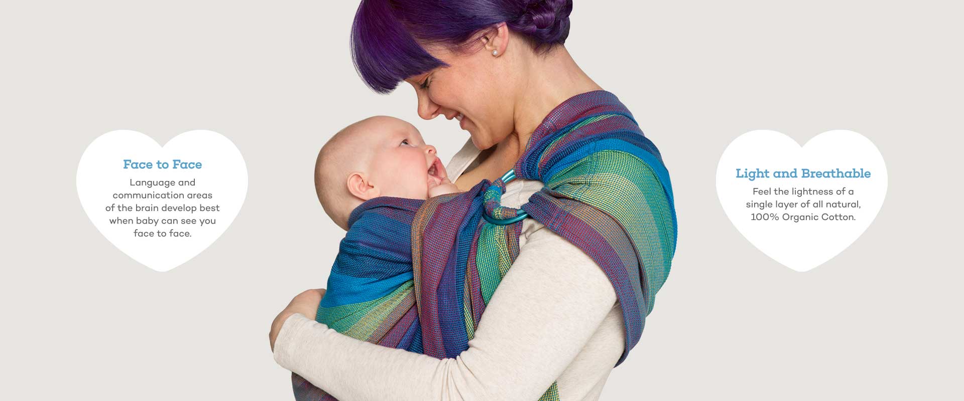
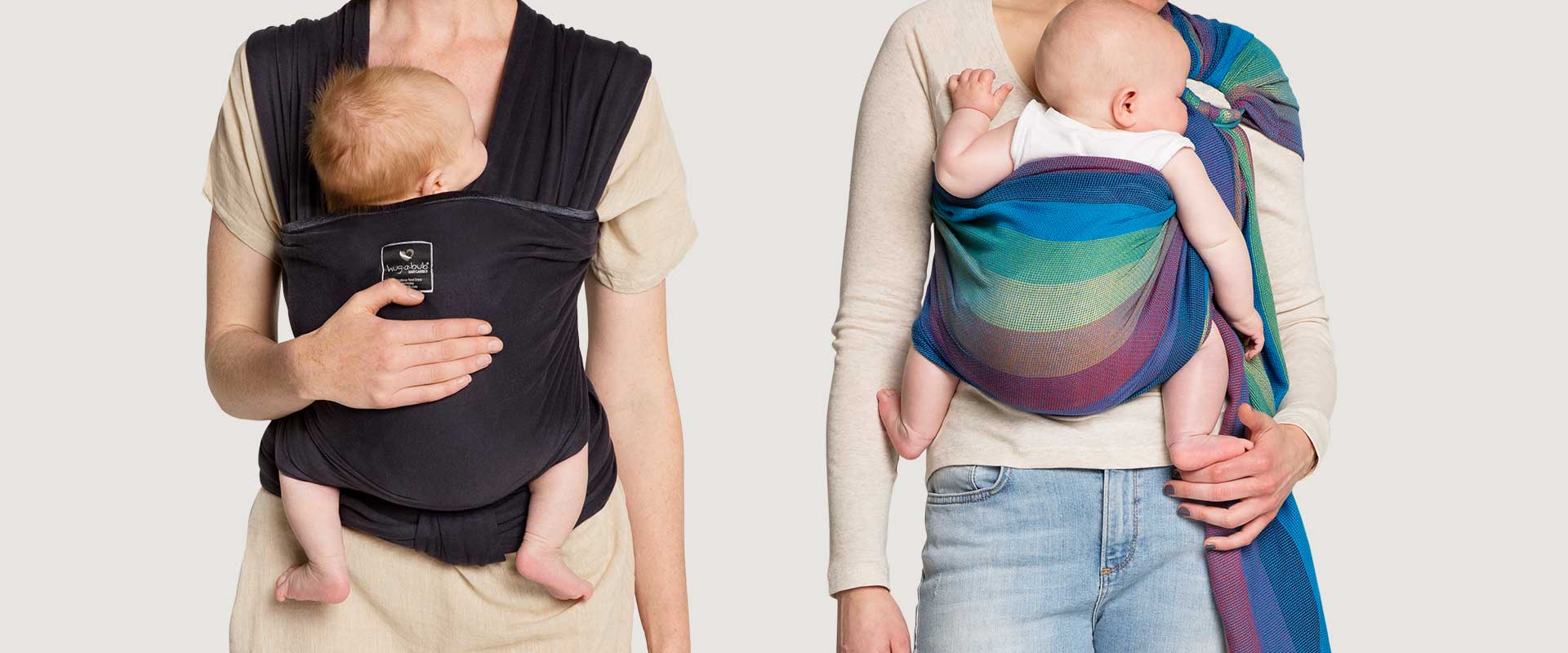
Percept Brand Design were also responsible for the art direction of a photoshoot as part of the project, focusing on warm colours, using soft shades of neutrals and greys to tie in with the new packaging design. Beautiful imagery of parents hugging babies is heartwarming and creates a sense of connection, safety and protection – values that are closely linked with the Hug-a-bub brand.