Branding / Food Product Label Design
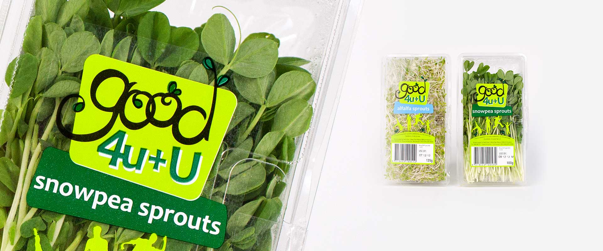
When Sydney’s Parilla Fresh had the opportunity to launch a new range of sprouts into the fresh food section of Woolworths they chose Percept as the design agency to answer their creative brief for the brand Good 4U + U.
These retail pack label designs began with the logo design which was created to represent the bright, energetic brand. It could also extend easily across a range of products and it inspired the label design for the whole range.
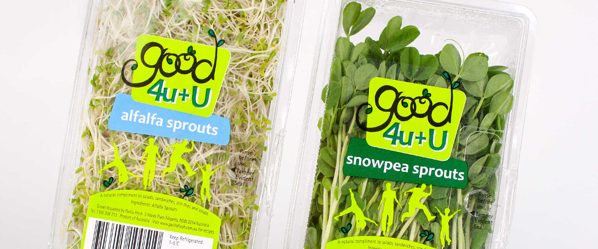
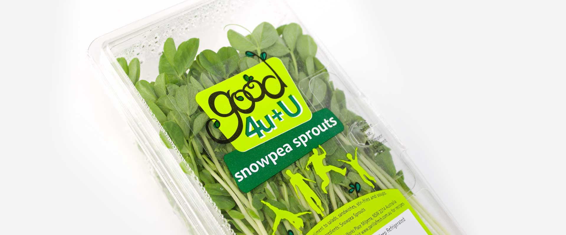
Appealing to mothers and health conscious foodies, the imagery and colours all reflect a vibrant and positive lifestyle. Moving human figures that are clearly getting the most out of life tell this story and engage the consumer.
This approach was not only for the consumer but also aligned with the business which is proud of the fresh produce that they supply.
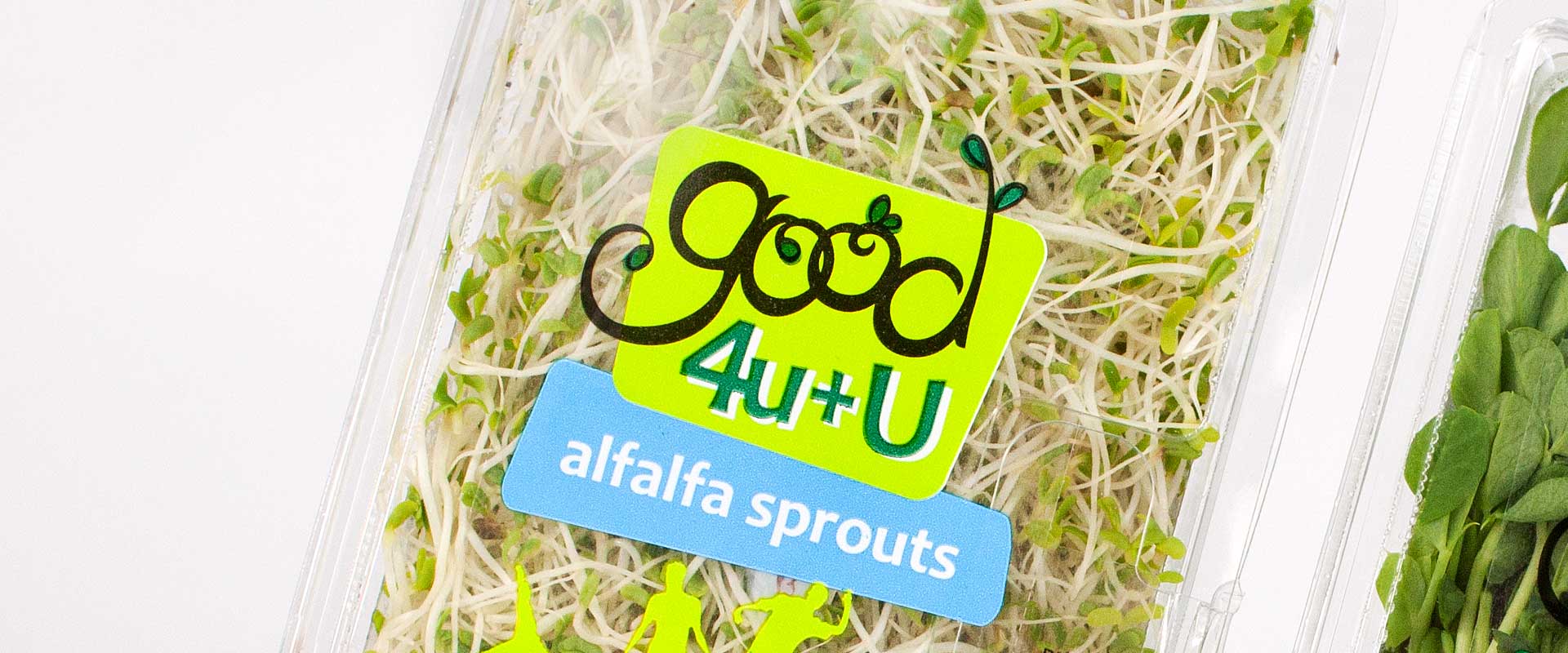
The label design ensures that the product is clearly visible though the packaging, which was an important part of the brief, as consumers expect this transparency when purchasing fresh food as it allows them to inspect the goods.
Another aspect to consider was strong shelf presence and recognisability. This is achieved thought the use of bright colours and consistency across the range.
Colour coding is used to differentiate the products clearly. Colour and style were selected carefully not only for brand engagement but also to ensure ease of printing on the clear substrate.
The result is a new brand and packaging label design that tells a healthy story. It also stands out boldly in the bright and busy world of the fresh produce section of Australian supermarkets.
