Brand Refresh & FMCG Packaging Design
Discovery
Yo-Chi approached packaging design agency, Percept, with the goal of expanding its beloved in-store offering that has been popular since 2012 into the retail world.
A collaborative brand workshop was conducted to navigate the opportunity and challenges around a brand refresh and FMCG packaging design to suit the retail environment. The workshop sessions revealed Yo-Chi’s desire to maintain the authenticity of its existing branding while reaching new customers with a slight brand refresh in order to expanded their market into a retail presence.
Through a collective exploration, both teams assessed the potential for the brand’s growth and identified key product offerings and unique selling points (USPs) that would resonate with both retail partners and consumers alike.
The stakeholder workshop helped define the shift necessary in their branding strategy to scale up with FMCG packaging design, while staying true to its core brand identity – delicious, playful, and refreshing. This set the stage for a smooth integration into FMCG packaging design, maintaining Yo-Chi’s original charm while offering a more versatile, expansive framework for transition into the retail customer experience. Keeping things simple made total sense to achieve this and allow for range extensions in the future.
Branding Strategy
Guided by a branding strategy that embraced simplicity and flexibility, packaging design agency, Percept, worked to expand Yo-Chi’s presence while keeping the brand refresh very clean, ensuring the existing fun, vibrant essence remained intact.
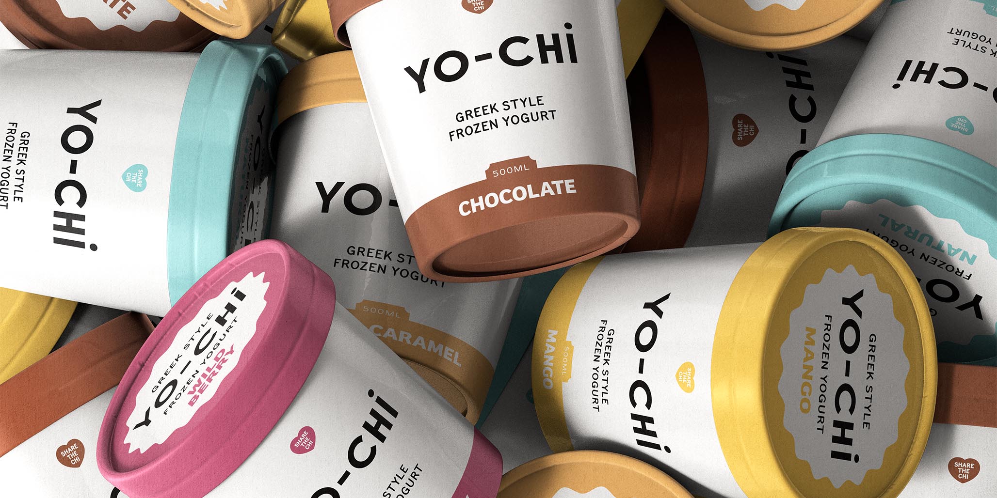
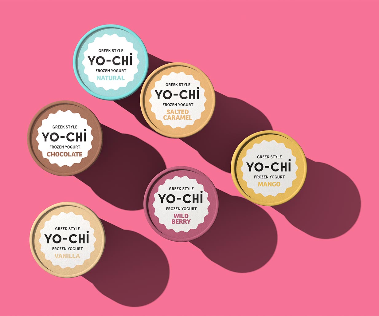
The focus of the brand refresh was to extend the brand’s playful devices into shorthands for both FMCG packaging design and retail marketing, creating a visual identity that could be easily adapted across a variety of different platforms. Key product offerings were accentuated through the use of clear, bold typography, helping to highlight Yo-Chi’s unique selling points and flavour varieties.
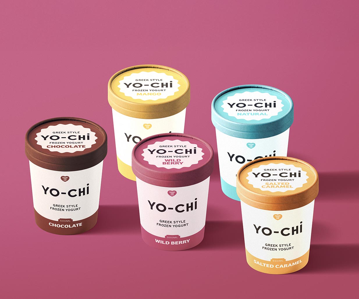
The colour palette was extended through banner-style designs, clearly distinguishing the different flavours while maintaining a cohesive visual language. The simplicity of this branding strategy aimed to present Yo-Chi as a leading brand in the retail food space, combining ease of recognition with a joyful consumer experience that was clear and straightforward.
The brand refresh resulted in a refined yet flexible visual language and FMCG packaging design that has expanded their products into the retail space. This enables the business to cater to a larger, more diverse audience while staying true to its roots. The updated branding strategy ensured Yo-Chi’s FMCG packaging design was not only attractive but also communicated clearly, conveyed the same personality and appeal that customers have come to love in-store because of its simplicity.
Design
As a packaging design agency with nearly 30 years in the game, Percept recognised that Yo-Chi’s brand refresh didn’t require a complete overhaul, but instead of reinventing the wheel, the smart play was to clean things up, provide enhancement through clarity and extend into retail with FMCG packaging design that delivers its messaging succinctly.
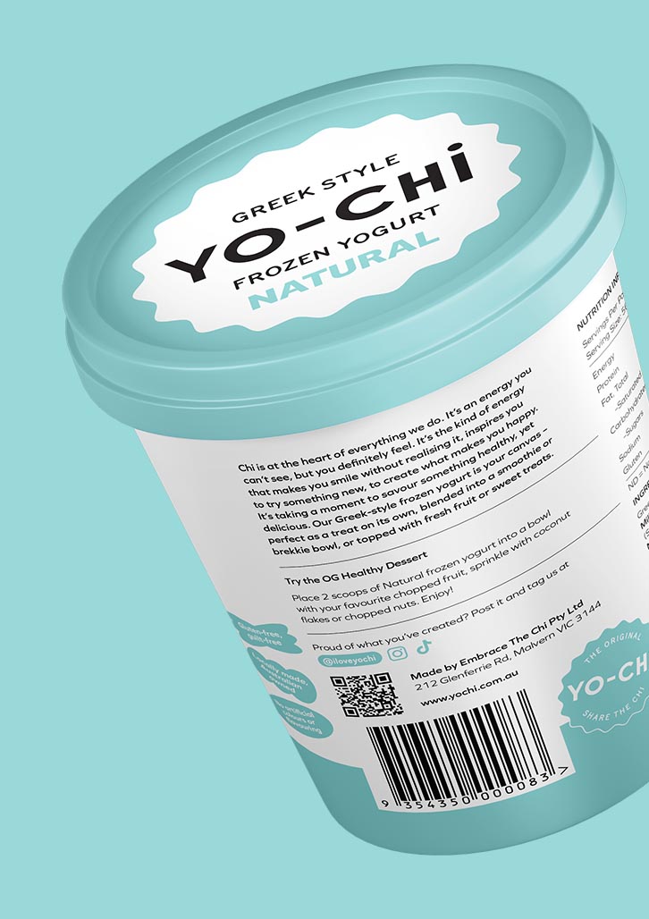
By continuing the use of Yo-Chi’s core elements and extending that into a visual language that can be adapted to flex seamlessly between its in-store and FMCG offerings, it allows their products to communicate clearly in all environments.
The simple but effective system creates a link between the retail products available in a supermarket setting, and the positive emotional connection associated with the in-store Yo-Chi experience. This obviously makes their products more accessible and the FMCG packaging design is intended to grow as their range does with more popularity.
In addition, the brand refresh introduces playful graphic devices, providing shorthand symbols for various flavours and offerings, in a consistent way. This means the brand is instantly recognisable and easy to navigate on shelf as well as in point of sale marketing situations.
The colour palette was carefully adjusted, with bold banners representing the distinct flavours on offer while maintaining a cohesive visual identity across all packaging design. This ensures that each product variation is differentiated visually while still belonging to the larger Yo-Chi family.
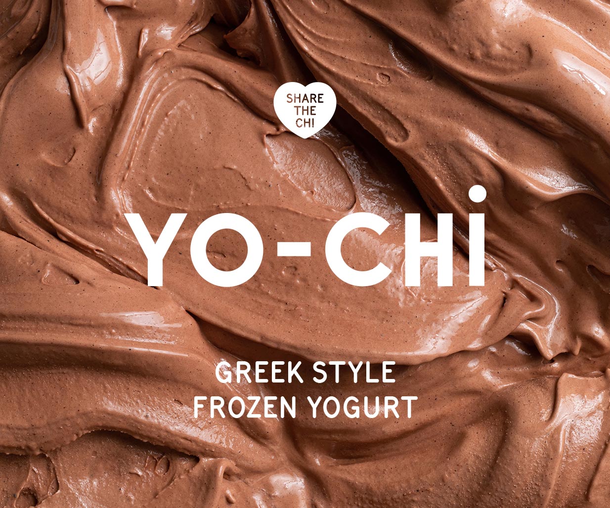
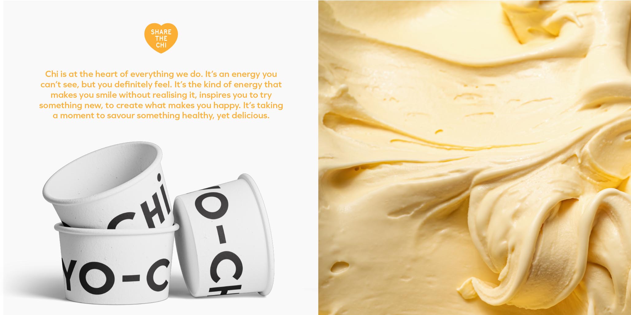
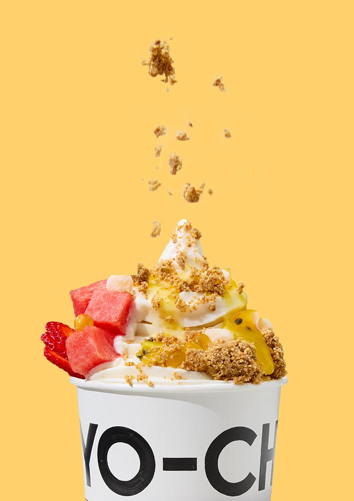
Photography continues to showcase the vibrant, joyful nature of the brand, now further enhanced to communicate both the indulgence and simplicity of Yo-Chi’s products. Whether through the new packaging design in a retail environment, or in Yo-Chi stores, the brand refresh is a reflection of the company’s commitment to accessibility, quality, and fun.