Branding & Marketing Collateral by Brand Consultancy, Percept
Discovery
Brand consultancy, Percept, was engaged by Angel Underwriting for a total rebranding, including brand identity, marketing collateral and website design.
Through stakeholder discussions and industry review, it became clear that underwriting in general, was often slow, complex, and frustrating. Legacy systems, unclear processes, and excessive back-and-forth were costing brokers time, momentum, and business opportunities.
From these insights, Percept identified the opportunity for Angel Underwriting to rebrand with a new identity and marketing collateral that prioritises speed, clarity, and confidence, providing faster turnaround, clearer communication, flexible coverage, and a partner brokers can trust.
These insights provided the foundation for the rebrand, informing a verbal and visual brand identity that embodies responsiveness, precision, protection and partnership.
Every design decision that Percept made as the brand consultancy, from typography and colour, to tone of voice and digital touch points, was guided by the need to rebrand, creating a contemporary identity that behaves as efficiently and confidently as the company it serves.
Strategy
The brand strategy positions Angel as the responsive alternative in a traditionally slow, rigid insurance category. The rebrand is sharp, modern, relevant and confident, conveying speed and simplicity through intuitive digital systems. It represents a true partner, built around the real needs of brokers.
Every aspect of the brand identity reflects this narrative: broker-first, action-focused, and contemporary. A confident tone of voice reinforces Angel’s promise of precision, responsiveness, and trust, while design, messaging, and digital touch points consistently embody these qualities.
This strategy ensures that Angel doesn’t just look different across its new branding, marketing collateral and website design — it behaves differently, delivering the speed, clarity, and confidence brokers experience every time they engage with the brand.
Brand Positioning
Angel Underwriting positions itself as the agile, intelligent underwriting partner built for brokers.
Key brand stance:
- Responsive: Fast quotes and streamlined workflows.
- Precise: Expert underwriting backed by sharp thinking.
- Supportive: Human, clear communication that builds trust.
Brand positioning statement:
Angel Underwriting delivers precision and protection with speed — underwriting that works the way brokers need it to: fast, flexible, and dependable.
The brand promise is simple and confident — Sharp thinking. Fast cover.
Supporting messages reinforce this ethos:
- Agile. Intelligent. Insurance.
- Confidence in risky business.
- Built for brokers. Ready for more.
- Sharp thinking. Fast cover.
With this clearly defined brand positioning, Angel doesn’t aim to keep up, it moves the industry forward, delivering a broker-first experience that is fast, precise, and trusted.
Brand Identity Design
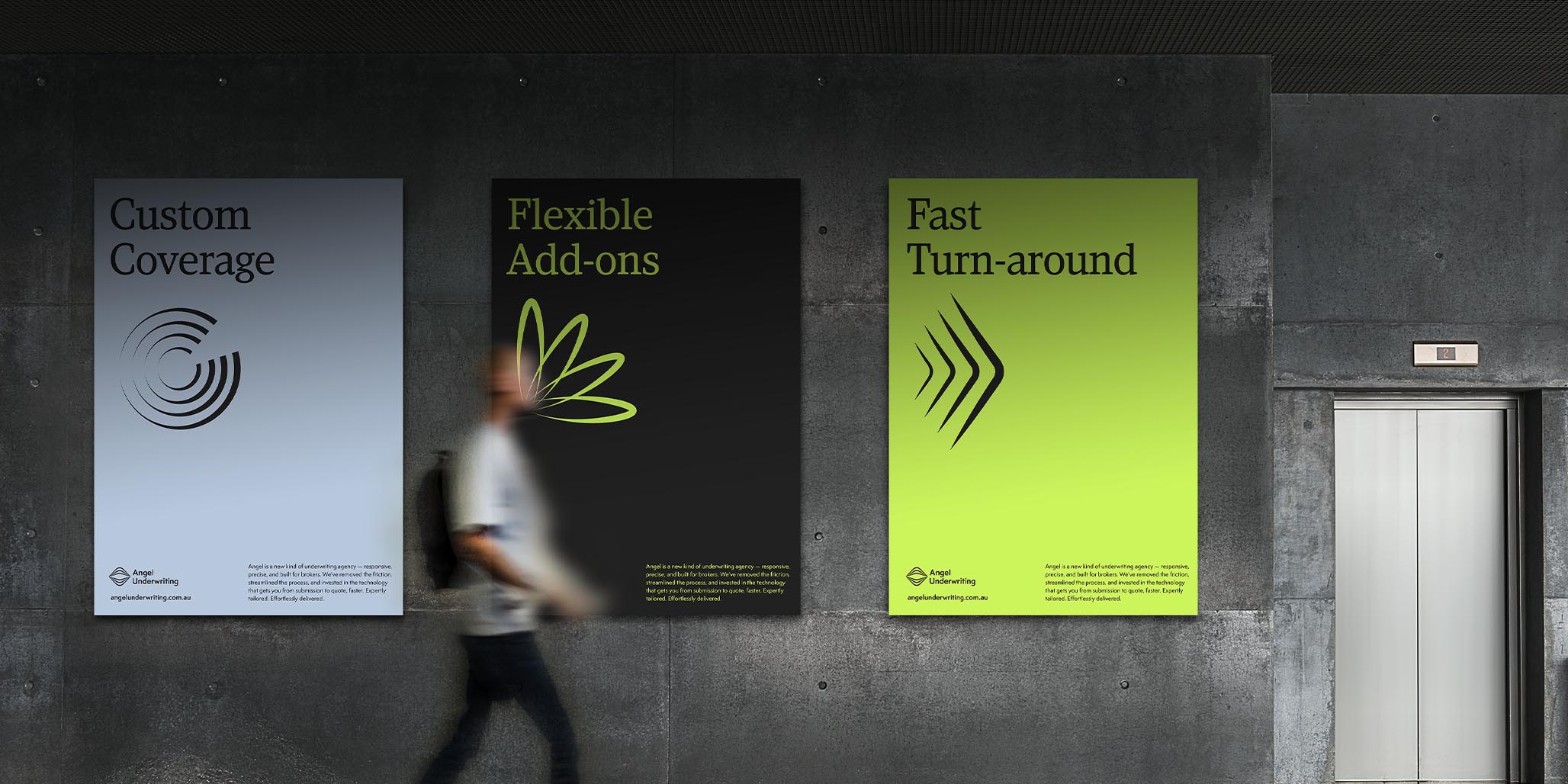
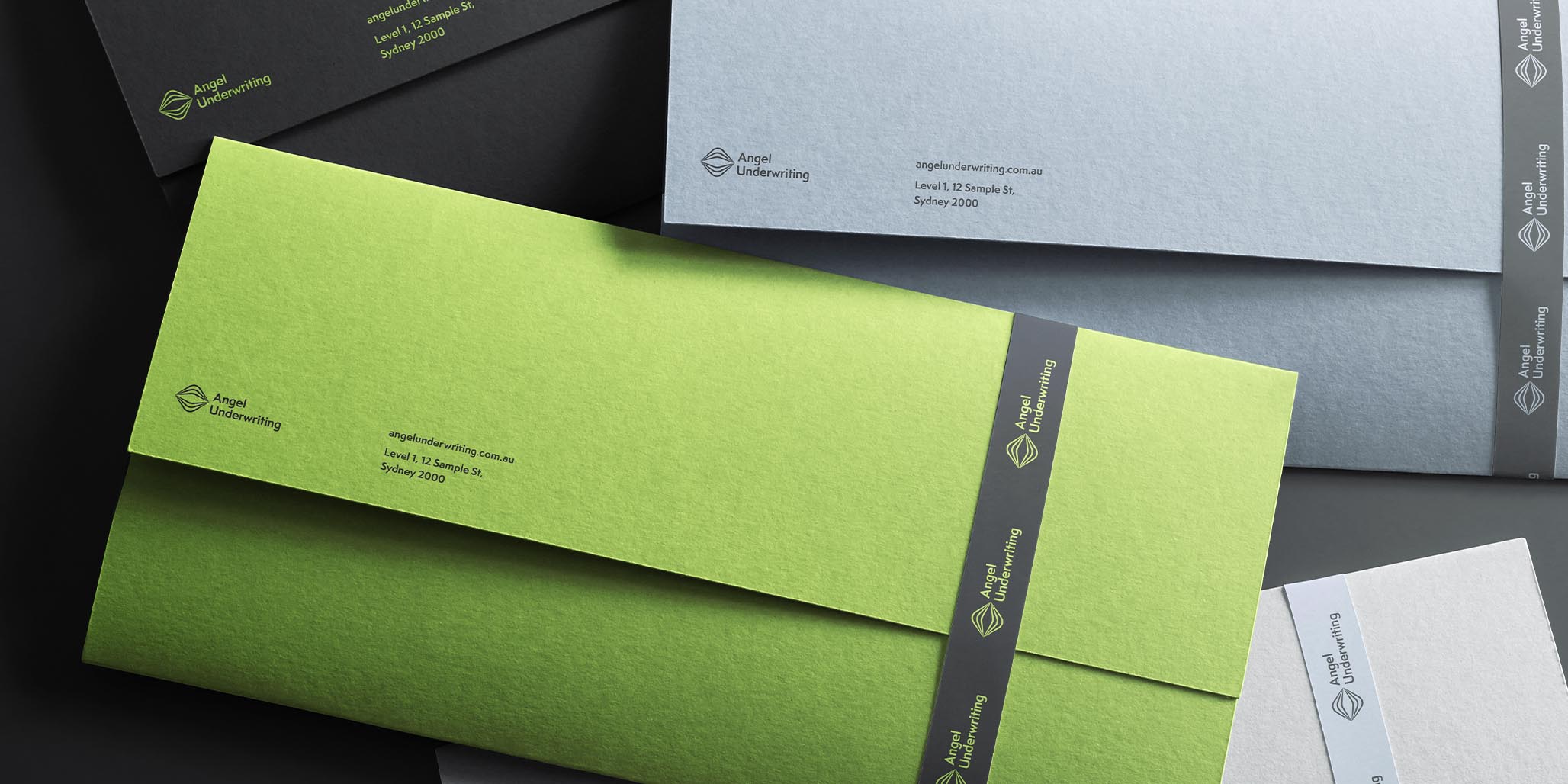
The brand identity design expresses confidence, clarity, and protection at every touch point.
A sharp, contemporary sans serif typeface conveys speed and precision, while a warm, refined serif font introduces trust and approachability, reflecting the human side of underwriting.
The layered halo device symbolises integrated protection, visually reinforcing the promise of cover that surrounds, supports, and adapts.
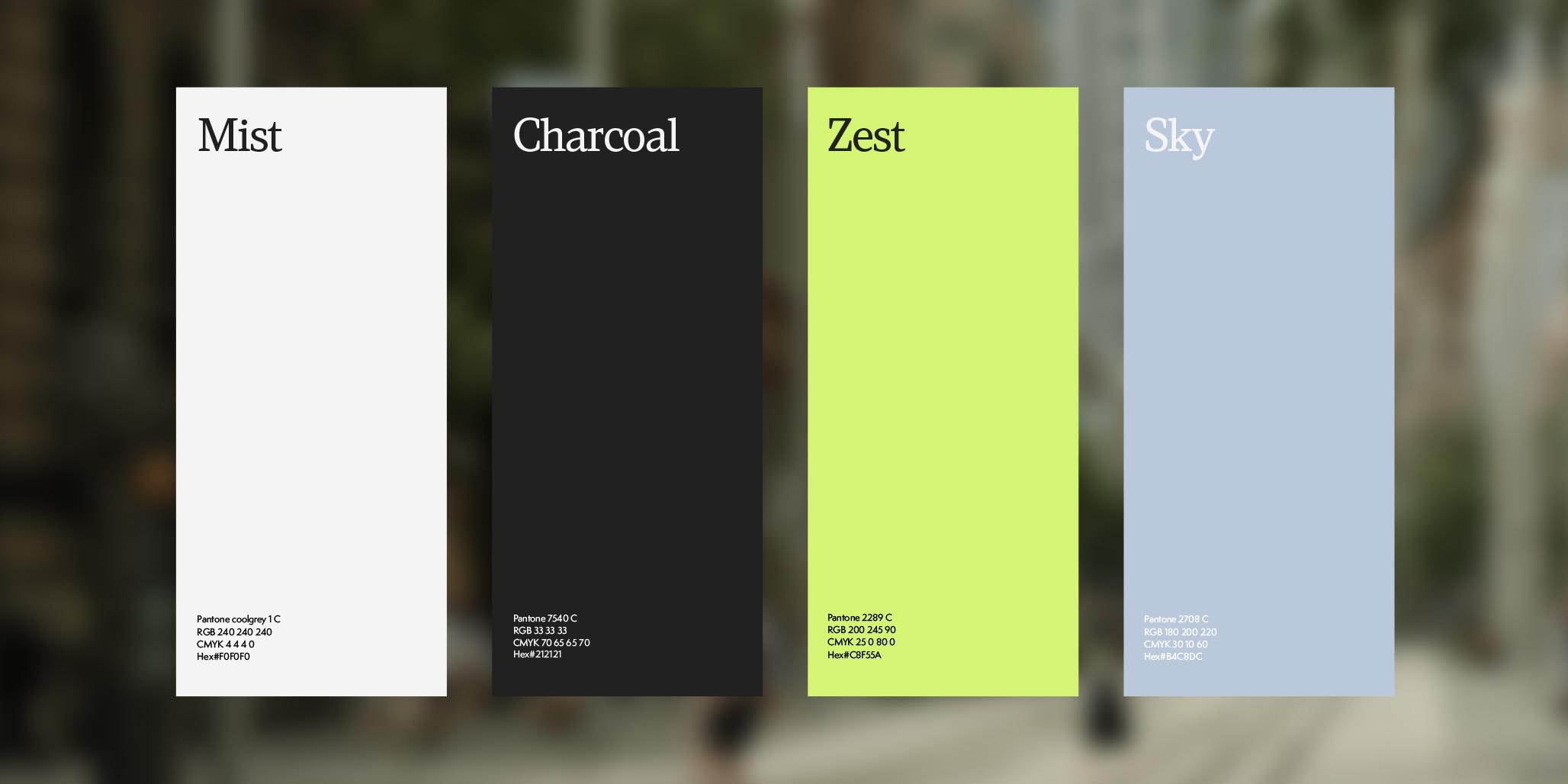
The broader brand identity system is spacious, modern, and uncluttered, reflecting the efficiency and ease of the Angel experience. Calm, controlled colours, assertive yet legible typography, and direct, purposeful messaging work together to communicate clarity, confidence, and professionalism.
An intentional photography treatment puts a frame of focus on the subject, reinforcing the brand messaging and positioning. At the same time, this unique effect gives the brand another point of differentiation from it’s competitors with a style they can own that has good reasoning behind it.
Together, the brand identity and language used throughout all print and digital marketing collateral, combines to embody what Angel Underwriting delivers every day: smart, fast, broker-first underwriting, built for clarity, trust, and confidence.

