


Corporate Branding & Identity Design
Discovery
Corporate branding agency, Percept, was approached by Energy Bay to create their new identity design in an effort to update the brand’s positioning and image in relation to their competitors.
They identified the need to revitalise their business by outwardly communicating that their brand was relevant in today’s market. To achieve this, they chose to work with Percept to create a new identity design in a process that would address their positioning as part of the rebrand.
Energy Bay was established in 2016 to support Australia’s clean energy transition, the business built deep expertise in Distributed Energy Resources and a fully integrated delivery model spanning feasibility through to optimisation.
Energy Bay owns and operates assets, it delivers at scale, it maintains long-term partnerships. Yet this capability was not clearly understood in market.
The category was saturated with sustainability claims and short-term savings narratives. Few competitors spoke with authority about ownership, capital backing or lifecycle accountability — as part of Percept’s discovery process, these factors were identified to be Energy Bay’s strengths of differentiation.
Enterprise clients were managing increasing infrastructure complexity across embedded networks, on-site generation and storage. They required certainty, control and long-term performance.
In terms of corporate branding, the opportunity was clear — reposition Energy Bay as the integrator of sustainable distributed energy infrastructure, and create an identity design, marketing campaign and digital experience that communicates this with equal clarity.
Strategy
Like with any identity design project, it all started with a smart strategy. Percept anchored the corporate branding around a clear and disciplined idea that repositioned their company within the industry:
Australia’s sustainable energy infrastructure partner — delivering integrated, long-term energy performance.
This shifted the narrative from energy solutions to infrastructure integration.
Energy Bay is an owner–operator that designs, funds, integrates and manages Distributed Energy Resources across the full lifecycle. The strategy unified this as the core principle of the brand.
The core values were formalised as operating principles in the form of an ambigram: SPARC — Sustainability, Performance, Assurance, Rigour and Customer-Driven delivery.
This clarity extended into digital, where the website design was restructured through a new sitemap and UX framework to simplify a complex offering into a clear corporate branding system aligned to how enterprise clients evaluate infrastructure partners.
The result is a platform for scalable, enterprise growth — clear in market and built for long-term partnerships.
Positioning
Energy Bay is Australia’s sustainable energy infrastructure partner.
From embedded networks to on-site renewable generation and battery storage, its vertically integrated model provides certainty at every stage of the transition.
Energy Bay turns energy transition into engineered infrastructure — managed with precision, integrity and control.
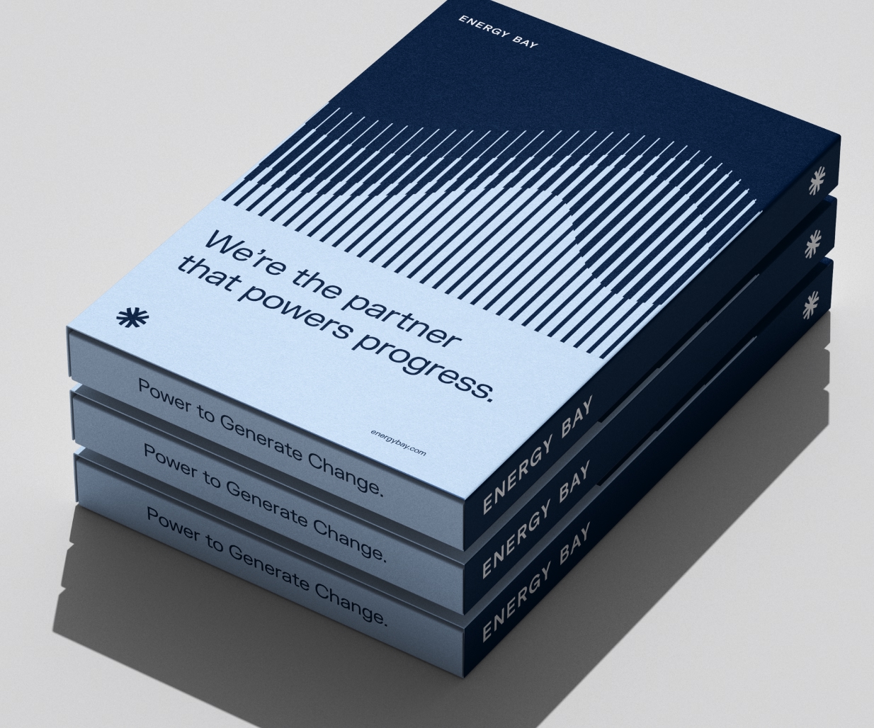
‘Power to generate change’ manifests as more than a tagline. It defines intent — performance-led, infrastructure-first and built for measurable impact.
This brand positioning informs both the corporate branding and digital expression, ensuring every interaction reinforces clarity, capability and control, and is realised through an identity design that signals authority, integration and scale.
Identity Design
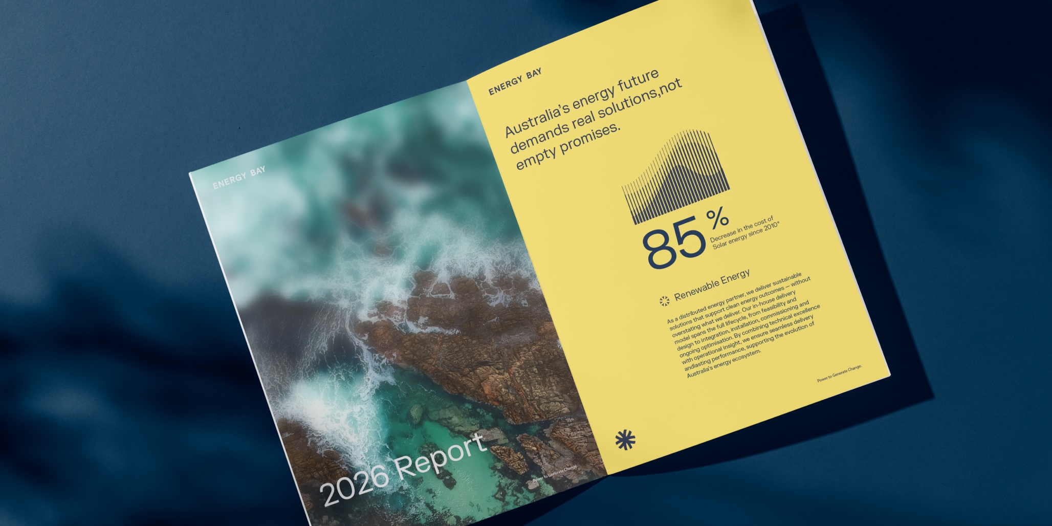
Percept created the identity design to express integration, structure and technical authority.
A symmetrical, radial brandmark reflects energy flow and engineered systems — multiple inputs unified within a controlled framework. The retained wordmark preserves equity in the existing corporate branding and reinforces stability, creating a confident enterprise presence.
The identity design features a deep navy that anchors the palette, supported by calibrated environmental tones that introduce measured energy. Typography is precise and disciplined, with structured layouts that reinforce order and control. Wave-inspired graphic devices add scalable dynamism throughout the corporate branding system. A recognisable, photography style balances infrastructure, environment and expertise.
This identity design system extends into digital environments. UX and UI design were developed to mirror the brand’s structured clarity — simplifying complex infrastructure offerings into intuitive, high-confidence user journeys.
The website design was delivered end-to-end, including front and back-end development, testing and deployment — ensuring performance, reliability and scalability aligned with the brand promise.
Energy Bay now has an identity design that presents as the company operates — integrated, rigorous and built for long-term performance.