Australian Website Design and Development / Communications / Tone of Voice / Copywriting
The Challenge
The Australian Commission on Safety and Quality in Health Care (the Commission) was initially established in 2006 by the Australian, state and territory governments to lead and coordinate national improvements in safety and quality in health care.
The Commission launched the Caring for Cognitive Impairment campaign in January 2016. The campaign builds on Commission projects that relate to the safety and quality of care for people with a cognitive impairment in hospital.
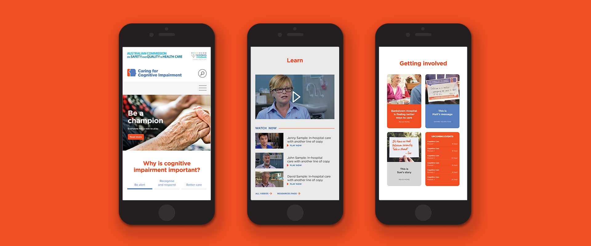
The website housed a lot of important information but was difficult to navigate and lacked cohesion. The human element was missing and they also needed to encourage people to get involved in the cause.
The aim of the creative campaign refresh was to increase awareness so healthcare professionals can better recognise symptoms and respond accordingly, ultimately leading to better levels of care. They engaged Percept, website design agency Sydney, for this website design and development project, to deliver on that aim.
The Solution
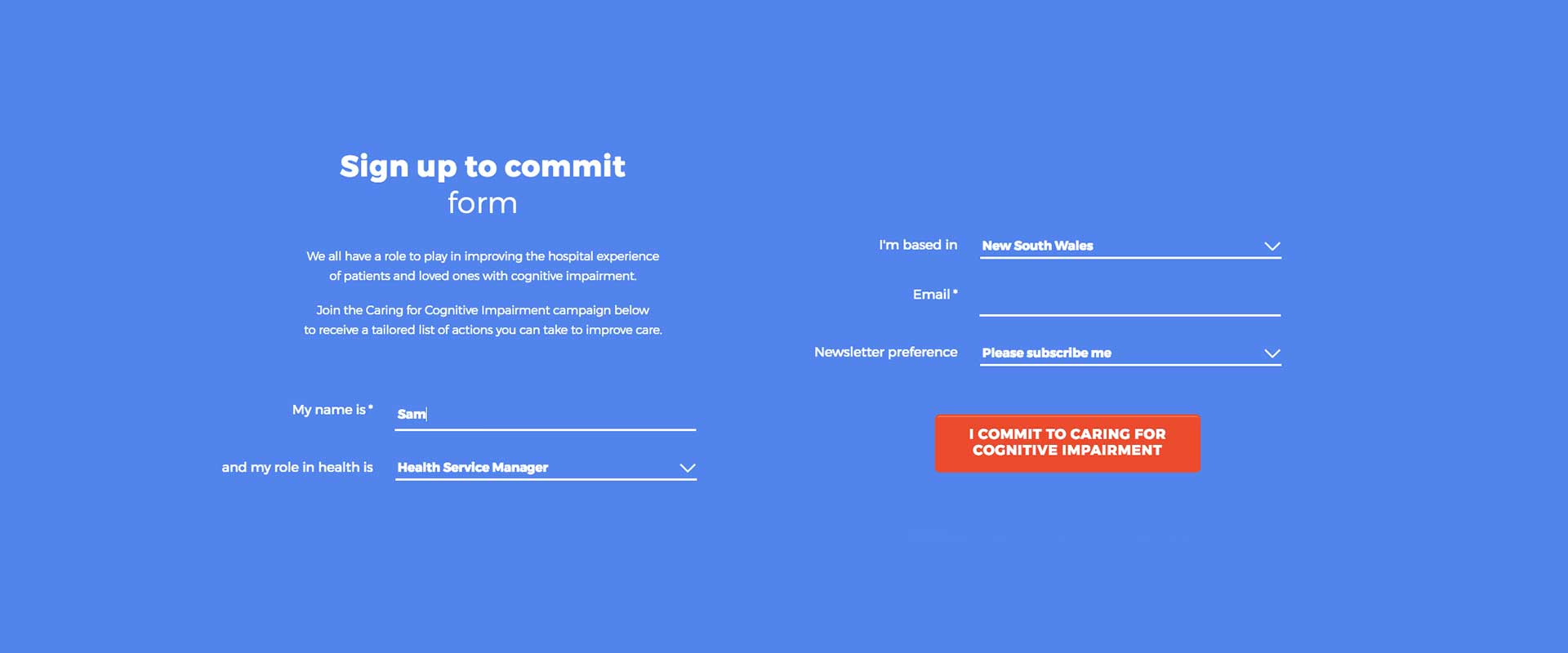
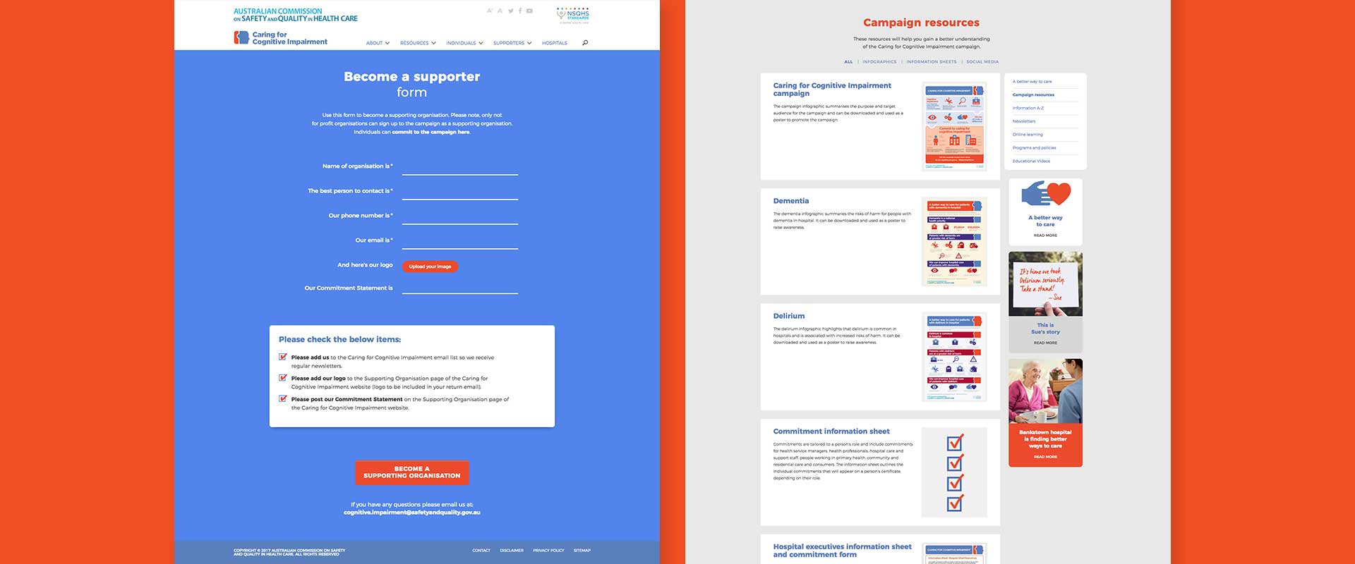
Percept’s approach on this website design and development brief, was to introduce more human tone of voice into the creative campaign development. Using natural language and a simplified framework we clearly defined the issues around cognitive impairment care and guided people on how to lend a hand. Copywriting addressed everything from headlines through to easy-to-use forms, creating fewer barriers to entry for signups.
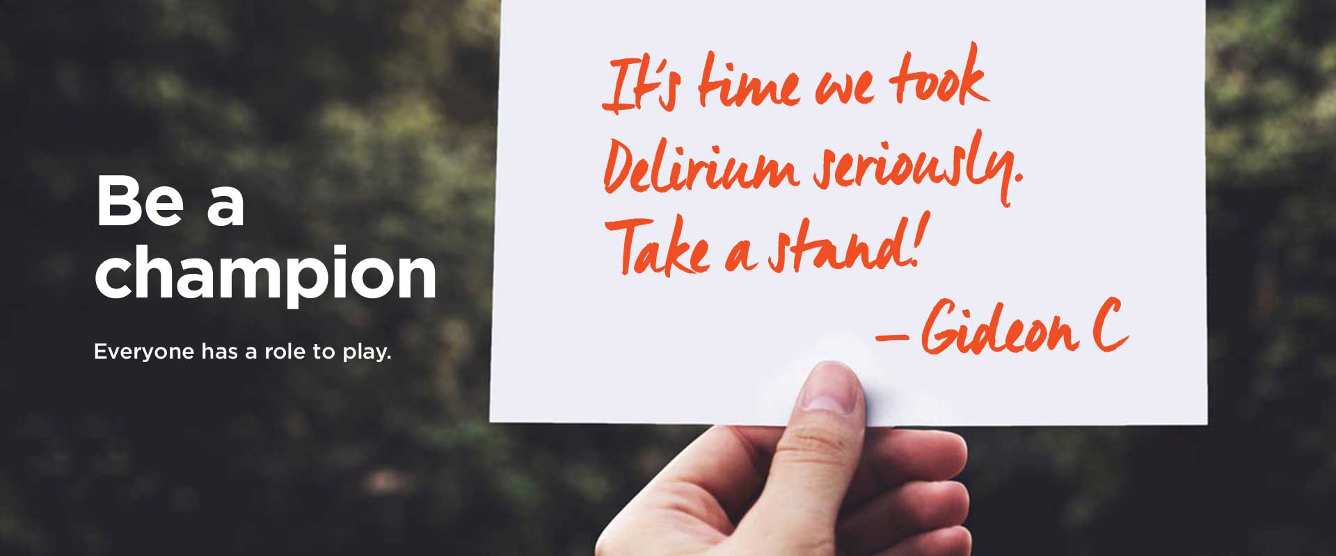
We uncovered human stories by encouraging people to share theirs via the website. A downloadable placard template gave people a visual way to share their experiences along with long form text options.
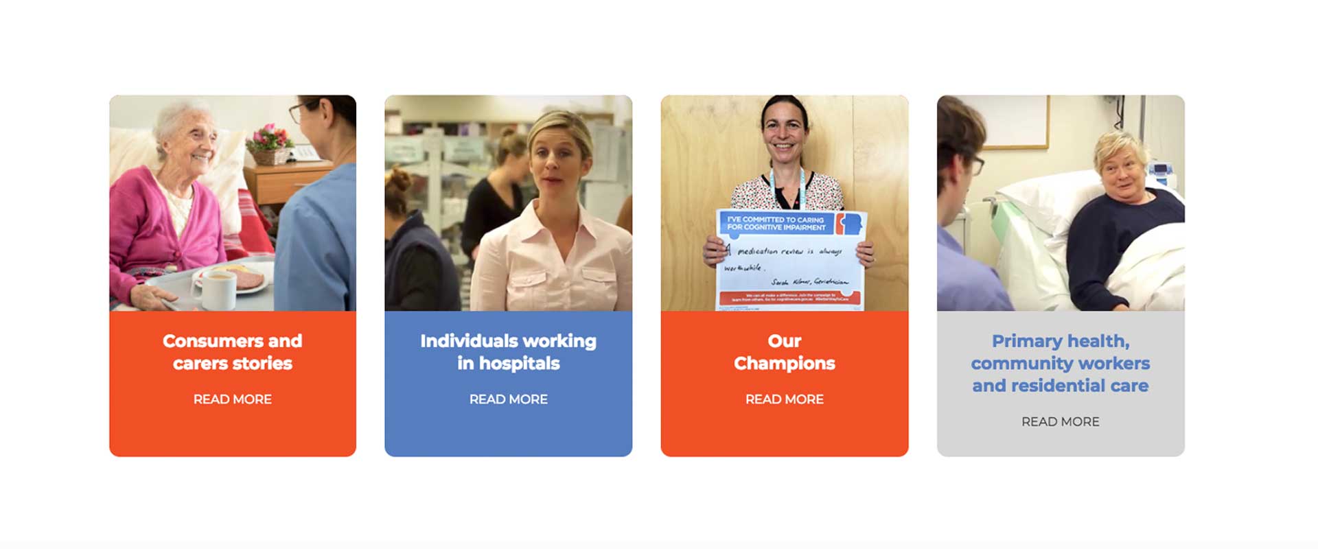
Pairing this with warm imagery of carers and patients created a compelling library of sharable stories.
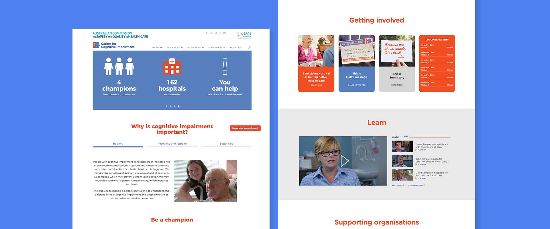
An enhanced database and tabbed content blocks made information and resources much more accessible. It also made it easier for people to connect with supporters and ‘champions’ across the country.
Ultimately, by highlighting humanity and giving people a voice, we were able to create a richer, more engaging platform for research, discovery and discourse.
Prior to branding design specialist, Percept’s involvement, the digital campaign had stagnated with 1456 individuals and 160 hospitals committed to the campaign. In the first 6 months since the launch of the new website design and development project, sign-ups spiked and there were 2061 individuals and 218 hospitals that had committed. Those numbers are now even larger and are continuing to grow every day.
