Packaging Redesign Sydney
The Challenge
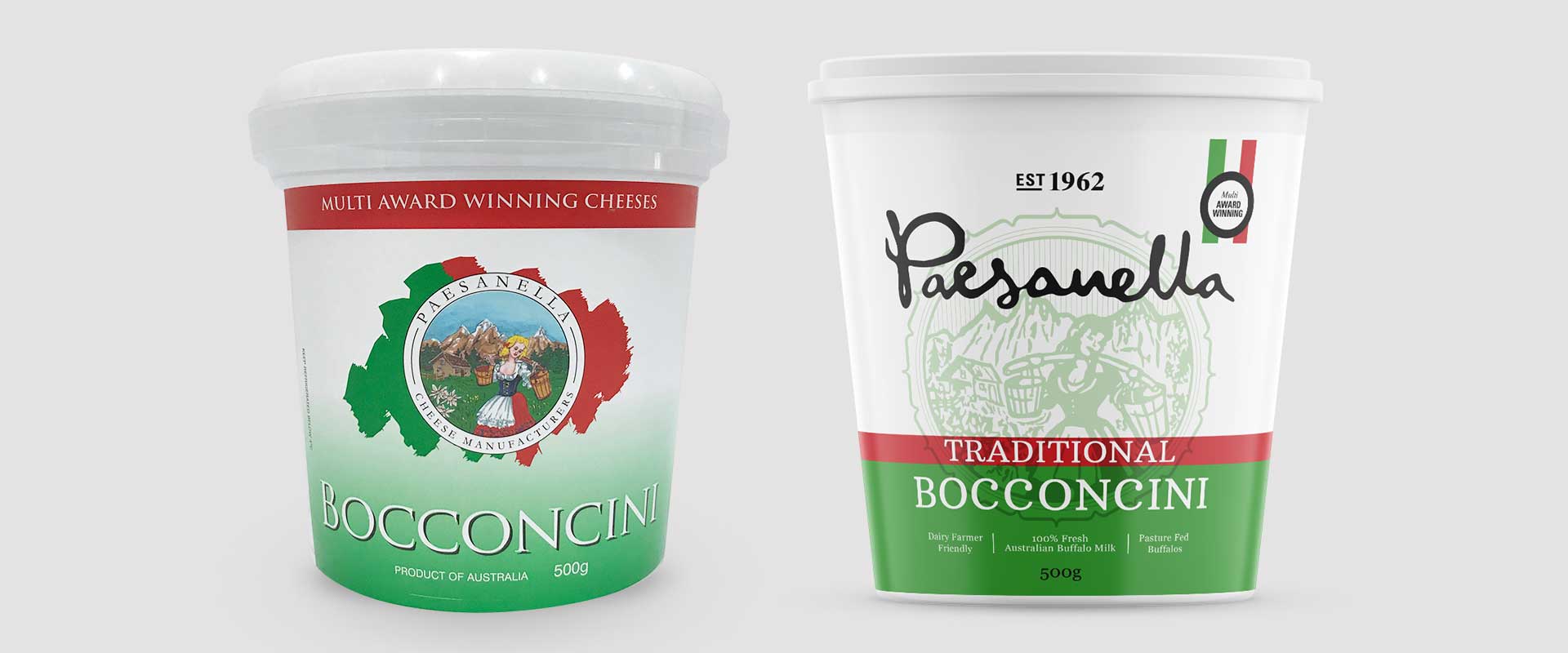
Paesanella Cheese is a family-owned business in Sydney Australia that have been producing quality cheese products since 1962. With the company moving into a more competitive space, they required packaging redesign as they felt their existing design was outdated.
The objective was to give the brand a stronger presence on shelf, whilst still retaining the Italian colour cues of red, white and green.
The Solution
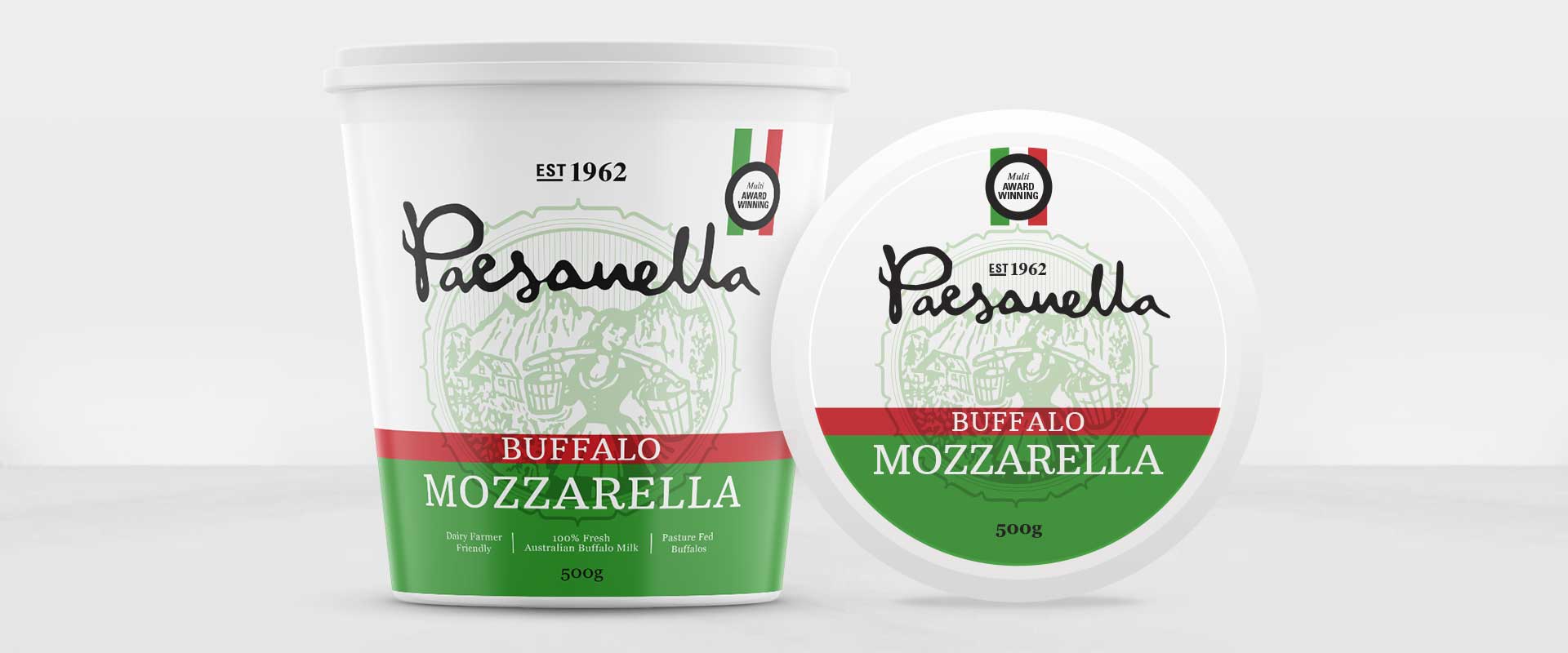
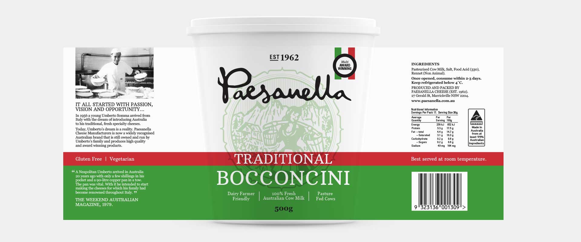
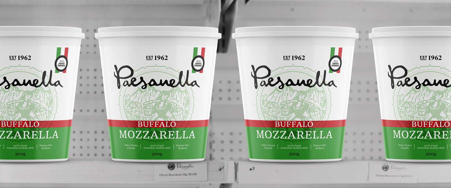
For the packaging redesign, Percept created a modern interpretation of the existing packaging that brought it into a more refined and confident space. The central design with information on either side heroes the brand and brings focus to key content that will attract a buyer’s attention.
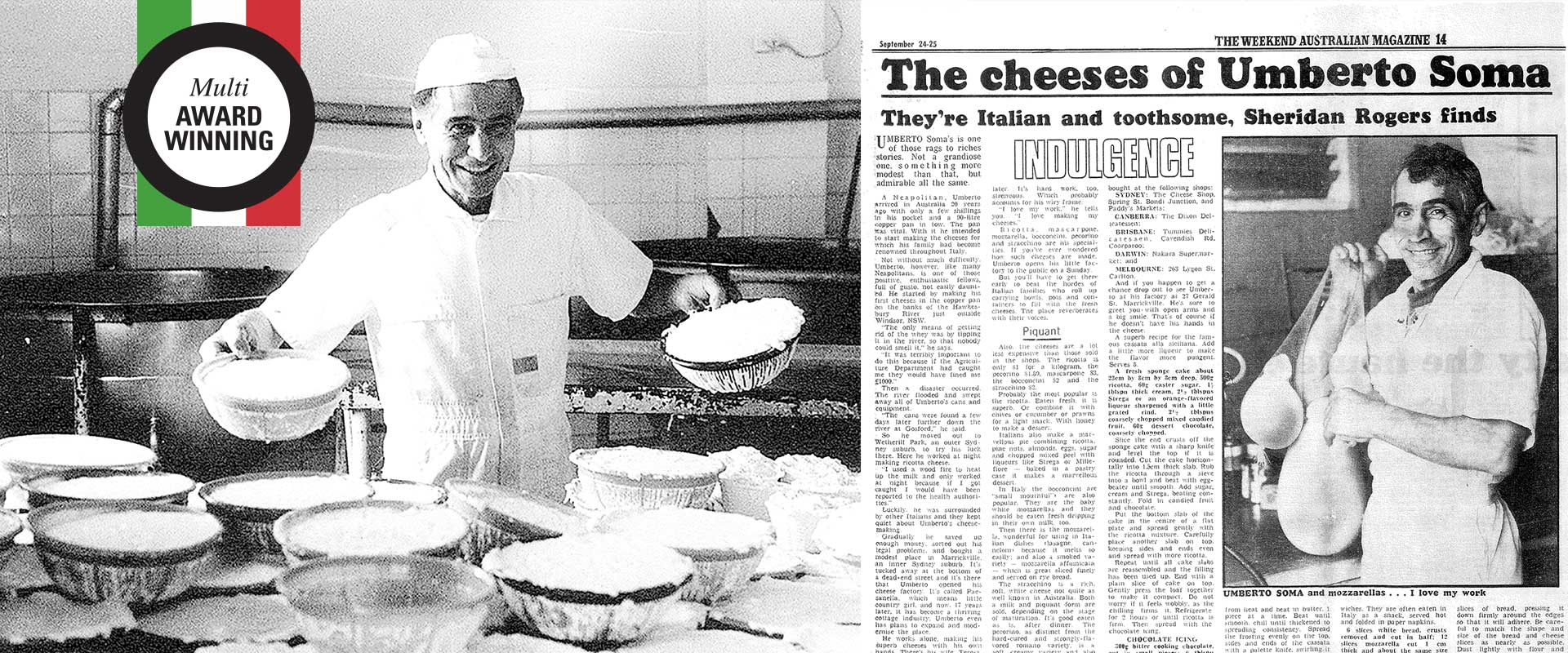
The detailed icon featured behind the logo and black and white photography of the company’s founder, acknowledges Paesanella’s rich heritage and brand story, a vital differentiator from their competitors.
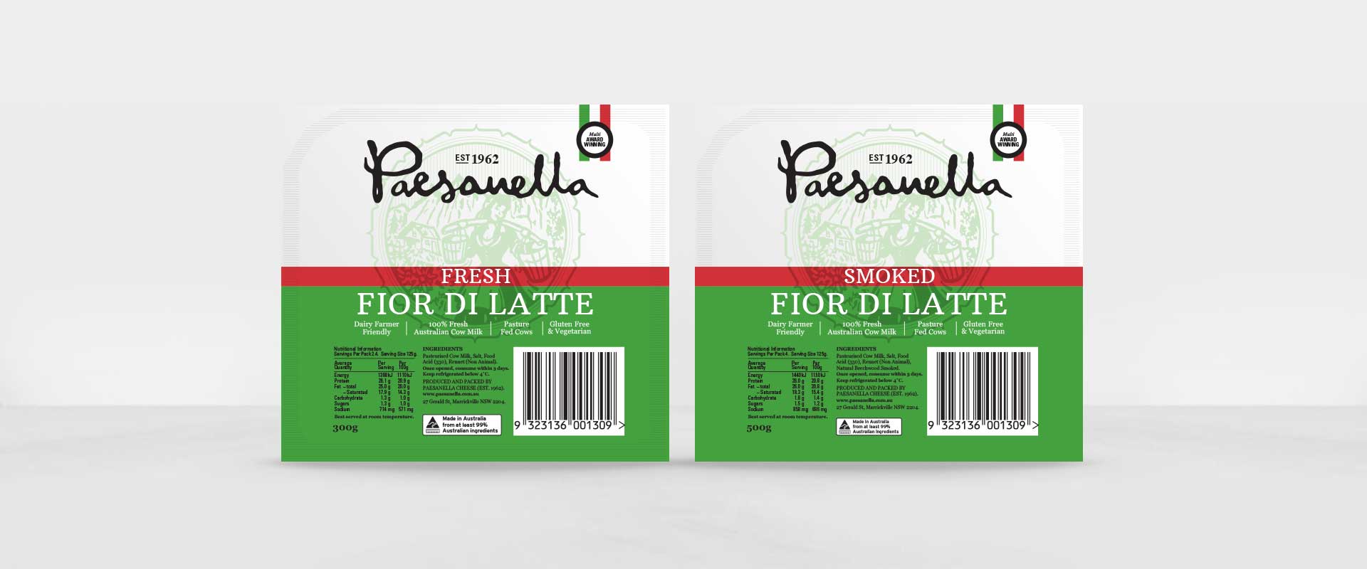
The packaging redesign retains the Italian colour cues for authenticity, using strong blocking that maximises shelf-shout. A stylised medal also sits alongside the logo, creating an increased sense of quality for their products.
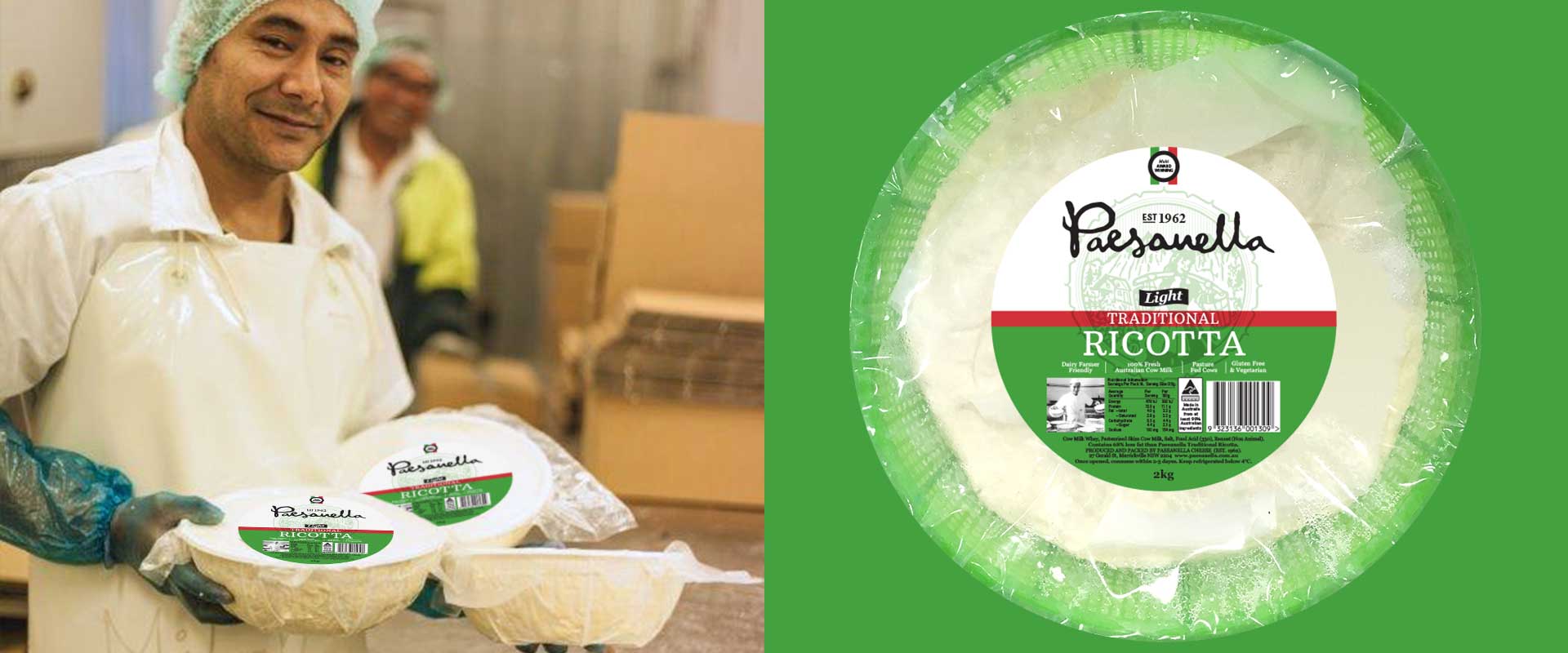
The redesign of the packaging was rolled out to a variety of cheese ranges and pack types which included round labels, film wraps and tubs.
