Brand Packaging Design / Style Guide / Communications
The Challenge
Rapid Loss offer a range of nutritious meal replacement shakes formulated to assist in reducing weight rapidly.
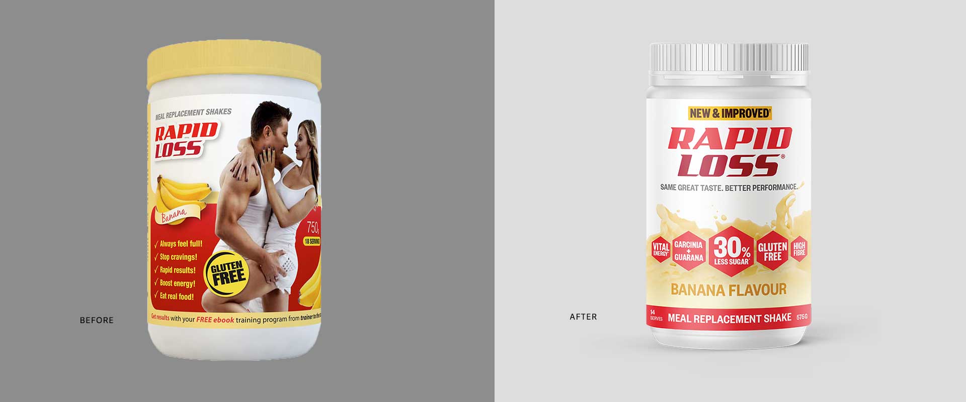
Percept Brand Design were engaged to help with their brand packaging design refresh to give the products a more modern look that conveys them as a light, ‘diet friendly’ replacement for meals and snacks.
The Solution
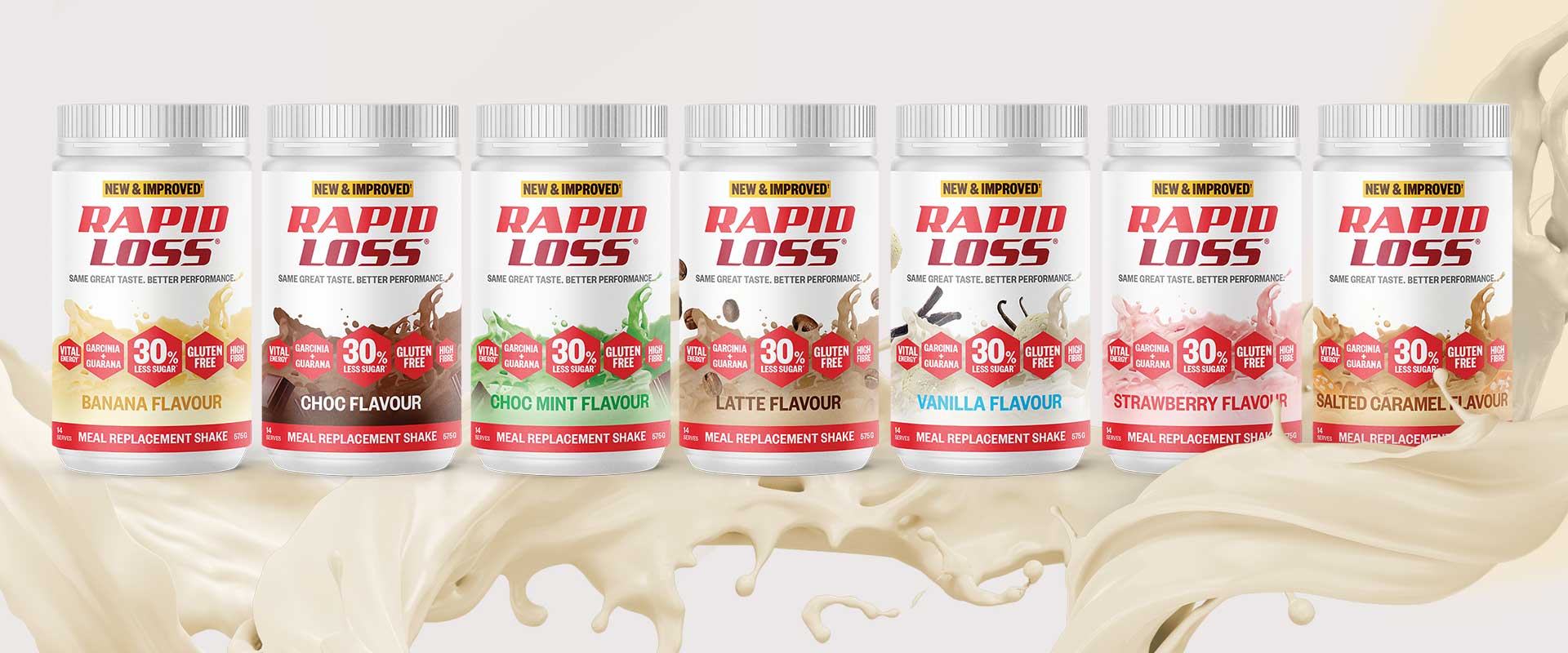
With the strong equity of the current brand in the Australian market front-of-mind, Percept created a modern and fresh evolution for their brand packaging design with focus on colour, flavour and energy paired with the support of scientific benefits, to improve the range’s shelf presence.
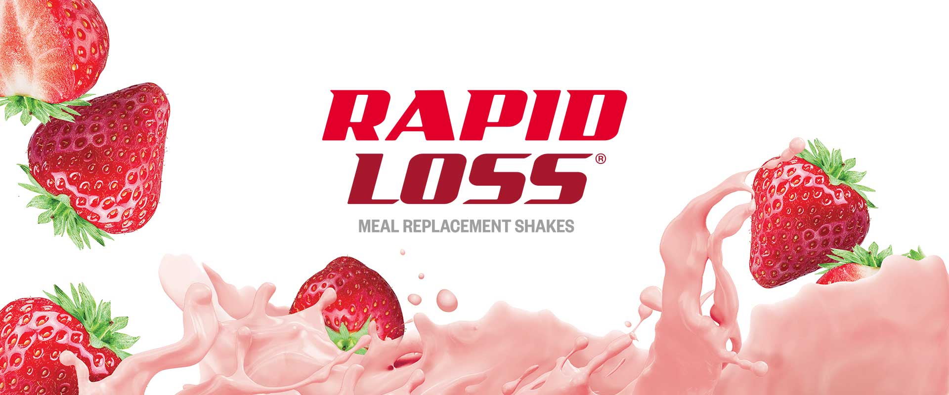
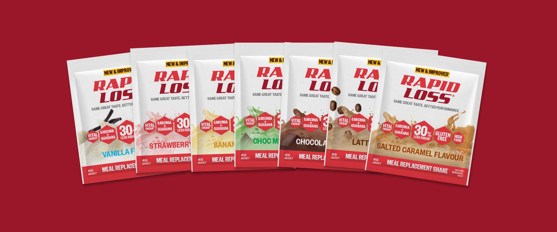
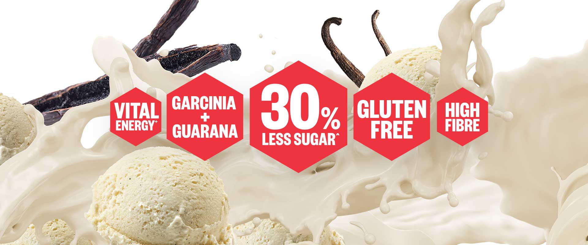
The brand packaging design features coloured splashes of milk with fresh, appetising ingredients where appropriate. Key scientific benefits are housed in iconic callouts with strong colour-coding – making recognition of individual flavours easy when in store.
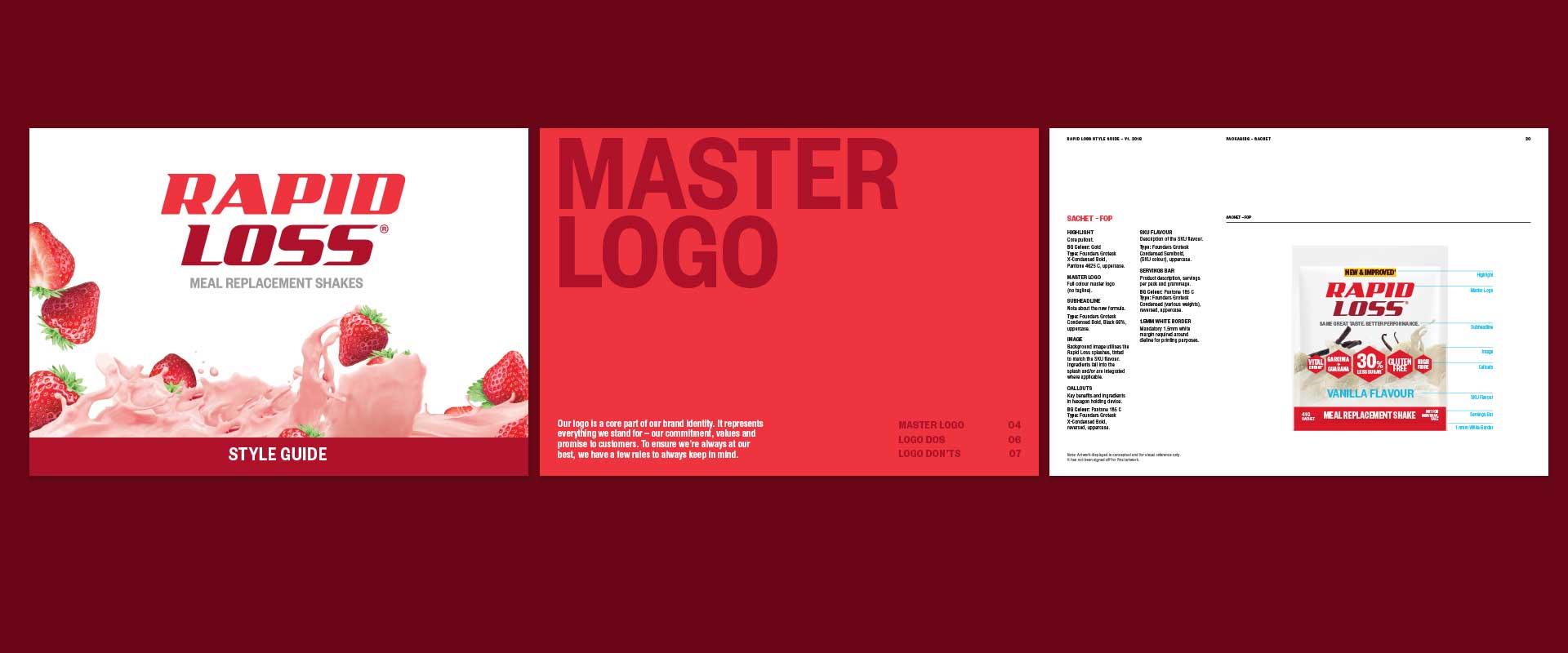
Logo refinement organically became a part of this brand packaging design refresh project, as well as a style guide which was also developed to control the rollout of the new look and feel.
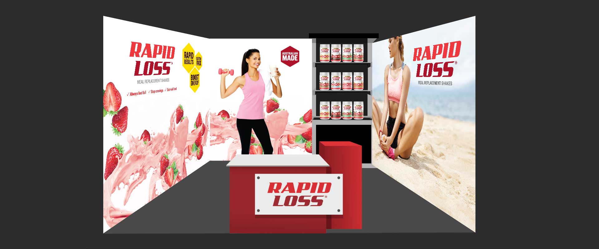
The new brand packaging design was executed across various pack types, point of sale and brand communication pieces including labels, posters and trade show exhibition stands.
