Brand Refresh by Percept Design Agencies
The Challenge
Reno Art is one of the leading importers and distributors of high quality art and craft materials at competitive prices in Australia and New Zealand. They engaged one of Sydney’s top design agencies, Percept, for help with a brand refresh for the launch of a new stationery arm, starting with the graphic design to feature on a new range of stationery products.
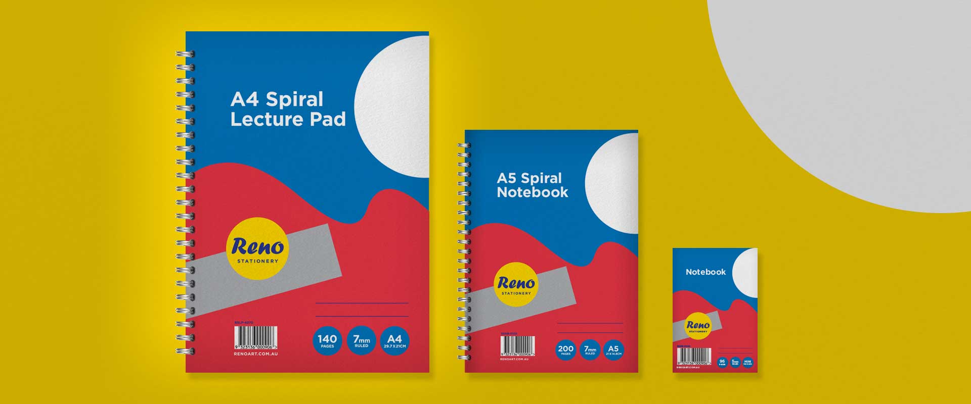
The objective for the Percept design agencies on this brand refresh and graphic design project, was to create a universal design to be used across 5 different sizes with appeal and stand-out in a crowded retail environment.
The Solution
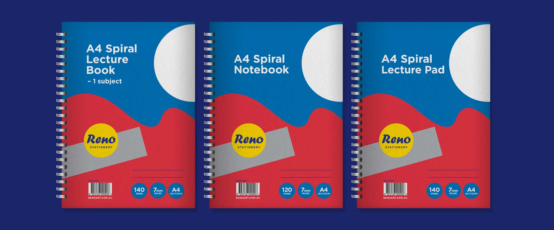
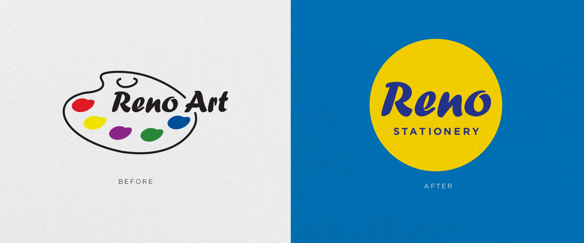
The introduction of these products sparks a new way to view their branding. Know among the top design agencies in Sydney, Percept, utilised deconstructed shapes from the new logo design, breaking it down and building it back up to create a confident and playful graphic solution.
The brand refresh takes colour cues from the previous branding for inspiration, the new product cover graphic design utilise warm verses cool colours for dynamic shelf-shout that easily sets the Reno brand apart from their competitors in a competitive marketplace.
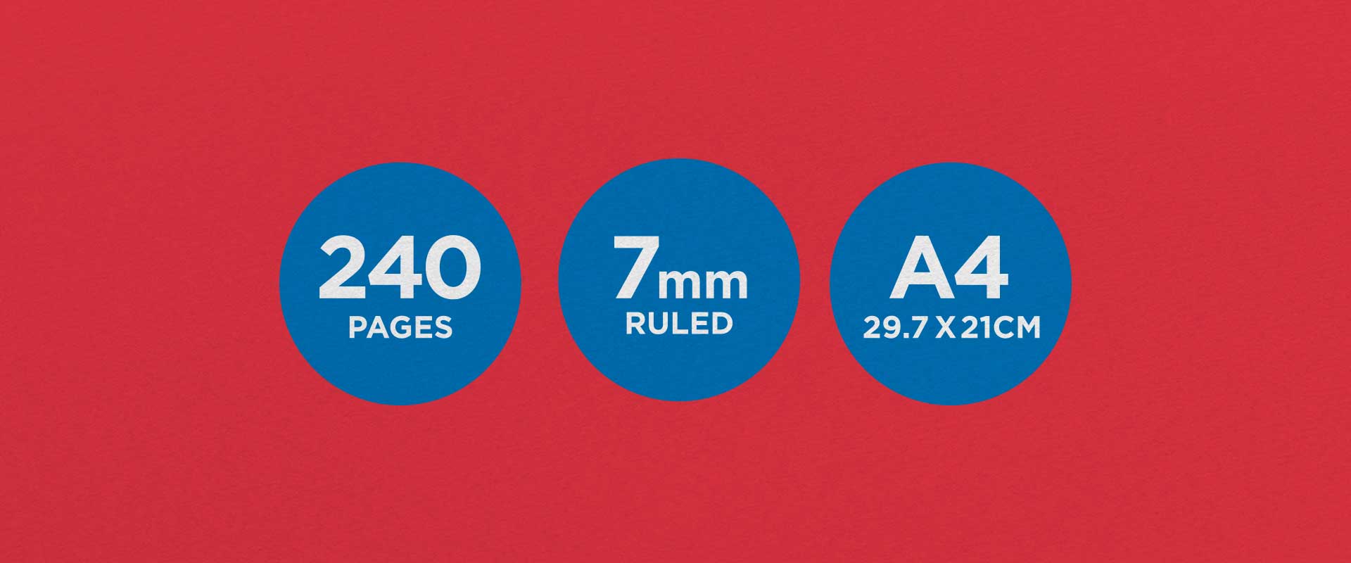
Key details such as page count are emphasised with simple, yet strong circular holding devices that fit neatly into the graphic backdrop, ensuring they are easily seen and understood at a glance.
The new graphic design for this range of stationery products is visually dynamic. It is also engaging, maintaining a universal look and feel that works perfectly across different sizes, connecting with the consumer market in an appealing way.
If you are looking for Sydney design agencies to partner with, look no further than Percept.

