Branding / Packaging Design / Styleguide
The Challenge
The Smart Value brand was launched as Big W’s own brand for everyday value items. The brand is positioned in the price fighter category, under ‘good’ in the good/better/best architecture.
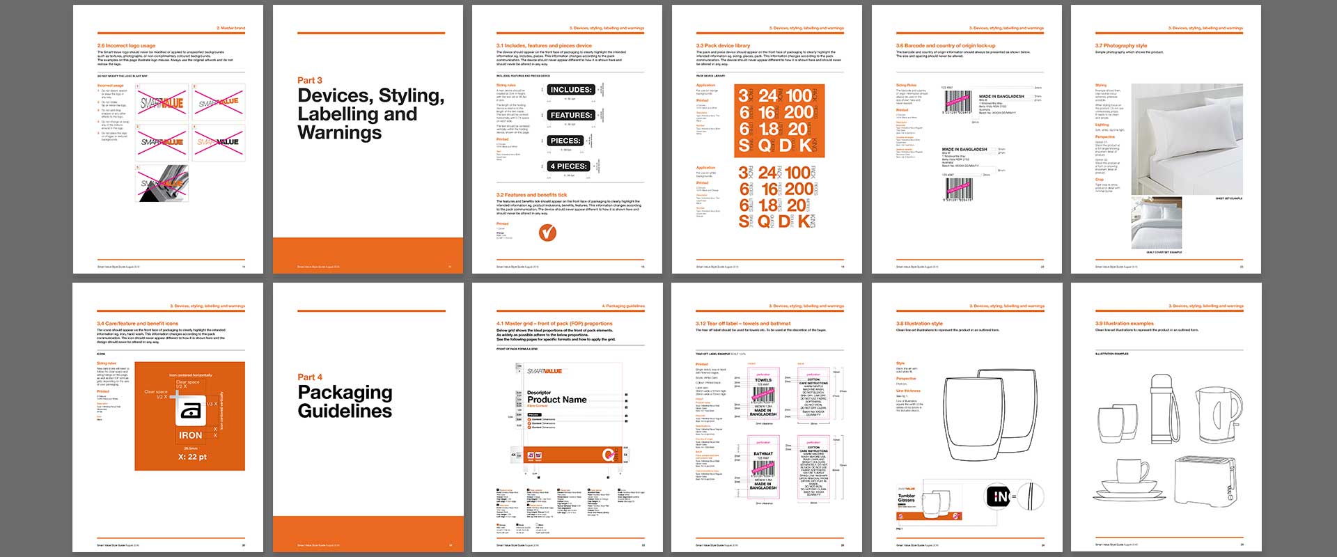
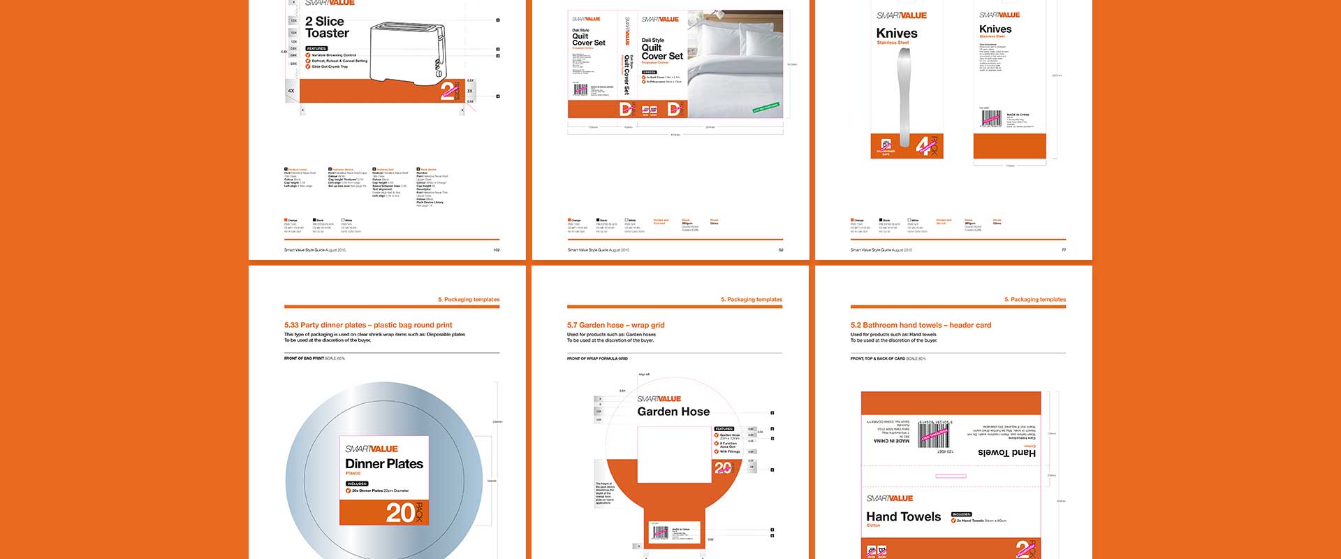
There are over 800 SKUs under the Smart Value brand, ranged across several different categories retailing throughout Australia. The purpose was to redevelop the branding in terms of logo, colour scheme, packaging layout and messaging hierarchy, followed by the output of an extensive styleguide, which included packaging design templates for key product category items.
The Solution
Sydney creative agency Percept, designed a visual language especially for the ‘value’ category. The use of bold colour, sans-serif typography and clear messaging gives an approachable and affordable feel.
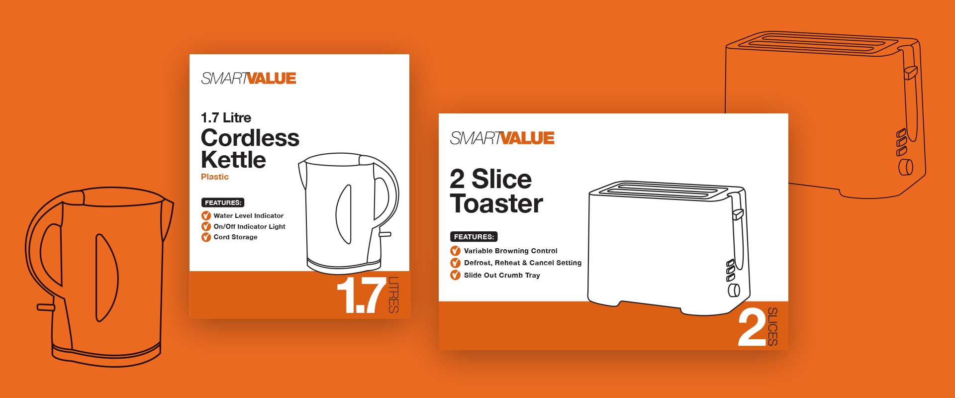
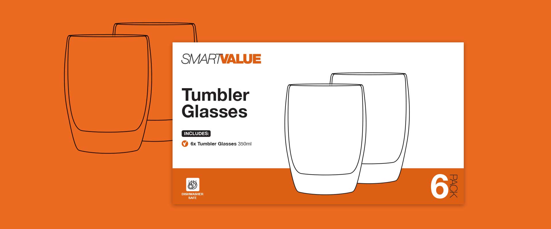
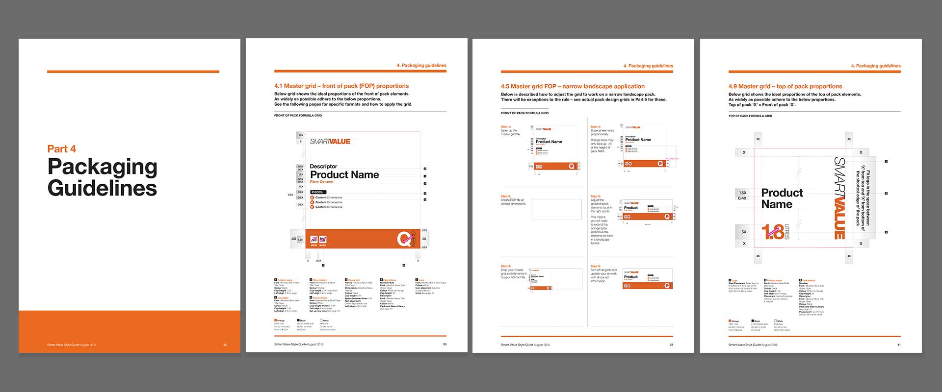
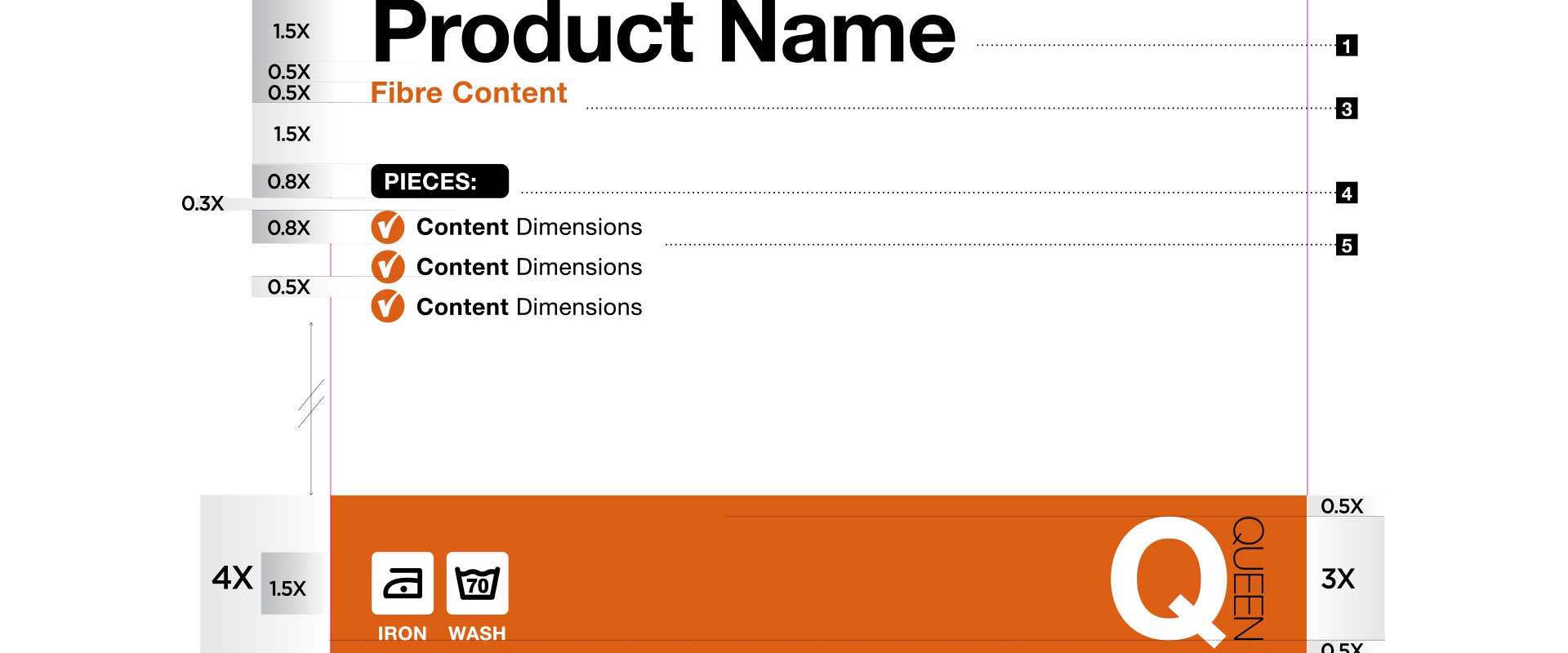
To make the customer’s retail shopping experience as straight-forward as possible, we developed a packaging design system that has clear hierarchy of information and consistency on shelf, so customers can easily navigate and assess key information quickly, aiding their decision making process.
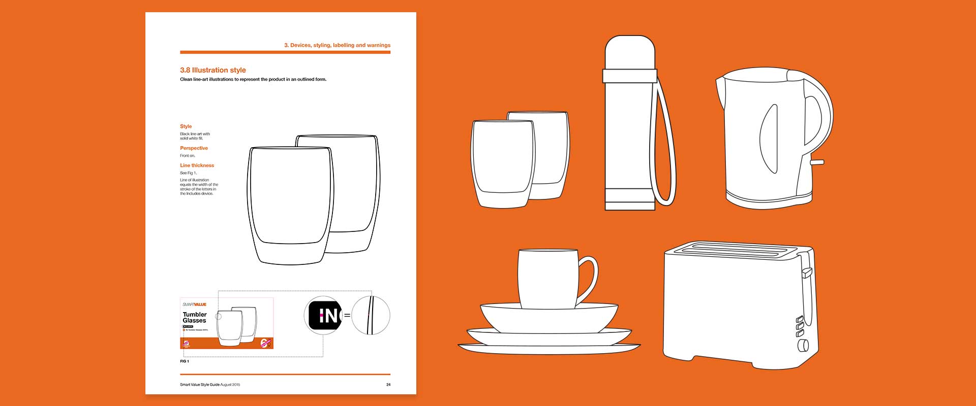
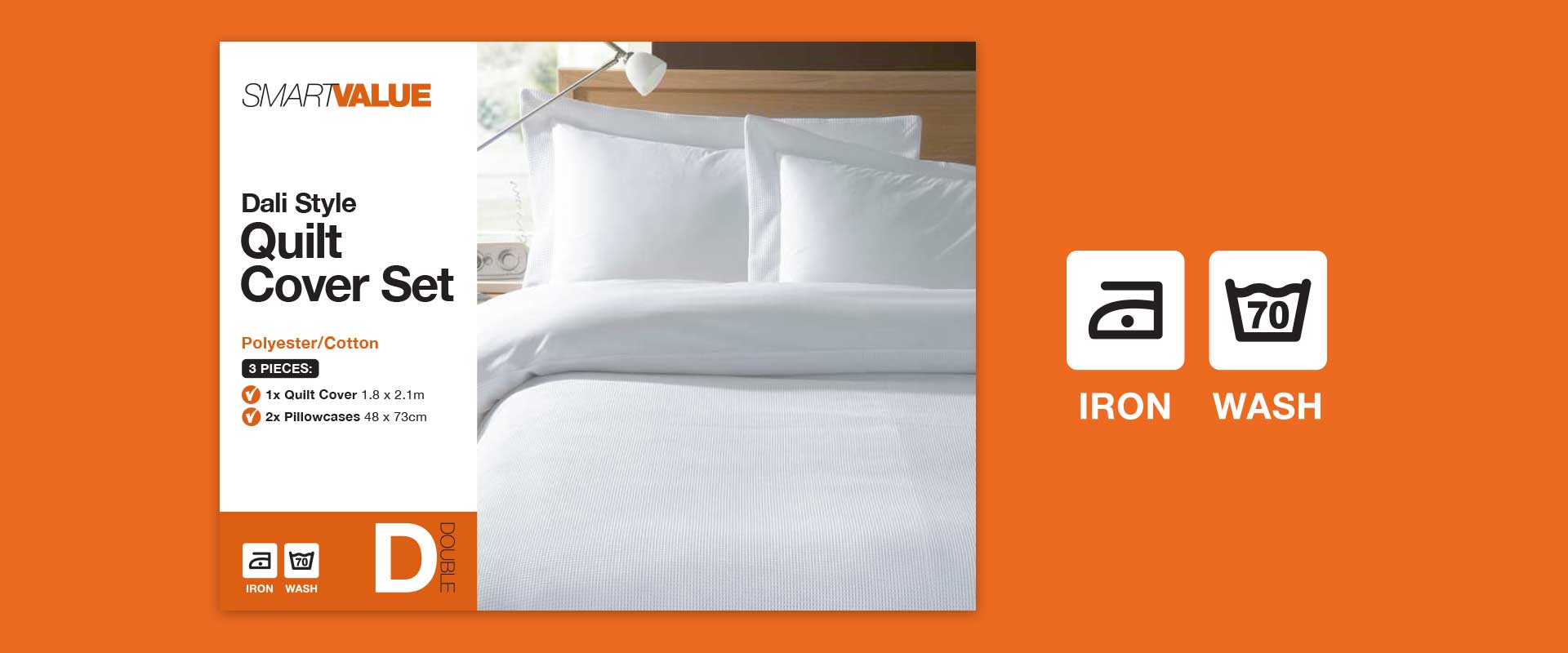
Strong contrasting colours create strong shelf blocking for high visual impact, simple illustrations or product photography allow easy package content identification. Holding devices are used for essential information i.e. sizing or quantities. The layout and pack grid is easily modified across various product ranges.
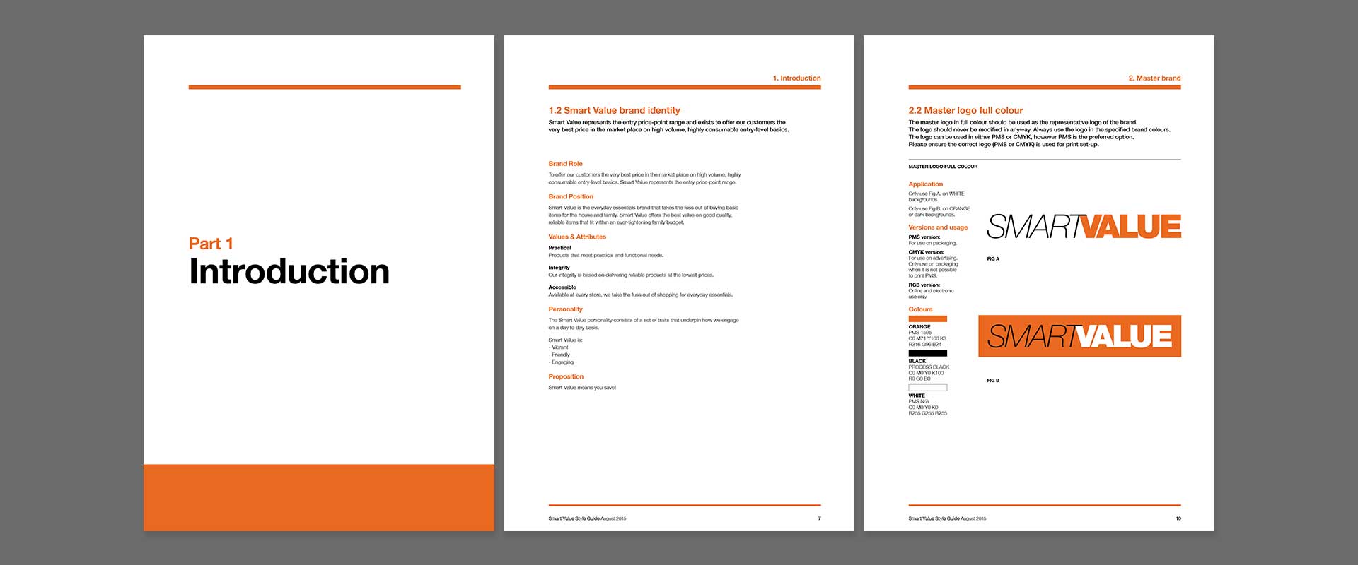
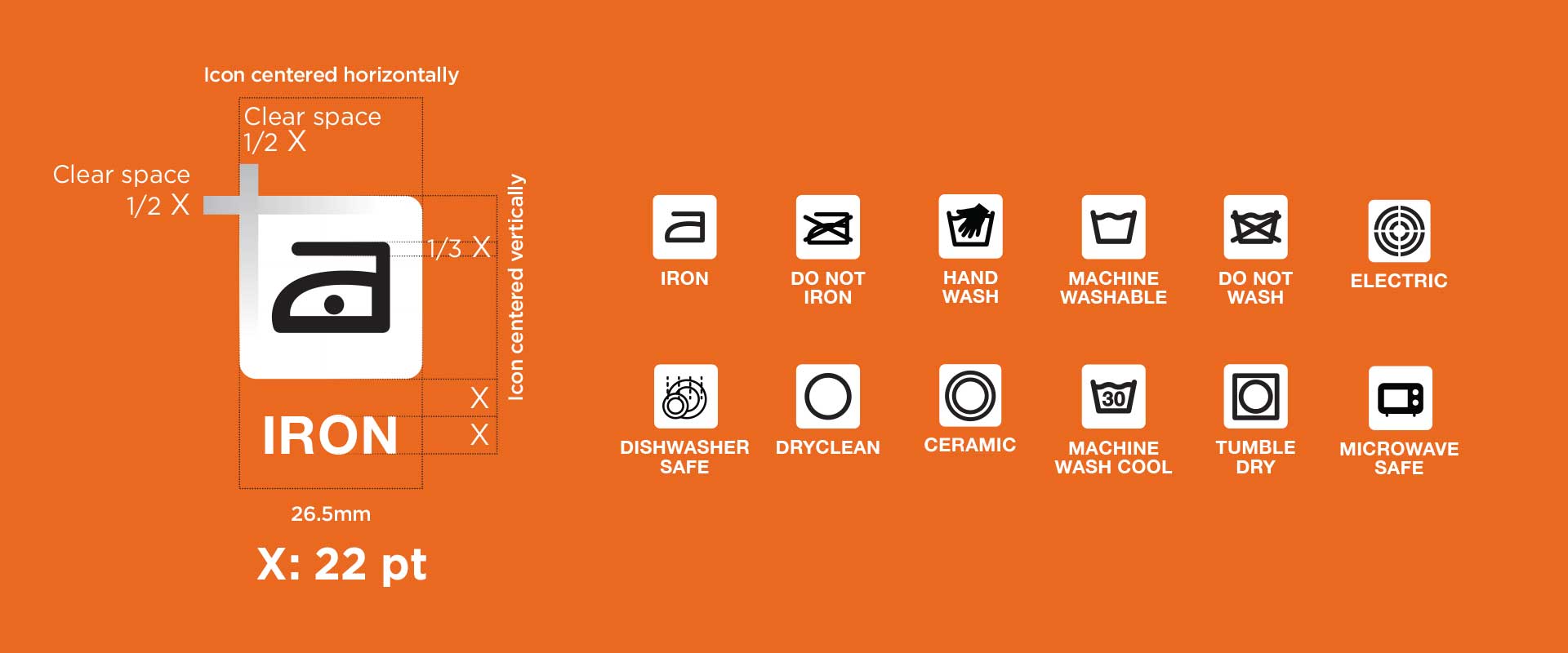
The rules for the new branding and packaging design are detailed in the extensive styleguide that stipulates grids, instructions and formulas so that consistency can be achieved by international suppliers and the result appears uniform when arranged in retail environments, in-store, here in Australia.
