Rebranding / Stationery / Website Design
The Challenge
Milestone have an enviable reputation in the town planning industry, with all new business coming through word of mouth. Milestone were looking to undergo a new website design, an exciting time within the company, and they felt this was an opportunity to also refresh their logo and stationery, so they elected to engage Percept for their full rebranding project.
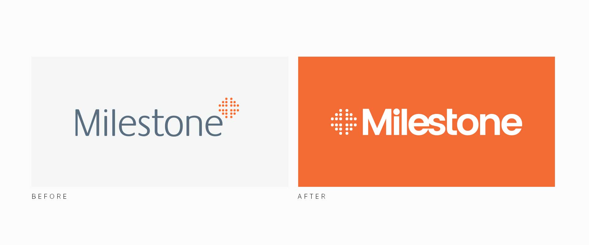
Milestone requested that Percept approach the rebranding with consideration to their corporate market and to modernise their existing branding. The Milestone icon is well known and recognised in the industry, therefore it was important that the equity in the icon was maintained when modernising the logo as the first step in this rebranding project.
The Solution
A rebrand that retains the familiarity and equity of the original logo design with a contemporary twist. This was achieved by dialing up the vibrant orange in their brand colours and incorporating a bespoke type style to create a bold and modern brand mark that stands out amongst its competitors in the industry.
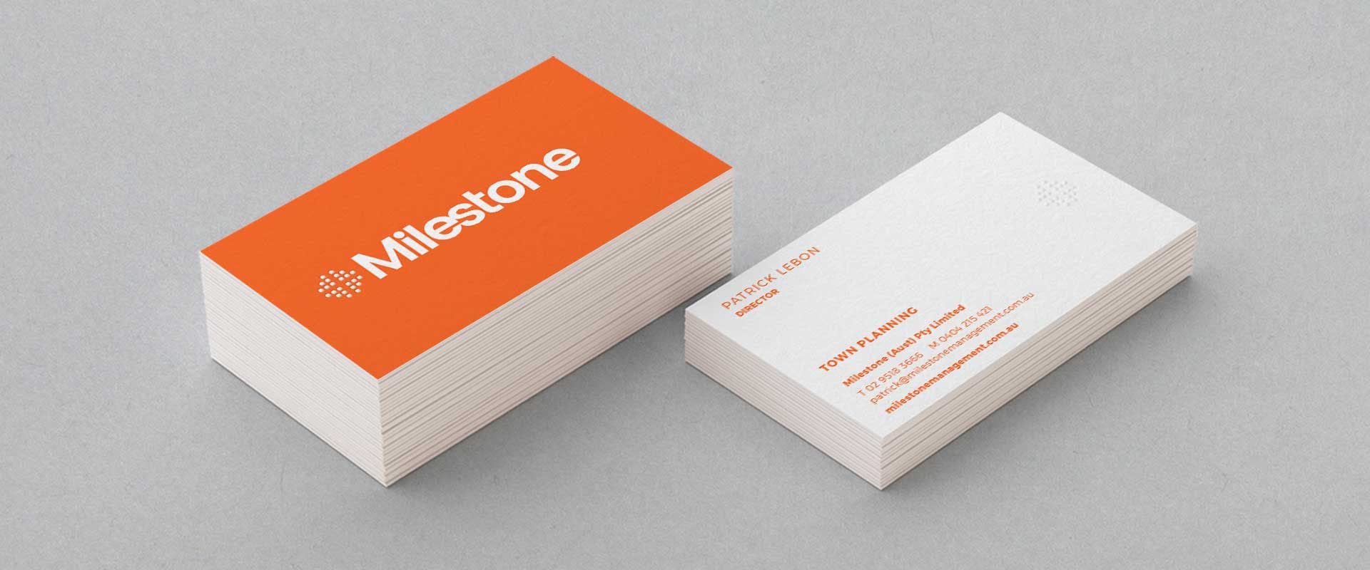
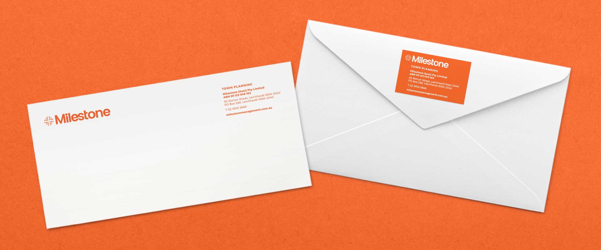
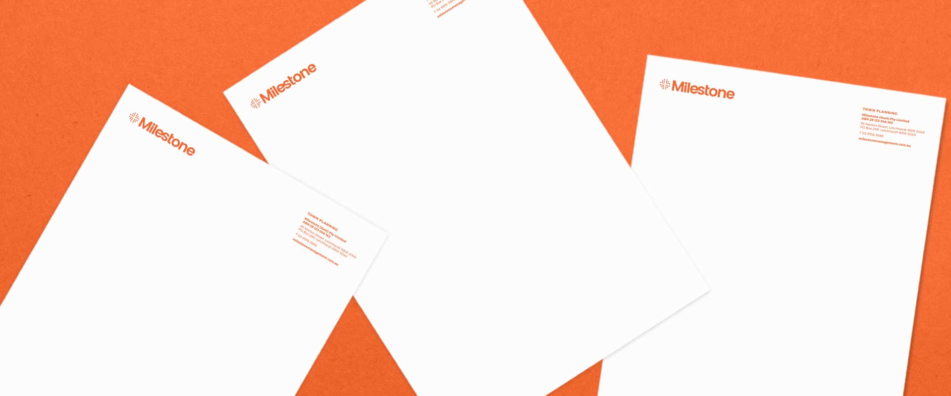
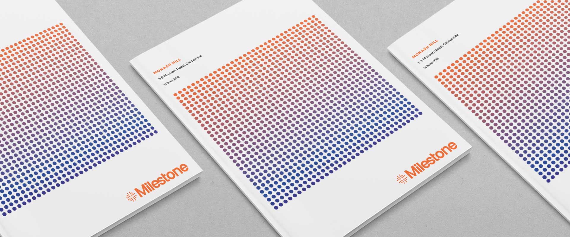
The logo design is clean, fresh and professional with bespoke modifications to the type making it unique and ownable. The refreshed, vibrant brand was applied across various print and digital collateral to form their corporate stationery package, including business cards, letterhead, with compliments slips, report covers, and email signatures.
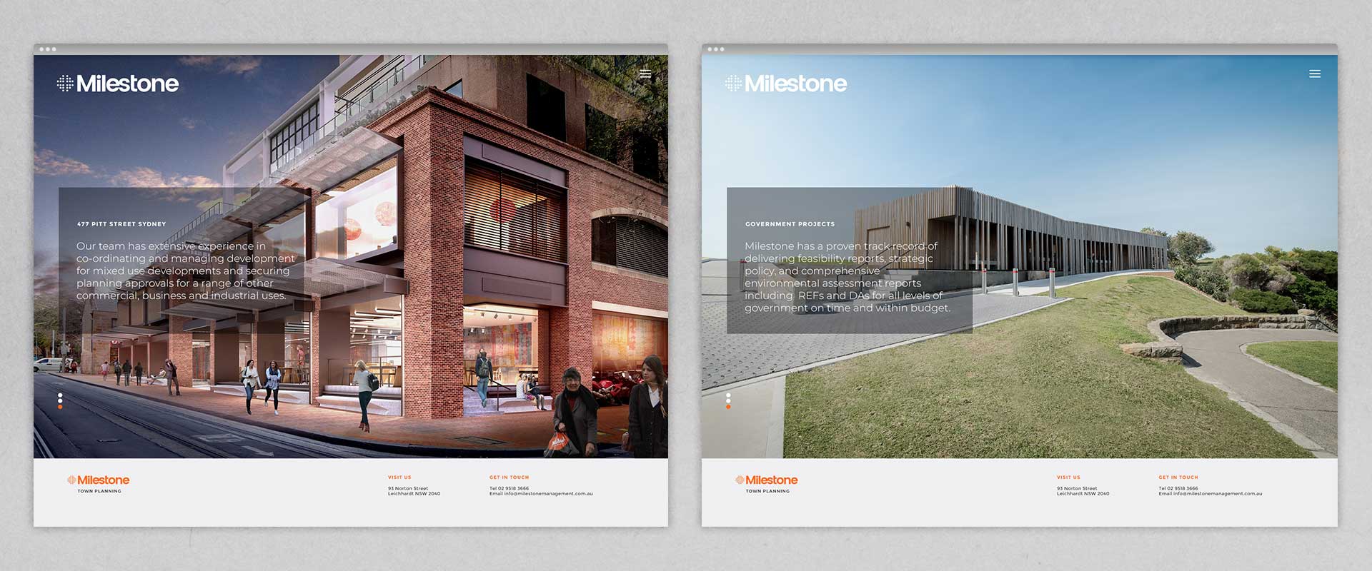
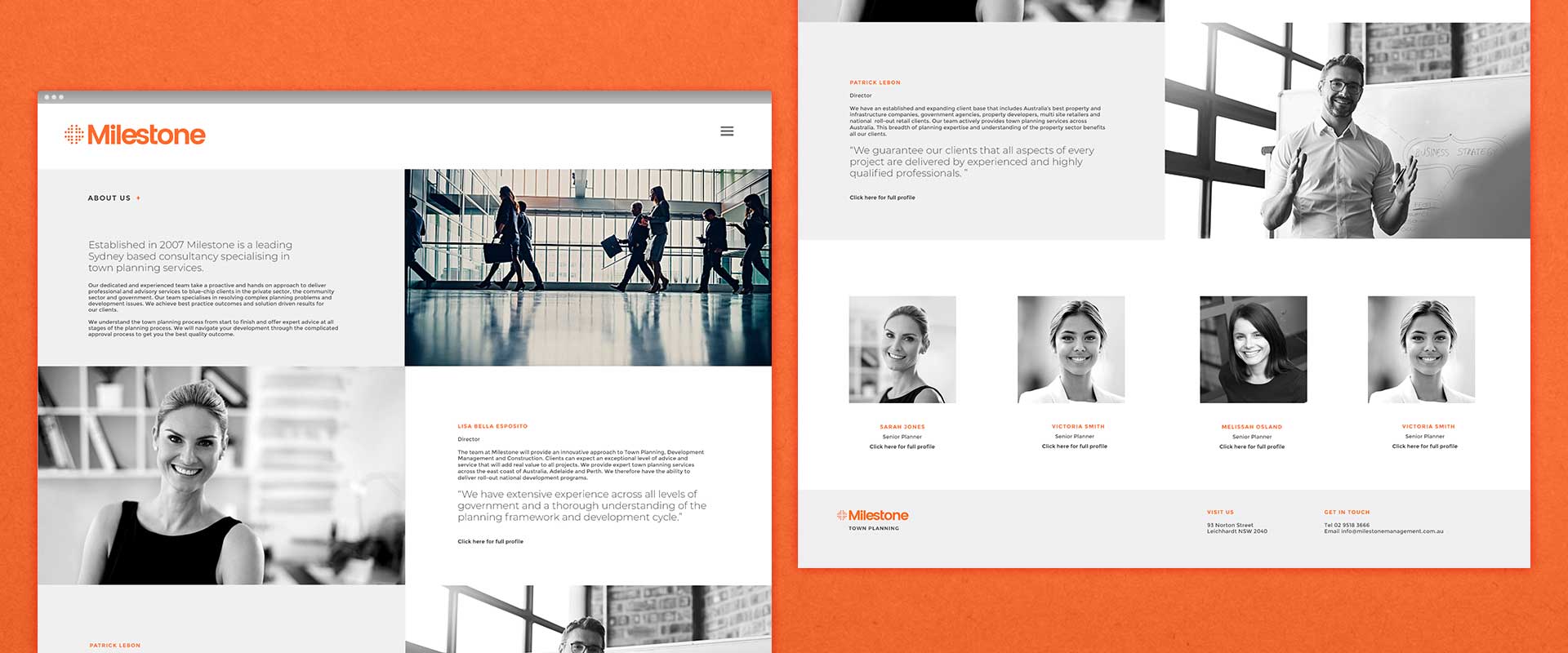
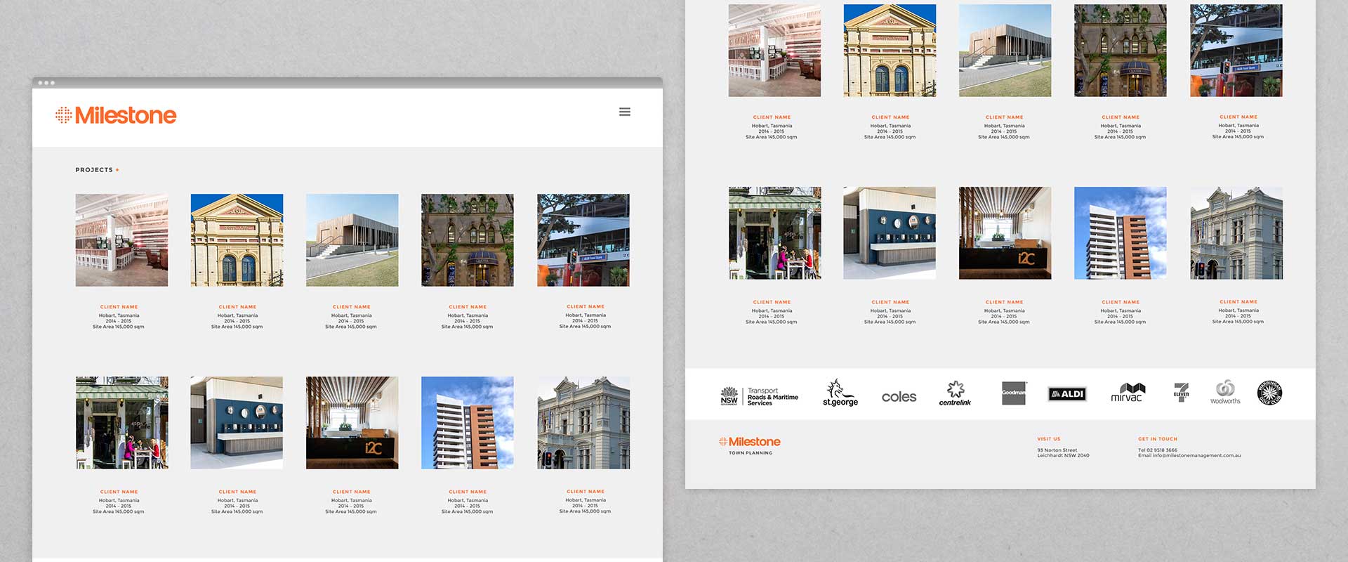
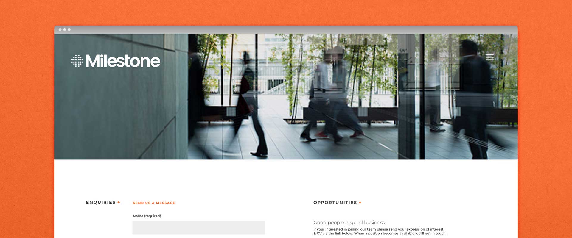
To complete the rebranding, Percept designed a new look and feel for their website design that not only brought it in line with the new brand identity, but also advanced it’s operation and user experience to ensure they remain at the forefront of their industry.
