Brand Style Guide by Percept Branding
The Challenge
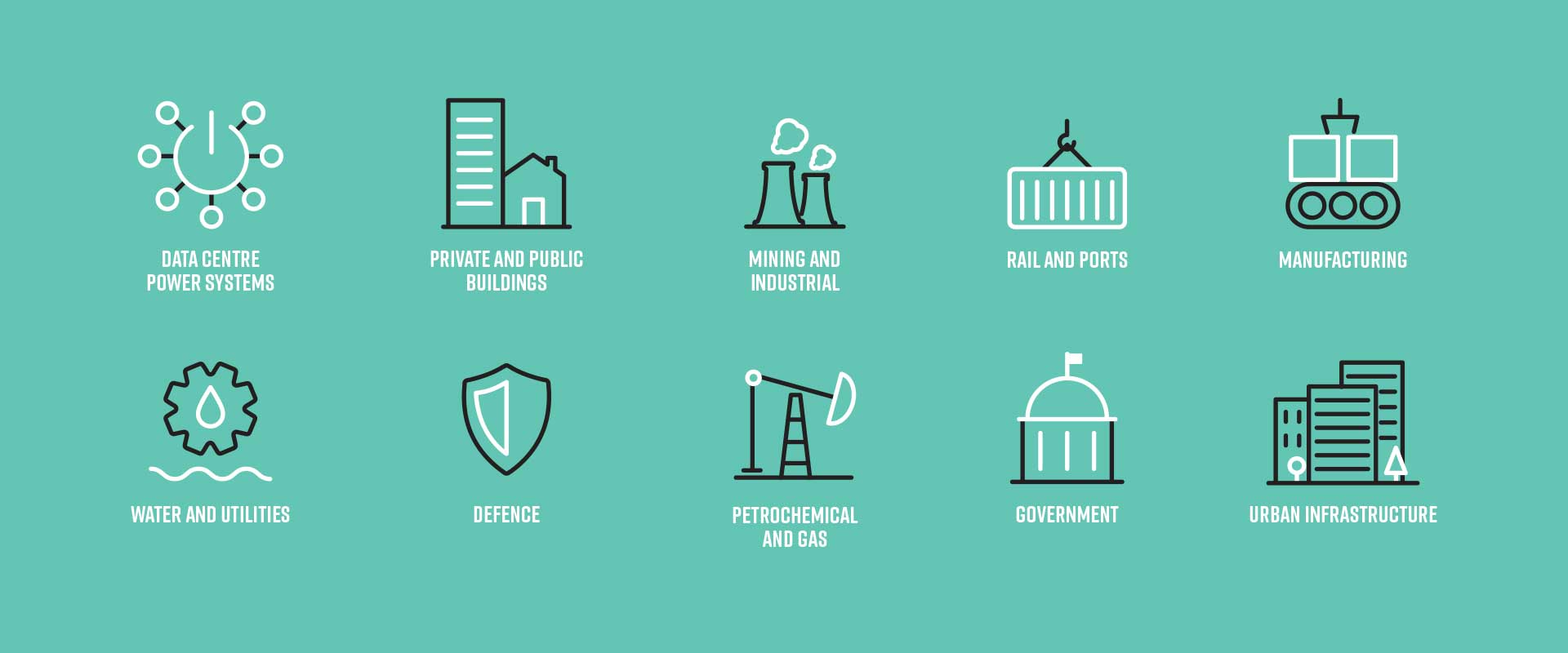
Stowe Australia was established in 1910 and is a leading electrical and communications installation specialist with a strong reputation for performance, quality and reliability. As thier branding has equity, they had largely relied on word of mouth and reputation to win business. In the current competitive environment, the task was to evolve their image with a brand refinement that repositioned their B2B marketing communications.
Branding agency, Percept, was hired to showcase the company’s offering by designing new B2B marketing communications and developing a brand style guide that pulls everything together. The outcome of the brand refinement project would assist in overall brand management, business pitches and tender applications.
The Solution
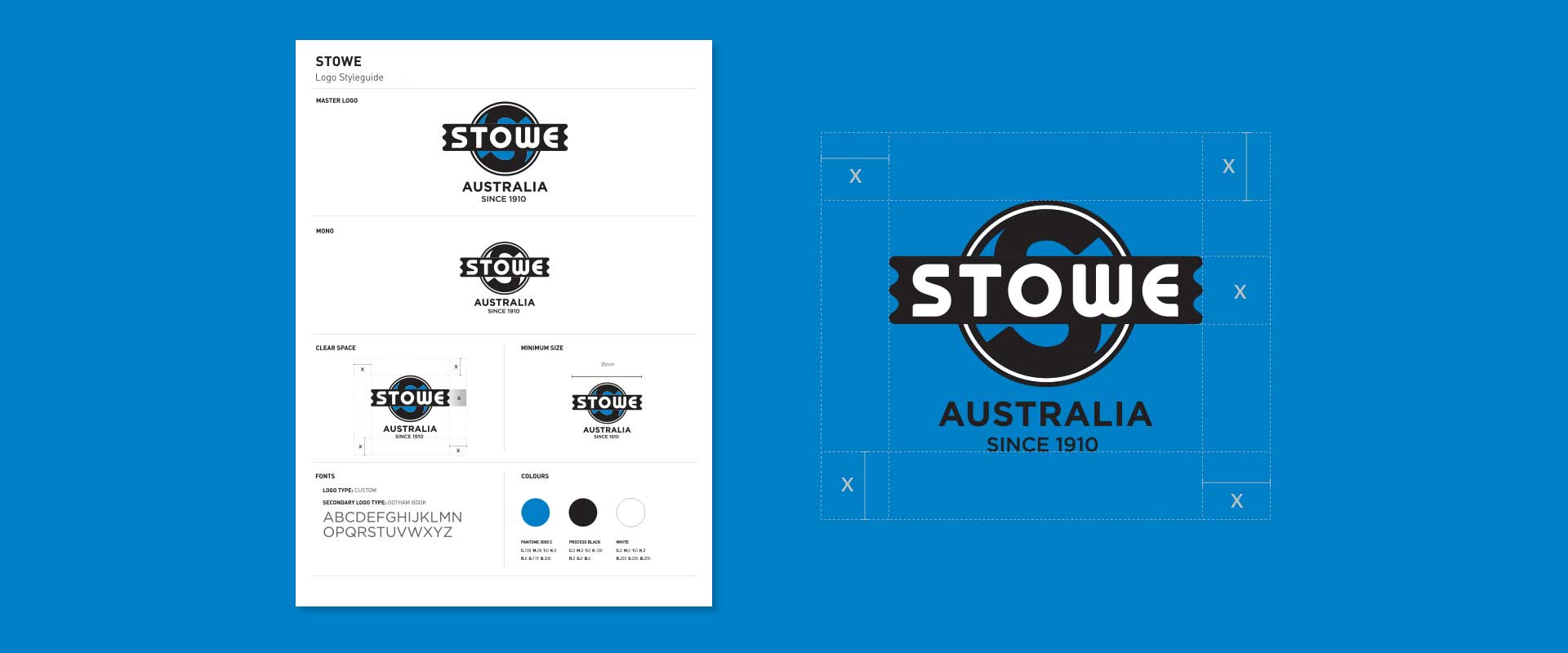
Throughout Stowe’s company history, a number of branding variations have been used, causing confusion within the company. Branding agency, Percept, began the brand refinement with the logo design and created a master logo suite along with a brand style guide to establish consistent usage across all company branding.
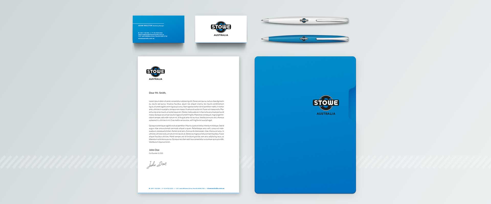
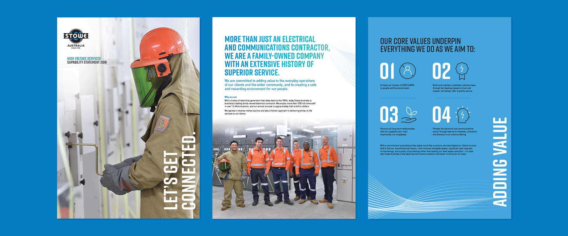
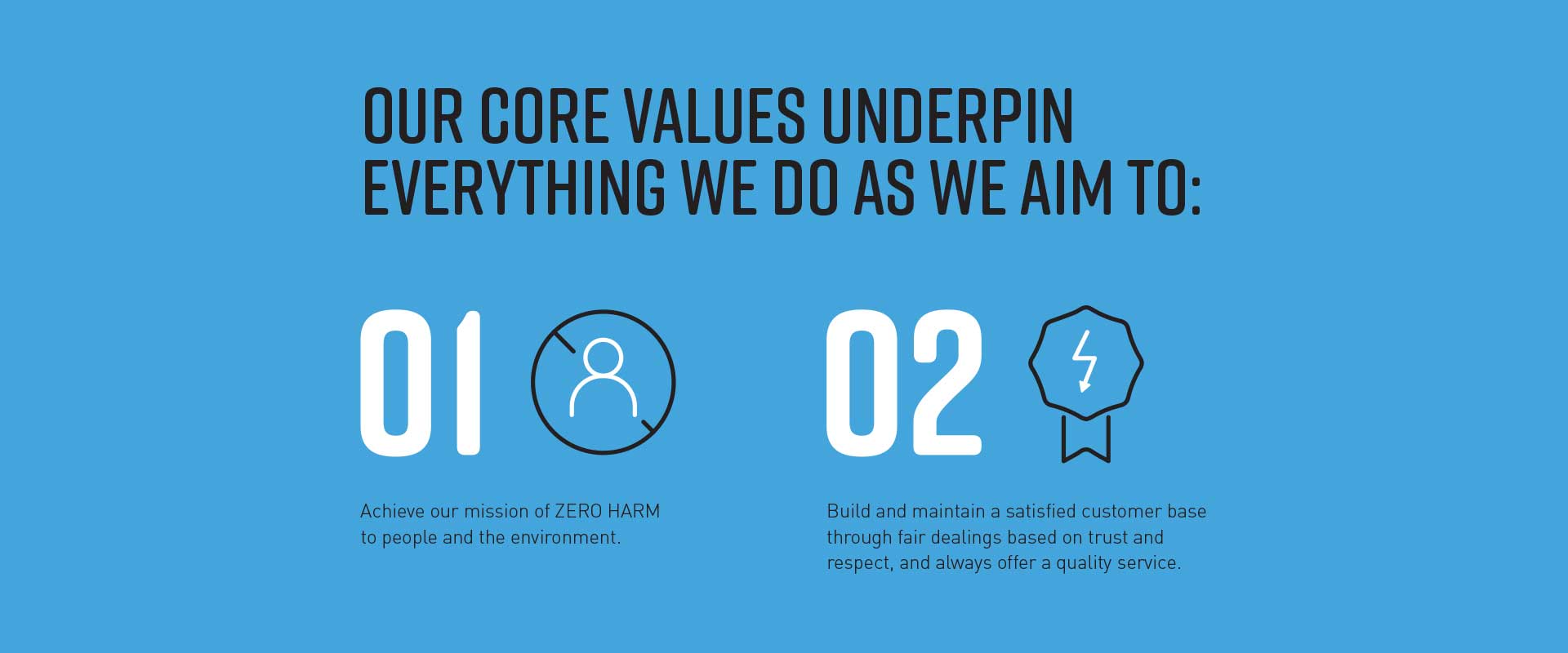
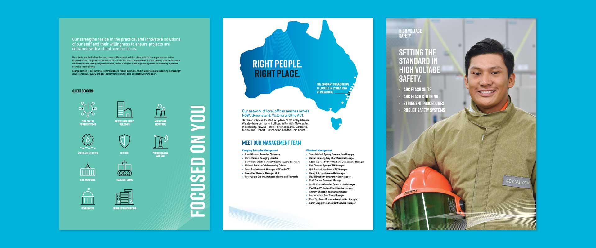
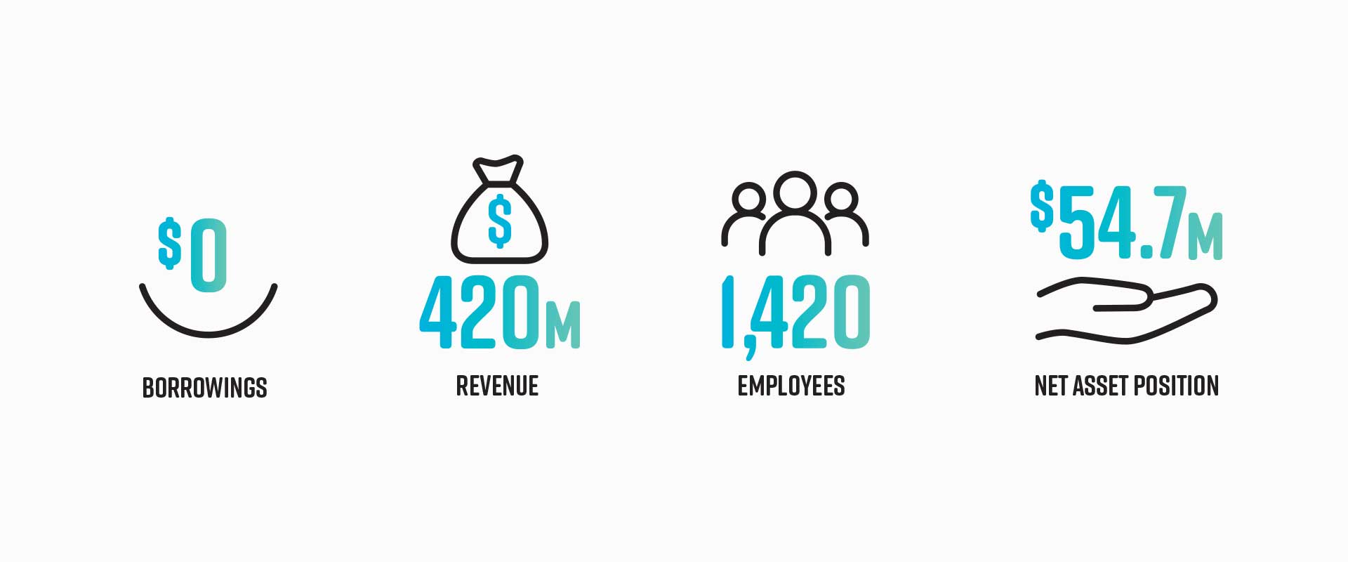
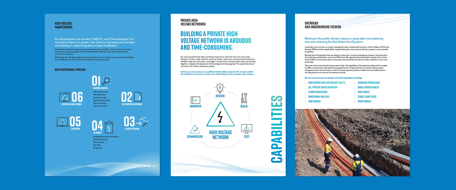
Following the logo refresh in the brand refinement, Percept then created a suite of marketing communications, featuring an updated branding style and copywriting that repositioned the company branding, utilising a new tone of voice.
The design of the refined branding mimics Stowe’s business approach – clean, ordered and engaging. This new branding design style flowed throughout their stationery, capabilities document, advertisements and print communication collateral. Once branding agency, Percept, had clarified the design of all these different outputs, the final brand style guide was created.
Contact us if you have a similar project you would like to discuss.