Branding, Packaging Design & Style Guide
The Challenge
Originally launched in 2010, Big W wanted to re-brand their ‘own brand’ of toys (aimed at ages 0-3) as it was losing traction against competitor brands.
Tinkers is exclusive to Big W, with products ranging across many different categories.
The intent was to re-establish the value of the Tinkers brand in this competitive market, inspire fun, promise satisfaction and ultimately resonate with parents and grandparents who would be the likely purchasers.
The task was to redevelop the Tinkers branding, including logo creation, colour scheme, packaging design, layout and messaging hierarchy. This was then followed by the output of a comprehensive style guide to enable consistent production of packaging by a variety of offshore suppliers.
The Solution
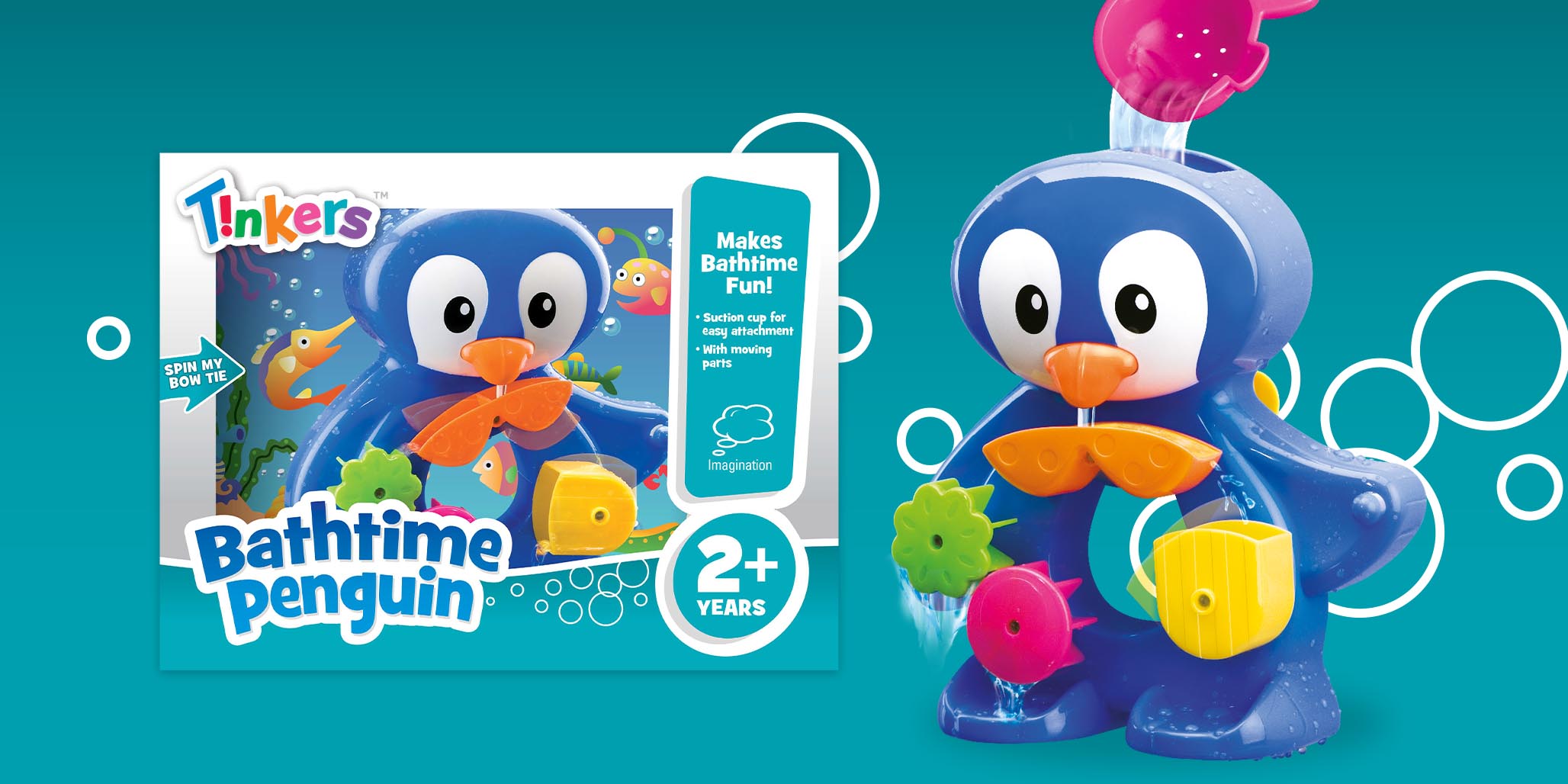
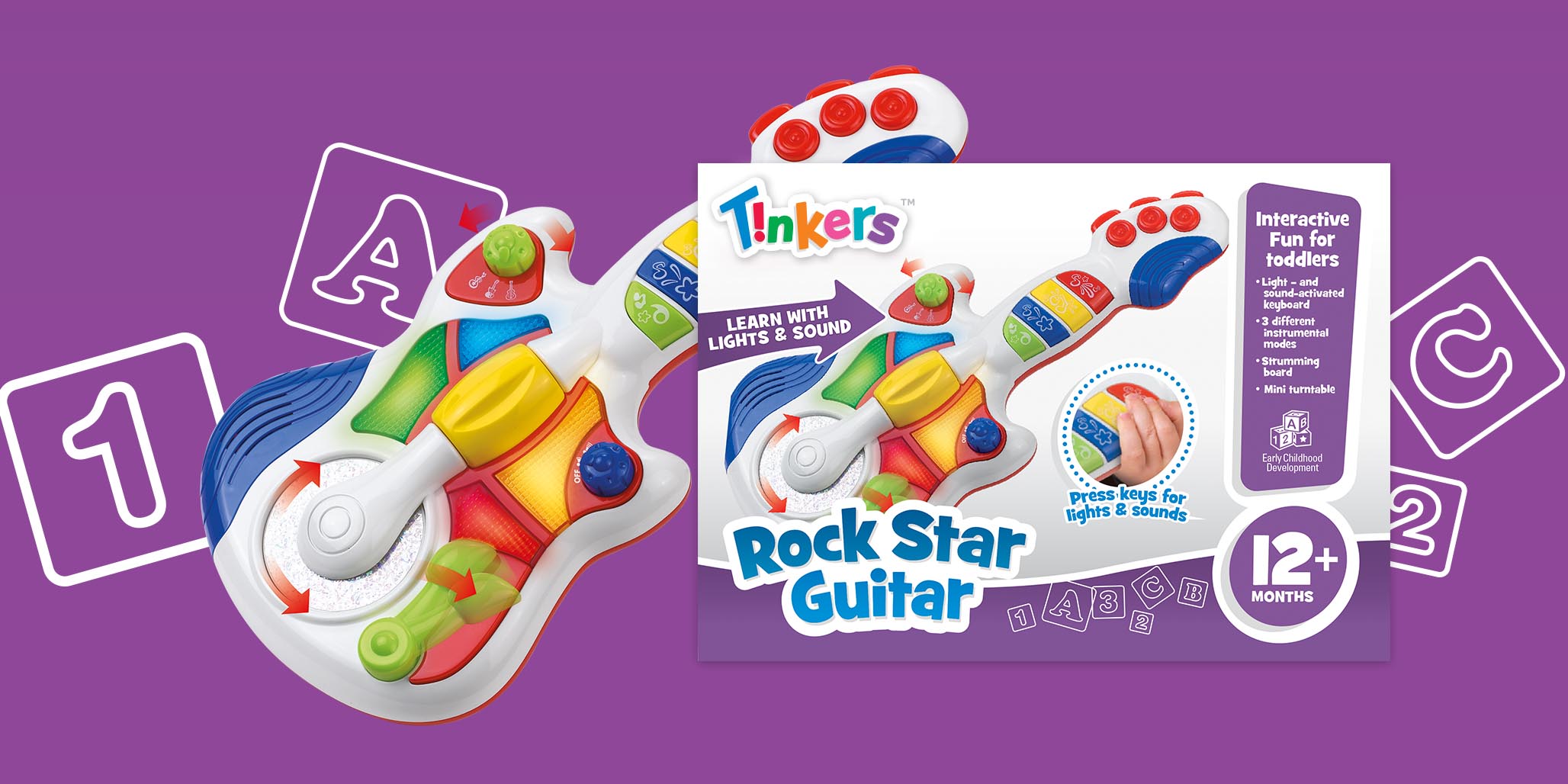
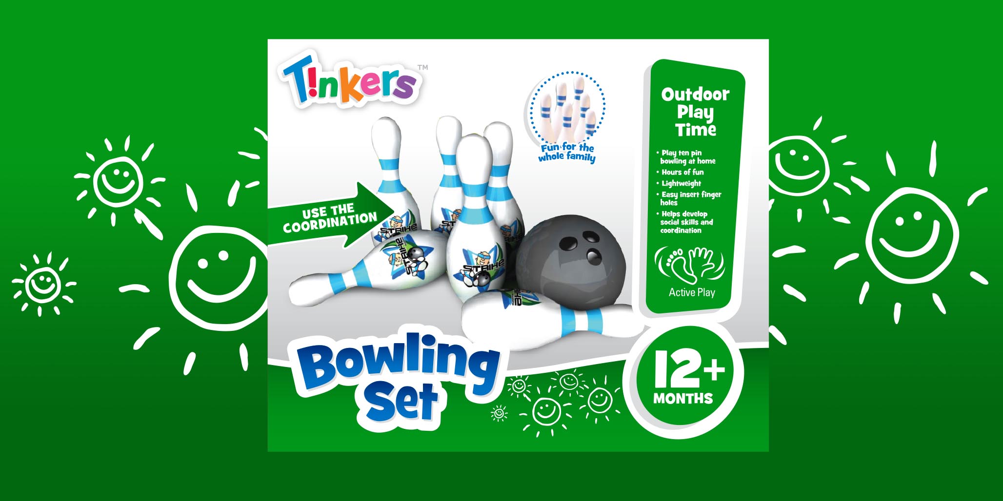
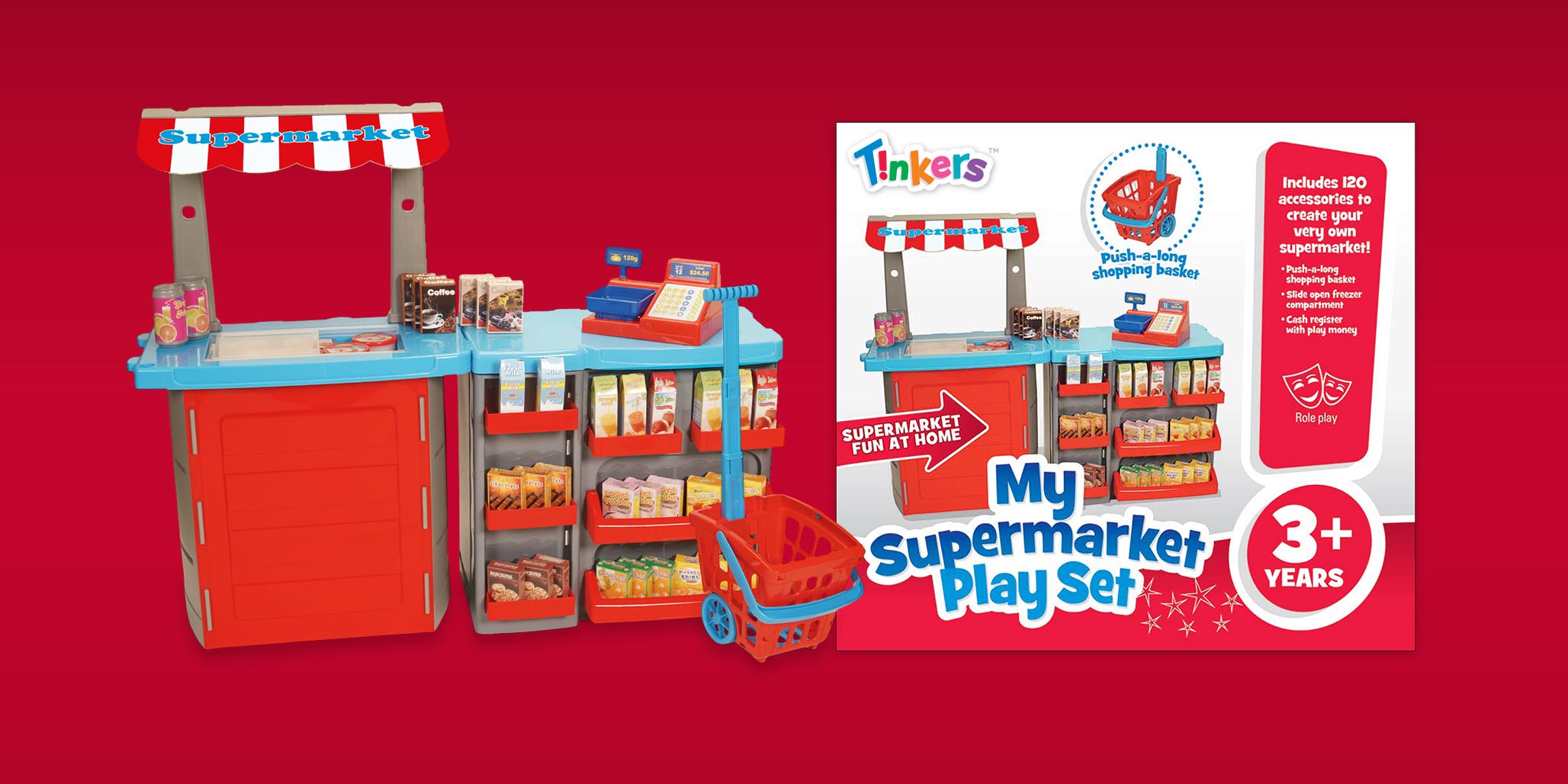
The branding and packaging design needed to work across multiple categories, including; outdoor, plush, preschool, bath, baby, trucks, wooden and imaginative play.
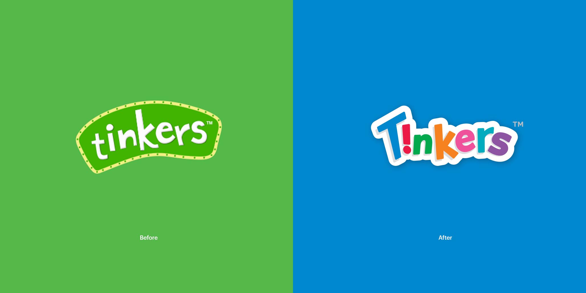
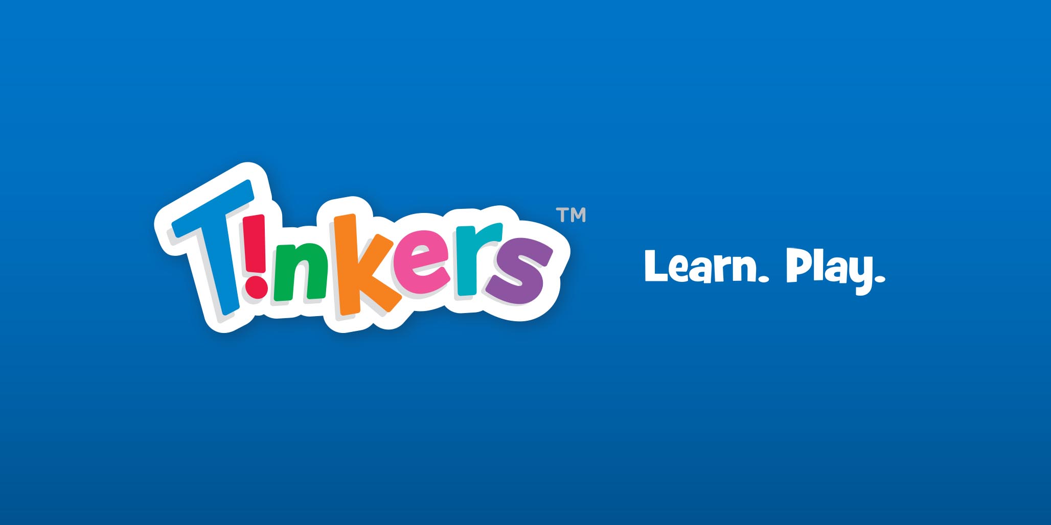
Percept created an informal wordmark with sporadic spacing to give energy, liveliness and fun to each letter that makes up the Tinkers logo. Overall, this new logo communicates clear ‘play signals’ to children.
It also features a graphic exclamation mark, a reversed ‘i’, which alludes to excitement without detracting from the overall integrity and readability of the name.
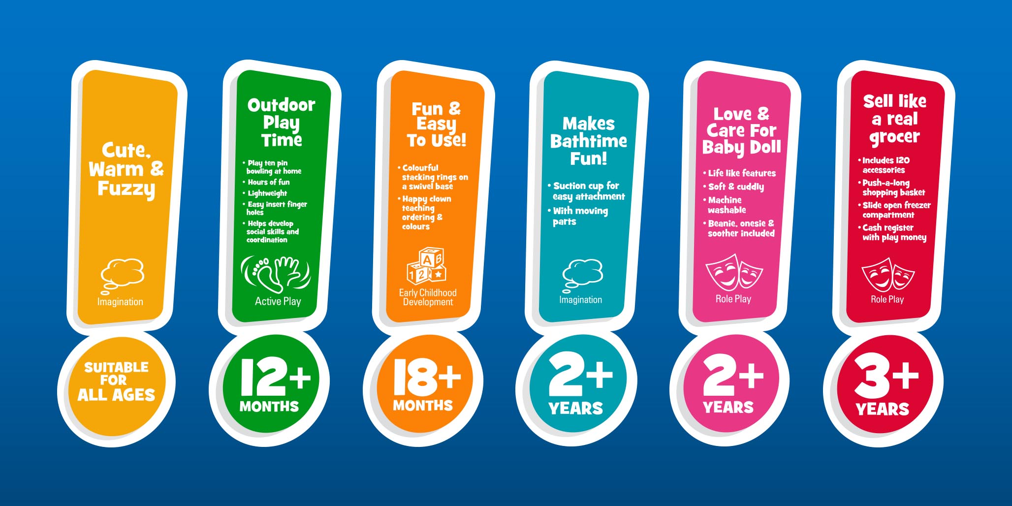
The exclamation mark was also used as a device to bring attention to the age dinkus, features and benefits, value proposition and quantity information. Each colour from the logo is used with custom illustrated backgrounds to distinguish between different categories.
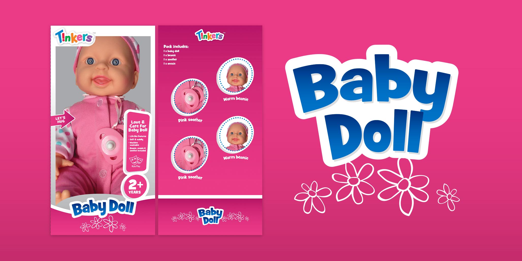
Sydney design agency, Percept, also devised a grid formula for the packaging roll-out to ensure pack proportions and brand assets are used correctly and consistently.
In the process of creating the new packaging design for the range, key products were used in each category to allow us to overcome ‘worst case scenarios’ such as long product names and difficult pack shapes. We were conscious to address any issues on these key product designs before we could finalise the formula and rules that would make up the style guide used for roll-out by third party suppliers.
The overall refresh added energy, liveliness and a uniform visual look which strengthened the Tinkers brand and conveyed its values. The new packaging design ensured that products stood out on shelf and effectively communicated information that is key in the purchasing decision.
Following the creation of the new branding and packaging, an extensive style guide was created. It’s to be used by the variety of producers who roll-out the line extensions in each category. As much of this is carried out offshore, it was important that the style guide was comprehensive, detailed and easy to follow. We also ensured that the design formula was depicted in a clear visual language so that non-English-speakers could understand and follow the instructions.
Since launching, the project has proven successful with the full range looking great and being well received by consumers. You can check them out for yourself in Big W stores across Australia now!
